Gathering CONSTRUCTIVE Comments About MGoBlog 3.0

Mates,
So this might be a good time to start gathering constructive comments about the new site. I get the feeling that transferring an entire blog from one platform to another is difficult, in the same way referring is difficult - We all want to complain but we'd be a lot less whiny if we were the ones tasked to do it and we had some experience doing so. Also remember that undoubtedly there has been a significant drop in user traffic this week and I'm sure Brian isn't digging that one bit since its no guarantee that it'll all come back.
I'm about as computer savvy as my cattle and my comments here will reflect that. You coding and computer whizzes should wade in with suggestions and comments though. This might be better as a diary, or mod deleted, or me sent to Bolivia, but in the spirit of constructive commentary lets see what we can put together for the computer crew:
1. For OP's, an Edit function would be helpful. Also think the old visible up vote/down vote for OPs would be good to come back. Lastly, how about any avatar picture for the posting OP.
2. For regular posts, Edit function and the old style up/down vote where both totals showed, not just a 'net' total.
3. Some form of easily visible notation of 'new' posts in any one thread. Makes for much quicker processing of lots of info, convenient when scrolling, etc.
4. Along the same lines, can we get a 'track' function back?
5. If you are on a user's posting history and you want to see where a specific comment is in a thread, when you click on that comment it takes you the top of the thread, not the comment itself.
6. What are the differences with the yellow lines or brackets in replies to OP's, and the dark ones? There doesn't seem to be any rhyme or reason to them but I'm slow, so maybe there is one and I've missed it.
7. The banner pictures are: Robo-Chase + blind Trekkie + Tron with a hockey helmet. How about swapping those out for one of a million more inspiring possibilities of past or present players, the Big House, celebrations, campus pictures, muppets, or just about anything else?
Blaze away with hot takes. I've tried to be gentle about it b/c it would not be surprising if behind the scenes there is crying and wailing and gnashing of teeth, and I don't want to make it worse.
Hope you are all having a great summer weekend.
XM
I don't have much to add to the specific complaints raised by the OP and a few others. One thing Brad said rang true for me. I spend too much time here, this update has given me the push I needed to spend less.
To me what's most disappointing isn't the number of flaws in the redesign. I expect they will eventually get addressed. We'll come to appreciate some new features and put up with remaining annoyances. It's more the attitude of the people in charge. At the very least, they should be doing this, not the OP. They should have put out FAQs about the changes. Instead I sense an overwhelming smugness. Sorry, but I do.
It started with the rollout of the joke site. I'm (again) sorry, that wasn't clever, it was idiotic. It still pops up for people visiting the site. They are either motivated enough to find out what's going on or just give up because it's not that important to them. It's one way to weed out your users. Maybe that attitude could be justified if the upgrade was truly amazing. They must have thought it was, but I can't help but wonder why.
Brian does things his own way, he always has. Frustrating to those of us that don’t think the way he does, but you just have to accept it.
i like the functionality of the new site, but all of the white space needs to go. My phone can serve as a flashlight while viewing comments.
Just bring back MGoBlog HD. Problem solved.
Agree with the OP. To be honest this feels like a step backwards. We've lost the edit feature and the ability to identify new posts and have a lot more wasted space and have gained . . . collapsibility? I'm hoping there are kinks that can be worked out and that we don't have to go through another major change to get those features back.
Pretty annoying that you have to scroll down when you click to read more of an article. Used to take you to your place (at "the jump").
Also, is it just me, but I don't even see a place to vote up or down on either OPs or comments. Nothing.
I might be the only one but I miss the links to other Michigan web content. I saw Mgoblog as the center of a hub. I would come here (multiple times each day), read the front page, read the message board, and then open new tabs to UMHoops, Maizenbrew, and Touch the Banner.
Mgoblog was the center of my Michigan media coverage. This change will change how I read my Michigan content because it will no longer be a jumping off point.
I never went to any of those other blogs directly. I always came here first.
Way to much white space - need sunglasses to read this site now
too much spacing between comments
too much spacing between sentences
all the above means too much scrolling
buttons to big, don't need another 2" of screen space to see when a commenter joined
It's like this was made for retiring boomers with eyesight problems
As usual, I agree with everything in XM's post.
I admire all the work that went into updating the site. And I realize that readers virtually always immediately reject redesigns, which initially come off as weird and confusing. That being said, this one is especially...unfriendly. Way too much white space, too much cluttered design. And it's too hard to find the message boards, which should be the most prominent feature (aside from the front page posts, of course). And losing the mobile apps is a biggie. But I'm sure this is a work in progress, so thinking good thoughts...
The banner is too busy. And the board should be easier to find from the home page (i.e. without all the scrolling or click throughs) Everything else is manageable. Although what's weird is simetimes the thumbs are already bolded in blue before I've even voted. Having the AndrouAbapp back would be cool but isn't critical. Overall, I'm just appreciative of all the hard work done on behalf of our amusement. Oh, and I'm eternally grateful for my rehabilitation. Thanks, guys! Go Blue!
Next thing you know, they'll let you back in the G7.
I’d like to be able to see the board on the front page. I’d also like the sticky threads to be moved (at least at some point). I’d like the threads to look essentially as they did before. The new threads are harder to follow.
First, congratulations to the team on getting 3.0 launched! A lot of work, I’m sure.
The only thing I have to say is that I used to visit the site/app 15 times a day. It might be a quick check for new posts and message board topics, and done in 30 seconds - but because I could efficiently check in an elevator or when I had a short window, I would.
Now it feels like I need to allocate at least 5 minutes to check the site for new blog posts, diaries, or key message board movement. As a result, I’m only checking it 3 times a day; when I feel like I have 5+ minutes to give.
The good news is that it is probably much healthier for me personally. The bad need is, I’m sure Brian would like to maintain that traffic.
I’ve done the same as far as checking the blog less.
A number of elements (banner, featured content boxes, welcome message, message board and diary sidebars, fonts of board/diary topics, the size billion font Comments header above where I now type) are too big and much of the site has too much white space around it. Result is far too much scrolling.
The board experience in particular suffers from this. Only being able to see 2-3 replies to a thread at a time even on a 13 inch screen makes board posts cumbersome. Getting to the board and glancing for interesting topics is a pain as well (hover over MGoBoard, click, scroll beyond stickies OR scroll down on homepage, only see seven topics despite Message Board side bar taking up more than a full laptop screen vertically, click to see more, scroll beyond stickies).
Agreed
"Also think the old visible up vote/down vote for OPs would be good to come back. "
Really? You don't get enough negativity in life already?
much like 'points' in general, i think the OP up/down votes serve as a subtle but effective way for us to pick our topics with at least a modicum of care. it was also the one area where you knew who and how they had voted, no hiding behind anonymity. lastly, knowing and seeing those totals was an important part of some of the most entertaining or most worthwhile OP's. i mean, somebody gets on a roll one way or the other with those and it can be fun, or affirming (on deeper topics), or properly corrective.
Personally, I like the new design. I do a lot of blog browsing on my iPad and this format and mobile browser strategy works well for me. Keeps it consistent with viewing the blog on my PC. I’m an occasional blog user via my Android phone.
im sure we’ll get post editing back once the basics have been cared for. I want to restore my avatar I picked about a month ago and agree that clicking on my name should take me to my profile so I can edit.
I’m OK with seeing the net of up and down votes. Our total points are “net” anyway. However, I think that color could be our friends here. The new site is mainly black and blue and it looks clean that way, but....green for positive points and red for negative would be easier to read and mentally process. Go blue and maize if that is more aesthetically pleasing.
I’ll also suggest that varying the background color of nested comments might be easier to follow than using bracket lines. Shades of light grey, yellow, and blue would work just fine. Color provides a lot of visual queues and is quickly digested by the eye and brain.
i also agree that the space under the avatar in posts should be used for text. Screen area is at a premium on mobile devices.
I liked seeing each user'sn overall point total under their avatar. Maybe it's mgoclassicist, but when reading a particularly hot take the point total would help me decide if I should pay attention.
It's really too bad the design style of 2.0 couldn't be implemented in 3.0. The new look isn't as polished as 2.0 and actually seems like a step back design wise. I'm sure administering 3.0 is much more appreciated by the MGOGODS who magically oversee us plebs.
I am sure I will adjust in time but it's like trying to go cold turkey after been on heroin for years.
oh, I forgot to add to my post which I can't because there is no EDIT BUTTON.
So an EDIT button would nice.
Oh, and more request...
Might have already been posted but it would be nifty if when I change the drop down to show newest posts first and to show 100 posts per page that the site sets a cookie to SAVE that preference from here until I toss my cookies. Currently, it does not save it and i have to change it every time I come to the site or refresh the page.
This is a critical issue for me:
The mobile version of the site doesn't have adjustable font (as far as I can tell anywhere). I'm 47 and started needed reading glasses a few years ago. The type is just too small for me to read comfortably. I imagine many of your over 50 readers are going to end up ditching looking at the site while mobile - I already mostly have.
Please look into this. This will probably effect many people.
Too soon for me to comment. Still getting used to the changes. Change is usually stressful.
Swap the position of diaries and message board on the front page. Shrink the banner height. Hopefully once the "Hail" banner/ad is removed the message board and diaries will slide up as well.
New site is horrible, and i’m visiting FAR less than I used to as a result. Used to check the mobile app hourly. Now I’m checking the site at most once a day. Completely unreadable and unusable on a phone; only slightly more usable on an iPad. I work for a digital agency who designs and builds websites (Drupal and many other technologies) for major brands. I know users complain about new sites just because they’re different. But I can honestly tell you as a professional in this space, the design and lack of testing on this project are bush league. This is not a success. See you tomorrow. Maybe
Total computer illiterate here but I'm not a fan. I'm not even sure I can put my finger on it but the site seems more outdated to me now. Could be that it looks more like every other site out there now whereas the old site was unique. Could be all the white space. The size of the font in the right sided columns is also a bit big. I like how on the old site I could see more of the recent topics without clicking around. Although for some reason I was never able to go to the next page of Mgoboard topics on the old site, so that part is better for me anyway. Overall downgrade.
Also I would much prefer having a dedicated mobile app than having to go to my phone browser which in itself is unwieldy.
Really small thing, but I like when forums show a little preview of the post when you hover over the title with your mouse. Useful for when people use vague titles to tell if it's worth clicking on the thread or not.
Viewing it on a desktop (Opera) for the 1st time. I didn't care for the mobile site layout. The new desktop is just enough like the old that it isn't jarring like visiting a place you lived after 10 or 20 years and all your landmarks are gone.
Too much whitespace would be the only thing I'd like to see changed. The rest of it will probably feel more like home soon.
Against all odds, I'm actually pretty happy with the change. I know I'm in the minority but I also know that people will eventually acquiesce.
Also, I fucking hate the CFB Reddit threads. They make me want to get physically violent.
One thing that's been getting me: when you save a post, you get dropped back into the thread somewhere. But nowhere near where you posted, so you gotta go find your place again. One other thing, I prefer the new comment box to be at the bottom of the page, rather than the top. It makes more sense to me that when scrolling down as you read, you'd be getting closer to the new comment box.
Maybe if you could save a preference for ordering posts to be newest on top, the top comment box makes sense? Probably... But we can't save the preference with any persistence.
I'm one of those people for whom change is difficult. I'm grateful for the site, and the free content. I'm grateful for the faint glimpse of HTTV on the horizon. I'm grateful for a group of genuinely great guys and phenomenal writers who labor over my entertainment week after week.
But it's going to take me a while to get comfortable here. I'm sure many things are better, and I'm not technically savvy enough to recognize them. I just know my mgoblog routine is going to have to change. It will be like doing my homework. I'll make myself check mgoblog once a day, and I'll make myself click on a link I haven't clicked on before, or try out a function I haven't tried. Over time, it will get easier. Will I relapse into the mgoaddiction I had until last week? Probably. In time.
I’m trying to reserve judgment until I’ve used it more. I prefer the old site, but that is probably because that’s what I was used to. Many of the things others have complained about I find mildly annoying, but we all will adjust eventually.
1. I miss the "New" identifier. If I refresh a post, it is nice to easily see if anything has been added, so I can then look at it.
2. I cannot get the site to show Newest Posts Firsts, nor can I get it so 100 posts show on a page.
3. When I refresh, I am taken back to the first page, not the page I was on.
4. Difficult to get to my previous posts.
5. Would like notifications if a person replies to a post of mine directly.
So I found "reply" where is "add new"
Ok, it's early. People always, always hate change. I've hated every redesign of ESPN.com from 1996 to today. I enjoyed the old site enough. It was fine.
So I'll hold off on judging the whole site now. Of course the loudest people are going to be complainers; it seemed like everybody was griping about the lack of a new site before, and now that it's here a lot of people are griping. Probably different people, mostly. But it's easy to miss that.
All that said, here are some initial impressions:
I agree with others, there just isn't that much information on a given page. I prefer to have as many comments visible on screen as possible.
And it's a bit harder to physically scan comments quickly. Some of this is just newness; the new indent-and-drop-line scheme is different but fine. But there's no color separation the way there was on the old site, and there's no "new" flag that I think most of us became dependent upon to quickly drop to new comments on the board.
It'd be nice to have some soft grey in certain areas to break up the white space.
I'll hold off on everything until football season. Once we see how things work after Notre Dame, we'll have a better idea--if most people still find the new board really awkward to use, that's not a good sign. But it may be that between time spent learning and continued improvements from the hamsters, we'll like it just fine by then.
You have twenty million points. You don't need my upvote. But you earned it. Sensible advice which I often got from my mother -- be patient and don't speak most of what you're thinking. By Notre Dame, I'll probably know my way around here pretty well.
Still Struggling to Learn MGoBlog 3.0
I'm old (born during the Truman administration) and not as technically proficient as I'd like to be.
When using the Chrome browser on a desktop PC, MGoBlog 3.0 seems like one of those Escape Rooms in which a group of people struggles with puzzles and clues for an hour or more until they finally realize that there are no easy ways to unravel the mysteries of how to navigate through a series of challenges like: (a) how to embed videos and insert and resize photos and gifs; (b) how to edit a post; (c) how to determine whether a post is new; (d) how to determine whether you’ve already up-voted a post when the color of the fist isn’t blue; (e) why CTRL + V is the only way to paste text into a post; (f) how to determine whether you’ve read a post without having to read it; (g) where to find links to other Michigan-related websites; (h) how to determine how many up-votes and down-votes have been made for a given post; (i) how to quickly navigate to a user’s comment in a thread, without having to scroll through most of the thread to locate that comment; and (j) why the new comment box is at the top of the thread, instead of at the bottom, so that there’s some incentive to read all the previous comments before posting, among other things.
Grateful for all the free content that’s provided here by some passionate, knowledgeable writers and commentators. Appreciate all the work that goes into providing content and the pain that the site’s creators have endured during the years when they’ve worked on updating the site. Regret that they're taking more heat than they probably deserve.
For several years, MGoBlog has been the most distinctive Michigan-sports-related website that I’ve checked during the day and have commented on from time to time. Unfortunately, after opening Touch the Banner, Maize N Brew, The Wolverine, The Michigan Insider and MGoFish in separate tabs alongside MgoBlog on my computer screen, I see that there’s nothing all that special about MGoBlog 3.0 other than posters’ comments.
So, how do I feel about MGoBlog 3.0? Here’s where I’d embed the “Not Great, Bob” video and Fred Willard’s (Mike LaFontaine) “Hey, Wha' Happen?” video, and maybe add the video for the Mel Brooks song "Hope for the Best", but the best I can do now is insert the links to the videos in the text.
Hoping that all the kinks get worked out here and that we'll be treated to an easy-to-understand MGoBlog 3.0 Instructions Manual before the start of the football season.
Very true. Hate to give credit to something OSU but Eleven Warriors is set up very well. Small banner on top, new content appears right on the top, minimal clicks to get to different pages...unfortunately all things that are lacking on this current version of MGoBlog.
I completely agree that the font is unnecessarily large and the whitespace is overwhelming on this site currently.
It's also really frustrating that you can't save user preferences (eg. I like having 100 comments per page but as soon as I leave the current page it reverts back to 50/page and takes me back to page 1 of comments regardless of where I left off)
I'm not real tech savvy and I can get along fine with this site or the old. I'm sure there are lots of bugs to work out and additional modules still to be installed. Overall, it feels like I moved into a big new house that doesn't have much furniture in it. Maybe a TV and a couch right smack dab in the middle of the living room, a bed and not much of anything hanging on the walls.
to follow your analogy for the new house, i feel its more like the plumber put the one toilet in the garage and the electrician forgot to wire switches for a lot of the lights, and the framers decided not to put too many windows in the place.
not afraid of change and i like new houses, but this one wasn't ready for its certificate of occupancy....
Also feels like being lost at sea in a leaky boat without a functioning GPS and communications system, drifting towards islands with names like Land of 10, Touch the Banner, Maize N Brew, The Wolverine, The Michigan Insider, MgoFish and GBM Wolverine.
m'aidez! m'aidez! m'aidez! we're going down!
I wonder how many MGoBloggers are feeling like these guys.
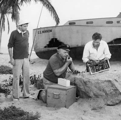
I never knew that's where "mayday" came from.