Semi OT: Some sweet CFB helmet concepts (but the Michigan one is bad)

A creative design firm redesigned the helmets of a few iconic college football programs and IMO did a fantastic job with a lot of them. I'm not generally impressed with these remixes, but this round was pretty good with the exception of ours, which looks a lot like Missouri's. Obviously the best can't be topped (there's clearly no improving on the winged helmet) but for some of the others I think they are actually a decent uppgrade.
What do you guys think?

http://www.cbssports.com/collegefootball/eye-on-college-football/250790…
Edit: I agree with all of you that the Michigan one is bad, I just put it there for reference.
February 24th, 2015 at 1:36 PM ^
The one they did for ND was ridiculous, two-tone green and white with an oversized leprechaun on it. Neither of ND's actual colors, and a lame logo with way too much detail.
I liked the Oregon State helmet, but most of them are weak. Never add gray'silver to a team that doesn't have it as one of their official colors.
February 23rd, 2015 at 3:57 PM ^
Some weren't too bad. But don't ever mess with the winged helmet.
As an aside, while looking at some photos of Zach Gentry playing , and noticed that one of the teams he played against had winged helmets but the colors were black and silver. Looked cool to me.
http://www.maxpreps.com/high-schools/volcano-vista-hawks-%28albuquerque…
February 23rd, 2015 at 4:01 PM ^
Baylor, Oklahoma, Tennessee.
February 23rd, 2015 at 6:52 PM ^
The Oklahoma helmet was the only one I thought was better than the team's existing helmet.
February 23rd, 2015 at 8:15 PM ^
February 23rd, 2015 at 4:02 PM ^
lay off of them, man.
February 23rd, 2015 at 4:35 PM ^
see any wings.
Blech. No.
February 23rd, 2015 at 4:03 PM ^
February 23rd, 2015 at 4:05 PM ^
Perhaps we'll get a duckface Mona Lisa out of this crew. That thing hasn't been changed in years! It's getting stale yo.
February 23rd, 2015 at 4:06 PM ^
Just nope
February 23rd, 2015 at 4:06 PM ^
February 23rd, 2015 at 4:08 PM ^
ridiculous yellow. Break out some early 70's away throwbacks to use if our opponent wants to use uniformz for their home game against us. Use legend numbers very rarely and only to honor outstanding players for their final home game + OSU + postseason. #1 is a recruiting tool and should always be in use and on the back of a wideout. Finally, the head coach should wear Bo's cap with the not-brandon-approved narrower block M. There, we've solved all Michigan Football dressing issues for the second half of my lifetime.
February 23rd, 2015 at 4:09 PM ^

February 23rd, 2015 at 4:17 PM ^
I suppose it's not meant to replace the winged helmets, just something to be used alongside them to pump up the crowds and unite our fanbase?
February 23rd, 2015 at 4:32 PM ^
What's needed here is formation of, and funding for a group to come up with a sweet new design idea for a new Michigan uniform and helmet. Let's call it Honor and Bond! By bringing together an all star team of marketers, facilitators, financiers, and consumer analysts, we can be assured better uniforms than we ever thought possible. And to think what we've had for the last 100 years was adequate! HA!
February 23rd, 2015 at 4:20 PM ^
Sorry YoungGeezy, nothing against you personally, but it's just a principle of mine to automatically neg any "uniformz" type posts (real or pretend) by anyone if they consist of drastic changes to Michigan gear. A man without principles is like a tree without roots, as they say.
February 23rd, 2015 at 5:35 PM ^
In hindsight, I shouldn't have referenced the Michigan one since it's so bad.

February 23rd, 2015 at 4:35 PM ^
Sent from MGoBlog HD for iPhone & iPad
February 23rd, 2015 at 4:37 PM ^
for the Uniform/Helmet combination that are bland in normal light and come to life in black lights.
Or maybe some Uni's with some solar powered neon on them for the Southern states.
This is all getting a bit ridiculous.
February 23rd, 2015 at 4:37 PM ^
Never touch the winged helmet, ever.
February 23rd, 2015 at 4:43 PM ^
The whirring sound you hear is Fritz Crisler spinning in his grave.
February 23rd, 2015 at 4:44 PM ^
February 23rd, 2015 at 5:22 PM ^
Didn't make much difference to me.
I did like the jerseys if you were to reverse the numbers and have blue w/ a maize outline. They would be good enough to be our full time away jersey.
February 23rd, 2015 at 4:51 PM ^
Fuck you dave brandon.
February 23rd, 2015 at 4:52 PM ^
February 23rd, 2015 at 4:54 PM ^
I'd prefer a Wolverine rather than a block M that makes us look like Mizzou...that being said...don't ever mess with the Winged Helmet, like ever
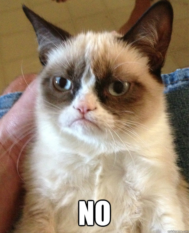
February 23rd, 2015 at 5:21 PM ^
After reviewing the full lot, I stand by this gif. The helmets are almost uniformly (no pun intended) horrible.
February 23rd, 2015 at 5:06 PM ^
I upvoted ya
February 23rd, 2015 at 5:10 PM ^
But, I like things that shit on its history.
February 23rd, 2015 at 5:11 PM ^
February 23rd, 2015 at 5:16 PM ^
not very original. oversized logo on a helmet is a repeat of what Nike did for Boise State first and on to other teams. not impressed.
February 23rd, 2015 at 7:24 PM ^
February 23rd, 2015 at 5:19 PM ^
Don't mess with the helmets.
Don't encourage others to mess with the helmets.
Just don't.
February 23rd, 2015 at 5:25 PM ^
... already garish enough. I'm sure, however, that this will be bulletin board material for Dantonio. "They don't even respect us enough to mar our helmet!!!!"
February 23rd, 2015 at 5:27 PM ^

Just being honest bro.
Maybe instead take your helmet ideas and team up with those guys who want to introduce a new UM fight song?
February 23rd, 2015 at 5:33 PM ^
Yeah all of those are terrible.
February 23rd, 2015 at 5:36 PM ^
Huh. Lack of creativity exhibits itself in the creation of "Uniformz." Shocking
February 23rd, 2015 at 5:39 PM ^
February 23rd, 2015 at 5:41 PM ^
So basically, large logos and gray = cutting edge.
February 23rd, 2015 at 6:02 PM ^
February 23rd, 2015 at 6:04 PM ^
Debate amongst yourselves
Sent from MGoBlog HD for iPhone & iPad
February 23rd, 2015 at 6:17 PM ^
They look too much like something the creators of NFL Blitz would've come up with. I have nothing to add about the spot-on comments about the designs on the helmets. If those aren't Dave Brandon approved, I don't know what is.

February 23rd, 2015 at 6:53 PM ^
February 23rd, 2015 at 6:54 PM ^
Sent from MGoBlog HD for iPhone & iPad