Welcome To The Successories Conference


aaargh unnecessary comma
When Twitter blew up at noon I figured something inane involving Jim Delany had just happened—this is my default assumption whenever Twitter blows up and has always been right, even when Michael Jackson died—and good lord, inane doesn't even begin to cover it. You know this by now but to remind you that the people in charge of marketing the Big Ten are either very stupid or think you are very stupid, the Big Ten Divisions are called "Legends" and "Leaders."
So. A group of people responsible for turning the Big Ten Network into a spigot of filthy lucre so gushing it can afford to employ Chris Martin is also responsible for making the Big Ten the Successories Conference. They've created division names that signify nothing about the teams inside of them—the only way I can remember that Michigan is in the "Legends" division is that "Leaders" is part of the friggin' fight song and we're not in that division. Their inane names don't just start with the same letter, they start with the same two letters. They are unusable.
And they've done this with 15 minutes in photoshop:

Note the use of negative space. Also note how stupid it looks.
By comparison, the new Pac-10 logo would look badass on any soccer shirt in the world:

How can the same group of people responsible for creating the BTN be responsible for this? Obviously the visionary bits of the BTN arrangement come from Fox, with Delany and company the lucky nomads who parked their camels in the right bit of desert and now get to call themselves an emirate.
Policy
These division names do not exist. I'm not using them. Michigan is in the West. Ohio State is in the East. Wisconsin has to deal. It is immediately obvious which teams are in the West—the ones mostly in the west. Michigan can be Champions of the West, and no one has to think about how leadership is more about character than authority.
Can we make this a blogosphere-wide insurrection? Please? Everyone just use "East" and "West."
Remember when you'd go in your room and imagine that instead of a broken down tricycle you had a flying unicorn that could take you away from mommy and daddy's screaming? Yeah, this will be like that.
BONUS: someone on the twitters said "I'm pretty sure an ordinary @MGoBlog thread could have produced better logo options," which is true. So do it either in the comments or by email and I'll pull up the best five and we can vote on the Unofficial Big Ten Logo; I hope I can work out a deal with the winner so we can offer it to the conference for free, if only to shame them.
December 13th, 2010 at 1:53 PM ^
the "Hot, Hot, Hot" of conference division names/logos.
December 13th, 2010 at 2:33 PM ^
DON'T MOCK THEM THEY MIGHT COME BACK
*passes out from trauma*
December 13th, 2010 at 1:56 PM ^
L's
"Somebody once told me the world was gonna roll me, I ain't the sharpest tool in the shed. Well she was lookin' kinda dumb with her finger in her thumb and the shape of an "L" on her forehead......"
December 13th, 2010 at 2:00 PM ^
Come on, you know that's not true. I re-created that logo in freakin' PowerPoint in 3 mins - most of which was spent just trying to get the font type and color exactly right. Seriously, 3 mins in a program that isn't even meant for something like that...

December 13th, 2010 at 2:03 PM ^
I like the spray brush technique. Adds character.
December 13th, 2010 at 2:05 PM ^
Can you spot the number 12 in the logo? It's a little subtle.
December 13th, 2010 at 2:12 PM ^
you, my friend, have a future designing logos at "the distinguished, international design consultancy", Pentagram.
December 13th, 2010 at 4:25 PM ^
from the pentagram website, "the conference is comprised of schools located mainly in the Midwest and includes world-class academic institutions such as Ohio State, Michigan State, Penn State, Purdue, Northwestern, and University of Wisconsin–Madison."
In a list of world-class academic institutions in the Big 10, Michigan did not make the top 6.
December 13th, 2010 at 7:04 PM ^
I can't believe our conference is doing business with a company called Pentagram. Make a deal with the devil, you get what you deserve.
December 13th, 2010 at 11:05 PM ^
I don't think they put any thought into that list. I'd understand it if the person who wrote that was a MSU or OSU fan or something, but why exclude Illinois if that's the case.
December 14th, 2010 at 1:42 PM ^
Note also from the Pentagram website that the logo designers are a Wisconsin grad and the husband of an Ohio State alum. They are 2 of only a couple of Americans on the entire Pentagram staff, with one Harvard degree holder. The rest are Europeans and an Argentinian. My guess is the Badger and the Buckeye spouse wrote the copy and deliberately omitted Michigan.
Jealous much?
December 13th, 2010 at 3:04 PM ^
I am trying to solve your fuzzy matrix without success.
December 13th, 2010 at 2:02 PM ^
I vaguely recall a threa like that already existing. It contained many excellent suggestions for the logo, especially compared to this goat turd. Anyone able to locate it? I have been unsuccessful to date, as I have been looking for it since this abomination surfaced.
December 13th, 2010 at 9:48 PM ^
BIG 10?
December 13th, 2010 at 10:26 PM ^
I think the question mark should be a part of the logo.
December 13th, 2010 at 2:03 PM ^
I always thought that the Big Ten logo for the basketball tourney looked alright. All they would have to do is update the pinwheel for Nebraska....

December 13th, 2010 at 2:38 PM ^
I don't know. That looks pretty complicated for most uses. And although we're all in knee-jerk reaction mode due to the stupid division names and everything, I honestly haven't seen a better mockup of a proposed logo, anywhere. All the designs I have seen have been jokes or an attempt to shoe-horn a 12 into the pre-existing negative space logo. The new Big Ten logo will take some getting used to but I think over time people will come to accept and appreciate it. It is simple, useful, will display well on paper, wall, screen, or fabric. It might not be as clever as the previous Big Ten logo but that logo was dated and needed updating. Give it time.
December 13th, 2010 at 2:52 PM ^
OK, I looked at it for a couple more minutes . . . and it still sucks.
December 13th, 2010 at 4:03 PM ^
More like give it a few years. Nobody likes new logos. This logo isn't that bad.
December 13th, 2010 at 3:29 PM ^
it looks like a shitty winter olympics being held in Quebec
December 13th, 2010 at 2:05 PM ^
Ok seriously, when are the REAL division names being announced?
December 13th, 2010 at 3:30 PM ^
DRINKS YOUR MILKSHAKE
December 13th, 2010 at 2:04 PM ^
But does someone have Delany's address so we can inundate him with mail telling him how much the logo/names suck?
December 13th, 2010 at 2:42 PM ^
Big Ten Conference
James E. Delany
Commissioner
1500 West Higgins Road
Park Ridge, IL 60068-6300
(847) 696-1010
December 13th, 2010 at 2:06 PM ^
This is so fucking stupid.
December 13th, 2010 at 2:07 PM ^
I had an awesome Big 10 logo that took me one minute to make in ms paint. After 3 minutes of figuring out how to post it here, I gave up. So here is the ascii version:
BIG * 6/5
TEN
December 13th, 2010 at 2:08 PM ^
May be the worst branding by any group of people who talked so much about "brand management." The font is boring. There is nothing remarkable about the logo at all - save an "I" replace by a "1" and a "G" that fails in trying to look like a zero. It's as stuffy and boring as the stigma that the conference is trying to shake. What a steaming piss of fail.
December 13th, 2010 at 7:40 PM ^
That heart makes this design. LOVE IT!
December 13th, 2010 at 10:33 PM ^
I'm shocked that this didn't win. I think it's better; it's also ready for a 13th team.
December 13th, 2010 at 2:09 PM ^
"From the minds that brought you the Microsoft Clip Art collection, we introduce to you the new Big Ten logo..."

December 13th, 2010 at 2:19 PM ^
Six Zero? Are you out there? Your services are greatly needed.
December 13th, 2010 at 2:45 PM ^
The 2 can be incorporated...

December 13th, 2010 at 2:12 PM ^
Ok DB, you wanted us to buy your story that you single handedly kept UM-OSU as the last game of the year (well, maybe with a little help from the tOSU AD) we're giving you a chance to live up to that pimp hand you're carrying around. Squash this - NOW. Maybe it's another intentionally retarded leak just to scare people into thinking the worst and then they'll give us something that's "meh" instead of "put a fork in my eye please." But, please, for the love of the fans kill this...
I still don't get why they said they never considered hiding a 12 in there - it's not like they haven't done EXACTLY that with the current logo...
December 14th, 2010 at 1:59 PM ^
Because every time a school is added they'd have to redesign the logo. What bull squat. Not that hard, as many MGoDesigners have aptly demonstrated.
Wonder how much Wisky grad and Buckeye hubby got paid for that POS?
December 13th, 2010 at 2:12 PM ^
It isn't just a nightclub in Detroit anymore . . . .
December 13th, 2010 at 2:15 PM ^
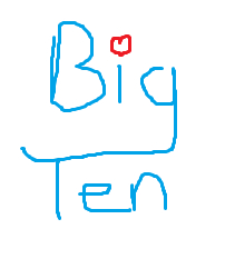
I hereby submit the following for review by the commenters:
TEN
December 13th, 2010 at 2:16 PM ^
In response to the naming of the Big 10 divisions the SEC had to make sure they point out their superiority and they are going to be renaming their divisions "Best" and "Bestest" - those in the "Bestest" division will be the 6 schools that rank lowest in the US News & WR rankings...
December 13th, 2010 at 2:16 PM ^
Than Legends and Leaders.
Also, give it to the Big Ten to keep the team that are the "Leaders and best" out of the leaders conference.
Soon we'll be talking about the leader of legends divisions, the leader of the leaders division, and how we still don't see the "12" hidden in the logo.
As an aside, I do like the shorthand version, the simple B1G (kind of cool), but the full on version isn't even worthy of a meh.
December 13th, 2010 at 2:41 PM ^
The historical references to Michigan as "Champions of the West," the old reference to the teams including, significantly, Michigan, Northwestern and Minnesota, as being part of the Western Conference. (Purdue, Wisconsin, Illinois and Chicago were the others).
I would've bet money that "East and West" would have been the default option, after all was said and done and a conference room filled with 12 assistant AD's and their assistant-assistants had finished laughing at an idea like "Legends and Leaders."
December 13th, 2010 at 3:22 PM ^
Beavii and Buttheads
December 13th, 2010 at 2:41 PM ^
And not seeing anything like a 12...is it even there?
It's like one of those hidden pictures in the pictures thing I can never see...

December 13th, 2010 at 3:02 PM ^
Is that a horse, i've been staring cross-eyed at the screen for 5 min. now.
December 13th, 2010 at 3:04 PM ^
I'm pretty sure it's goatse.
(caution: do NOT Google goatse)
December 13th, 2010 at 3:05 PM ^
I don't know if you wrote horse or borse, but I think you're right. Also, I can't see straight any more.
December 13th, 2010 at 3:12 PM ^
http://cae2k.com/baby-blocks-photos-0/hidden-picture-within-a-picture.h…
But if I could have found one with boobs, like suggested, that would have been meta awesome.
December 13th, 2010 at 3:29 PM ^
I see 3 giraffes
December 13th, 2010 at 3:05 PM ^
??? I see huge boobies bouncing up and down. Alert Kass.
Comments