Jumpman Football uniforms (PHOTO)

I woke up to a nice surprise this morning. Someone tweeted this and it was brought to my attention.
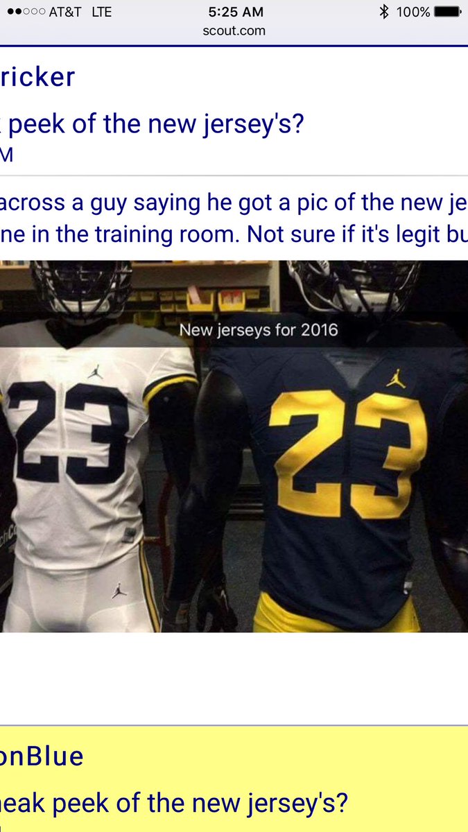
ORIGINAL TWEET:
@mgoblog @michiganinsider @umichWD @SamWebb77 pic.twitter.com/NzWfGbhPVn
— Justin E Harkelroad (@jharkelroad1) July 29, 2016
The font we're using is NBA Bulls. The first change to the font in almost 50 years. The classic #2 worn by Woodson is gone.
C'mon WD, you turned 21 and your game is slipping.
It's all downhill from here.
Sent from MGoBlog HD for iPhone & iPad
Next week is going to be a bummer without threads where adults bitch about slight variations in the numbers on jerseys.
Sent from MGoBlog HD for iPhone & iPad
that I couldn'rt care less about. As long as they are maize and blue unis and are pretty much traditional, who cares?
The only thing that bugs me are the non-traditional things (bumblebee stripes etc.) but even then, just win the game. It's not like i no longer know which team Michigan is because of the uniforms. Of course, I prefer the 1990s traditional unis but whatevs.
If M was guaranteed a National Title but we had to wear the bumblebee unis every game, then bring on the bumblebee unis.
Sent from MGoBlog HD for iPhone & iPad
you sure are a bit butthurt over an anonymous person's opinion.
Curious as to why to targeted me instead of the other 200 anonymous people's opinions. Oh, wait, no . . . IDGAF.
Those are fresh. I approve.
Sent from MGoBlog HD for iPhone & iPad
Makes sense.
They look great however I much prefer the traditional Nike swoosh which looked very classy

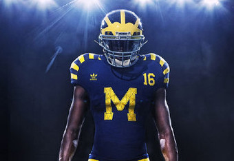
This is pretty much perfection, IMO, give or take the M on the pants:
Though that logo might not be big enough to attract the 'croots in 2016.
I still don't understand what a dude with a basketball in his hand has to do with football, but meh.... I'm an old fogey now, so it probably doesn't matter.
The dude with the basketball in his hands is the most popular brand of athletic shoes/cleats (football/baseball cleats).
The brand with the dude with the basketball in his hands is beloved by athletes all over, and helps with recruiting , as a number of recruits have mentioned how cool it is UM is with Jumpman.
The dude with the basketball in his hands logo is a brand logo.
I agree it is weird at first but you have to think of it as an athletic company logo, not a "basketball clothing line."
I really don't think the Jumpman is as groundbreakingly important as people like you think it is. The fact that about 99% of the people looking at this stuff are wondering why Jordan is dunking on a football uniform, with about 1% of the people yelling "crootin'!", seems to verify that it could be the swoosh and Harbaugh would still be able to recruit at precisely the same level.
Call me an old fashioned sports fashion conservative, But the only thing the Jumpman should be on is a pair of Jordan sneakers. I don't have a problem with the dude with a basketball in his hand. The Jumpman logo just looks out of place on a football uniform.
Like I said though. I'm old, and I'm allowed to get cranky about inconsequential things. I'm sure I'll get over it once the season starts.
I've just worked out my waffling opinion on the white vs maize away pants. I want BOTH.
Wear maize most of the time, but wear the all-whites when playing at the likes of Iowa, Minnesota and maybe Maryland.
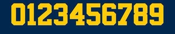
It's difficult to make that happen considering the fact that the shoulder has virtually disappeared on the modern football uniform. Without pads, the average jersey looks almost exactly like a cutoff tee. You're pretty much forced to put the number on the top of the shoulder nowadays.
I like them a lot. I kinda wish the away white pants didn't have the stripes down the sides. Having mostly all white unis, and only the helmet being maize and blue, would make the best helmet ever stand out even more, and the overall look of the team would be badass. Just my $0.02.
I'm a maize pants guy myself. But I see what you're going for and I agree that'd be a good look.
I'm a maize pants guy too, and I like them so much because there are no stripes or other nonsense down the sides--just maize.
Sent from MGoBlog HD for iPhone & iPad
i wouldve liked to see a switch to Roman numerals
DARBOH
LXXXII
PPPPFFFFFFFFTTTTTT
We already did that, but everyone wore number 1000 and it was confusing.
so we have a all white away jersey again this year. i like that.
Swoosh. Get rid of the jumpman.
I love addidas compared to these.
I have NEVER really cared about what Michigan wore on the field. It was Michigan FERGODSAKES. I look at this and all I can think of is that we are the Michigan Bulls from Chicago. Next year, swoosh everything.
Sent from MGoBlog HD for iPhone & iPad


in ohio?
i would be all for three different road jerseys, but with historical connections. one from the 70s which we have now. one from the 80s that harbaugh wore. and one from the 90s that woodson wore.
instead of reinventing yourselves you mantain tradition and history. plus maize or white pants could be worn with any of the jerseys. you would never need another away jersey.
Personally I'm not crazy about this whole Jumpman thing, but if it's good for recruiting, then I'm all for it.
Not sure if you were told, this is a pic from February
Hello Nike employee.
"Nike's latest uniform innovation."
Yeesh.
In interviews on Detnews.com it states that Michael Jordon told JH that we will be the first and only Jordon brand football team. If that's true that we will always be the only one, that is pretty awesome and great for recruiting!