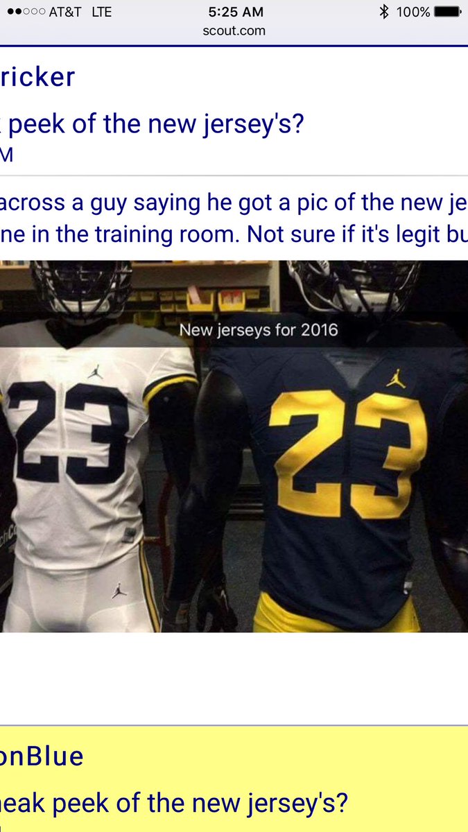
Jumpman Football uniforms (PHOTO)

I woke up to a nice surprise this morning. Someone tweeted this and it was brought to my attention.
ORIGINAL TWEET:
@mgoblog @michiganinsider @umichWD @SamWebb77 pic.twitter.com/NzWfGbhPVn
— Justin E Harkelroad (@jharkelroad1) July 29, 2016
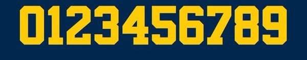
The font we're using is NBA Bulls. The first change to the font in almost 50 years. The classic #2 worn by Woodson is gone.
I for 1 think they are awesome 2! I've looked 'em over 3 times (or more, I've 4 gotten how many), and I just want to high 5 the creator 6 times over the next 7 days. More on this L8er.
Sent from MGoBlog HD for iPhone & iPad
Sent from MGoBlog HD for iPhone & iPad
Yeah, this is the downfall. Maybe that still changes when they do an official unveiling.
However, we've been hyping this up for over a year just for font change and aging jersey template.
Sent from MGoBlog HD for iPhone & iPad
I dont think they are 2 bad at all. It's 2 bad some you don't like them. 2 many picky people here. I'd be mad 2 if the style I grew up with 2 decades ago was changed, but when we go 2 2 championships you won't care. Either way, 2night I'll sleep well knowing Harbaugh is our coach.
I, 2, think that these changes are a bit 2 much.
Sent from MGoBlog HD for iPhone & iPad
Sent from MGoBlog HD for iPhone & iPad
Until the jerseys are officially revealed on 2sday
" first change to the font in almost 50 years."
Ugh.
Sent from MGoBlog HD for iPhone & iPad
neat
Harkelroad is a fun last name
+1 Informative
Looks o.k. to me. Could be my laptop screen. Will have to see it live and unfiltered.
The font change on the other hand...
I just 2ted.
If it were up to me, Michigan's uniforms would forever be locked into the version that AC wore when he was breaking ankles a few times a game. That said, people younger than I am put more care and consideration into their athletic wear than I do a suit, so, whatever. If the players are happy and the people who buy the merch are too, it's all good--so long as we're beating the everloving shit out of the other team every week.
Sent from MGoBlog HD for iPhone & iPad
Which we will be beating the everloving shit out of 8-9 teams on our schedule consistently for the next few years
I love these. Very nice work.
Michigan was a Nike school in 1997-98. How could Champion market a Michigan jersey? Maybe making the 2 the incorrect font is what made it possible. Not an actual replica.
Yeah, that might have been it, but I don't know. I bought a couple Riddell jerseys from MDen as late as about 1998 or 9 and they were the big-hole mesh game issue-type jerseys. There were some weird things happening back then. The apparel contracts weren't so airtight as they are now.
To my knowledge, Champion was the only company to make the Rose Bowl replica jerseys that year. I think Nike made some later, as there are some really good replica jerseys floating around, but it seemed that winter, the only bowl jerseys out there were Champion knockoffs.The font wasn't right, the fabric was weird, and they were all really freaking short. It barely reached my belt.
Here's one:

Sent from MGoBlog HD for iPhone & iPad
There will be, they usually add those for real jerseys. Notice the B1G logo also isn't there yet.
I love your avatar. The right shade of maize M on a blue background. Clean, simple, totally Michigan. If the final unis adopt that aesthetic, I'll be elated.
Due to my age I have seen Michigan suck for nearly half of my life....so honestly the slight number font change and the white pants are a welcome change to the HARBAUGH era
winning cures everything
Fuck Penn State
Eh - a basketball logo just looks wrong on a football jersey.
...provided that Michigan wins the Big Ten Championship this year.
It's not a basketball logo. It's the Jumpman logo. There is a difference. It also looks fantastic on the football jersey. The fact that Michigan is the only one allowed to have it for football is great.
It's a picture of a guy playing basketball. And I don't think it looks very good.
I love it.
I'm pushing 40, grew up during the Jordan boom. That logo means more than "a guy playing basketball" to me. I don't associate it with Michael Jordan the player, and I don't even see a basketball player when I see this logo.
When I see that logo, I think of the most prestigious athletic shoe that has ever existed and that has carried that title undefeated for 30 years.
If you don't care about branding, that's not a crime. More power to you. But for those that do, whether they be Jim Harbaugh, Random 5-star recruit, Wolverine Devotee or anyone else, that "guy playing basketball" represents the Leader and Best in that industry.
And they chose Michigan Football to be the first and only school to wear it.
I find that to be fantastic. MOAR apparel posts please.
Sent from MGoBlog HD for iPhone & iPad
Nike originated that logo to sell basketball shoes to basketball players. I think the analogy is better stated as if the school decided to replace the block M on its athletic uniforms with the official school seal. Academic logo, academic uses; athletic logo, athletic uses.
The Air Jordan brand sponsors NBA, MLB & NFL players, NASCAR drivers, Boxers, PGA Golfers, and Soccer players, numerous college basketball programs and now 1 college football program.
Everyone wears Jordans: Athletes and non-athletes alike. Both men and women, young and old. It is not even specific to athletes, let alone team sports, let alone basketball. Air Jordan is not a "basketball" brand. It's not even debatable.
What does Nike's original intention have to do with anything?
(Library of companies that pivoted and changed direction loaded and ready)
Nothing to see here...this picture was from February, FWIW. These aren't the final product.
Well no shit it's not the final product. There's no sleeve numbers or B1G logo.