Welcome To MGoBlog 3.0

SORRY, SORRY, TRYING TO REDESIGN IT
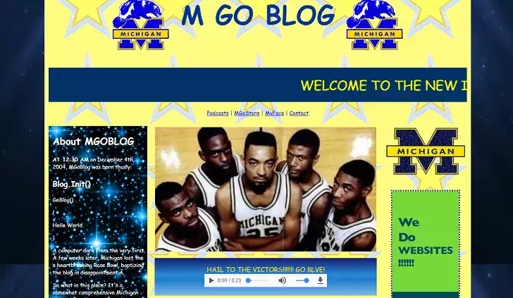
Fine, we'll not do the geocities site for the rest of time. I hope you're happy with a background that does not include animated gifs and zero Victors midis in your life, you philistines.
Anyway, this is the New Site. There will inevitably be some hiccups as with any large complicated activity. Please feel free to email or comment about them and we'll look into it. Here is a bolded alter-ego discussion about it.
Why did it take so long?
We missed an aggressive date in August and then I didn't want to upset the apple cart during football season. Then bandwidth got extremely low for us, the MGoBlog half of the equation, with a weird spate of folks being very ill at the same time hockey and basketball went to their respective Final/Frozen Fours. We didn't really pick the project back up until April.
I thought the August date was going to be a miss because this was a bear of a migration from Drupal 6 to Drupal 8 for a site with millions of comments and hundreds of thousands of nodes, poorly maintained by a web coding dilettante (that would be me) and using various Drupal 6 alpha modules that never transitioned to 7, let alone 8. Some functionality was lost. (RIP hellbanning.)
So what are the bells and whistles?
Step one was attempting to replicate current features and port the site to 8. There isn't a ton of new functionality. The main new feature is a responsive design that will work on phones and tablets in addition to PCs. This means we don't need to have specialized apps anymore. The new site is also a long term platform that we can build new stuff into; features on the old site stopped happening because I was perpetually hoping to have a new site in the near future. Now diabolical plans can transpire.
One new thing: comment threads are collapsible, so when that guy who fights with that other guy starts fighting with that guy you can just click the collapse button and move on with your life.
So there are no apps?
The apps were just a mobile-friendly way to view the site and are currently discontinued. If we have functionality we want to add that requires an app they might come back.
I have a problem with this!
Yeah, if you click on "read more" it doesn't take you to where you left off. That is a known issue. Voting is also missing from some article types.
Where's the midi?
You'll have to ask HUEL… er, Human Element about that. Human Element develops websites, usually well and sometimes very very badly but on purpose.
Now diabolical plans can transpire.
You mean this WASN'T the diabolical plan? I am intrigued now...do tell.
Thank you guys all for the incredible work on this new site!
I'll check into the Snowflakes thread over on the board if I notice any issues.
Can “up” comments on the phone, terrific. At least on Posts you can, doesn’t appear to be an option on the board. Either way, thumbs up. ?
I'm missing up/down voting on the board.
Especially missing the ability to edit posts and comments!
Lots and lots of bugs....
Looks good! Will there be a new RSS feed, or is that going away like the app?
I'm sort of......
lost.
don't stop to ask directions! This is a bad neighborhood!
Anyone else see
- Unable to retrieve https://media3.giphy.com/media/SggILpMXO7Xt6/source.gif at this time, please check again later.
- Unable to retrieve https://media.giphy.com/media/l2Je2ifGlRZEWDbb2/giphy.gif at this time, please check again later.
- Unable to retrieve https://media.giphy.com/media/l2Je2ifGlRZEWDbb2/giphy.gif at this time, please check again later.
- Unable to retrieve https://gph.is/2sSDAmJ at this time, please check again later.
At the top of this page?
Yeah, I do. I'm on the Samsung browser. I'm not sure if that's what's creating the issues. Also, I'm not sure if it's bulleted lists or URLs, but they trail off the right side of my screen.
I’m on an iPhone and I’m getting that too.
Yep. Saw it last night when I couldn't log in, see it this morning when I can.
Yup when logging in and when clicking on a username. And portrait mode on iPhone is missing text and reply buttons deep in threads (well 2 levels deep).
Cheers and looking forward to enjoying 3.0 (spent many moments in the last 24 hrs in a confused time machine circa Dec. 2004)
Dang it!
Mobile site needs WAY less padding, especially on the board. On my Pixel 2 XL I can see about two comments before I have to scroll again.
Also, TLS please :)
Well that initial version of the new site had me in a panic. Couldn't find the forums and felt the quality of my day going downhill fast without my mgoblog fix. Much relieved to see things up again. Don't do something like this again.
Glad we got to keep our original joined on dates! Hurray old-timers!
No sparkly?
Thank God!!! I was starting to have withdrawal symptoms. I actually had to do work today. WORK!!
The site is looking great! I think I will miss the app, just because I'm not exactly digging the layout of the comments. Seems like there's a lot of space/scrolling required on mobile. But otherwise I'm really enjoying how much easier it is to post again from my phone....
The site is looking great! I think I will miss the app, just because I'm not exactly digging the layout of the comments. Seems like there's a lot of space/scrolling required on mobile. But otherwise I'm really enjoying how much easier it is to post again from my phone....
double posting still works!
Double posting was probably one of the top requirements for the new site!
Love the new site design.
Go Blue!
It's weird, can't see which posts are new, can't edit, can't figure out posting gifs...I hope these are just bugs and not long term issues. We'll see. In the meantime, proofread your posts!
I reloaded the site several times this morning thinking that this couldn't actually be the site's redesign. That it took a number of years for that.
What in the world were the designers thinking? That the readership was a bunch of gerbils with ADD?
There were no links to comment, or get to diaries or the board. No community interaction, the development of which was the primary goal for the blog at its inception. And this was beta tested?
But the blog is functional and more responsive than previously, and all of the archives have been transferred over (which seems to be a primary goal) now to a platform that can be add new features.
I guess that web design and maintenance is a much more difficult endeavor than I ever thought.
I love this update but I vote MGoGeocite as the best version ever.
Ah, this is more like it. And so far, I haven't had site load/reload issues, like with the old app! Bravo, guys.
Two things:
1. Anyone else have to reset their password in order to log in?
2. I don't think this is how it's meant to function: (This is at the top of this post when I open it.)
I logged in with my normal information with no problem
Yes, I had to change my password as well
I did not have to change my password.
I also see the "unable to retrieve" mess at the top of my screen, but maybe that's because I'm on my corporate VPN...
I had my account reset to a previous user name and password so I had to reset. Odd but my history is all there. You aren’t the only one.
I changed my password and still couldn’t get in until this morning. I emailed Brian. Maybe he did some voodoo on my account as I was obviously able to get in this morning.
Damn. I aaaaaaalmost made it ten years on the same mgoblog password
I was able to use my same one when I reset it. :)
Took me a while but finally I get to see the new site in all of its glory!!!
Can't browse diaries. . . is there a link somewhere that I can't find, or are only seven left in existence?
Also can't check my own content. I hope that's not gone; I liked checking back for LTTP replies.
I also can't see hamsterdance anymore. I don't care about this though. Just thought I should mention it.
This is a good point, it was easy to check on your own post history to look for new comments in threads you already commented on. What's the best way to do that now? Probably upgrade to the new MGo4.0
I noticed it had my points total in the login box after logging in
On my iPhone, the account (person) icon in the top right doesn’t work. I had to post and then click on my name to check my history.
This version of the blog will eventually fall out of favor and now I'm left wanting to see your progress on MGoBlog 4.0
So this is my first attempt at a comment. I’m sure it’ll work, but I had to clear my internet cache to even get the main page to show up.
Glad to see we’re on the other side.
Is this the future?
The functionalities and features of the new site are probably fine, but visually? yeeeesh. It looks as outdated, if not moreso, as the previous version.
And that new top banner? From the background images to the typography, it's horrific. I'm actually surprised it's this bad. Maybe it's a placeholder...
The only caveat I can make is that I've had to design sites within a Drupal framework in the past and it's pretty damn limiting.
First: congrats to the MGoBlog team on successfully updating the site, which we all know was a huge undertaking. Your readers are grateful.
That said, I kinda agree w/Don re: the aesthetic of the new site. But I don't think it's the fault of the MGoBlog guys -- this is the (unfortunate) trend of website design now, where "responsive design" and "mobile optimization" has come to = "looks like shit on a desktop." See some web designers complaining about this here:
I was wondering if the necessity to make it mobile-friendly was hamstringing the visual design. I'm a designer, not a tech guy, so I can only guess at the constraints the technical side of things imposed.
I'm sure I'll get used to it eventually and won't think about it, but I'm still surprised.
I doubt very much that the top banner looks the way it does because of Drupal or mobile requirements, though. Lord.
Having a good looking desktop version of a responsive site can be done, it just takes a very good blend of creative talent along with someone who understands the technical capabilities and limitation of responsive design.
Comments