


Yup, Adidas. Definitely not Under Armour.
Son of a bitch...my fault. I pride myself on random, useless jersey knowledge.
mostly because my expectations were raised thusly
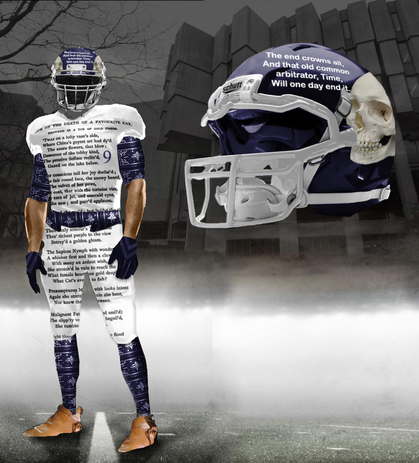
Found this online and thought it was interesting. Maybe not super informative, but it at least shows some of the work that went into this design...
The white with the puprple stripe reminds me of the old Red Wings jersies.
They remind me of the Montreal Canadiens' home uniforms:

WHen did they switch to under armor?
Thanks! Interesting that they also hate Adidas. I don't, but it seems like many on here do. Would the masses be content if we went to under armour or would they be fearful of the changes that would inevitably come?
Their uniforms should be like 60% maize and blue... after all, the stadium always is whenever we play them. Only fair.
I didn't realize that NU was no longer sponsored by adidas. These are sort of cool and sort of ugly.
My first thought was that these are a better attempt at the vinatge Houston Astros
The northwestern stripes on the undershirt are too much of the jersey. Personally I don't like the trend of having an undershirt be visually a part of the uniform. If they put the northwestern stripes higher up on the shoulder pads without the midriff stripes it would be a classic jersey.
If they had done the helmet in black, I would approve.
It's not bad... we knew the NW stripe was going to be prominent, but I didn't anticipate this. Actually there was all kind of talk that it was going to be arched, like the architecture in Evanston or something to that effect.
Looks better on the home and the away, obviously, because there's less contrast between the purple & black than purple & white. Purple is a high value color, which means it's closer to black than white, which allows it to blend in better and therefore helps those white numbers pop. The purple on the white distances itself more from its white ground, tricking your eye into conceiving that the stripes are part of the numbers rather than the background. The result may very well tamper with the viewer's ability to recognize the numeric shapes.
In other words, the white's won't look as good on TV. I also think the whole thing will take another hit if and when the players aren't wearing the base layer. Thoese sleeves certainly help sell the stripe motif, and I'm curious to see how it will look without them.
Still, not bad. UnderArmour's hell bent on innovation... but at least they've learned a bit of restraint since last year.
These are really, really dope. Can't wait to see them play now.
Neither can their fans.
If they hit someone real hard and lay them out they can turn their hand and tell them to sleep with the "z".
Good for Northwestern. Nice look
I have to admit, I like them. I like the throwback look they're going for. It'll be great for them with the night game against Vandy in the 2nd week of the season. That will get them some good publicity.
I actually like these uniforms overall.
The stripe looks better on the white jersey as opposed to the purple one, I think - the black and the purple are just a little too blended. I really like the look in the last photo in particular, however - it gives Northwestern a brighter, more modern look while paying homage to their past with the stripe.
Anything worn by a winner is suddenly more intimidating. I'm sure Ray Lewis would agree.
I guess they are going for the "ah my eyes!" approach to intimidation.
The notion about uniforms looking intimidating is, to me, overblown. You know what makes a uniform look scary? Winning a lot of games while wearing it. If anyone ever suggested changing the Lakers' purple uniforms (that have clinched five titles) to black for intimidation value, I would put on a dolphin hand puppet and punch him in the dong.
I applaud the notion of the midriff stripe to make the uniforms distinctive but on the whole find it rather distracting. Maybe put it as shoulder and pants stripes, but whatevs. The font they're using for the numbers is pretty sharp, though.
I also totally agree with whoever said to get rid of the tramp stamp. Call me old-fashioned, but the only thing that should be on a uniform's butt is ladies' (and some guy's) admiring eyes. Put a tiny stylized N/wildcats wordmark right below the collar like everyone else is doing.
Lastly, maybe this is just me, but I alsost never like seeing the team name on the front of a football uniform - especially when it's a longish name that necessitates smaller letters, as is the case with Northwestern. It looks very badly scaled especially juxtaposed with the large jersey numbers right below. Let the uniform tell you who the team is, instead of spelling it out. (Yeah, I know it's Just Northwestern, but still)
I like them a lot. I could be a bit biased since my high school's colors were purple and white (and black at a certain point in time).
The road uni's look like pajamas
Did Pioneer High ever use black trim for their uniforms? (I'm a River Rat, myself)
Those are awesome for NW. Keeping it clean, classy, and not overwhelmingly purple.
We're sorrrrry...
How USFLish of them.
them until some point in time when they beat Michigan while wearing them - then I will hate them. OF COURSE the only way they will beat Michigan is because the officials make bad calls - just for clarification
Or if the defensive coaching staff refuses to come out of a 4-3 when faced with a spread offense, plus our All-American RB drops the ball when running in the clear.
I fully loathe the midriff stripe. Yikes.
Not going to lie, it's cool seeing stuff like this out of Northwestern. I personally don't like the stripe, but I love the NW is pushing the envelope. It would be awesome to see NW become a legitimate threat to win the B10. North Chicago is already Ann Arbor lite (as well as Bloomington lite, Iowa City lite, etc), so it would be nice to see some part of Chicago take ownership of the Cats.
I think I know what school my next NCAA dynasty is going to be...
On second glance they are very unique. I think this is the future of uniforms. Teams that don't have a traditional classic look, i.e. the teams that change unis every 2-3 years, are going to try to rebrand themselves for the long term. While it looks wierd at first glance NU just found a uniform that will make them stand out.
Also, some people have said that they like the purple helmet, black jersey, purple pants look. I think that looks too similar to TCU
has uniforms that make them standout too.
I spy 16 Under Armour logos
1st picture- 9
2nd- 6
3rd- 1
winner winner chicken dinner, you guys forgot the visor has two.. boom
there isn't much you can do with purple honestly. I'm more than happy to see them drop those terrible black on purple home jersey's they wore for most of the last 20 years.
Its Northwestern, in the category of uniforms I care about they're right above Indiana.
anyway, it looks like these might be some kind of tribute to their 1909 uniforms more likely its the ones Under Armour paterned the idea after so they could claim historical significance.
http://hailtopurple.com/features/unis1.html
Thank you for that link. And the stripes are definitely seen on the sleeve of their later jerseys, no real similarities to the 1909 version.
Do you know if Michigan has the historic jersey info anywhere?
But hey, it's college football in the 21st century. Ugly and dumb uniform designs now come with the territory. The more inane the better.
Modern fashion design students don't understand why they're hated so much. Well now you know, modern fashion design students, now you freaking know.
Lacking imagination? Keeping it simple with making the purple look better is good by me.
You must hate, PSU, Texas, Bama, and ND. No imagination went in to those. They picked 2 colors and that was it.
Another posted made a good point, the stripes are actually more of what their historic jerseys looked like.
That horizontal stripe will look great on the O, and could be a competitive advantage. It draws attention to their man-bewbs and away from their hands (thus negating potential holding penalties).