Michigan Throwback Jersey for ND game

One of the writers for the freep posted this on twitter...adidas provided this sample to the freep.
"Last week, athletic director Dave Brandon told a meeting of the state's sports editors that U-M intended to hold a nighttime unveiling of the jersey this summer and that U-M hoped fans would purchase a lot of jerseys, as they did for the Big Chill last winter."
here is the link to the freep site (OMG yes its the freep)
WTF is that? Throwback? Looks more like throw up to me.
I knew it wouldn't happen, but I was hoping they would just unveil the regular uniforms and say "We've been using the same uni for 7000 years, bitches!" and be done with it. What is this a throwback to?!
1899?

That design is making my eyes sore.
Gag me. Those are awful. I really don't understand the fascination with throwback jerseys. If we are going to throw back at all, they should go back no further than Bo (isn't 40 years enough at this point?) and maybe put some stickers on those helmets.
Otherwise, quit turning what will obviously be a great game on its own merits into a frickin' costume ball.
and our "throwbacks" will be 1991 throwbacks celebrating Desmond Howard beating ND with the diving catch :)
... Oregon's been wearing ugly-as-shit uniforms full-time for like 7 or 8 years now, and recruits have been FLOCKING there*. I actually think this would be a good thing -- recruits don't want to go somewhere that always just does the same old shit, they want to go somewhere that's edgy and DGAF what the rest of the world thinks. Either way, the most important thing is that we win the game.
*Though possibly and hopefully for other (illegitimate) reasons
Have you seen our recruiting class lately? I know what you mean, but I would hope that changing jerseys every game would factor in at less than 1% when it comes to things that sway a recruit to sign for a given school.
but it's a way for us to make ourselves stand out get some extra attention. And I'll repeat that the most important thing for us to do is win the game -- if we don't do that, it doesn't really matter what we wear. Personally I think it'd be badass if we wore those hideous things and still won -- it sends a message along the lines of "we can wear this stuff and still look awesome because we're that damn good" -- but that might be just me.
Obviously at the end of the day uniforms don't mean much to a recruit, but like I said, it's a good way to get some attention (as long as we win).
Don't confuse this with being heaped with Nike gear, they're not even in the same ballpark.
Are you farking kidding me?
As others have said, what the hell? It does look like a soccer jersey.


I like the Big Chill jersey. However, thst thing is ugly as sin.
The stripes are horrible. The rest looks good though.
Turrible, just turrible.
Dad?
1) The cross stiching on the numbers is very "retro"... but I'm pretty sure seamstresses in the day could sew on numbers without blue thread running across the entire width of the letter
2) The jerseys I think they're trying to emulate (not copy, emulate) are the Fielding Yost "M sweaters" as seen in the photo immediately below:
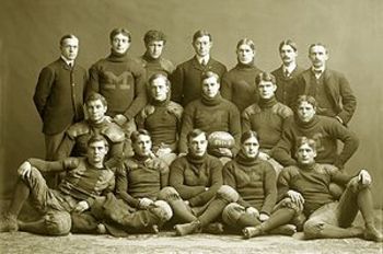
You can see the block M on the front and what may be striping on the shoulder areas, but I don't think the "M sweaters" were ever actually jerseys. And if that's the case, then we shouldn't have the winged helmets either since Crisler brought those to michigan, not Yost. (although I wouldn't mind a Yost like "point a minute" whipping of ND that night). The artwork below I think better captures the actual jersey history (credit: http://blog.heritagesportsart.com/2010/08/university-of-michigan-football-uniform.html)
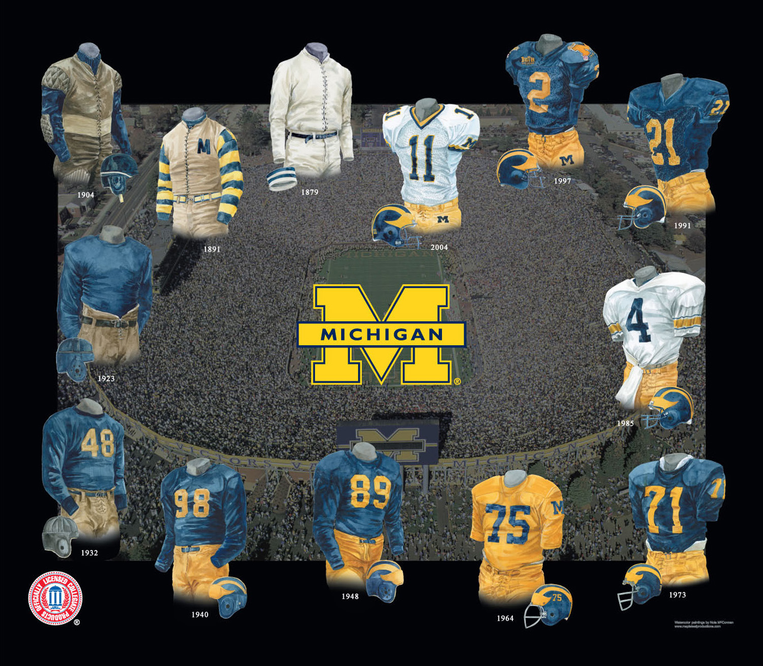
althought I do think the 1964 "maize" jersey is incorrect as pointed out in a previous MVictors post.
Personnally I'd go with the early 70's style with the big long numbers, the white hip pads sticking out, white socks and maybe numbers on the helmets. But if you really wanted to go different, they should have gone with the 1891 design... beige sleeveless with a block M on the heart locale, with maize & blue striped long sleeves, brown leather-esque helmets with the "wing" design in a slightly offset brown
i like the 1940's vintage. Plain blue long-sleeve jerseys (although probably too hot in september long sleeves) with no adornments, just the maize numbers. Then again, that might really just mean that the only differences between the current and throwback jerseys would be (1) no shoulder numbers; (2) no name on back; and (3) slightly different color maize - ie, less highlighter yellow - for pants/jersey/helmet. It'd be subtle, but also speak to the relative timelessness of our uniform designs.
That would have been my design choice as well. That, or replace the bizare shoulder stripes on this one with the rugby stripes and give the team athletic faux-suede or brown vests with the M to wear in team pictures to emulate the look.
David Brandon wants more of your money. I'm not surprised. I hope I am right about his true passion being in politics, and I hope he leaves to run next year. If he doesn't, there is a very good chance that Michigan Stadium is going to look like a rather large minor league baseball park someday.
I think I just threw up. These are really really ugly.
1stnitegameevarmoarthanenufexiteme
This type of jersey you either love or hate. I love it, and think most young people will too.
f. Numerals. Clearly visible, permanent Arabic numerals on one jersey at
least 8 and 10 inches in height front and back, respectively, of a color(s)
in distinct contrast with the jersey. All players of a team shall have the
same color and style numbers front and back. The individual bars must
be approximately 1-1/2 inches wide. Numbers on any part of the uniform
shall correspond with the mandatory front and back jersey numbers.
Source: http://fs.ncaa.org/Docs/rules/fielddiagrams/football.pdf p.16
My point here is that these jersey's aren't even legal per the NCAA's regulations, although the images provided may have just been that of replicas intended to be sold to the public. There can be no large block M on the front of the jersey and there must be numbers which meet the requirements posted above. There are more rules that indicate that any insignia may not be more than 16 square inches in area.
This. I was going to look that up, because I was pretty sure that it's a requirement, but thanks for saving me the time.
Frankly, you want more maize, I would have simply gone back to the 1964 maize background jersey.
that would look very West Virginia, no?
(Of course then it wouldn't be DB's or Adidas' fault, it would be Rich Rod's fault /s)
Never happened.
Here's my take: if the current players want to wear them and like them, who gives a shit what we think? Yeah, they may look ugly in this picture but it's just that: a picture. Relax.
I know I am the minority here, but I actually like them. My feeling was not immediate, however, after pondering it for a little while, they have grown on me. As long as they don't mess with the helmet and have solid color pants and socks, these will look sharp under the lights.
I was waiting to see when someone would say they like the jerseys. I like 'em too. I think they have potential if the rest of the outfit complements them well.
Really hard to judge without seeing them over pads with the pants and helmet. My feeling is they might look pretty sweet.
They don't compare to our regular uniforms (obviously), but I like them way better than any Nike throwback I've seen, and way way better than the Nike futuristic robot crap.
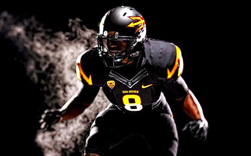
These Adidas throwbacks are still 1000% more dignified than, for example:
The whole idea of "throwback" uniforms is kinda silly IME. Parts of those uniforms aren't even legal in the game anymore, to say nothing of the helmets. Take a look at the jerseys actually worn by teams of 100 years ago. They're more like sweaters. Tom Harmon's jersey is similar to today's style, but with longer sleeves. And, going back all the way to 1880, I can't find any photos with the stripes on the sleeves (that's not to say we never played an exhibition game with the San Quentin squad in the Victorian Era, but somehow, I doubt it).
I understand the desire for nostalgia, but for me, it never really works.
The Big Chill jersies grew on me for the novelty and because they weren't actually all that bad.
This is an historic game, to be sure, but it is still being played in the same stadium and its not like we've never had games go into night before. Sorry, but these are hideous and I have no intention of buying one. When in the world did we have stripes on the shoulders, anyway?
the Big Chill jerseys actually had historical precedence to them

These supposed (that's what i'm calling now them until its official) football throwbacks have no historical precendence.
As long as we beat ND the uniforms could be made of old burlap sacks.
It's only one game. If they didn't go with something outlandish and eye-popping, then what would be the point in changing at all? Plus, how cool will it be when Denard takes off for a run and those striped sleeves blur together and turn green? He'll be full on camouflage with the turf, making him even harder to catch.
That would be terrible if his jersey turned green.
NEEDS MOAR BLAKK
Count your blessings.
While UM is all about tradition and remembering those who came before us, these jerseys do not pay any homage to them. They are an embarassment and lack any sort of semblance to jerseys past. Two thumbs way down.