On Maize, And Also On Blue A Little

A while back I posted on an athletic department initiative to reclaim maize from the vast sea of generic (and increasingly bright) yellow that has slowly enveloped everything from t-shirts to the uniforms themselves.
This is the part where very serious people leap in to note the effects of lighting, your monitor, your mood, and your brain on your perception of color. When I asked for an official RGB conversion of the pantone colors the University recognizes as official to deploy here, helpful users came up with a hilariously diverse gamut of possibilities.
![Pantonedischord[1]](https://mgoblog.com/sites/mgoblog.com/files/images/Colors_1BC7/Pantonedischord1.jpg "Pantonedischord[1]")
In response to this I threw up my hands and didn't change anything, because it's not like there's a right answer. The one useful thing we can draw from this is that all of these shades are darker than than the current deployments in basketball and football:
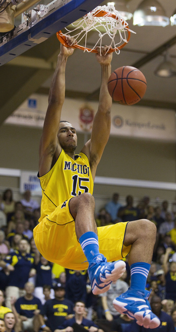
![UM_MSU_Gordon-thumb-300x451-91668[1]](https://mgoblog.com/sites/mgoblog.com/files/images/Colors_1BC7/UM_MSU_Gordon-thumb-300x451-916681.jpg "UM_MSU_Gordon-thumb-300x451-91668[1]")

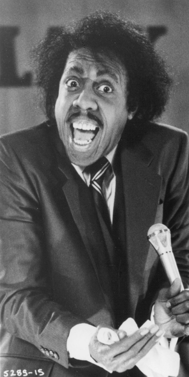
Gordon chosen for maximum soul-offensiveness; I was at that game and that seems like an accurate reproduction. Hardaway uniform an approximate median from the first couple pages of Google Image Search.
Insert usual disclaimers about pictures—the famous Desmond Howard picture I brought out for the original post is almost orange because of things not related to the actual uniform color—but I've been there in person, I've scanned the student section and had the lack of pop from an actually-maize shirt pop out at me: this is correct insofar as these things can be correct.
Argh.
We're never going to get anywhere doing this. I'd like to put aside the hard science of color and play a little feelingsball, if we can. Here's an email I received a couple weeks back after a guy tweeted at me about the differences between the Crisler floor (a darker shade I associate more strongly with maize) and the team's uniforms (YELLOW YELLOW YELLOW):
Brian,
I saw your RT of some guy's tweet referencing the "maize" on the Crisler Center's floor and the "highlighter yellow" of the bball uniforms. I fall more on the highlighter side of the argument, as I remember as a kid watching teams in the late 70's and early 80's crushing opponents with maize pants that were far closer to the highlighter than the Crisler M border that reminds me of the maize used by t-shirt street vendors.
Bored, I dug around and found this article from 1996. Interesting read, but it seems that the author concludes that the maize we see in the uniform is closer to the 1912 approved colors than the border around the M. The last two pics are interesting in that the one on the right:
looks more like the bball floor than the approved:
Love the blog.
Regards,


And now the background color of block quotes is really bothering me. We must forge on.
Here is the feelingsball: that strip on the bottom is wrong. It's Second-Great-Awakening-preacher wraoooong, at least as far as athletic teams are concerned. In other contexts I'm sure it's fine. If a Michigan team came out in a blue that light, though, there would be a riot. It would be a genteel Earl Grey kind of riot in which people hop on the internet to demand the email address of Dave Brandon, but it would be a riot nonetheless. I question the validity of applying the yellow from the official colors when the blue is clearly not right.
I bring it up because I've gotten a moderate amount of pushback on the idea that Michigan's current yellow is bad and ahistoric and should be hit with a shovel and buried in an Iowa cornfield. Like the guy above there's a group of Michigan fans out there that sees the lighter shade as the right one. I think they're in the minority, but they exist.
I'm with the darker shades mostly because I find them more aesthetically appealing. They're also more distinct and remind me less of the Seattle Sounders's increasingly neon kits.
Even if you're on the other side of the divide, we can all agree that this…
![numberdecals_thumb[1]](https://mgoblog.com/sites/mgoblog.com/files/images/Colors_1BC7/numberdecals_thumb1.jpg "numberdecals_thumb[1]")
…is not good. Those are the actual helmet decals Michigan used this year compared to an actual Michigan helmet. MVictors acquired them from Helmet Hut, the manufacturer Michigan uses, and reports that Helmet Hut does have colors that match the helmet but Michigan wanted the darker shade.
Dave Brandon's all about uniformity of branding. This aggression will not stand, and on the thing Michigan could change immediately they went with a darker, maiz-ier color. That's the direction we're headed. When Michigan isn't wearing their commemorative flamenco-inspired jerseys against Notre Dame or their special Save the Marsupials outfits for the Big Ten opener, Michigan will take the field against a MAC team looking more like Rick Leach is piloting things. In this, we can take comfort.
SEE ALSO: Maize 'n' Blue Nation.
Well our pants were a canvas/khaki color until 1940, so we can't 18-whatever anyone.
And anyway, we don't wear yellow. We don't wear gold. We wear MAIZE. We are the only school that wears maize. It shouldn't look just like what everyone thinks of when they think of "yellow" or "gold", cultural touchstones be damned.
The nice thing about being the only school that's maize is that we get to define what that means. We have two unique options that aren't plain old "yellow": dark yellow-orange, or bright "highlighter" yellow. The bright option looks a heck of a lot better.
And honestly, "it looks cool" is a perfectly valid reason to change a uniform. My main problem with the bumble-bee / Pro Combat looks is that they look awful and aren't a uniform, because they change 5 times a year and tend to look better on an individual than on a team.
You are confusing perception and reality.
Color is about perception, and perception is the reason people act like the Christmas hits of the 1950s and '60s were ALWAYS the Christmas songs, and Penn State thinks they invented navy blue, and the reason that so long as it's not neon or something people will believe whatever yellow-y looking yellow Michigan wears is like "THE" yellow that we called dibs on because we invented football shortly after the color yellow was invented.
Maize and yellow are the same thing, except we get to decide that "maize" is whatever yellow is the yellow everyone wishes they had since 18-whatever.
To take my tongue out of my cheek for a second, it's about color symbolism. A primary color is a symbol of continuity. Neon has symbolic meaning too: it means new, and flashy, and modern, and a little bit iconoclastic. In Paris terms Neon is Place Pigalle; Yellow is Notre Dame cathedral. It's perfect for Oregon; it's terrible for Michigan, since our value statement is wrapped up in a conservative* ideology of tradition and prestige. Neon screams "look at me!" which suggests you're not being looked at, while a primary color says "I've had your attention since there were only three colors."
* not politically -- I mean as in aggressive lawn protection.
Construction helmet.
I am probably in the minority, but higlighter all the way, man. If you look at the color scheme of this blog, IT even has the hilighter yellow. It just looks better.
In addition, MAIZE = CORN, amirite? I don't know if you've been to the grocery store lately, but mustard =/= corn. CORN = CORN. The highlighter yellow is way closer to what maize actually looks like than that darker mustard color brian loves so much.
The orange-y yellow looks like gold without the metallic sheen. (Which makes sense, because gold is actually metallic orange.)
So, y'know, if we completely lacked school pride and didn't mind being confused with Notre Dame then I guess blue and orange will work, but I'd prefer otherwise.


Can't they just grow corn/maize in one darn color?!?!
is whether you want to be tough or sweet.
Is it bad that I saw the iStockPhoto watermark and instantly got angry?
I feel like I'm the Pavlov's dog of choosing presentation photos at my company.
Monsanto to the rescue!!
Now we must spend a few pages arguing what kind of corn we're talking about when referencing maize. Silage corn like this or sweet corn? I vote sweet corn!
If lovin' the Maize is wraooooooong... I don't wanna be right!
but these Baylor unis today make me long for the days of black and white tv. Ouch.
Personally, Seth's looks the best to me, but if you average them together you get:
| Blue | Yellow |
that the sodarkblueastobealmostblack is the prefered blue these days.
I like it a "bit lighter" than that. The continued darkening of the blue over the years slowly leads us down a road towards Eugene.
I grew up with a slightly darker Maize as well, but don't mind any version that doesn't stray too close to "highlighter".
But lets face it, if Michigan was truely all about tradition, then the football uniforms would be almost indistinguishable from Deleware.
I could live with that.
Maybe.
were darker in the 70s than they are today--they were lightened because it looked better on tv, weren't they?
I also think we should get back to using an azure blue rather than a dark navy blue. Brighter is better.
Of course the most important thing is that the colors shift each year so that I have to keep buying new gear to look cool.
They DID come out in that shade of blue that you appall. I remember watching the MBB team come on the floor with warmups and shoes in bright blue at the Maui Invitational, and I was shocked. Then after a little while, I realized it actually looked pretty awesome.
Now, that wasn't a uniform, but the maize unis with the lighter, brighter blue shoes looked pretty cool. Let's just get an old person to verify the blue that was used way back then?
That was all Adidas Maui Invitational stuff. All the schools had it.
See how the jersey blue is the same? But all the schools had that gear.
http://solecollector.com/news/adidas-unveils-exclusive-gear-for-the-mau…
Is Brian's last picture. I have some slight OCD tendancies, and damn if we don't fricken match. At this point, I don't care which maize and which blue they use, just pick one and make it UNIFORM. The helmets didn't match the jerseys in football. The numbers didn't match the wings. The Floor doesn't match the jerseys, dammit. Just pick something and go with it.
The difference between the maize hockey unis and the helmets used to bug the heck out of me too, but they seem to have fixed it somewhat.
I'm in Phoenix now, and until last year's uniform reboot, ASU wore football helmets with a totally different shade of yellow than their pants. It looked awful.
laundry detergents that make for whiter whites and brighter colors.
may MICH should use All Color Cheer
Perfection, in my opinion:

And again:

My only beef with our current uniforms is the constant tinkering with the road football uniform (especially the abomination we wore against Sparty). The current yellow/maize whatever has only enhanced the uhh electricity of our home environments. Forgive the pun, but UTL at the Big House and the Ohio hoops game at Crisler looked as good as they sounded with the current maize.
Am i the only one that dislikes how the all the teams use the same color maize on the helmets instead of lacrosse which uses the brighter highlighter yellow (which i actually prefer).
I went to lunch with Brandon this summer as part of a prize that my friends and I won with the business school.
He said that he knew that the 'maize' had changed and that they were working with Adidas to get it right. I'm fairly certain this was genuine as he is the one that brought up the subject of the color in response to our question about the impact of the Adidas deal.
Brandon just gets it, in general.
. . . also features highlighter yellow, not to mention a very un-Michigan-ish pale blue. UCLA, it makes me think.
The athletic colors are darker than those of the University. The University colors were posted higher before in the thread to compare with the athetic colors. Also, take a look at the flag from the '96 Record article about our colors for a really light blue.

Never noticed the numbers were so different from the helmet color but looking at the UTL game now and sure enough they are. Because of where they are on the side and how the light hits it doesn't jump out at you.
After reading this post, I found it funny that the very next thing after it was a picture of Shawn Hunwick wearing, IMO, the correct version of Michigan's colors.
Also... please destroy all copies of pics of the uniforms we wore vs. MSU in 2011. Those unis should be forgotten. I pray we never have to set eyes upon them again.
Too much either way is way presents a problem. You don't want it too bright, but you don't want to look dull or washed out either. I like Seth's colors up top personally.
Also, bravo on the Sounders reference. I'm a huge Sounders supporter, but I agree, the highligher "electricity" kits are just atrocious. Did anybody see those horrendous Cyan kits they wore last night in the CCL? *Vomits in mouth* Let's hope the Michigan maize and blue never reaches anything like the Sounder's third "Electricity" and Cyan kits...
is an abomination from hell. I HATE IT SO MUCH. I don't care if the players like it. It's one thing to go UTL and modify them, but this uniform looks like a 1st grader designed it. NEVER AGAIN
Our current version of "maize" combined with dark blue is unique in all of college sports.
I was at a Ruth's Chris steakhouse in Bethesda, MD on a Sunday . . . not exactly a college or even a sports environment. In walked a guy with a dark blue golf shirt with yellow lettering and trim. I knew right away just by the colors it was a Michigan shirt. Sure enough, when he turned around, I saw a big block Michigan M. It wasn't just another blue and yellow shirt.
Try something like Golden Bantam, introduced c. 1902.
Shouldn't the 'maize' on the brand new scoreboard tell us what Dave Brandon is thinking? Obviously that thing looks like the 'maize' basketball uniforms we've been wearing and is a pretty good indication of the maize we will be looking at for all sports moving forward.
Am I right?
Comments