Jordan Football Uniforms Unveiled


via Michigan's new apparel site, which also has many detail shots
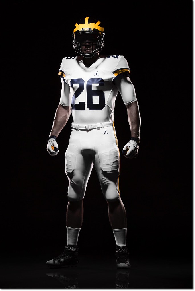
Michigan officially unveiled their new Jordan brand football uniforms in a totally understated setting this afternoon, and for the most part little has changed except the logo. This is good, especially if you're a fan of the all-white road uniforms. I count myself among that number, and so does Jim Harbaugh:
Harbaugh says the white pants on the road will be a permanent thing. He's a fan of that.
— Nick Baumgardner (@nickbaumgardner) August 2, 2016
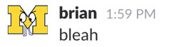
Nike did make a few minor alterations. The number font is new, which you can see in both the '4' on the home uniform and the '2' on the road. The road uniforms now feature two sleeve stripes (late 80s/mid 90s style) instead of the three they wore last year [edit: my mistake, it's still three stripes—the bottom one was hard to see] and the sleeve numbers have moved from the side to the top of the shoulder. The rest is the same, and mercifully clean, too—I was worried the Jumpman logo would be too large, and that's not at all the case.
There is one major change, and it's to the most legendary aspect of the uniform:
Those are matte helmets. Michigan spokesman says the plan is to wear those this season. That's new. pic.twitter.com/5taVBAjmWs
— Nick Baumgardner (@nickbaumgardner) August 2, 2016
I'm ambivalent about the paint style of the helmet, but I might be in the minority there.
I'll hold off on diving into color analysis—at first glance, both the maize and blue look a little darker than past years—until we get some photos in normal lighting.
Sent from MGoBlog HD for iPhone & iPad
He Tweeted that he must have gotten "darker" this summer too.
All weight change is good weight change.
Yeah, it's hard to tell the colors with the lighting they used. The blue looks a bit purple and the maize looks lighter in some shots. The full uniform pictures did not show the B1G logo, but the bust picture does, so I guess it's there.
All in all, I like.
I'm a big fan of everything Nike did. Nothing is overwhelming. Love that we kept the all white roads and I think the matte helmets will turn out great, but there is obvious skepticism with any change. The biggest point we should be making is MAIZE!!!!
...that the jumpman should be Jordan dunking a football over a goal post.
/s
I think they look pretty good. I don't see it as a big deal that the helmets are slighty different if the colors are right. And the faceguard matches the stripes. I think the look of these new concussion reduction helmets changes the look more than a difference on the gloss level of the paint, personally.
As far as the pants go, I would like to see an all blue uniform at some point just to see what it looks like. Wouldn't maybe mind that as an alternate.
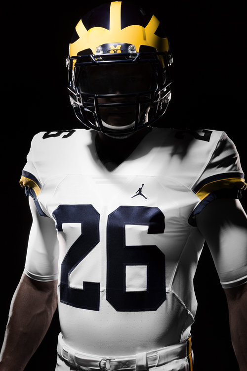
Pay no mind to the matte blue on the helmets. Remember how big and plentiful those helmet stickers are? (Un)fortunately you'll barely see the blue after the third game anyway.
Come to think of it, I wonder if what Nike was going for here was something different altogether. It's hard to tell in these photos but this doesn't look like a "traditional" matte, rather something in between glossy and matte. My guess is that Nike was going for a light reflection similar to that of leather.
Those who want people off their lawn because of the move away from glossy helmets are forgetting that before them, there were probably even older people wanting whippernsappers off their lawn when original leather helmets converted to plastic.
If an iconic leather helmet sheen is what they were going for, it would actually be a pretty clever troll by Nike.
The other thing about the helmets people seem to be forgetting -- its' going to be covered in helmet stickers anyway.
serious question, I know that is a flag in the NFL, but is it in college?
I don't know, but it should only be a flag if you don't get up high enough to do it or fall on your ass afterward
In college you have to lay it up, according to the Lew Alcindor rule.
Just Do It. Ask questions later.
Sent from MGoBlog HD for iPhone & iPad
But when I said so in the other thread was admonished to leave this electronic medium as my "old guy" fashion-sense was clearly outdated.
Either way I do like them. And I LOVE the white pants so I'm pretty happy with the whole thing to be honest.
pants but I'd really like it if they'd do the maize at least some of the time. I'm not ready to let that go yet.
From helmet throughout. Go figure.
Fingers crossed . . .
Sent from MGoBlog HD for iPhone & iPad
Sent from MGoBlog HD for iPhone & iPad
Pretty sure the away sleeve is still three stripes, but only the bottom stripe wraps around the arm.
Agree. I initially thought there were only two stripes and said so, based on views of the mannequins, but the close-up promo shots clearly have a blue sleeve elastic that serves as a third stripe.
You selected Jake Rudock who was the only guy on the field with baggy sleeves. Find a guy like Peppers with the tight sleeves and you can't even see the stripes.
(Also, I accidentally upvoted you when trying to click on the 2015 link. This isn't bad enough to turn that into a neg, but just know those two points are iffy.)
Sent from MGoBlog HD for iPhone & iPad
I get it and you're allowed an opinion. Myself, I can't get worked up over unseen stripes in a player's armpit. But that's neither here nor there.
I just didn't think it was fair to throw a QB out there who always has the most prominent sleeve stripes flapping around due to the baggy cut of the arms. Comparing two tight sleeves makes it much less glaring of a change.
Also, it's my biggest complaint, which kinda means I have no complaints.
bring back the maize road pants :-(
I can't believe that you got down-voted just because you had a different opinion.
I'm with you on the pants. Michigan's colors are Maize and Blue. It would be nice to emphasize the colors that are part of the part of the school's "brand".
I don't think that the white pants look too bad.....they just don't scream "Michigan". I'd rather see them once per year (Homecoming?) or something along those lines.
also like the maize road pants better, but I don't think I will care too much if they win all of their road games. In fact, there are a couple of road games in particular that I wouldn't care if they wore Big Bird costumes for as long as they win.
I am a big fan of the white pants. But would also like to see them wear maize on the road some games as well.
too much like Penn State.
Just pretend it's the '70s Vikings instead.
Sent from MGoBlog HD for iPhone & iPad
I think for me, not only are maize pants nostalgic, but they are our colors. Maize and Blue. White is nowhere to be found. Having nearly half of your body covered in a non-school color just feels weird to me. It also makes us look closer to Penn State than I would ever care to be.
all white uniforms are no closer to psu then any other team that wears all white. plus we didnt get rid of maize pants, they are worn for ever home game. how hard would it be to slip your maize pants on instead of the whites for any away game?
I guess it's easier to associate them with Penn State because we see them so often and they are (unfortunately) part of our conference.

Like I said before, they look sharp so it's not a total loss. But I much prefer your avatar over the white on white.
I've been lobbying hard for us and Ohio State to both wear home and home unis - blue and red jerseys - when we play The Game.
This picture gives me an idea . . . I think when we play Penn State we should both wear away and away unis - both wear white jerseys like in the picture - when we play.
Really fuck things up, just for fun.
Nobody will know what the hell is going on.
Nobody will know what the hell is going on.
Harbaugh would.
i used the wheatley avatar because that is my favorite away uniform ever. plus we owned both osu and msu during those years.
is that I ALWAYS hated the piping on the road unis, and wished they'd make this EXACT jersey with maize pant. 15 year-old me is weeping, knowing that the uni I always wanted was so close.
Only complains about Nike so far? Hockey jersy looks bleh, and the women's track unis look like the University of California to me.
I've known the white pants but I much prefer the maize pants. Sure, the white look okay but Michigan was one of the few with Maize pants, plus I just like the contrast better. Overall, I like the new jerseys but it would be close to perfect if the road unis had maize pants (with whites as an alternative).
I'd go with semi-gloss or satin. they have a little sheen to them (see the photo of the Jourdan Lewis mockup), but they're not the clear-coat high sheen / new-car-finish seen in previous years. The bowl year matte helmets were definitely matte... they had little to no shine on them, even in bright sunlight.
Comments