Tournament Uniformz Unveiled

Because it's always the right idea to mess with a good thing, Michigan (among several other Adidas schools) unveiled special uniformz for the postseason. They're not terrible, though I'd prefer "MICHIGAN" across the chest; they're also completely unnecessary and way worse than, say, the throwbacks they wore against Penn State last year.
 Jargon-laced press release ahoy. (Emphasis is mine, because holy jargon.)
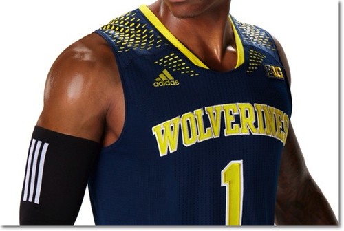
ANN ARBOR, Mich. -- The University of Michigan men's basketball team and adidas unveiled today (Thursday, March 6) the Made in March Uniform System for the 2014 basketball postseason. The collection was created to provide the Wolverines with adidas' most advanced uniform system and basketball apparel technology so they can take on the challenges and intense play of March.
To evoke team unity and spirit, Made in March uniforms feature the Wolverines team name across the chest, while the school's "Go Blue" rally cry is printed on the inside collar of each jersey.
Made in March uniforms feature a functional perforated print pattern along the leg of the stretch woven short to enhance breathability and ventilation, keeping players cool as the clock winds down. Adidas' quick-drying jersey technology found in current NBA uniforms along with ClimaCool zones on the chest, back and side move heat and moisture away from the body to keep the jersey light and dry as players sweat.
The Made in March Uniform System debuts on-court beginning with conference tournament play.
You can purchase these if you'd like; since I don't want to encourage this behavior, you'll have to find the link elsewhere.
The good news: at least we're not Baylor.
should be the standard home whites. These new uniformz aren't bad though.
They did this last year too with the Sleeves jerseys, but we didn't wear them I don't think. Either that or we wore the shorts but not the jerseys?
For all that is decent and noble, return Michigan Athletics to Nike. I hate the color addidas calls "maize", and I don't like their vision for alternative jerseys. It's only a matter of time before they force our guys to play in stupid short slevel jerseys. Make it stop.
No sleeves and it doesn't say "Go Blue" on the front.
I'm fine with it.
Honestly, I'd rather have it say "Go Blue" -- at least that's identifiable with the school. Michigan is probably more disassociated from their nickname than any team in North America. UM is probably the third thing that comes to my mind when I hear "Wolverines." After X-men and the zoo.
Why spend all this effort building a brand and then market something completely disassociated from that brand?
Well, there went all of our chances for a run in the tourney.
Can we just get back to Nike? Oregon needs more money to update their facilities.
It is funny in the link how they put the nicer designed ones in the front (UM, Kansas, Louisville, Cincy, Wiscy), and the fugly ones in the back. WTF with UCLA - they have some of the best color combos in sports and they did that? Baylor lol. Irish look bad too. The Kansas ones look real good.
Baylor? WTF?
but we might as well be.
Michigan fans after Louisville game last year: "This sucks," "This hurts, " etc.
Dave Brandon after Louisville game last year: "They won it all with new Adidas uniforms for the tournament? Not many people can complain about that next year!"
Michigan had the same new uniform set as Louisville, just without the sleeves.
Louisville players, and a few others that I saw last year, ended up really liking the sleeves.
No. Louisville and some other Adidas schools also had a camouflage pattern scheme on the shorts. Michigan's did not. In other words, they were almost nothing alike.
Michigan was offered the template and said no. There are pictures of the damn things hanging in the lockers.
Against Wisconsin last year.
"[S]ince I don't want to encourage this behavior, you'll have to find the link elsewhere."
Bravo! Unfortunately, it won't have much of an effect -- people will still buy them. :-(
At least you should be able to read the player names on these (a huge problem at the Outback Bowl), and you'll be able to tell who's whom regardless of if they're coming or going (UTL). So, they could be worse.
I guess I don't mind it, except for the word "Wolverines" where it should say "Michigan." That's seriously awful, though.
Question for the masses: has any Michigan team, in any sport, in any year, ever had the word "Wolverines" prominently displayed anywhere on their...uh...Uniform System?
Which was a nearly stich-for-stich throwback from the '40s...
Yes, I recall the throwbacks to possibly the ugliest uniform in Michigan sports history. At least those were so incredibly awful that they were also hilariously cool.
But I guess I was trying to ask specifically about the word "Wolverines". Any recollection of the word "Wolverines" on any Uniform System that any Michigan team has ever worn?
I'm honestly surprised that the AD is ok with these given nearly pathological push to brand/market concept of Michigan = Block M. Seems that the "Wolverines" on the front undercuts this quite a bit.

As for the Wolverines thing, why does it matter? I like Michigan better but seeing Wolverines isn't going to ruin my day. Believe it or not that is our mascot. I just feel like this is being blown way out of proportion right now. There isn't even a guarantee that we wear them yet.
Here are the teams in the photo (from L to R):
Notre Dame, Baylor, UCLA, Wisconsin, Michigan, Kansas, Louisville, Cincy, Indiana, and Tennessee.
Now which of these 10 teams listed doesn't belong? Another way to ask it is which teams aren't going to make the NCAAT.
The odd teams out are our buddies in South Bend and Bloomington. Too bad those beautiful lime green and black uni's won't be around for March Madness.
Not only is Notre Dame not a tournament team, they also just dumped adidas to go to Under Armor, IIRC. Maybe adidas has a contractual obligation to include them in the special uniform programs until their contract runs out, but I don't think adidas would be inclined to go out of their way to promote ND.
Look at the uni again. Addidas is not going out of their way to promote Notre Dame. They are going out of their way to spite Notre Dame.
I like the '60s or Fab Five throwbacks. Would love it if they wore the Fab Five yellows with black socks and shoes during the Big Dance. I'd also like to see us lose white piping/outlining. It's maize and blue; ain't no white in there!
I don't think I even would have noticed the jerseys had been changed if there wasn't an article about it. Small chance I'd notice it says wolverines instead of the usual michigan, also a chance i'd just assume it always said wolverines. Fab 5 jerseys were the best, the 89 ones are hideous.
I mean other than the hockey jersey with the pictures. It just looks so weird. I'm 90% sure baseball wears Michigan on home and away jerseys, if not just the block M.
I'd probably even like them if they said "Michigan".
I can live the design, but don't like the "Wolverines" instead of "Michigan." That just looks wrong.
I know this has been said already, but "Uniform system?" Eat a bag of dicks, Adidas.
Brandon could have put the "J. Ira Harris Family Basketball Team" on the front of the Jersey. Wait, Brandon doesn't read this blog, right?
I actually like the jersey, but would like to see the shorts. The current crappy looking Addidas shorts (same for every team they sponsor!@#$) have been driving me nuts for the last two years. Short of combat nonsense, anything would be an improvement on those.
A half interested kindergartner couldn't do worse. Go back to the fab five unis and be done with it.
Comments