Equipment: POTENTIALLY Michigan's new font?

I'm likely going to get killed for this being an excessive equipment thread, but there are some big changes coming this summer and it's the offseason.
MGoJohnStamos pointed this out to me this morning.
Remember that leaked photo a week ago that had a mannequin in the background wearing what appeared to be a Jumpman Michigan jersey? It had a wonky new font that freaked some people out because of the big change to the #2.
Well. Take a look at this-
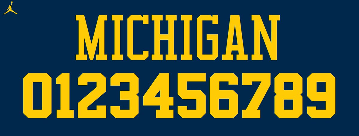
This is the font of the Chicago Bulls with a pallet in Maize and Blue. The font Michael Jordan obviously once wore.
Now look at the #23 on the mannequin in the photo

They look completely identical.
The Bulls typeface is as close to Michigan's current font, Superstar M54, as we're going to get if Nike wants to make a change. They aren't that much different.
Superstar M54

The radical changes are the #2 and the wordmark being amplified in the Bulls font. Everything else is pretty much the same, with some small change here and there. The M54 is a little more sleek and defined.
What are your thoughts on this?
Which font do you prefer? The current one or potentially the new one?
Am I the only one who thinks it looks the same?

The other night my 11 year old had a friend over for dinner. At some point while they were eating a debate between the two of them broke out over some video game they were both playing on their phones and it was apparent to me that both of them thought the issue was pretty important. I marvelled at the intensity of the arguement and the fact that inside their little 11 year brains THIS WAS VERY, VERY IMPORTANT. I simply couldnt fathom that anything as insignificant and trivial as a stupid video game could actually insight passion and get them worked up. I thought to myself this might be the dumbest damn thing I've ever heard somebody give two shits about.
Until now.
March 30th, 2016 at 10:14 PM ^
This is really funny!
Sent from MGoBlog HD for iPhone & iPad
March 30th, 2016 at 10:25 PM ^
new Jordan font

March 30th, 2016 at 11:16 PM ^
Sent from MGoBlog HD for iPhone & iPad
March 30th, 2016 at 10:41 PM ^
Sent from MGoBlog HD for iPhone & iPad
March 30th, 2016 at 10:47 PM ^
March 30th, 2016 at 11:07 PM ^
What do I think? I don't know if the font had anything to do with it, but #23 is definitely in some trouble--his locker isTOTALLY EMPTY! That cant be a good sign...
March 30th, 2016 at 11:20 PM ^
What if we are all getting Inception'ed right now? What is this is the Matrix?
Sent from MGoBlog HD for iPhone & iPad
March 30th, 2016 at 11:20 PM ^
March 30th, 2016 at 11:43 PM ^
Jumpman numbers
I think you are underselling how different the letters are. I like the M54 letters more. The proportions seems weird on the M and C in Jumpan, I don't love how the point in the middle comes all the way down to the bottom on the M, and the C is too tall, too much open space in the middle. The serif looks weird on the G with it only be the top and not on the bar inside. The jumpman is still tall and skinny, I like the blockiness of M54.
The numbers are way more similar, the only big difference I can see is the 2, which I like more in the M54, but other numbers are slightly better in jumpman I think.
March 31st, 2016 at 10:32 AM ^
there's a reason why it's called the "block" M...because it's "blocky" not skinny. bring back addidas (jk)
March 31st, 2016 at 10:51 AM ^
Can we all pitch in an get WD an escort? By escort, I mean a woman (or man!) who chooses the profession completely of their own accord. My hope is he will find out that there is a whole other world out there. And that in findging this out, he will stop with these dumbass threads.
March 31st, 2016 at 11:06 AM ^
March 31st, 2016 at 12:27 PM ^
You are screwed if you have jersey 20. What are they going to give you, a 2 and a smiley face?

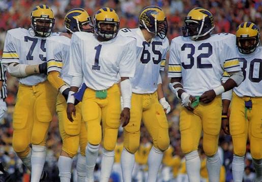
This is the classic numeral font Michigan must return to. Notice the "2" numeral font for Stanley Edwards No. 32. Also notice the "75" of Bubba Paris.
Nike is gonna Nike.
Get used to it.
Every year they're gonna change something just to change it because they know somebody out there will have to have the new version.
You wanted it, you got it. Now shut the fuck up and live with your weird 2 & skinny M. You'll buy it no matter what because it's Nike & a silouette of Michael Jordan will be on it.
Those 2's are slightly different.