This Week's Obsession: The Right Aways?


Spoiler: nobody answers "the bumblee ones" (and lives)
The Question:
With all the uniform-related news going around this week, I thought I'd ask about Michigan football's road jerseys, the not-so-constant in what's otherwise been a remarkably consistent wardrobe. Which of Michigan's road uniforms would you prefer they wear? Would you make any tweaks to a past look? Alternates—looking at you, Sugar Bowl uniforms—are very much eligible.
--------------------------------------
The Responses:
 |
| Not sure of original source; Adam found it on the board. |
Adam Schnepp: Ah, yes, Michigan's ever-changing road uniform. The wearable lab where the apparel supplier can tweak and tinker and see what whets the appetite of the jersey-buying masses.
My ideal road uniform is one that Michigan's essentially already wearing in practice (at right). I love the look of the all-navy numbers, but I'd add the blue-maize-blue shoulder striping Michigan wore from the mid-70s to the 90s.
I know Ace mentioned alternates as candidates for primary road jerseys, but in a world where multiple night games are likely it's hard to think alternates go away so I'll pick one of those while I'm at it. If Michigan wants to wear a "legacy" jersey on the road let's make it:
1) something they actually, you know, wore
2) something that integrates the wolverbear:

[Via the MVictors Uniform Timeline]
Go back to 1962 and there it is: block M on the sleeves, wolverbear on a patch, otherwise clean design. A legacy jersey I might actually buy despite knowing that I usually look like a doofus in jerseys.
[after the JUMP: we take piping very seriously]
--------------------------------------
 |
| The Adam Plan. |
Second choice would be another vote for the Schnepp Plan, sans Wolverbear. When I saw those in practice I thought they looked way more Michigan than anything we've worn since.I wouldn't even use shoulder stripes. Without all the stripes to offset, your eye is drawn to the blue numbers and the yellow pants. Going classic is usually going boring, but Michigan is certainly among the few schools that could pull off a statement like "we're the yellow and blue team...of sports." Anyway the helmets have enough going on for the rest to be an understatement.
Yellow, by the way, should be that goldenish color of American corn (there's a name for this) that's been faded by the sun.
My last request—and this goes for all the jerseys—is the numbers should be way larger. This was an Ohio State thing that Bo brought to Michigan in 1969: make the numbers extra large, like as huge as the shirts can take. Kinda puts an extra scare in the minds of teams coming to play the old power program.
--------------------------------------
Dave Nasternak: Probably my favorite Michigan road uniform is from the 2000 Orange Bowl (still would LOVE to own a white #10 with an Orange Bowl patch). The blue numbers outlines in maize and both colors trimming the edges with Block Ms on the sleeves...really liked those.

Nike also did some experimenting over the next few years with adding a maize stripe down the side and worked in some maize piping. All of those were fine, for the most part. They were generally pretty clean and the differences were rather minimal. I get that marketing will want to make slight adjustments to sell "this year's" jersey. That's fine, I guess. Like most other MGoContributors, though, I wasn't a huge fan of most of the alternate jerseys over the past few seasons.
I suppose if I had to choose one, perhaps the Alabama 2012 uniforms? I wouldn't want these to be the primary road uniforms, but I would probably be fine with them being worn once every couple/few years.

As far as the Legends Jerseys go, I'm with Brian in that I liked the idea as a whole. I think the implementation could be a little better (more infrequent use, maybe only Seniors? only 2-3 at a time?). Also, what about helmet numbers every so often? Maybe once out of 4 years?
--------------------------------------
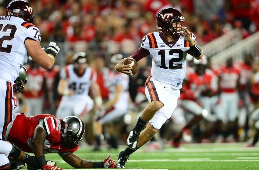
Ace: I really liked the look of the Sugar Bowl uniforms, which are what I had in mind when I mentioned alternates:

Remove the helmet numbers and the patches, make the uniform numbers a bit wider—perhaps by getting rid of the maize trim—and I think those are pretty great: clean, sharp, and simple but not Penn State simple. I'm a big fan of those shoulder stripes.
Otherwise, I'm down with something along the lines of what Adam suggests. I liked the simplicity of the last Nike away jerseys before Michigan made the switch to Adidas, if only they'd done away with the pointless maize piping. While I have remarkably fond memories of the 1997-2000 era uniforms that Dave posted, I think they've got just a little bit too much going on—and, with today's short, tight sleeves, the block-M emblazoned, double-piped shoulders probably wouldn't look nearly as good as they did back then.
--------------------------------------
Brian: I'm with Ace on this one: when the Sugar Bowl uniforms (no Z!) were announced, my immediate thought was "I wouldn't mind it if those were the permanent road jerseys." It strikes a nice balance between busy and plain that I don't think any of the other options have.
The plain whites are really plain; the Brady whites have a tiny bit too much frippery. I'm not a huge fan of the multi-hued block M on a white background. (The Block M on the pants is perfect and should stand as the only one on the uniforms, IMO.) The white and maize next to each other are a bit confusing visually. The large blue stripes on the Sugar jerseys give them a tiny bit of a winged helmet effect and are large, clear design elements. Dump the patches and helmet numbers and it's a winner.
I agree that blue pants on the road would be a good look. Also, I liked the Sugar Bowl jerseys but wasn't a fan of the grey facemasks.
March 25th, 2015 at 11:46 PM ^
I would love if they wore all blue once every year or two. I would especially love it if they wore the all blue unis from the PSU game this year once every year; I thought those looked slick. I usually like all white road unis as well, but I'm not sure how I feel about Michigan doing it. I think the maize pants look great. I don't think it would hurt to try it at least once and see how it looks though. If it looks good, keep doing it every once in a while, if not, don't do it again.
Sugar Bowl jerseys without the maize around the numbers and make them all blue. Makes it a classic look akin to USC's uniforms.

When I first glaced at the "Right Away" title, I thought for a moment that the post might be about the prospect of Alex Malzone starting "right away." Obviously it was actually on a different topic and I did enjoy the post, but here's a suggestion/request: given the possibility of a Malzone start at Utah, does history statistically tell us (from Michigan and the wider world of college football) about the performace of starting freshman QBs during their freshman year and what (if any) impact does starting in one's freshman year have upon the remainder of his career?
Been planning an H4 on that.
I liked those the best of all the white jerseys we've worn over the last few years.
But I won't rest until we get to see an all-home jersey Game like USC/UCLA do now.
Seth had a great point: I totally agree with large numbers, as large as possible. Many NFL teams get this exactly right. Think Green Bay, for example.
GTech:

VTech:
I think the VaTech uniforms look too 80s Houston Astros to me
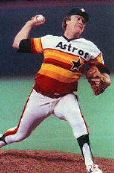
those are bad.
I had to wear this uni on a summer baseball team many years ago. We sucked - and wearing these abominations, we deserved to.
those jerseys sure are . . . slimming.
My main requirements:
-Maize pants, not white.
-Minimal use of maize on the jersey; outlining the numbers with it is enough.
I liked the 1997-04 ones a lot but I do find the current ones a bit cleaner. I was not a fan of the 2008-10 ones (with the big curved stripe) or the 2012 Alabama ones (the maize strip ruined it). The Sugar Bowl ones were OK but the M on the front was unnecessary and made it too busy.
I'm positive that the plain practice jersey is just an Adidas test of new uniform technology. They have select players wear the jersey in spring practice and get thier feedback. Given that these are test jerseys there is no reason to have any designs on them.
That being said my favorite jerseys are the Harbaugh through Tom Brady era jerseys. I like the sleeve stripes and the Tom Brady jerseys were new for '97 if I recall. Amazingly my taste in jerseys aligns with the era I grew up in as well as the most successful period of Michigan football. Selection bias anyone?
Otherwise I am open to experimentation on the away jerseys. Blue pants on an away jerseys why not? The image of Michigan football is a plain blue jersey with plain [insert your color] maize pants with the winged helmet running out of the tunnel.
Get rid of the yellow would be nice. I remember the all white look for road uniforms. I liked the white pants. Happy to see the yellow go if it went.
Gotta disagree here. We have two great colors that contrast beautifully; why minimize them with an all-white look? Plus, it makes for an odd combination with our helmets.
is sublte, but gives dimension to the numbers. Also, as you stated, like Lebowski's rug, it really ties things together.
why not have it available for some away Illinois game in October just because we feel like switching it up. Your right, all white would not good permanently, but I don't understand the fear of just mixing it up a little, a little dash here, a little dash there. I would be a fan.
I think all-white looks bad period, whether it's for one game or six. I don't see why a school with as colors as good as ours would want to do that.
I'm tired of the the winged helmets. I think we should just go plain blue with maybe a claw on the side or a wolverine scratch mark.
Hello ... Ann Arbor Torches & Pitchforks? I'd like to place a "to go" order.
Yea they just seam old, outdated and not very unique. Wings on the helmet? What are we, Team Redbull?
Absolutely agree with Ace. Without patches, helmet number or maize piping. The only change I would make is to put maize between the two blue shoulder stripes.
Also would like to see a blue v. red OSU game. For throwbacks OSU could wear the helmets they already have with the wide red stripe down the middle. M could do matte (I know, people don't like matte but it would work for a throwback) with the wings in "Nike maize" as above. That is the closer to the maize of the '50s. A darker, more navy blue for the jerseys with Nike maize number would look as close to throwback as you can get.
I don't know why Michigan and OSU don't do that. TVs aren't black and white these days. Might as well do what USC and UCLA do. Looks fantastic.
and correct maize color is the lettering in the "old" banner that was replaced two years ago. It happens to be the same maize color as my brothers jersey from 1976-1980 before TV and marketing/branding campaigns crept into college football.
White pants.
the 1980's uniform look. Since we have Harbaugh bringing back helmet stickers etc... why not go totally 80's and just use those uniforms as well.
I'm surprised how popular the stripes are with so many people. I thought the stripes up the sleeves were the dumbest thing about every "legacy" and "throwback" jersey under Brandon.
To me, the away uniform was at it's best in the late 90's when they brought the block M back on the sleeves.
Not that the Schembechler away jerseys weren't classic as Jamie Morris shows here...
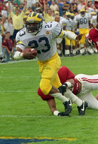
The helmet, shirt stripe and pants are all different colors of "maize". That's some Dallas Cowboys level weirdness right there.
Be careful about drawing too many conclusions from photographs. Lighting is always an issue with them.
reminds me of the halo on the big house.
Also, with the sleeves so short, I really don't think there is anything more necessary than just the number on the shoulder.
I like the Brady era sleeves a lot, but I'm meh on more 'M's. Except for some of the uniformz what they've done with the away jerseys over the years hasn't bothered me. The one time I really got up in arms about the outfits was when they had to cancel the pre-gaming meeting for the trash tornado as everyone changed into the bumblebees. That time could have been spent rehashing the gameplan so we don't come out testing them deep in 45 mph winds.
Agree that the Shembechler away jerseys are classif. The only problem is the sleeve treatment as sleeves aren't that long any more.
Like the Schembechler road jerseys, but modernized. Maize where the orange is and no school name on the front. That's my two cents.
I also liked the Sugar Bowl uniform against Virginia Tech but the numbers were too thin and goofy.

You mean these. I would love to these at Utah.
The Sugar Bowl unis are good except for the skinny numbers, which look awful. I'm cool with maize outline but the numbers should be bold.
Given Harbaugh's taste for the old school Bo baseball cap (solid blue, single maize block M), which is my preference as well, I am hoping that future uniforms will be classic and understated and Adidas won't be able to pull any crap like those horrible midriff yellow cumberbunds they just inflicted on the basketball team.
(I have to say I really like that computer rendering that's captioned as Adam's choice. Is that an official image, or something you guys did?)

Charles agrees.
Sent from MGoBlog HD for iPhone & iPad
I'm with you CJ, like CW above sans sleeve stripes, would be the best.
I am with you on the Orange Bowl uniform. Very cool, IMO.
Comments