This Week's Obsession: The Right Aways?

Spoiler: nobody answers "the bumblee ones" (and lives)
The Question:
With all the uniform-related news going around this week, I thought I'd ask about Michigan football's road jerseys, the not-so-constant in what's otherwise been a remarkably consistent wardrobe. Which of Michigan's road uniforms would you prefer they wear? Would you make any tweaks to a past look? Alternates—looking at you, Sugar Bowl uniforms—are very much eligible.
--------------------------------------
The Responses:
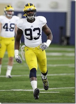 |
| Not sure of original source; Adam found it on the board. |
Adam Schnepp: Ah, yes, Michigan's ever-changing road uniform. The wearable lab where the apparel supplier can tweak and tinker and see what whets the appetite of the jersey-buying masses.
My ideal road uniform is one that Michigan's essentially already wearing in practice (at right). I love the look of the all-navy numbers, but I'd add the blue-maize-blue shoulder striping Michigan wore from the mid-70s to the 90s.
I know Ace mentioned alternates as candidates for primary road jerseys, but in a world where multiple night games are likely it's hard to think alternates go away so I'll pick one of those while I'm at it. If Michigan wants to wear a "legacy" jersey on the road let's make it:
1) something they actually, you know, wore
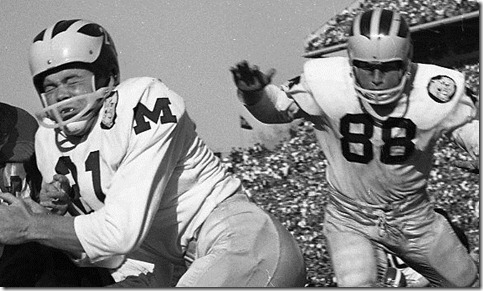
2) something that integrates the wolverbear:
[Via the MVictors Uniform Timeline]
Go back to 1962 and there it is: block M on the sleeves, wolverbear on a patch, otherwise clean design. A legacy jersey I might actually buy despite knowing that I usually look like a doofus in jerseys.
[after the JUMP: we take piping very seriously]
--------------------------------------
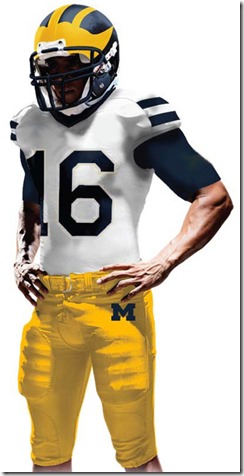 |
| The Adam Plan. |
Second choice would be another vote for the Schnepp Plan, sans Wolverbear. When I saw those in practice I thought they looked way more Michigan than anything we've worn since.I wouldn't even use shoulder stripes. Without all the stripes to offset, your eye is drawn to the blue numbers and the yellow pants. Going classic is usually going boring, but Michigan is certainly among the few schools that could pull off a statement like "we're the yellow and blue team...of sports." Anyway the helmets have enough going on for the rest to be an understatement.
Yellow, by the way, should be that goldenish color of American corn (there's a name for this) that's been faded by the sun.
My last request—and this goes for all the jerseys—is the numbers should be way larger. This was an Ohio State thing that Bo brought to Michigan in 1969: make the numbers extra large, like as huge as the shirts can take. Kinda puts an extra scare in the minds of teams coming to play the old power program.
--------------------------------------
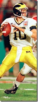
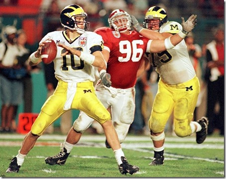
Dave Nasternak: Probably my favorite Michigan road uniform is from the 2000 Orange Bowl (still would LOVE to own a white #10 with an Orange Bowl patch). The blue numbers outlines in maize and both colors trimming the edges with Block Ms on the sleeves...really liked those.
Nike also did some experimenting over the next few years with adding a maize stripe down the side and worked in some maize piping. All of those were fine, for the most part. They were generally pretty clean and the differences were rather minimal. I get that marketing will want to make slight adjustments to sell "this year's" jersey. That's fine, I guess. Like most other MGoContributors, though, I wasn't a huge fan of most of the alternate jerseys over the past few seasons.
I suppose if I had to choose one, perhaps the Alabama 2012 uniforms? I wouldn't want these to be the primary road uniforms, but I would probably be fine with them being worn once every couple/few years.
As far as the Legends Jerseys go, I'm with Brian in that I liked the idea as a whole. I think the implementation could be a little better (more infrequent use, maybe only Seniors? only 2-3 at a time?). Also, what about helmet numbers every so often? Maybe once out of 4 years?
--------------------------------------
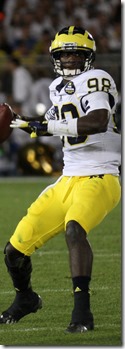
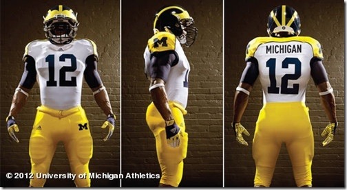
Ace: I really liked the look of the Sugar Bowl uniforms, which are what I had in mind when I mentioned alternates:
Remove the helmet numbers and the patches, make the uniform numbers a bit wider—perhaps by getting rid of the maize trim—and I think those are pretty great: clean, sharp, and simple but not Penn State simple. I'm a big fan of those shoulder stripes.
Otherwise, I'm down with something along the lines of what Adam suggests. I liked the simplicity of the last Nike away jerseys before Michigan made the switch to Adidas, if only they'd done away with the pointless maize piping. While I have remarkably fond memories of the 1997-2000 era uniforms that Dave posted, I think they've got just a little bit too much going on—and, with today's short, tight sleeves, the block-M emblazoned, double-piped shoulders probably wouldn't look nearly as good as they did back then.
--------------------------------------
Brian: I'm with Ace on this one: when the Sugar Bowl uniforms (no Z!) were announced, my immediate thought was "I wouldn't mind it if those were the permanent road jerseys." It strikes a nice balance between busy and plain that I don't think any of the other options have.
The plain whites are really plain; the Brady whites have a tiny bit too much frippery. I'm not a huge fan of the multi-hued block M on a white background. (The Block M on the pants is perfect and should stand as the only one on the uniforms, IMO.) The white and maize next to each other are a bit confusing visually. The large blue stripes on the Sugar jerseys give them a tiny bit of a winged helmet effect and are large, clear design elements. Dump the patches and helmet numbers and it's a winner.
Superimpose a 1989 Mens' Basketball away jersey over last year's whites. That would be cool. Distinctive "Michigan" over bold monitone blue number, no piping, thin blue/maize/blue stripes around collar and sleeves.
I was playing around with an idea. This is also in hopes of going back to Nike.
Sent from MGoBlog HD for iPhone & iPad
Yeah, I'll show myself out.
Why the yellow piping? I don't get why every design seems to have it.
Adaptation of the '62
All white
Blue sugar bowl numbers and blue stripe on shoulder, blue block M on the collar
Wolverbear on the hip, thin Maize and blue stripe down side of the pants
Jack and coke - do it..
Between Harbaugh coming home and the inherent class/tradition of the uniform, this should be the one. Adidas (or whoever down the road) should have little, if any problem, compensating for the shorter/non-existant sleeves.

March 26th, 2015 at 11:56 AM ^
Sent from MGoBlog HD for iPhone & iPad
Sent from MGoBlog HD for iPhone & iPad
Why not a Maize jersey like Gardner wore in the spring practice last year with Blue pants. Now that would be a sweet juxaposition for the away uni's!

Has lost considerable value in American society. We're overexposed and dulled with that now. It's like exploiting sexuality for advertising. Lucrative once but today, still lucrative because duh!, yet declining in effectiveness at reach and influence. Distill to the things that matter and direct your marketing there. Go elegant.
March 25th, 2015 at 10:23 PM ^
One for Adidas or whoever
Then one for the AD

March 25th, 2015 at 10:24 PM ^
March 25th, 2015 at 10:30 PM ^
March 25th, 2015 at 11:48 PM ^
No one is more of a stickler for tradition than me, but when I'm watching a game that doesn't seem to come to mind much. What really screams to me is when I cannot see the numbers. Usually that happens when there are no numbers on the sleeves.
There have been some games where there were no numbers on the sleeves, but on the helmets instead. That worked - but made the helmets look weird. Use the sleeves.
The yellow border around the numbers muddles their visibility on the TV. Get rid of that.
Tradition-wise, the biggest problem is using yellow. Old games from the 70s on youtube always look great because the uniforms are the right color.
Once I was pulled over by a Michigan State Trooper. As I was looking in the rear-view mirror it occurred to me: "hmm... his car has the correct two colors."
March 26th, 2015 at 10:05 AM ^
March 26th, 2015 at 11:03 AM ^
If this team wins football games, no one will care what they wear.
March 26th, 2015 at 12:52 PM ^
I sorta see what you're saying, Seth, but when I see a player with small numbers on the jersey, I think, "crap, that dude must be huge."
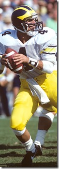
I realize it's not as clean as some other looks but I really like the 80s/early 90s with stripes on the sleeves.
Go back to Nike, then address the uniforms.
Enough said.
 I like having numbers on the shoulders like this
I would also be a fan of occasionally putting a huge M on the shoulder pads like in the rose bowl:

I do think the block M looks better in Maize, in opposed to in blue though, so I'm not quite sure how it would work on a white jersey... maybe they could make the shoulders blue...
March 27th, 2015 at 10:28 AM ^
My one appeal: don't outline the blue numbers in maize. It actually violates the old rules of heraldry -- an antiquated but fascinating artform that has surprisingly more modern application than one might expect. In heraldry -- the art of identification on a battlefield -- visibility is the primary concern; being able to pick out your teammate at some distance. (Not at all different from the philosophy that yielded our trademark winged helmets).
The Rule of Tincture states: "neither metal on metal nor colour on colour." Most international heraldry authorities hold that red ("Gules"), blue ("Azure"), green ("Vert"), purple ("Purpure"), orange ("Tawney"), and black ("Sable") are the 'Colours' ---- and gold and silver (though typically yellow and white--called "Or" and "Argent", respectively) are said to be the 'metals'.
It would only make sense to do the opposite (if so desired), by "fimbriating" (outlining) a metal with a color if it were going against a metal. So: gold outlined in blue on white...? Kosher. Blue outlined with gold on white? Against all that is holy and good in the world of heraldry. Also -- you'll notice on the old, old away jerseys, the stripes are more tightly packed, thus creating the image of a stripe of gold, being outlined in blue, on white, (which is kosher), but the minute you put that gold stripe alone against white background, and add space between the blue stripes and the gold stripe, it washes out, and you're violating heraldry's one and only rule: the Rule of Tincture.
It's my understanding heraldry used to be the first course in most art schools--the basics of design, if you will, (also called "the shorthand of history"). Love Nike all you want, (I'm personally ambivalent, but the kids like them, so...) but let's just say the art departments and designers that gave us a bunch of neon yellow stripes and outlines on white backgrounds are just a very small and largely benign example of how nobody knows what they're doing or talking about anymore. Rant over.
I would fully expect to get hammered for a comment so nerdy and yet also old-mannish elsewhere, but since we dine out on our history as a fanbase, I'd like us to get this right, even if everybody else gets it wrong.
Also--this is an explanation to things I've seen on the blog questioning why Michigan's official "colors" are seen to be a surprisingly light shade of blue and gold, as opposed to the more navy blue and corn-maize shades used on the unis. There IS no dark blue in real heraldry, Blue = Azure, and it's like the light blue color of the Mediterranean. Likewise, Maize = Or, and it's like straight-up yellow.
...are my faves. Old, old school, I know, but I love the stark look. And I really like the lack of serifs on the "2"s of that era...




Comments