Wisconsin unveils alternate uniforms for Nebraska game

Not to be outdone by Nebraska's tribute to The Noid of Dominos commercial fame, Wisconsin just unveiled the "feaux-back" uniforms they will wear in Lincoln this fall:


Via: http://www.cbssports.com/collegefootball/blog/eye-on-college-football/1…
So who you got--mayo or ketchup?
I don't mind the Nebraska ones, they look a little intimidating. Wisconin's on the other hand look like uniforms I'd see a high school wearing on Friday night...
Nebraska's looks like a Christmas candle.
August 6th, 2012 at 10:32 PM ^
I might be the minority but I think they're cool. I think kids will like them.
But then again we played our high school football games on saturday afternoons so what do I know.
adidas did the same thing this year when they unveiled our uniforms for the cowboys classic uniforms. the brick wall must convey some sort of strength or underground test facility.

Yep, exactly. All 3 are the same template.
I remember when we first signed the Adidas deal, one of the stipulations - and something people were excited about - was that Adidas was going to make Michigan's gear unique, not just apply the standard design templates they do for all their other schools.
Hmmmm, what ever happened to that?
With the UTL jerseys it looked like we actually got something unique, but now that Adidas is recycling the big letter on front design, turns out not even that is unique to us.
Mr. Brandon - Adidas sucks, the people want Nike back, please make it happen.
And yet, despite their radiant ugliness, somewhere in Madison stores are getting calls asking right now asking if they have the new jersey in stock yet.

Is it just me, or do all Adidas alternates look the same?
That being said, I sort of like the simple block W, and the tilt on the helmet makes it look interesting.
But it really seems like a copy and paste of existing Adidas alternates.
Nope, not you as the picture posted above suggests Adidas literally inverted the colors of the Neb uniform and called it good, not to mention the same design cue with the Big Alpha character and little shoulder numbers.
This alternate jersey thing is getting out of hand. What's the point of having a "normal" jersey when you make alternates for EVERY friggin game? I respect the NFL for making alternates once in a long while like the chargers powder blue jerseys. That way, they screw up only once in a few years.
Especially since most of these jerseys look like someone puked on a t-shirt.
When everyone is doing the alternate jersey bit, it just looks stupid.
Why does he have black socks?
because they never get dirty.
Actually according to unconfirmed reports they are really dirty white socks..
Fab Five!
I just hate red so there isn't much they can do to make it look better.
Well, having every Adidas school's "throwback" uniform have an identical style sure adds to their charm.
Honestly, if you need proof that life is absurd, all you need to know is that we're now dressing football programs (and baseball teams!) in fake throwback uniforms unlike anything they've ever worn. Love you, shoe companies.
NBC Sports CFT site had some of the official release here (Link).
Ostenibly, the "W" is a nod to the 1962 Big Ten Champion team that played USC in the 1963 Rose Bowl.
Even so, when Nebraska and Wisconsin play this season, between the two uniforms, there really won't be much "WN" in any given pile in anything other than the literal sense. That being said, I do like the idea of a more symmetrical "W" for Wisconsin, at the very least. Most everything else about it reminded me of a candy striper for some reason.
That is one UGLY uni...
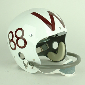
The W seems to have come from Wisconsin's helmet from the '50s and '60s.
.jpg)
.jpg)
Glad they eventually figured out that's NOT how you do a winged helmet...
Also, the vertical white stripe on the red undershirt sleeve is terrible.
That helmet's cool enough - and real! Wear that!
Just once before I die I hope I can see a big college football game in which each team wears its actual uniform.
They did, back in 2005.
Full article: http://www.helmethut.com/College/Wisconsin/Wisc2005.html
Money quote: "Wearing 'throwback' style uniforms to honor the past is not a new idea. Unfortunately, most teams have taken great liberties while trying to replicate their historic past designs and their results sadly reflect their casual or negligent approach."
I'm torn between liking those old helmets and thinking how dumb they look. On one hand, they're really unique, and the current "W" on Wisconsin's helmets is lackluster, in my opinion. I think it'd look cool if they took these helmets and put the number on one side and the straight "W" on the other.
Kids these days... not everything that is different is "cool." Your blue hair and septum ring are going to come knocking in 10 years to remind you just how big of a dumbass you really were.
I put Elmer's Glue in my hair..... yeah, that was cool.
Brought to you by the letter W and the number 86.
*sigh*... I guess we can take consolation in the fact that no one is immune from this nonsense.
As an aside, I wonder about the extent to which these uniform shenanigans are forced on the athletic departments by Adidas (or Nike). After all, it's the apparel manufacturers who pay the universities, not vice-versa. They're probably yet another one of the big entities in college football that have become much more assertive about getting their piece of the pie.
They should have stuck to their traditions.

I wish one of these self-inflicted wounds would just kill Adidas already. 2015 can't get here soon enough.
turrible.
Well even though I don't really care for the Adidas jerseys, I'm glad that at least they don't make me want to vomit explosively like Nike does sometimes.
EDIT: Ok, you asked for it.


*barf*

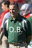
MSU coaching uniforms, as well....
There are so many combinations of words that would describe him.
The letter on the front of the jersey went from COOL when we did it...to played out and stale. Adidas ruined something unique and original.
Is UCLA going to have the letters across their jersey this year when they play Southern Cal? Make it stop.
I'm all for concept uniforms, but don't take the one cool idea you guys had and ruin it. Both teams in the UTL game had something special when it came to uniform design (ignoring the fact that it was shitty material that dissolved when you sweat in it).
under the lights uniforms would be a trend setter
I'm not that surprised. We sold a lot of UTL jerseys - I've seen them everywhere since then.
HEEEYEYEYEEEEYYYEY!
And all my People SAY.
Complete ripoff of Michigan's Legacy jersey just like nebraska did.
It was an adidas design. With "input" from, well whoever you want to believe. They aren't ripping anybody off if it is their own design.
Best you can do is to dig up all of the one-year-ago criticism aimed at Michigan's UTL tribute unis by Wisconsin and Nebraska bloggers and say, "Remember this?"
It's adidas' world; we just live in it.