OT: New Oregon Jersey

I hope this hasn't been discussed yet, but Oregon has come out with new jerseys again. Dr. Saturday has a good post on it and I found it interesting.
http://rivals.yahoo.com/ncaa/football/blog/dr_saturday/post/Molting-sea…
I'm not sure on how I feel about them changing jerseys every year and being, basically, owned by Nike. If anything, its a great recruiting tool.
Great recruiting tool for sure.
Also, I like them. They don't make me want to vomit like some of the previous renditions. Can do without the feathers though...
how much interest kids have on designing the jersey. I think most would just like to have Nike design a sweet uniform and they wear it.
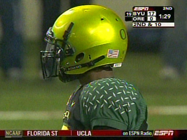
I'm really not a fan of the new unis. The jerseys I can live with, but the helmet just looks like someone took a dump on it and called it good. Why can't they just settle with the classic jerseys from the early 2000s. I liked the Oregon jersey that Harrington wore. Pick 1 home, 1 away, and one alternative.
the better I feel about our gear.
I think the one on the far right actually damaged my eyes...
Fly, fly away little duckies!
It's cool that they get the kids involved and all, but I just don't get these uniforms each year they are just hideous to my eyes. Shouldn't you have your school colors in your uniform??? The whole Raiders uniform looks nice but it has no yellow or green in it. I like the ugly 1990's yellow and green Packers feel. Why don't they just go chameleon and wear the colors of the rival of the opponent. When they play USC they can wear baby blue and gold and just have an O on the helmet to let everyone know it is Oregon.
 This is total win for Nike-- think of all the times they go out to a school with an idea and get shot down by the AD, saying "we don't want to get carried away with the design. We'd like something more traditional to satisfy our alumni boosters."
With Oregon, Phil Knight & Nike are the alumni boosters, so the design dept. can do pretty much anything they'd like. Whether or not they should is another story entirely, but that's how it goes.
BTW-- Personal milestone here with my 60th post. Part of me wants to stop posting awhile just for effect.
This is total win for Nike-- think of all the times they go out to a school with an idea and get shot down by the AD, saying "we don't want to get carried away with the design. We'd like something more traditional to satisfy our alumni boosters."
With Oregon, Phil Knight & Nike are the alumni boosters, so the design dept. can do pretty much anything they'd like. Whether or not they should is another story entirely, but that's how it goes.
BTW-- Personal milestone here with my 60th post. Part of me wants to stop posting awhile just for effect.The helmet hurts. It looks like something of an Air Jordan design, only wrapped onto way too large of a surface.
It is designed to replicate the Knights of the Round Table and their chain link attire!
I think the helmet is pretty cool. Is that actual carbon fiber, or just a carbon fiber paint job?
the weave is massive that is a paint job.
The weave pattern most people associate with carbon fiber is added purely for asthetics and actually serves no functional purpose
Paint job for sure
Damn, I didn't think it would be made of carbon fiber, but secretly hoped it was.
No, I'm sure it's really carbon fiber. The facemasks are made of platinum too, lined with diamonds.
Its Nike. Would that really surprise you that much?
I think Nike is doing some sweet stuff with Oregon's jerseys. I don't want this big of an extreme done to our jerseys at Michigan, but I would like a little bit of a chance taken a least with our away jerseys. I love our home jerseys, but I would like to see something done to our away jerseys. I would be ok with an alternate maize jersey just so I could see what it looks like.
Seriously, though, those helmets are crazy. Michigan should definitely put that design in with the wings over top. Total sarcasm there, but just think about it.
I like the white and silver one and the helmet are sweet, but other then that I’ve always thought they’re jerseys were ugly. Nevertheless what surprises me is how good of a recruiting tool their jersey’s are. Some kids will choose Eugene over some other school they simply b/c of their jersey.
they always have new ones because their old ones beg to be put out of their mercy at the end of each season.
has agreed to Nike making them look like an Arena Football League franchise. Didn't the Davenport Barnstormers look something like this a few years ago?
i've said it once, i'll say it again. Bill Simmons had it right when he called Oregon football "Nike's crash test dummy"
Well one of them is bound to stick sooner or later haha. And don't worry, when the one sticks and is replicated by all of the NCAA you will hear from every Oregon fan how their team started it all. I personally am rooting for the fluorescent yellow to stick, with a slight alteration..Maize for our night games. Win Win Win.
Tradition does mean something and by Oregon changing annually, they show why and how they have no tradition.
Haha in an odd way, their tradition is employing new varieties of jerseys. I mean, nowadays that's what I think of when I think of Oregon, and I can't be the only one.
Right - tradition comes in many forms. While it functions in identity formation, that identity can be shaped by change or stability. Part of Oregon's identity seems to be continual uniform change. It could be a fun tradition (for anyone but us), but obviously one that can result in some ugly exemplars.
I don't like the jersey, but the helmet does look pretty damn cool.
Youir statement is very true. It's tradition to change the unis. And for a recruiting tool, they have a great RB from Alabama partially because he likes the uniforms.
ass,
looks like.
the least offensive in a decade, so long as they bury those fluorescent yellows deep, deep in the back of the closet. Also, no blackout, alright? I do not care if ten thousand 15-year-olds are going to think that it is awesome.
The feathers are actually intriguing. Half feathered wing, half laurel wreath: they are already declaring themselves emperors of the Pac-10. I can dig that kind of statement.
As for the "carbon fiber" helmet: that kind of texture just does not translate visually, even in HD. Yes, this from a guy whose team made a big flaming deal about a design element on the inside of their jerseys...
I did not think it was possible that Oregon's uniforms could get any uglier. Somehow they have proven me wrong again.
If you say so...
but I have a hard time imagining highly competetive athletes see much appeal in being Phil Knight's little corporate dress-up dolls
I loved playing with GI Joes when I was a kid, but it didn't matter if they had a dazzling array of well-coordinated outfits to switch up. They could be wearing friggin potato sacks, as long as they had BIG GUNS and stuff
you might want to re-think that statement...
I think there was confusion regarding the goal of the redesign. Oregon said that they wanted the unis to be an effective recruiting tool, and Nike created unis that would do an effective job of recruiting tools . . .
is a bitch
i didn't think past uniforms were that bad but i am a bit surprised by these. not one uniform combo w/ yellow and green? weird, but it's oregon. let them do what they do.
The white on green is my definite favorite, and please oh please may I never watch a game where they don the highlighter yellows.
Also, needs more piping.
And more lightning bolts.
And some mushroom clouds to go with their "Nike Pro Combat" gear.
Maybe they could change the jersey each week, with a different graphic of a rabid duck tearing apart the mascot of each opponent. You know, something low-key.
I mean, if you're gonna whore it up, go all the way.
In this instance, this statement has never been more true . . . It's great to be a Michigan Wolverine.
I dig the feathers... due to the laurel reference someone made (and 'cause I always love to think of football players as gladiators)
The numbers are what gets me. They're so modern that they're already outdated... doesn't Knight know that the throwback is the new thing?
Oregon still putting "gimmick" where it does not belong
When I see that "2", I can't help but think "backwards 5". Worst. Font. Ever.
Diamond Tread or the Feathers
yeah, feathers.
and everyone knows what university it belongs to. Tradition at its finest. Oregon seems to want to be ever changing. Personally, this would be a major turn off to me. I wonder if they make all their players get a swoosh tatoo after they sign their LOI.
fugly.
As usual.
This is why I chuckle when people say Adidas is screwing up our uniforms. Nike's fashion people are beyond awful. Word is they actually wanted to go in an Oregon direction with us (no joke), but Lloyd Carr repeatedly vetoed the idea.
They'll go for the full Mountain Dew.
I for one love the uniforms...think about it, we are talking about Oregon on a Michigan blog. Say what you want but it gets them national attention and that can't be a bad thing. Also, the players requested the wings and picked the jerseys so obviously they like them. I LOVED the highligther pants! I was at a game against ASU last year when they wore the yellow pants, with the white jersey and helmet and topped it off with white and yellow shoes. It was so flashy that it was cool. I don't know, maybe I am not old school enough but I think its cool and attention grabbing and gets people talking about Oregon.
On a side note, I like how the shoes match as well. I think it would be cool to wear black and maize shoes at home and then white and blue shoes on the road. Thoughts?
No offense, but were you one of those kids that changed the color of his shoelaces based on what outfit you were wearing on any given day? Just wondering . . .
two states get married or something?
So are they wings on the shoulders or what?
Also, I know if I was an alumni or student there I'd be ticked off about having to buy a new jersey every year... oh wait I pretty much do that anyways with Michigan.