Adidas Unveils Postseason Uniformz

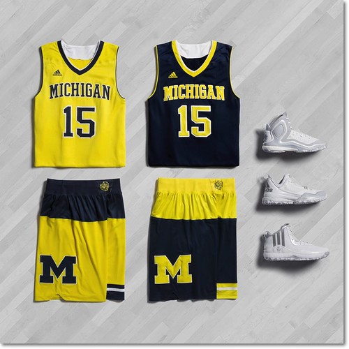
Adidas released a group of alternate jerseys for the college hoops postseason today, including the uniforms Michigan will wear for both the Big Ten Tournament and, most likely, the NIT.
I'll withhold total judgment until I see these on an actual human, but they could be a lot worse, especially given adidas' standards. Remember, Michigan turned down that horrible zubaz concept a couple years ago. At least these have normal looking tops and understated shoes; the shorts would probably look pretty sharp if not for the whole two-tone thing, which is unfortunately the selling point of the uniforms.
Anyway, you'll see these on Michigan for the conference tourney and maybe a handful of postseason games, and then we'll all forget this ever happened.
February 26th, 2015 at 1:40 PM ^
February 26th, 2015 at 11:14 AM ^
Y'know, these actually give me a uniformz idea that people might actually be able to get behind: what about a hoops uniform that mimics the home football uniform? Blue jersey, with no "Michigan" on the front--just a number. Maize shorts with nothing but the block M near the beltine.
That could be not completely awful, right? I guess the big problem is it would require a separate Michigan-only design, which Adidas surely would not do.
I'll duck when the rotten fruit comes flying at me.
February 26th, 2015 at 11:21 AM ^
That would be stupid, having a non-football sport try to look like the football team. We would never do that.

. . . oh, wait.
February 26th, 2015 at 1:19 PM ^
Sent from MGoBlog HD for iPhone & iPad

February 26th, 2015 at 11:15 AM ^
Please drop adidas and sign with Under Armor or Nike
February 26th, 2015 at 11:16 AM ^
Do you sometimes get the feeling that Adidas is either trying too hard, or just isn't trying at all?
February 26th, 2015 at 11:29 AM ^
to differentiate themselves from Nike and Under Armor by making having their own unique take on alternate uniforms, the only problem is, you can only do so much before the ideas become preposterous. There can be no better example than those shorts, I mean WTF?! Like, at the end of the design meeting, are they lock step that THESE are the shorts we are putting out. It looks like a random drawing my 7 year old son would do just because "M is a cool letter" and he wants to do something cool with it. Those aren't "shorts." They are really, really bad abstract art.
February 26th, 2015 at 11:17 AM ^

February 26th, 2015 at 11:18 AM ^
February 26th, 2015 at 5:44 PM ^
when I was in High School (BH Andover) a buddy of mine was a ball boy for the Pistons. Dude had so many pairs of shoes it was ridiculous. He gave away game shoes regularly. This was 1985-86. I seem to remember him saying the players wore brand new shoes for every game.
February 26th, 2015 at 11:18 AM ^
Cool swim trunks.
Seriously though, that two tone design is really popular for mens swim trunks, like the cheap ones you'd ind at meijer or target.
Sent from MGoBlog HD for iPhone & iPad
February 26th, 2015 at 11:31 AM ^
You nailed it, swim trunks. I think we'll see them on the rack at TJMaxx this summer.
I do like white shoes, though. The only thing cooler than white shoes is, black shoes.
February 26th, 2015 at 11:18 AM ^
Does ANYONE like these shorts? Some of you are meh over them, but I don't hear anyone actually excited about them. What kind of vetting process does Adidas perform? They apparently have a blind (literally) panel judge their concoctions.
February 26th, 2015 at 5:31 PM ^
Their goal is to make things as ugly as possible to get people to notice them. They are like a misbehaving child starved for attention.
February 26th, 2015 at 11:25 AM ^
I wish we didn't have postseason alternate uniformz at all, but at least they don't say "Wolverines."
It's functionally our normal uniform with a Lousiville-style crotch stripe.
February 26th, 2015 at 11:23 AM ^
Maybe its good that we probably won't be playing too many post season games. Those shorts are fucking ridiculous.
February 26th, 2015 at 11:25 AM ^
Eh.
Is not good. Is not worst thing ever. Is just... eh.
February 26th, 2015 at 11:31 AM ^

February 26th, 2015 at 11:31 AM ^
...are as good as the shorts are bad. Call it a wash.
February 26th, 2015 at 12:09 PM ^
Who the fuck signs off on those shorts? Even Mugatu would think its a terrible idea. And he invented the piano key necktie, so he knows
February 26th, 2015 at 11:45 AM ^
Wolverine Devotee says they're sweet or it didn't happen.
February 26th, 2015 at 11:46 AM ^
February 26th, 2015 at 12:37 PM ^
February 26th, 2015 at 12:00 PM ^
If not for the top section of the shorts, they'd be fine.
February 26th, 2015 at 12:11 PM ^
I'd actually be OK with these if I could just figure out what the hell that little stripe on the bottom corner of the shorts is supposed to be and how if will look when worn. I mean two tone shorts with the Block M would probably look fine if they'd just put some piping along the bottom hem, but no because Adidas.
February 26th, 2015 at 1:04 PM ^
Not sure, but I think one leg has the Block M and the other leg has the stripe all the way around.
That imbalance might be okay in a funky sort of way if not for the color blocking above it, which just doesn't work for me.
February 26th, 2015 at 12:20 PM ^
Sent from MGoBlog HD for iPhone & iPad
February 26th, 2015 at 12:23 PM ^
What's next? A Maize and Blue checkerboard uni?
February 26th, 2015 at 12:27 PM ^
It's a formal look with the addition of the tuxedo cumberbund around the middle.
February 26th, 2015 at 12:30 PM ^
"What’s that? Ah — Playoffs? Don’t talk about — playoffs?You kidding me? Playoffs? I just hope we can win a game! Another game."
February 26th, 2015 at 12:30 PM ^
If they got rid of the two-tone top half of the shorts and the stripes on the left leg, these would be fantastic. Do less, Adidas.
February 26th, 2015 at 12:53 PM ^
Sometimes, less is indeed more.
February 26th, 2015 at 12:32 PM ^
Sent from MGoBlog HD for iPhone & iPad
February 26th, 2015 at 12:34 PM ^
People actually buy this crap in M-Den and elsewhere, it makes adidas money. So until people stop buying it in retail shops, adidas will keep putting it on the team. If you ask me, this is adidasas' worst effort yet. I'd rather see the team in those Indiana Pacers uniforms- that at least has precedent with Iowa mimicking the Steelers.
February 26th, 2015 at 12:37 PM ^
I mean if you are going for that bees look...which you know has a traditional tie in...ugh I cannot be positive with this, but I'm trying! The best thing about them is the big block M. I to missed that.
February 26th, 2015 at 12:43 PM ^
Sent from MGoBlog HD for iPhone & iPad
February 26th, 2015 at 12:44 PM ^
February 26th, 2015 at 12:46 PM ^
I think these might look decent on an actual basketball player
February 26th, 2015 at 12:51 PM ^
That giant strip style thing on the shorts is no-go in this guys book. The giant block M on the other, is a yes-go.
February 26th, 2015 at 12:59 PM ^
Michigan basketball should always wear black shoes.
February 26th, 2015 at 12:59 PM ^
like these uniforms. I think the 1989 uni's are the gold standard and I would take those 10 times out of 10. That being said, I think these will look pretty dope on actual players.
February 26th, 2015 at 5:47 PM ^
all MBB Tourney uni's should be this:

February 26th, 2015 at 1:06 PM ^
For once, they get the M's on the sides of the shorts at appropriate size.
But then make the tops of the shorts look like the factory ran out of fabric and decided to use what was left.
Why is this so fucking difficult?
February 26th, 2015 at 1:23 PM ^
February 26th, 2015 at 1:43 PM ^
February 26th, 2015 at 9:05 PM ^
Comments