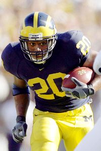
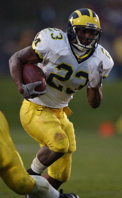
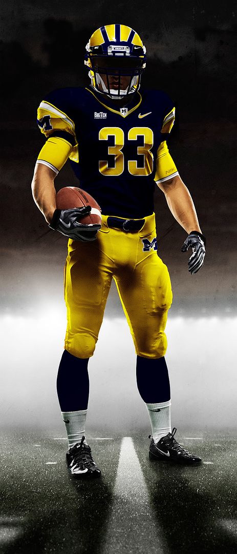
prototype M football jerseys created by a fan
Here is a link to some prototype uniforms for football that a fan seems to have created: http://umgoblue.com/talk/Concept-Michigan-jerseys-m163569.aspx
I picked up the link following Stonum Woolfolk and Roundtree on twitter. While they seem to like the idea of changing the uniforms, I am a traditionalist, at least with regard to our home uniforms. Anyway just thought it might be fun to discuss. The fan's name is Tom Summers and a link to his twitter can be found here ---> http://twitter.com/#!/t_sizzle7494
Also, if someone could just embed these photos, that would be much appreciated.
edit/ Here are links to the individual prototypes. The guy must have used a Nike model since he forgot to remove the swooshes from the shoes and gloves.
Away: http://farm6.static.flickr.com/5053/5475435492_597361871c_o.jpg
Home: http://farm6.static.flickr.com/5212/5475435350_6edf9b1fd0_o.jpg
Alternate: http://farm6.static.flickr.com/5172/5474838093_dc006b8f6e_o.jpg
I love the old school but I also enjoy the new and these jerseys are smooth as frick.
February 28th, 2011 at 8:30 PM ^
I like the facemask. That is all
February 28th, 2011 at 9:27 PM ^
The yellow on the bars above the forehead is cool, really makes the wings pop. I like that.
February 28th, 2011 at 8:33 PM ^
i kinda like #1 and #2 uniforms. Damn I cant believe I admitted that!
February 28th, 2011 at 8:41 PM ^
Is one of the worst things I've ever seen.
February 28th, 2011 at 8:44 PM ^
Is this City of Heroes? Gah!
February 28th, 2011 at 9:06 PM ^
Home:
Away:
Next.
p.s. thanks to Denarded for the plethora of pictures from which to choose
February 28th, 2011 at 9:12 PM ^
the word "vomit."
leave out the word vomit without omit.
February 28th, 2011 at 9:28 PM ^
Step ya game up Adidas make it happen. You traditional, old folk, these are so cool looking.
And the Third choice makes a Freaking Block M, that is so creative!
February 28th, 2011 at 9:54 PM ^
yah these are pretty fukkin wikked, all they need is some fukkin wikked blakk to look even sikker then they'll look look like fukkin WARRIORS how sikk would that be???????????
Fuck. That.
February 28th, 2011 at 10:50 PM ^
and I like Michigan. If you like strobe light jerseys, root for Oregon.
February 28th, 2011 at 9:28 PM ^
1 was cool, 2 was alright and there no fucking way with 3.
February 28th, 2011 at 9:31 PM ^
these are terrible
February 28th, 2011 at 9:31 PM ^
The only one I can stand to look at is the Blue variety, but you don't mess with the homes. So, uh, no thanks.
February 28th, 2011 at 9:34 PM ^
3 is an abomination. However, I do like the white. Those belt loops and belt are boss. I'd still stick with the original home jerseys though.
February 28th, 2011 at 9:39 PM ^
A for effort, but . . . no.
February 28th, 2011 at 10:17 PM ^
Tom, if you're on here I think you did an excellent job and would like to see all 3 of your designs applied to the current unis
February 28th, 2011 at 9:57 PM ^
No thanks.
I am amused by what Oregon does with their uniforms, but that is Oregon's thing. We don't need Oregon's thing, we've got our own thing.
February 28th, 2011 at 9:58 PM ^
February 28th, 2011 at 10:02 PM ^
I like em all. The Road Whites are pretty nice. The Alternate is a good 1-Time wear IMO. The Home ones look pretty cool too.
That being said. I don't believe the Home jersey's sould be changed EVER, for any reason. No matter how awesome it may look, that tradition is here to stay. Road Whites can be changed to this. No tradition points lost. The Alternate could work, but only if it's in a game where the other team is also doing a crazy alternate too, and commemerating something.
February 28th, 2011 at 10:07 PM ^
Turruble
February 28th, 2011 at 10:08 PM ^
NEVER touch the home
Do what you want with the white but please no block Ms on the sleeve. I hated those.
Add a maize jersey once. But just once. Then every 5 years people can complain when we wear them as throwbacks.
AND please school down south, STOP wearing your ugly alternates during The Game.
February 28th, 2011 at 10:22 PM ^
They are awesome. Great fan art. Perfect for NCAA 2012 on my 360.
February 28th, 2011 at 10:54 PM ^
Talked to my friends at EA. This is not something for this year, but they seem to toss around an idea similar to this every year. Never get's approved by the NCAA and the schools though.
February 28th, 2011 at 10:26 PM ^
Is it bad if I actually like #1 and #2?
February 28th, 2011 at 10:42 PM ^
I like the home and away, but agree with most of you guys: don't change the home uni's. As for an alternate, those are pointless and useless. Lets just win games....then jerseys sell themselves.
February 28th, 2011 at 10:44 PM ^
I hope a thousand pound unchained malignant ape descends upon all who would even consider these atrocities.
<br>Kthanksthatisall
February 28th, 2011 at 10:49 PM ^
Had some issues, but I hope this works--I had some issues with embedding. This is not mine, just stumbled across it a while back.
The link is to the forum where there are a lot of designs, some are so sick they should be used every game... others fall short, like ours.
http://boards.sportslogos.net/index.php?showtopic=70902
Straight to ours...
February 28th, 2011 at 10:52 PM ^
You don't mess with the wings! WTF?!
Second of all, the colors are wrong. Those are Toledo Colors. That midnight blue is not M at all.
February 28th, 2011 at 10:54 PM ^
I agree 100%!!!
I just posted since people were intrigued. I did not have anything to do with these. The others are worth a look though--some are SICK!!! Definitely not ours though!
February 28th, 2011 at 10:56 PM ^
A++? Would buy again?
I'm so confused!
February 28th, 2011 at 11:05 PM ^
Just stop posting. We shouldn't have to suffer with you!
February 28th, 2011 at 11:12 PM ^
You know Blazefire's a mod, right?
Not trying to be a dick... obviously a bad attempt at humor.
February 28th, 2011 at 11:06 PM ^
No. No. A thousand times. No.
NO NO NO...
Why do the jerseys need to be messed with? This is NOT Oregon!!!
Do 'Bama fans mess with their jerseys? State Penn? ND?
NO...
Let's start talking about spring ball instead of this blasphemy.
the Irish changed up their football jerseys this year...
Get a clue... Michigan has tweaked their jerseys over the years too... yellow pinstriping on away unis, subdued "M" stitching on the shoulderpads, "M" on the pants, etc. But fundamentally, the uniform has remained pretty static over the past couple of generations. Just like the schools I mentioned. Spillting hairs to prove a point when the body of the idea is true doesn't make you more right (or wrong).
psu also tweaked their uniform
I have a lot to say about this. Bullet points prevent me from having to generate paragraphs.
1.) The flashy uniforms of Oregon generate publicity and buzz. Just because Michigan isn't short on publicity and buzz does not mean we couldn't use more. Furthermore, the poster saying if kids would like alternates they can leave and go to Oregon just posted the most ludicrous thing I've read in a while.
2.) The vicious adherence to tradition is more ardently expressed in this thread than it has been in the actual uniforms Michigan has worn over the years. White pants at home, white pants away, helmet stickers, block Ms on the shoulders - all these things have been tried over the years. Our jerseys aren't Penn State's - forever unchangable. A longing for uniform stability in the name of tradition is really just a rebranding of an individual's personal resistance to change because it recalls a past that has never existed.
3.) Everyone is obviously entitled to dislike these jerseys. They're also entitled to love our jerseys.
4.) When you're one of the few teams in the NCAA that doesn't do alternates, you should ask yourself why that is and seriously consider changing that.
4.) I dislike the block M jersey modeled above, but I think the home and away uniforms are tremendously sick and would be awesome to deploy in a primetime game against a team like Nebraska.
By far the best post in this thread. I do, however, like the idea of the maize block M unis. And the blues are forever unchangeable.
And great idea of wearing them during a game like Nebraska.
Here's a rule of thumb: Any time a uniform is described as "sick," that is code for "ugly." Since you've decided to stereotype all those who don't like "sick" uniforms as "resistant to change" and "recalling a past that never existed," I'll return the favor: Anyone who wants "sick" new uniforms, alternates, maize tops, etc., is a product of the new age Twitterverse with the attention span of a housefly. They don't want new uniforms because they're awesome-looking and an improvement over the old, they want new uniforms because they're bored of the old. No matter what hideous piece of shit Nike or Under Armour foists upon an unsuspecting fanbase, there will be a 17-year-old who calls it "sick" and loves it to death. Until the next "sick" uniform comes out eighteen months later. Lady Gaga is such old news.
Here's a fact. No matter how pedantic you get over the changes Michigan's made to the uniform over the years, one thing doesn't change: Michigan is associated with blue jerseys, maize pants, and blue helmets with maize wings. White jerseys on the road. No alternates. That's an association and, more importantly, a brand.
You too should ask yourself why Michigan is one of the few that doesn't do alternates. Perhaps it's because Michigan is one of the few who can be identified without having to tell the whole world the uniform of the day. You seem to have a follow-the-crowd mentality about alternate jerseys. Let's look at the teams that don't do alternate jerseys: Penn State. Nebraska. Alabama. Auburn. Texas. USC. Notre Dame, except as a part of the tradition you claim is nothing more than resistance to change. LSU. Oklahoma. There are a hell of a lot more. Do you have this glaring need to be Maryland, or Oregon, or another attention-whore kind of team that needs to play LOOK-AT-ME games in order to get any attention?
The flashy uniforms of Oregon generate publicity and buzz. Just because Michigan isn't short on publicity and buzz does not mean we couldn't use more
You need to consider the law of diminishing returns. The more schools go to gimmicky uniform designs, the less buzz they generate. Even Oregon is no longer turning as many heads with its annual uniform redesigns. Other teams, like Virginia Tech, are trying to join in and most people hardly even notice.
The vicious adherence to tradition is more ardently expressed in this thread than it has been in the actual uniforms Michigan has worn over the years. White pants at home, white pants away, helmet stickers, block Ms on the shoulders - all these things have been tried over the years. Our jerseys aren't Penn State's - forever unchangable.
That we have occasionally tinkered around the edges does not change the basic fact that Michigan's football uniforms have essentially looked the same for years and years. You're aware of all those little changes because you're a Michigan fan. Rival fans do not notice these things - just like you haven't noticed that PSU has actually made minor cosmetic changes over the years, too (like briefly having numbers on their helmets, and adding a white collar on their home uniforms). For many decades, our home uniform has been blue, with maize numbers, and maize pants, and no writing on the front. Aside from two years in the 1970s, we've always worn a white road jersey (with blue numbers and no writing on the front) with maize pants on the road. We have tinkered with the look far less than almost every other program in the country, to the point that minor changes (like those curved stripes) strike as huge deviations.
Everyone is obviously entitled to dislike these jerseys. They're also entitled to love our jerseys.
Sure - but there is no reason to believe that people who like these are in the majority.
When you're one of the few teams in the NCAA that doesn't do alternates, you should ask yourself why that is and seriously consider changing that.
First, this really isn't true; most schools never wear alternate jerseys. Secondly, the reason why any school unveils a new uniform is to sell more merchandise, and we sell more than virtually any other school in the country, probably in part because our look is so iconic and recognizeable. If we deviate from it, we risk diluting our brand identity.
I dislike the block M jersey modeled above, but I think the home and away uniforms are tremendously sick and would be awesome to deploy in a primetime game against a team like Nebraska.
Great, but I think you're in the minority.
A switch to these uniforms will cause me to find other things to do with my time.
*shudders at the thought*
The more I look at the road uniforms, the more I like it. I would remove the wings on the shoulder pads and put the block M there.
for a WARLOCK
The current ones are lacking. The wings look cool on the shoulder pads. The current home jerseys are already perfect.