January 2nd, 2013 at 10:35 AM ^
Go ahead, tell us we have sand in our vaginas. We you know you want to.
January 2nd, 2013 at 10:00 AM ^
January 2nd, 2013 at 10:02 AM ^
At first I didn't have a problem with changing the away uniforms because there wasn't anything really iconic about them aside from the helmets but how can you trust a designer that doesn't even take into account that it is impossible to see maize on white. It is like they just tried to find something different and then went with it, instead of testing it out AT ALL. I liked these much more:
January 2nd, 2013 at 10:03 AM ^
I am glad that people protested the jerseys. As others have said, you couldn't read the numbers. I also simply don't want Michigan to use alternate jerseys ever, so I want every such jersey to be protested just on principle...That said, I certainly wasn't focused much on the jerseys during the game.
January 2nd, 2013 at 10:15 AM ^
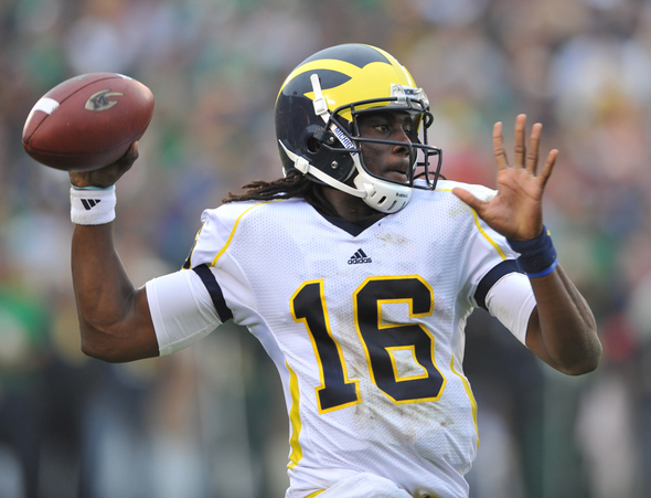
If the numbers had been blue, they would have been more tolerable. Not being able to tell who just did what, and having the announcers mocking them on national TV was terrible.
January 2nd, 2013 at 10:29 AM ^
No. I liked them. Neg-Away
January 2nd, 2013 at 10:33 AM ^
and comments that the unis are ugly, adding that they make the players look fat. . . She even said, "They did something to the helmets, too." Now granted, my kid is bright, but.
January 2nd, 2013 at 10:37 AM ^
For some reason I love the fact that an eight-year-old said that the jerseys made the players look fat.
January 2nd, 2013 at 10:46 AM ^
January 2nd, 2013 at 4:42 PM ^
When I was 9, I just wanted a Michigan jersey. I wouldn't have cared if it had Zubaz stripes.
A school with 133 years of football tradition shouldn't wear shitty jerseys just so they can sell a few replicas to 9 year olds.
January 2nd, 2013 at 10:36 AM ^
January 2nd, 2013 at 10:53 AM ^
January 2nd, 2013 at 12:39 PM ^
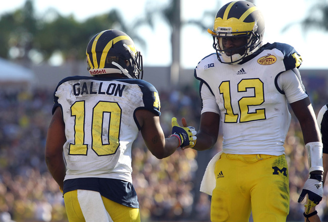
Yeah, Dave Brandon couldn't help slapping as many block Ms as possible on those 1975 jerseys they wore at the GLI. (http://tinyurl.com/bkjcktk)

January 2nd, 2013 at 10:38 AM ^
I heard my grandfather say "what happened to the shiny helmets??!" But the new helmets looked great, jerseys looked like trash. I am still waiting for the white pants to come out, I personally think it looks awesome
January 2nd, 2013 at 10:52 AM ^
January 2nd, 2013 at 11:06 AM ^
January 2nd, 2013 at 11:11 AM ^
This latest uniform fiasco just shows how little thought actually goes into designing "alternate" uniforms. In an era when everything is done for television (hello, rutgers), we put out uniforms that failed to even consider television.
The helmets (as most agree) were ok, but why mess with the best for "ok". But for the invisible numbers, I'd place these jerseys behind the Bumblebees for turribleness, but given the "oops, forgot the game is in Florida and being televised", Brandon just outdid himself!
Side note...for those saying, "Bring back Nike," they're just as bad, or worse. They made State look like Xmas trees and have basketball uniforms that make UnderArmor proud.
January 4th, 2013 at 10:24 PM ^
Numbers were unreadable, and NOT FUCKING MAIZE. Look at what the cheerleaders were wearing, get the pantone number, and buy some fucking maize material for some pants.
Is this stuff thought out ahead of time, or really just a test to see if fans will buy anything? Why would someone buy this, the MSU shirt from last year, or the bumblebee abomination from Jerrah world?
Alternate unis are just silly for a football team with the tradition we have (or USC, or Alabama, or Penn St., or OSU for that matter).
The brand has already been built with winning football games for more than 100 years. We're debasing that brand by putting our football players in clown costumes so we can sell worthless shit.
I did think yesterday's game was very exciting, and am looking forward to a great season next year. As long as I can tell who's playing.
1) Stop fucking with the uniforms
2) Win games
3) Profit
January 2nd, 2013 at 11:45 AM ^
If the numnbers were blue, lose the matte finish on the helmets and I could live with them. It is not like the home blues, where we actually do have a tradition of varying up the away uniforms. The yellow numbers could barely be seen or read with any accuracy during the broad cast. I mean, didn't they think that playing in the sunshinse state, where it might actually be sunny, there wouldn't be a reflection off the numbers?
These incarnations as a whole were horrible. Frankly, I never in my life remember a time in my fandom where we even spoke about the jerseys. Now, its "whats next" as the season and games approach. Times have changed, and for the worst in my epinion.
January 2nd, 2013 at 11:47 AM ^
January 2nd, 2013 at 4:44 PM ^
Sure, you can argue that we have changed up the away uniforms in the past. But do you know who was the designated "home" team for the Outback Bowl? We were. We gave up the opportunity to wear our beautiful home uniform so we could wear those unreadable piles of crap. So effectively, we did change our home uniform for this game.
January 2nd, 2013 at 12:03 PM ^
They were definitely a lot better than the Bama jerseys as well as the 2011 MSU jerseys
January 2nd, 2013 at 12:23 PM ^
January 2nd, 2013 at 12:30 PM ^
I disliked both the uniforms and the helmets. While I could read the numbers, it would have been a lot easier if they had been blue. My personal reality, however, is that I don't care that much . . . this isn't a hill I would die on. I'd gladly trade a win yesterday for playing the next season in these uniforms.
January 2nd, 2013 at 12:31 PM ^
We should take all that time and energy used in making these fancy uniforms and put it into, you know, playing football better.
January 2nd, 2013 at 12:31 PM ^
But what I really want to see is some throwback from the real old days, when uniforms were plain blue with the blocky maize numbers and the paints were truly maize, much darker than this neon yellow. Take the field looking like we're right out of the 40's (with some modernity for safety/comfort/performance) on the day we honor Tom Harmon.
January 2nd, 2013 at 12:35 PM ^
They may not have looked too bad, but a statistic Brandon should look at is that we are only 2-3 now playing in alternate uniforms... I'm sick of them, though.
January 2nd, 2013 at 12:43 PM ^
January 2nd, 2013 at 12:44 PM ^
I thought it was rather sweet of us to pay homage to our neighbors to the south, the Toledo Rockets.

January 4th, 2013 at 10:27 PM ^
January 2nd, 2013 at 12:54 PM ^
On a side note with bowl games why aren't both teams allowed to wear their home uniforms. Unless there's two teams with virtually similar unis like USC and Iowa state this really shouldn't ever be an issue. The home uniforms are almost always the more significant of the choices and it would make bowl specific jersey sales probably escalate as well.
January 2nd, 2013 at 1:09 PM ^
Watched the game with a girl who had never watched UM before. She asked why our numbers were neon yellow.
That's a fail in my book.
January 2nd, 2013 at 1:17 PM ^
These are the most Wal-Mart looking jerseys we've had yet. I am waiting for Brandon to take off the wings and stick a block M on the helmet. And then come the camo jerseys. Both are coming. I just know it.
January 2nd, 2013 at 4:07 PM ^
but I could get behind some really outrageous ones if they went for it, like uniforms that have fireballs come off of the sleeves and helmets with maize and blue laser beams shooting out of them...
January 2nd, 2013 at 1:21 PM ^
January 2nd, 2013 at 1:26 PM ^
They really didn't look as bad as I thought they would, but the numbers absolutely should have been blue.
January 2nd, 2013 at 1:39 PM ^
I did not like the uniforms. Just use the normal away jerseys. You couldn't read the numbers, the shoulder pad design was bad, overall ugly!! Just stay with the usual jerseys!
January 2nd, 2013 at 2:29 PM ^
I don't usually give a damn about this sort of thing, but these jerseys were cartoonish. Aside from just being plain ugly, they looked like the tacky type of jerseys that a D2 school (or Toledo, as pointed out above). They do not look anything like something that a traditional power in college football would wear. As a program that emphasizes our great tradition, our winningest record of all time and all of the other great accomplishments from decades ago, why would we wear jerseys of a MAC / WAC team?
Also, obvious fail on not being able to see the numbers.
Also, also, I had a few people over to watch the game. My friend's wife, who knows nothing of college football, kept commenting on how ugly our jerseys are. Another friend, who is a ND fan, kept making fun of us for wearing what looked like knock-off Michigan merchandise that is sold at Wallmart or Meijers. Sadly, I had no response.
January 2nd, 2013 at 2:31 PM ^
Aesthetcally, they were better than expected. Not being able to read the numbers reminds me of the Seinfeld where George gets the Yankees to wear cotton uniforms that shrink after the first wearing. Do they really not think these things through?
Change the letters to blue (or at least thicker borders), make all the yellows match, preferably a less bright yellow, keep the matte helmets and I think it's a reasonable bowl uni.
January 2nd, 2013 at 2:45 PM ^
It seems to me that the jerseys were approved in a fluorescent-lit conference room, and they turned out to be a total fail out on the field with the numbers being unreadable in sunlight. Boo, uniformz.
January 2nd, 2013 at 5:46 PM ^
I liked the helmets. I even liked the close-up shots of the players which showed the helmets with the shoulders. Ordinarily, I would not have been so keen to see our numbers, except I was always straining to see if Denard was in the backfield, or under center, or playing the electron receiver position. Unfortunately, there were dreads at most of those positions, which made it nearly impossible to tell. However, I did notice that as the shadows drew longer, the numbers became clearer, an old elvish trick.
January 2nd, 2013 at 5:00 PM ^
Don't worry about it. It's all part of the B1G's Master Plan!
Brandon has hopped aboard Delaney's innovative strategy to make the B1G more attractive to television eyeballs in the South, where the population is growing. So the B1G is encouraging a few small changes to cater to this new fanbase:
Now that the state of Michigan has adopted exemplary Southern-friendly laws to appeal to its sister states in the South, the school is changing its name to The University of Michissippi.
The winged helmets will be dropped in favor of yellow helmets with a script, "Ole Mich" on each side.
The jerseys will be a less Yankee shade of blue, and instead will sport the school's official sky blue and yellow colors, sporting a variety of interesting designs and of course the "Ole Mich" logo.
Our fellow B1Gers at the newly-renamed Michissippi State will ring cowbells at games, which is "udderly" more fitting for a Southern-style agricultural school. The school's packaging major will offer a concentration in fried chicken take-out bucket design.
The long term goal of the conference is to absorb such legendary football schools as Jamaica's University of the West Indies and the fabled University of Havana.
January 2nd, 2013 at 6:01 PM ^
January 2nd, 2013 at 8:17 PM ^
January 5th, 2013 at 12:41 AM ^
I didn't "freak out" when they were announced and I'm not freaking out now. Didn't really like them then, still don't, and just generally going on with life. It was a one game thing.