Alternate Jersey Release Open Thread
Well, after weeks of speculation, we will all discover what our Michigan Wolverines will be wearing at the night game against Notre Dame.
8:00 on Mgoblue.com, they will be unveiled. Apparently, the players all really like them.
As long as the game results in a W for us, I'm ok with whatever they wear.
Hopefully they don't look too bad!
Back in the 50's into the 60's, colored facemasks were a pretty rare thing. Everybody wore grays. Same reason the Irish, Giants, etc. wear them today.
Uh, we had gray facemasks far longer than any other color.
I never knew retro meant something that never existed...who knew. I'm sorry these look terrible.
I don't hate them as much on as I did when they are not worn. Key words = "as much"
Chris McGuire, explaining himself.
Not as bad as I thought.
Not looking all that thrilled.
Shoulder stripes don't look that bad on the pads, to be honest...
i actually like it.
I can't tell from the shitty feed whether the numbers and M have the geometric lines inside them going on
They look pretty sweet with pads on...not gonna lie...the long sleeved replicas look like crap, but these are tight!
They are the Mden jersey's but tweaked a little bit, they actually look a lot better with the helmets and pads
I love them. Gray facemasks are awesome.
I hate myself for starting to like these things.
Denard makes it look good. That is all.
I think they look badass as a whole uniform. Not traditional but for one game they will look great.
Alot better than the mden pic. Lots less stripes.
Wouldn't mind those helmets sticking around. Love those grey facemasks.
I like it!
And Denard's smile makes it even better.
He walks off one way, gets directed to exit the other. Love that guy. He can't speak well, but he speaks football like none other.
Y'all can say what you like about them, but I think they're not too bad. They'll work fine!
I actually dont think they look bad with the pads. Not great but could be worse. I also like how we are auctioning them off and not trading them for tats or a discount on cars.
as i thought they would be
Grey facemasks with numbers...Fine, I won't be critical anymore.
I agree, looks better on than it does in pictures. Not as dissapointed as I thought.
Not so sure about the numbers on the side of the helmet though...
Denard cannot stop smiling!!!!
and Van Bergen is a man-statue.
I actually like the numbers on the helmets.
Not that bad! Definitely not as gaudy as the MDen pics.
I still hate that this has never been worn by Michigan before. I hate the whole idea of Michigan "throwing back" anyway, or "legacying" or whatever. I'm happy they don't look terrible. I still never want to see them on the field.
Your avatar would disagree, considering she's wearing the equivalent hockey uniform.
It's not as sacred a uniform, since they change the white and maize ones pretty frequently. And they had a picture of a 1948 uniform that looked a ton like the big chill sweaters
EDIT: embed of Big Chill sweater's inspiration (although to be fair I felt like I read on MVictors that the stripes on this bad boy were red, white and blue instead of maize, white and blue):
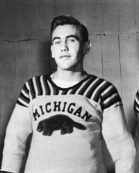
The grey facemasks and the numbers on the helmets are nice touches.
Denard likes the idea of the cheerleaders dressed in legacy uniforms.
Are they the horror that everyone was saying they were going to be? I don't think so. I think they look pretty good! They look like the tech-fit type jerseys that we decided not to wear last year.
I like them.
they look really good IMO
also VanBergan keeps looking around akwardly
I think they look surprisingly great.
Cheerleaders get legacy uniforms? I can't tell if he's serious or not.
....just look cool in whatever he wears?
interesting they have shoulder stripes too. We have more so ours are obivously better.
Interesting they have shoulder stripes too. We have more so ours are obivously better.
EDIT: Grrr, double post. sorry.
EDIT: didn't scroll all the way up, so here's one from the side with the helmet view 
Ok Denard likes them.... THEN I LOVE THEM!!!!!
Denard smiles and everything is good in this world.
you see them on the players. GO BLUE! Beat the hell out of Notre Dame!!!
They look like a glorified high school program jersey. Okay, but the shoulder stripes on the ND jersey are a little overdone.
I'm a little relieved. They're O.K. Still don't understand the stained glass cracks look in the block M but I'll live.
I want to go to this game so bad. Anyone have a couple grand they can loan me? That might get me a nose bleed seat.
Used to be pretty commonplace, esp. old school NHL-- but usually it was the same color as the felt number going on the shirt/jersey/sweater. ie they should've used maize thread on maize numbers so it wasn't so flippin' obvious.
Don't know if you remember, but the 99-ish ice hockey uniforms (98? 2000??) had the same thing. I have a maize jersey hanging in my closet up there with a big blue M with the same pattern on it, just in corresponding blue thread. Much more subtle, thanks Nike.
I've got that same jersey and I can confirm that it is chain-stitched. Seems like we have Ira from TKA to blame for this "stained glass" description. For being such a big U-M hockey fan, I'm surprised he didn't know about the chain-stitching.