Jumpman Football uniforms (PHOTO)

I woke up to a nice surprise this morning. Someone tweeted this and it was brought to my attention.
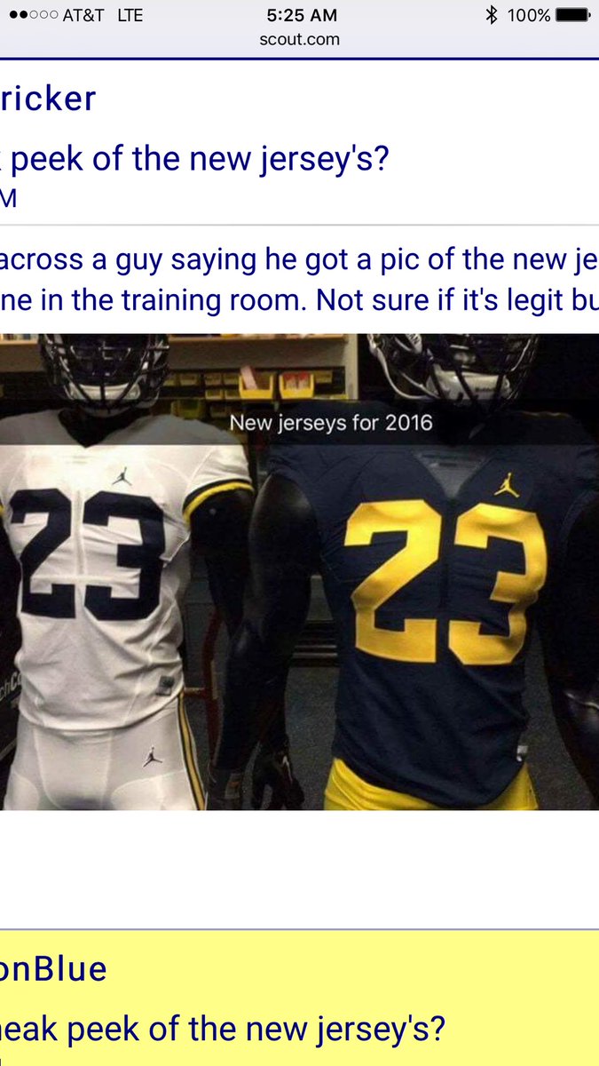
ORIGINAL TWEET:
@mgoblog @michiganinsider @umichWD @SamWebb77 pic.twitter.com/NzWfGbhPVn
— Justin E Harkelroad (@jharkelroad1) July 29, 2016
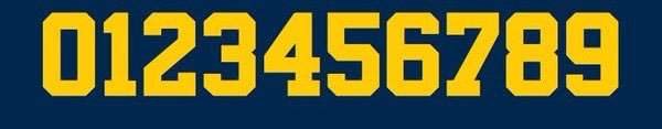
The font we're using is NBA Bulls. The first change to the font in almost 50 years. The classic #2 worn by Woodson is gone.
wore maize. The whites were in the 70s. I like the whites better, but don't understand why they can't be interchangeable.
Sent from MGoBlog HD for iPhone & iPad
At first I wasn't sure how I felt about the white on white uni's last year when it was announced, but man I love them now and hope that becomes the permanent road combo.
Caring about the logo seems weird to me. These look like last years, which isn't suprising because the uniforms always look the same which is why you just take the best deal.
Sent from MGoBlog HD for iPhone & iPad
The only people that care about the logo are uptight white people.
Good enough for me. Better than Addidas junk. I'll enjoy the uniforms from my couch every game! Go Blue!
Are they going to be selling these in hardware stores?
Sent from MGoBlog HD for iPhone & iPad
Sent from MGoBlog HD for iPhone & iPad
I think these are just a mock up jersey by Nike/Jordan. Why would they have the jerseys out for the team to see if they are revealing the jerseys to the team on Tuesday? I'm skeptical.
The players already have the gear and that isn't being unveiled unitl Sunday night.
I thought the jersey is being "revealed" on August 2nd? And it's players only...and in Detroit...what is there to reveal if they've seen it? Modeling?
Players have seen the Jordan and Nike apparel, not sure if the team has seen the jerseys yet. Harbaugh has.
The Jersey reveal is invite only in Detroit, Tuesday, August 2nd. It will be mostly media, some former players, maybe the team.
When recruits come to visit they have most apparel and uniforms out in the locker room. In the last year the staff has kept a closet of Jordan prototypes to show recruits when they come, but they mostly kept it under lock and key. Just a teaser for recruits.
Yeah - not buying this is the real deal.
This is likely to have been well covered elsewhere, but I am assuming that the Nike deal extends to the basketball program as well? Though we're the first football program to use the Jumpman setup, I'm guessing it's old had in MBB?
Sent from MGoBlog HD for iPhone & iPad
Add to that Fresno State, Oakland and Cal
Cal is no longer a Nike school...they're UA. Also, Oakland and Fresno pay for Jordan...they're not officially "endorsed" by Jordan.
Sent from MGoBlog HD for iPhone & iPad
Wait....Oakland is in play?
jumpman logo on a football uniform. Otherwise, might as well be last years uniforms with a different logo, which is fine with me.
thats a pretty deep V on the homes
I'll still be getting a Woodson jersey
Sent from MGoBlog HD for iPhone & iPad
Sent from MGoBlog HD for iPhone & iPad
Sent from MGoBlog HD for iPhone & iPad
Sent from MGoBlog HD for iPhone & iPad
Sent from MGoBlog HD for iPhone & iPad
I wasn't talking to you!
Extended thoughts:
- Font change: Still a very simple, classic font. Extremely minor change that doesn't merit a conniption, IMO
- Overall aesthetic: Clean, traditional, sharp
- Jumpman logo: Really slick, almost disappears because of it's thin visual weight. Yes, it's technically a basketball player, but it's a high-performance logo/brand/icon before that.
- White pants: They looked sharp last year. I think I prefer maize, but the white has grown on me.
- No block M: These are immediately recognizable as Michigan (even without the helmet). Also, a small B1G logo opposite the jumpman will balance these out.
Hey, we got pretty close :)
 +
+  =
= 
Get rid of those M's on the helmet
Sent from MGoBlog HD for iPhone & iPad
I really like everything I've seen so far. Colors are on point, font changes are subtle, and the white pants remain.
I know a lot of people would prefer maize pants for the road, but I like the white pants as a way to signify a new era of Michigan football (yes I know they have been worn in the past).
Honestly, the only thing I'm not crazy about is the collar. It looks like a piece of pastic on the blue jersey.
agree, collar is weird. Not sure why Nike has been using those plastic collar things.
edit: per another commenter, apparently it's some kind of mesh fabric system thingy, not plastic
Nothing radical and quite traditional-looking. I prefer the Maize pants and not to F with C Dub's 2, but overall pretty sharp. The Jumpman logo will sell, perhaps even in Ohio.
and in this addition of let's find little things to complain about:
-the 2 slants too much!
-the jumpman logo is too low!
-a basketball player on a football jersey?! For shame!
-no block M anywhere? how will i sleep at night?
-the number font is a basketball font?! i'm done. Even though i could have never guessed if you didn't tell me.
Yeah, all these little things will surely take its toll on how the team performs on the field.
Sent from MGoBlog HD for iPhone & iPad
so, so bad.
Sent from MGoBlog HD for iPhone & iPad