OT: WTF Adidas

Soar Higher. Score Faster. Another look at @UofLFootball's #UNCAGED uniform. #L1C4 #teamadidas pic.twitter.com/rkRMmxpa6T
— adidas Football US (@adidasFballUS) June 25, 2015


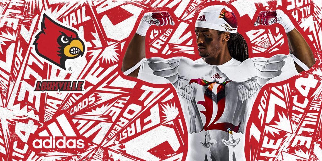


Eh. It's somewhere in between horrible and awesome.
EDIT - That helmet... that's something though, isn't it? Like an Angry Bird made love to the only cardinal too stupid to get away from it. And this is the consequence.
Agree and agree...
I think the problem is the graphic, red and white background screaming at anyone who dares look

one pissed off songbird.
" Like an Angry Bird made love to the only cardinal too stupid to get away from it. And this is the consequence."
BWAHAHAHAHAAHA!!! You sir, win the internet for today. I literally almost swallowed my toothpick laughing.
Who wouldn't want to buy that? That jersey would look great in my closet next to my zebra striped pants and camo-snuggies.
Wow, that's out there. I wonder if the players like it?
Good question on the players, but honestly it's no different from the myriad Oregon uniforms. And although songbirds aren't exactly fearsome, neither are ducks. Canada geese protecting their nests, on the other hand, are scary mofos.
Why wouldn't they...they can score faster with them!
I just did the pidgeon sound that birdman does: prrrrrrrr
Also not liking the zombie bird.
You've seen some of the uniforms the other companies put out too right?
I'm guessing you didn't see the bird.

Why does Foghorn Leghorn have a nutsack below his beak?
Sent from MGoBlog HD for iPhone & iPad
I think the bird on the helmet ruins the whole concept. Aside from that, it's fine. That classic "L" logo might look cool, moreso than that angry cardinal with the soulless eyes.
Im on to you Herbert Hainer
Sent from MGoBlog HD for iPhone & iPad
looks like.

Sent from MGoBlog HD for iPhone & iPad
Love the helmets, hate the EVERYTHING ELSE
I could maybe tolerate the helmets if I had not seen the little bird feet poking out next to the ear holes.
It looks like the concept drawing was too fucking big for the helmet and Adidas just went, "eh, fuck it. No need to scale, just slap it on there."
I'm literally the opposite...HATE the helmets, they're awful and that picture on them is terrible.
Love everything else, love the gloves playing off the thumbs rather than the same "dynasty sign" on the palms that everyone else uses.
The "under armour" is pretty sweet, looks like a huge tat, and I like how it shows through the sleeves when the jersey is on.
The feathers on the shoulders are fine...plenty of schools do this.
The angry bird helmet is so frickin bad.
If anything, they should've just used the same bird head logo and altered that to be all "chromey" and real looks (vs. the traditional cartoon bird look)
These fucking threads are way past the annoying point.
Those gloves look like one of my 5 year old's fingerpainting projects.
Background is horrendous - epileptics beware!
This cannot possibly be real. There is no way.

Not zombie enough. That Louisville bird looks like it should be on the Walking Dead.
Sent from MGoBlog HD for iPhone & iPad
Sent from MGoBlog HD for iPhone & iPad
in southern Indiana and Kentucky. I'm totally tracking with you - seed hat cockeyed on his head, jorts, and knockoff Crocs.
Seeing those pics gave me ocular cancer.
Sent from MGoBlog HD for iPhone & iPad
How creative. He's holding his hands in the shape of a bird, and there's a bird on the gloves. That's wow factor right there.