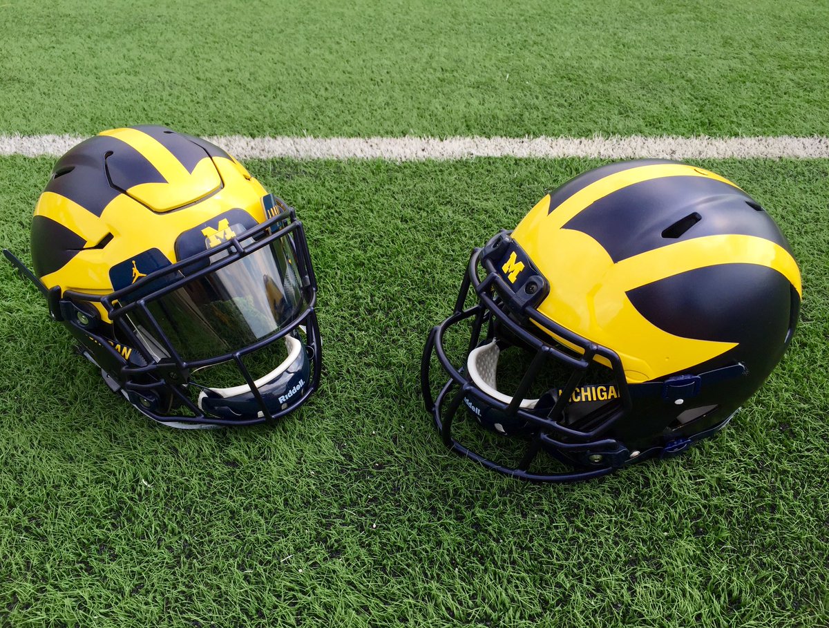
Better look at the matte helmets


August 3rd, 2016 at 11:24 AM ^
Neither are matte.
August 3rd, 2016 at 12:24 PM ^
Sent from MGoBlog HD for iPhone & iPad
August 13th, 2016 at 11:55 AM ^
August 3rd, 2016 at 11:23 AM ^
We need more uniform threads!
WD, can you please start one to get peoples' opinions on the blue chin straps?
I'd do it, but I find I have too much self-respect. :(
August 3rd, 2016 at 11:25 AM ^
I feel we haven't talked enough about socks.
August 3rd, 2016 at 11:30 AM ^
There was some back and forth yesterday about Michigan not going to black cleats and black socks.
But what color will the ankle tape be?
August 3rd, 2016 at 11:52 AM ^
Sent from MGoBlog HD for iPhone & iPad
August 3rd, 2016 at 12:46 PM ^
Sent from MGoBlog HD for iPhone & iPad
Ankle taping actually crossed my mind the other day. The Nike contract prohibits taping over the logo (unless medically necessary), and the location of the jumpman on the shoe is right at the ankle. Many players tape their ankles over the shoe and it has nothing to do with looks. Well, I guess that's my answer--it would be medically necessary in that regard and allowable. Anyway, I'm curious to find out how they'll tape over shoe and comply with the contract.
August 3rd, 2016 at 11:47 AM ^
Exactly. Jumpman socks now! And sleeves!
August 3rd, 2016 at 12:28 PM ^
August 3rd, 2016 at 11:37 AM ^
I totally agree with you about the apparel threads. But since you brought it up, the change in chinstrap color really flew under the radar, yet marks a rather signficant change (for the better).
August 3rd, 2016 at 11:46 AM ^
August 3rd, 2016 at 11:52 AM ^
I was undecided on the helmets because of the dark lighting in the photos that came out yesterday. But after seeing these photos, I'm sold. Nice job, Nike.
Or did you photoshop the hat and scarf onto Bill Bonds?
August 3rd, 2016 at 11:52 AM ^
These uniforms are great. That satin finish on those helmets. Wow.
August 3rd, 2016 at 11:55 AM ^
August 3rd, 2016 at 11:59 AM ^
At the end of the day, it's Michigan and it's hot. GO BLUE!!
August 3rd, 2016 at 12:09 PM ^
Sent from MGoBlog HD for iPhone & iPad
August 3rd, 2016 at 12:12 PM ^
Sent from MGoBlog HD for iPhone & iPad
August 3rd, 2016 at 12:28 PM ^
Sent from MGoBlog HD for iPhone & iPad
August 3rd, 2016 at 12:40 PM ^
That's just for the visor. All visors have those. We had adidas ones last year.
Sent from MGoBlog HD for iPhone & iPad
Stephen who would post a mushroom cloud every other day on this site.
August 3rd, 2016 at 12:42 PM ^
Sent from MGoBlog HD for iPhone & iPad
It darkens the entire helmet that much more.
Great decision.
It darkens the entire helmet that much more.
Great decision.
I agree with this. My hope is they either ditch the stickers entirely, or if they keep them, cut them down to about 1/2 or 1/3 the size and be much more stingy in giving them out. A dozen around just the base of the helmet at the end of the season is fine, but I don't want to see those winged helmets covered up. The buckeyes are different becasue they've got pretty much plain vanilla helmets to begin with, but our helmet is iconic.
Sent from MGoBlog HD for iPhone & iPad
That's bone. And the lettering is something called Sillian Rail.
That's nothing, Eggshell with Romalian type...
Those are the clips for the visor.
November 6th, 2018 at 7:52 PM ^
Ah yes, that informative helpful content from wd. It's been a while. Look at the helmet. Dont they look cool? Next up from the incredible world of wd SuperGuides, the history of UM athletic supporters and his personal analysis of the fit and and smell of supporters used by the current roster both before and after games. Stay tuned!!!