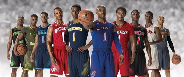
New Hoops Unis

What do we all think? I'm personally a fan.

Edit: Here is a full version in Blue
it is Sic 'Em Bears which is their slogan trademark.

Sic semper bearannis.
Meh on Wolverines, like it otherwise. I was so scared when I clicked this thread. Could be sooo much worse. Mostly relieved that there aren't sleeves. I mean just look at Baylor's (not for too long though).
a high school uni

Unpopular opinion here, but I really loved this template. I liked the simplicity, and the shorts were pretty great. A downgrade from what came before, sure, but in the moment, it was pretty decent.
You are correct - that is an unpopular opinion.
I agree, Bando- I kind of liked them. Maybe it's nostalgia from seeing Jamal Crawford wearing the jersey (it looked great on him with the #1 and his tall, thin frame...sorry, Oscar season must have me in fashion model), but I liked the concept as well. Perhaps change the trim around the armholes and neckline to something less wide/solid, but yeah, I liked it as well. It looked the best on U of M. They did it with UNC's jersey's and it didn't look right at all, but it sort of works with the block M.
Wolverines is too long for the front of a jersey. Otherwise I think they look pretty cool.
Indiana is so bad they can't even make the picture. Even Notre Dame got into the picture.
That or maybe they didn't agree to the alternates. I like imagining a world of the first scenario though.
You are right.
It's official per MGoBlue statement: http://www.mgoblue.com/sports/m-baskbl/spec-rel/030614aac.html
My sheep self will buy buy buy away.
The last time I counted, which was in July, I had over 50 shirts/jerseys. That number is not including shorts, pants, the football receiver glove collection and the football/basketball socks.
That number has definitely increased since I buy something at every single Michigan game I go to.
What I can definitely tell you is that-
- I have the authentic home and road football jerseys worn from 2008-2011
- A premier football road jersey and soon a home one
- Each of the alternate jerseys from football.
- six basketball jerseys 2010-11 - 2011-12 Home & Road and the current Maize jersey along with the throwback Glen Rice road jersey and the classic Home Cazzie Russel jerseys.
- 3 hockey jerseys. Two of which are going to be officially retired from wearing during games to the, well, not good results they've had.
- The Maize baseball jersey.
Can't wait to go to the athletic department garage sale this summer.
People look at me like I'm from Mars. I know I'm crazy.
Do you sling rock or something?
Shorts should have a block M and some color or design.
I respect you, man, but you are wrong on both an aesthetic and philosophical level here. These shorts (below) are perfect.
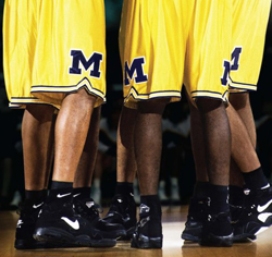
Give me the Fab Five maize, the '89 Championsiop blue, and the Cazzie white and we never have to think about it again.
^Love These!^
The block M on the Fab Five unis was significantly bigger, which in my mind helps overcome the lack of design on the rest of the garment. I do, however, prefer some contrast color. The old/current unis, in my opinion, balance things quite well.
And the new tourney ones are ok.
The Brand
The Brand
adidas
adidas
adidas
More "template" uniforms. It's the worst trend in collegiate sports. Letting the manufacturers dictate template designs, into which they force schools under contract.
Indiana, I presume, said "No" to this. They have a classic, iconic basketball uniform that they regard as emblematic of the brand of Indiana basketball. I am guessing that they have decided not to compormise it.
No To "Wolverines." Are we "the anti-mascot school"? I kind of hope so.
It seems to me that the most handsome and most-admired basketball uniforms in recent years were the designs from last year where someone had the brilliant idea to go back to Michigan's basic, simple, classic design from the 1960's and early 1970's:

These are the jerseys they need to go to. I would "buy" one of those. not the cookie cutter crap adidas is putting out there. Once again Dave Brandon is failing to get it right.
Martin signed the Addidas contract. Never let facts get in the way of a good narrative.
I dont care about adidas or nike. It is just that the basketball jerseys could be nicer. And he has the power to change that. Nothing else.
You think Dave Brandon is picking out uniforms?
If he is...he should be fired.
Can't stand YOU PEOPLE who want to use any excuse possible to bag on Brandon and have no idea what you're talking about. As clarified in the next post about Martin signing the contract.
The Brandon stuff is old. It's like the joke about James Harrison getting fined every time someone in the NFL does something wrong.
Sooo can these still be bought?
Michigan
Kinda plain, actually, but perhaps strong in understatement.
I am thrilled with the current state of the basketball program, and I want to start by saying that. I do not like the yellow flecking on the jerseys or the shorts, though. Michigan already has at least two tremendous sets of designs to work with: the uniforms worn in the Cazzie Russel era and the ones worn by the Fab Five. The 1989 uniforms aren't bad either. Stick with one of those. We don't need this new-fangled chicanery...And what's with Roosevelt trying to drive up wheat prices? What business of that is his?

Want to find ways to upvote this the way ole' Franklin is stacking the Supreme Court.
/throwbackthursday
1966 Home Whites. Perfection personified

why Wolverines on the front? seriously, the design is decent compared to the other shit Adidas has come out with...but why is Michigan taken off the front? its a dumb, pointless switch...why is it so hard to just leave some things alone?


They are the same as all the other schools. Make something original just for M and I'll be more on board for that. I do like the jersey tho.
Well, at least they got the M on the shorts right. So there's that. But the TNG Q-esque vector shit on the shoulders and shorts... Yeesh. And, really not on board with Wolverines instead of Michigan.
Really, Adidas is just so bad at this stuff. I know, Nike isn't much better, but really, remember when we wore uniforms for Michigan, and not as vehicles for a shoe company's across-the-brand marketing ideas?
That was before the Marketing Virus took over everything in sports...In a couple of years, we will on a daily basis hear things like "Today's love and support is brought to you by your wife and her corporate partner, Proctor & Gamble."
I just don't get the mindset of a designer who says "I know! Let's put this cool raised geometric vector design on the shoulders!" Or for last year's experiment, "I wonder if I could find a way to incorporate the old Fruit Stripe Gum animal print somewhere... Eureka!"
"MICHIGAN" belongs on the front. "WOLVERINES" is too long and makes the gear look about as distinctive as the average high school uniform.
I like Michigan on the jersey, not Wolverines. With all of the attention to the block "M", i'm surprised that something that didn't have the "M" in the name would be an option.