New 2015 Road jerseys: no more piping, trim!

HARBAUGH BRINGING BACK THE OLD PLAIN ROAD JERSEYS
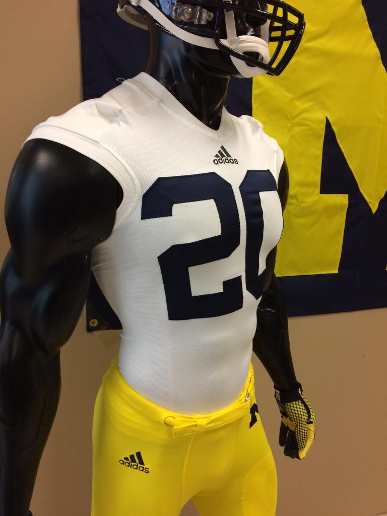
edit: from Brandon Brown of Rivals
Clean, white look on the away jerseys. pic.twitter.com/aqhqGNVaa8
— Brandon Brown (@BSB_Wolverine) May 27, 2015
Sent from MGoBlog HD for iPhone & iPad
awesome!
That does look like a smedium cutoff t shirt though. Just win guys.
edit with helmet on top.

revised

Wouldn't that be confusing?
Seriously, have you seen Minnesota's effort to wear all gold? Do. Not. Want.
And they've had plenty of famous ones over the years...
Sent from MGoBlog HD for iPhone & iPad
What the hell, dude.
Plain white jersey. Large, disfigured blue numbers. Large coporate logo. Large conference logo.
No traditional connection, except for maybe the wool jerseys in the early years of the 1900's.
That's what the fanbase wants, got it.
Sent from MGoBlog HD for iPhone & iPad
Sent from MGoBlog HD for iPhone & iPad
Give me that and it would be PERFECT.
By itself it's going to look like Penn St.
My first thought was to outline the numbers in maize too.
But then again, that might look a bit like Notre Dame.
Sent from MGoBlog HD for iPhone & iPad
This isn't understated elegance. It's a white t-shirt with an iron-on number on the front.
Some guy on Twitter that goes by MGoFish thinks the Harbaugh-era sleeve stripes are coming back too, which also look good.
I'd vote for the Plain White T's, but either option is better than that god forsaken piping.
Sent from MGoBlog HD for iPhone & iPad
Love this jersey. Maybe I would be ok with staying with Adidas after all. No it doesn't look anything like PSU. I don't see PSU taking the field with maize pants and a winged helmet.
This just proved this is NOT a Nike v Adidas thing. It's a school thing. The SCHOOL approves the design. Nike/Adidas/UA, etc just make it!
The maize outlining on the numbers looks absolutely terrible. I get why people don't want it to look like Penn State, but that's not the way to do it. The BIG logo in maize definitely adds something to the jersey, but the maize outline looks horrid. Like others have said, PSU isn't running out in maize pants and the winged helmet. People will know who is who.
Sent from MGoBlog HD for iPhone & iPad
Is everyone really cheering because they got rid of two maize lines around the shoulders? Is it that big of a deal?
No capes
I like the gloves.
Not gonna pass judgment until something more official comes out, but some basic principles here:
No piping is always better than piping.
Maize outlines on the numbers look way better than no maize outlines on the numbers.
The best away jerseys ever were the Tom Brady-era ones. God those were sharp.
If the tradeoff for losing all the godawful stupid piping is having no maize outlines on the numbers, I'll take it all day every day.
but there's no way that's the actual game jersey—there isn't enough nearly enough material at the shoulders to fit over the pads. This is basically a sleeveless workout shirt.
The materials these jerseys are made out of nowadays are super stretchy. Basically, the cut sleeve like these all bunch up like that, especially without numbers to give the material a little support. Furthermore, that mannequin's shoulders are extremely huge.
Here is a tech fit jersey with and without pads

