
The Basketball Graphics and You

Welcome to basketball season. As with football, I've been slowly evolving my basketball graphics for previews and the like. They finally reached something close to a final form last season. They're intended to make it easy to see basketball things that will be relevant to basketball discussions each week. Most of you intuit most of what's on there, but since they're really for people like me who need to see it to understand it, I figured we could use a tutorial to refer back to later.

The point of the graphic is to help people like, uh, me, who haven't been steeped that deep in basketball catch up. It has rankings, ratings, stats, archetypes, relative usage, shot charts, and a way to gauge how insane the coach is. You're supposed to be able to see at a glance what kinds of players are out there, how they fit together, and what to watch for on the court.
[After THE JUMP: what it all means]
ARCHETYPES

If you read the bar charts above, you see #24 is a sharpshooter who also gets to the rim and draws fouls. #42 is a talented freshman who gets to the rim and draws a lot of fouls but doesn't take nor make many threes. #4 is a solid shooter from range and does nothing else. We run into players like these three a lot. So we have symbols that denote their archetypes.
After building a dizzying glossary of badges, the graphical short hands went through a major revision last year to make these simpler and adhere to certain types of players that teams build out of.
GUARDS & WINGS
![]() = Just a Shooter™. Spacing is a huge deal in modern basketball, so if you're filling out your roster and don't have enough wings, the cheapest and most effective type of player you can get is a person who can shoot 40% from three. That guy will sit outside the arc for the most part, occupying one defender because you can't leave him alone out there, and thus creating more space for the rest of your guys to operate. On defense he's just a long guy who guards your shooter. We use this with some degree of contempt because Just-a-Shooters are cheap and ubiquitous.
= Just a Shooter™. Spacing is a huge deal in modern basketball, so if you're filling out your roster and don't have enough wings, the cheapest and most effective type of player you can get is a person who can shoot 40% from three. That guy will sit outside the arc for the most part, occupying one defender because you can't leave him alone out there, and thus creating more space for the rest of your guys to operate. On defense he's just a long guy who guards your shooter. We use this with some degree of contempt because Just-a-Shooters are cheap and ubiquitous.
![]() = Not Just a Shooter™. Invented because this is what announcers would reliably use to describe Stauskas before he was a bona fide star. A NJAS is a volume outside shooter foremost, but also creates for himself and/or teammates, drives open-enough lanes, draws fouls, and/or is an important defensive player. This is said with no contempt, except maybe announcers who are surprised when the guy isn't a contemptuous Just a Shooter™.
= Not Just a Shooter™. Invented because this is what announcers would reliably use to describe Stauskas before he was a bona fide star. A NJAS is a volume outside shooter foremost, but also creates for himself and/or teammates, drives open-enough lanes, draws fouls, and/or is an important defensive player. This is said with no contempt, except maybe announcers who are surprised when the guy isn't a contemptuous Just a Shooter™.
![]() = Maestro. This is usually a point guard but doesn't have to be (e.g. former Wisconsin C Ethan Happ ran that offense through the post). This guy is conducting the offense, dishing out many assists, creating many opportunities, and taking a fair number of shots—unassisted—himself. One of the hallmarks of a maestro is the other guys on his team have very high rates of assisted buckets. Maestros have high assist rates, relatively low turnover rates, and are often surrounded by Just-a-Shooters. You also have to earn this--a PG who isn't efficient is merely a player--though we make exceptions when we spot a savant surrounded by gumps (see: Mike Smith's former Columbia teammates).
= Maestro. This is usually a point guard but doesn't have to be (e.g. former Wisconsin C Ethan Happ ran that offense through the post). This guy is conducting the offense, dishing out many assists, creating many opportunities, and taking a fair number of shots—unassisted—himself. One of the hallmarks of a maestro is the other guys on his team have very high rates of assisted buckets. Maestros have high assist rates, relatively low turnover rates, and are often surrounded by Just-a-Shooters. You also have to earn this--a PG who isn't efficient is merely a player--though we make exceptions when we spot a savant surrounded by gumps (see: Mike Smith's former Columbia teammates).
![]() = Chucker. The thing about a chucker isn't necessarily that he doesn't make his shots; it's that he doesn't care. Chuckers take contested shots and pull-up threes with abandon. A chucker may occasionally venture to the rim, but will generate far more three-point and two-point attempts, unassisted. Allen Iverson is a Chucker, but the real chuckers are the guys who think they're Allen Iverson.
= Chucker. The thing about a chucker isn't necessarily that he doesn't make his shots; it's that he doesn't care. Chuckers take contested shots and pull-up threes with abandon. A chucker may occasionally venture to the rim, but will generate far more three-point and two-point attempts, unassisted. Allen Iverson is a Chucker, but the real chuckers are the guys who think they're Allen Iverson.

![]() = Slasher. This is the opposite of a chucker. The slasher looks to get into the lane. He's often highly athletic, an incredible dribbler, a solid finisher, and well-practiced at drawing contact. They're often ball hogs too, since if you dish as well as you drive you're probably a Maestro. Slashers will have a high number of shots at the rim and a surprisingly high number of 2PJs, because you have to be right up to the rim to get credited with a layup.
= Slasher. This is the opposite of a chucker. The slasher looks to get into the lane. He's often highly athletic, an incredible dribbler, a solid finisher, and well-practiced at drawing contact. They're often ball hogs too, since if you dish as well as you drive you're probably a Maestro. Slashers will have a high number of shots at the rim and a surprisingly high number of 2PJs, because you have to be right up to the rim to get credited with a layup.
![]() = Gritty Gritstein. That's a picture of a lunch pail. A Gritstein (portmanteau of grit and David Eckstein) elicits a ton of love from announcers because he's got little to no scoring ability but plays hard, defends well for his size and athleticism, does the little things…you get it. Often has the same last name of the coach…or the announcer. Yes, it's a disparagement. The original guy to get this was Brad Davison the dirty Wisconsin player who puts his foot under shooters to break their ankles and likes to thump guys in the jiggly bits when the refs aren't looking.
= Gritty Gritstein. That's a picture of a lunch pail. A Gritstein (portmanteau of grit and David Eckstein) elicits a ton of love from announcers because he's got little to no scoring ability but plays hard, defends well for his size and athleticism, does the little things…you get it. Often has the same last name of the coach…or the announcer. Yes, it's a disparagement. The original guy to get this was Brad Davison the dirty Wisconsin player who puts his foot under shooters to break their ankles and likes to thump guys in the jiggly bits when the refs aren't looking.
BIGS
![]() = Traditional. These are the centers (and occasionally power forwards) who live in the paint with their backs to the basket. They rarely if ever will shoot threes. But you don't just get this designation for being a lug. These guys have developed post moves, will draw attention when they get the ball, and can kick it back out to generate chances for their teammates.
= Traditional. These are the centers (and occasionally power forwards) who live in the paint with their backs to the basket. They rarely if ever will shoot threes. But you don't just get this designation for being a lug. These guys have developed post moves, will draw attention when they get the ball, and can kick it back out to generate chances for their teammates.
![]() = Stretch. This is a true big (6'10" or at least with arms long enough to be basically that) with a sweet shot. He doesn't have to be hitting 40% on his threes, but neither is he just getting the rare one off when they leave him alone out there. A stretch big changes the makeup of your defense because you can't have anyone sitting inside to stop penetration. Moe Wagner or Pittsnoggle are classic Stretch bigs. We also will extend the gumby to players who are legitimately center-sized but playing wing positions, e.g. Franz Wagner.
= Stretch. This is a true big (6'10" or at least with arms long enough to be basically that) with a sweet shot. He doesn't have to be hitting 40% on his threes, but neither is he just getting the rare one off when they leave him alone out there. A stretch big changes the makeup of your defense because you can't have anyone sitting inside to stop penetration. Moe Wagner or Pittsnoggle are classic Stretch bigs. We also will extend the gumby to players who are legitimately center-sized but playing wing positions, e.g. Franz Wagner.
![]() = Switchable. If the stretch big is a mismatch, the switch big is the answer to the mismatch. He's smaller—maybe 6'7" or 6'8"—but because of that he can guard almost anybody on defense. The versatility he provides nerfs pick and roll games. It's not necessary for the badge (former MSU C Xavier Tillman is a case example of a switcher) to be a shooter, but many are, which gives you a stretch big's spacing, albeit from a guy that the opponent's 6'7" wings can check.
= Switchable. If the stretch big is a mismatch, the switch big is the answer to the mismatch. He's smaller—maybe 6'7" or 6'8"—but because of that he can guard almost anybody on defense. The versatility he provides nerfs pick and roll games. It's not necessary for the badge (former MSU C Xavier Tillman is a case example of a switcher) to be a shooter, but many are, which gives you a stretch big's spacing, albeit from a guy that the opponent's 6'7" wings can check.
GENERAL BADGES
We will give these out to anybody—they're not archetypes but recognition of special skills, or special other things. Some of them are rare so they're not always in the Key.
![]() = All-America or Kenpom Top 10 or Top 5 Draft Picks. The crown is for when there's a true national name in the lineup. The game plan starts and ends with what you do about him. Or in spite of.
= All-America or Kenpom Top 10 or Top 5 Draft Picks. The crown is for when there's a true national name in the lineup. The game plan starts and ends with what you do about him. Or in spite of.
![]() = Defender. The kind of guy we'd expect to be on the Big Ten 1st or 2nd team all-defensive team in a normal year. Defenders are judged positionally. They're expected to alter the way you play offense.
= Defender. The kind of guy we'd expect to be on the Big Ten 1st or 2nd team all-defensive team in a normal year. Defenders are judged positionally. They're expected to alter the way you play offense.
![]() = Error Prone. We've largely replaced this with cyan but we'll still trot it out for a guy who seems particularly likely to dribble it off his own foot.
= Error Prone. We've largely replaced this with cyan but we'll still trot it out for a guy who seems particularly likely to dribble it off his own foot.
![]() = Transition Speedster. This comes out when we play Illinois' Ayo Dosunmu. It's a guy who's both looking to catch you in transition and is so much faster that he'll get a few buckets a game just from going by you before you're set.
= Transition Speedster. This comes out when we play Illinois' Ayo Dosunmu. It's a guy who's both looking to catch you in transition and is so much faster that he'll get a few buckets a game just from going by you before you're set.
![]() = Black Hole (of usage). I forget to bring this out but it's for especial ball-hogs.
= Black Hole (of usage). I forget to bring this out but it's for especial ball-hogs.
![]() = Dangerman.
= Dangerman.
TEAM STATS

These are Kenpom stats, specifically their percent rank among tourney teams since 2008. Early in the season most teams are less offensively efficient since they gain that by playing together. Tempo is currently matched against other teams this season, however. I include these switches so you can see what kind of basketball a team plays. Do they turn the ball over a lot? Do they shoot well? Do they go for threes or twos (3PA/FGA). Do they defend the perimeter or force a lot of threes? Do they block shots, steal, foul? Are they tall, experienced, lean on their starters?, etc.
PLAYER STATS

All but one of these are Kenpom stats. ORtg is Pomeroy's overall offensive rating, taking into account scoring, assists, turnovers, and offensive boards, on a 50 to 150 scale, where 100 is neutral and you'd like your scorers to all be over 110.
Poss, also often called "usage", is the percent of a team's possessions that end with him, either with a shot that isn't rebounded by a teammate or a turnover. A guy at 10% is a role player, 20% is an important part of the offense, 30% is ball-dominant (Trey Burke in 2013). Usage often has an inverse correlation with ORtg, as we'll discuss in a moment.
ARate (assist rate) is the percentage of the teams' total assists a player accounts for while he's on the floor. It's therefore very team-dependent.
TORate (turnover rate) is the likelihood one of his possessions is a turnover.
And Stl Rt (Steal Rate) is the percent of opponent possessions he generates a steal. For bigs instead of assists/turnovers/steals I will show offensive/defensive rebounding and block rate.

The last stat is %PAst (percent of points that were assisted), which is my own stat. It tells you how much of their scoring they're generating themselves, more or less (free throws aren't assisted but often the shot that led to a foul was).
How to read correlated stats like ORtg and Usage: You judge many of these against each other because the higher your usage the more defensive attention you're drawing. Let's compare our two starting guards.

Eli's at an average offensive rating on low usage, with a decent assist rate but a high turnover rate, and over half of his points assisted. Mike Smith is the far superior offensive player: his ORtg is very good on higher (though still relatively low) usage. His assists/turnovers ratio is the reverse of Eli's. And Smith is generating over 75% of his own points, meaning he's the offensive initiator when he's on the court. On the other hand Eli is generating one more steal every 100 possessions. When you mentall combine ORtg and Usage you get a strong mental image of what to expect from the player on offense. Let's try it with a historic Michigan guard:

That's Darius Morris in 2011. His 109 ORtg is "just decent" you think, but then you see his 29% Usage and Whoa--he's still scoring at an efficient rate despite sucking up a lot of defensive material. Then you look at the turnover rate next to Usage and assist rate, and can see how good Morris was at avoiding turnovers despite that attention, and how important he was to setting up the rest of the offense. That's also in context of his low %PAst: Morris is creating 89% of his buckets as well as 44% of the other guys' assisted buckets, all while being the #1 guy defenses are focused on.
THE SHOOTING BAR GRAPHS

These are the types of shots the guy takes along with his success rate. From the top, it's threes, two-point jumpers, anything at the rim, and free throws, with makes shown then misses. I’ve removed the reference marks so it doesn’t get cluttered, but what they literally represent are field goal attempts by type per 30 minutes. Here’s what they look like before I place them.

The x-axis for the starting five remains locked at a max of 7* so the graphs remain to scale. The bench bars are squished but I try to size them to suggest how shooty a guy is.
*(to accommodate the 6.9 two-point jumpers per 30 taken by Purdue C Trevion Williams)
This can tell you quickly how much of a perimeter threat each guy is. I include the 3-point percentage (or if it's under ten the actual attempts) because this is a very important part of modern basketball. Generally on a good offensive team someone shooting over 30% from three has to be guarded at the perimeter, which opens up space for drives on the interior. More credible outside threats in general will stretch a defense and thus make everyone's offense better.
This also tells you a lot about what kind of offensive player you're looking at. Let's examine those three archetypical Buckeyes from last year again:

Wesson and Ahrens were both great (43% and 41%) three-point shooters who took more of those than anything. But Wesson also took two-pointers, went to the rim a fair amount, and generated free throws. Look down and you see 59% of his points were assisted. That's a wing who's doing way more than just sitting out on the perimeter to create space. Justin Ahrens on the other hand almost never shot anything but catch-and-shoot threes. Then you have EJ Liddell, who has a ton of shots at the rim and a ton of fouls, plus a good many 2PJs and a few three-point attempts that mostly missed. When Liddell is on the court, there's less space in the paint to operate because his defender doesn't have to be outside. But he's a talented athlete who's going to blow by people, or pull up and shoot.
PRPG!

The boxes show Bart Torvik’s all-encompassing PORPAGATU! stat, which is supposed to be one of those modern points over replacement stats that estimate player efficiency. It literally stands for Points Over Replacement Per Adjusted Game At That Usage. These were added this year after repeated requests, but I still don’t know if I want to keep them because it’s too easy to use an imperfect stat as the overall value of a player when the rest of the stats around them say important things you might then ignore.
The boxes are shaded green (good) to red (bad) with a mid (white) point of +2.0, which is a decent Big Ten starter.
THE CIRCLES

These contain a ton of information, and are meant to give you a team-wide overview of the players on the court. The number inside is of course his jersey #. If it's bold the guy's a returning starter.
The upside-down stars indicate top-50 recruits—that number is the cutoff because it's roughly how many guys per class will be NBA draftees.
The two colors are a circle graph depicting what % of total team minutes they've been on the court. [UPDATE 1/15: These are now calculated to only represent the games they’ve played in].
Cyan is another tradition borrowed from the football graphics. If the off-color is cyan he's a defensive liability. If the on-color is cyan that means offensive liability.
Finally I use the thickness to show usage. The idea is you can focus just on the circles to get an idea of who's on the court and when. Here's a balanced offensive team that brings its star center and a talented wing off the bench over half the time.

This one has a ball-dominant center, a heavy guard rotation, and major defensive issues in the post.

BASICS BOX & COACH

These are pretty self-explanatory. Kenpom and Torvik are "how good are you?" rankings and NET and AP are "how worthy are you?" rankings. The coach's record is at his current school.
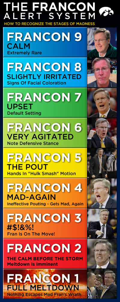
The Bo Ryan Index (origin) is the percent of photos that come up on the first page of a Google Image Search of the coach in which the coach is expressing something unpleasant to either the refs or his team. For example, Bo Ryan:
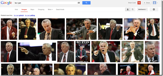
Yes, it is completely subjective. It's also perfectly scientific, and tiered.
- Normal Humans: Chris Mack: 0%, Fred Hoiberg: 0%, Juwan Howard: 4%, John Beilein: 12%, Dana Altman: 15%, Chris Holtmann: 20%, Steve Pikiell: 21%, Richard Pitino: 25%, Johnny Dawkins: 26%, Matt Painter: 27%
- Appropriately Biased: Roy Williams: 36%, Steve Prohm: 36%
- Perpetually Bothered: Greg Kampe: 50%, Greg Gard: 57%, Chris Collins: 57%, Mark Turgeon: 58%, Pat Chambers: 60%
- Would Testify Next to Rudy Giuliani at a Congressional Hearing on Blocking Foul Irregularities: Brad Underwood: 70%, Tom Izzo: 75%, Fran McCaffery: 86%, Archie Miller: 90%
THE GUYS
![]() = Nefarious Eduardo. He's scary.
= Nefarious Eduardo. He's scary.
![]() = Data. He's alright.
= Data. He's alright.
![]() = Memo. He tries.
= Memo. He tries.
![]() = Sad Josh. Very bad.
= Sad Josh. Very bad.
FAVORITE RESOURCES
Kenpom. Ken Pomeroy is the gold standard for advanced hoops stats. He has his site updated minutes after a game is over with tons of helpful information that can be gleaned from box scores. Green-shaded things (eg wins) are good, red are bad, yellow/blue are neutral personality things like tempo.
The part to pay most attention to is the roster. "ORtg" is offensive rating, a combination of offensive contributions. A 100 is average; ideally you want your guys all over 110. Three-pointers are at the right; I probably look there more than anything.
They also generate lineups based on substitution patterns and statistical profiles, however these should NOT be taken as gospel. They're auto-generated, and a guy playing the five (center) with a guard's statistical profile can sometimes wreck their accuracy.
Torvik. Nearly as useful and often better than Kenpom as a general stat palace, and you can make all of your own charts. The great thing about Torvik too is you can generate splits, e.g. against Tier 2 teams only.
Hooplens. This is where we get these on/off charts that tell you things like "Michigan is way better at everything when Dickinson is on the floor."

We will often also mention that "tomato cans have been removed" and "three-point luck" when we use these. The former is because with a click of the button you can choose which games you want included and really bad opponents will throw off your numbers. We also mention three-point luck the sample sizes get low—especially this early in the year—and you have to mentally adjust for major differences. On the other hand, it's not always separated from the player, e.g. Hunter Dickinson being on the court tends to suck defenders away from the perimeter and leads to more open shots.
The defensive on/off splits are really good for finding important defensive players, but it helps to know whom they're rotating with.
Hoop Math. These guys use play by play data instead of the box scores to produce simple tables about style of play. They're the resource for splitting up 2-point attempts into rim and 2PJs. They're the resource for how many of each type of basket were assisted. They're the resource for transition splits. They'll tell you who's scoring on putbacks, and how well. Their value is slightly diminished because they only update about once a week, often way too late for my charts, so I've had to recreate their stats myself from the play by play data to get the bar charts and %PAst.
Synergy. This is where Ace gets his shot chart graphics and pulls a lot of his advanced numbers. It's a paid service app so I don't include numbers from them on the charts, but it definitely informs many of the subjective decisions therein.
Hoop Vision Plus. This is an app not a website. It knows where the shots are coming from, and can generate cool charts.
Etc. There are a lot more we use for bracketology and scouting but these are the main sites I use to make the charts. ESPN has play-by-play data that's easy to spreadsheet. The NCAA publishes the NET ratings. Ace has other sites he uses for previews, the teams publish a bunch of ancillary information in their game notes, and then we usually use their beat writers to get a handle on the injury situation and explain substitution patterns, and with Matt from Endless Motor because he scouted a lot of these players.
December 4th, 2020 at 10:46 AM ^
This is great Seth thanks! Great to see Dickinson earning that Dangerman star.
FYI - It looks like Chaundee's Not Just a Shooter™ logo is up too high in his frame :)
December 4th, 2020 at 11:11 AM ^
Would any one else prefer the % minutes and yellow/cyan coloring to be opposite/inverted? I feel like it's more natural for me to read a circle clockwise, and the yellow/cyan sticks out more than the dark blue background, so every time I look at them I see a small yellow/cyan bar and think "oh, this person doesn't play much" and have to remind myself it's the opposite. If others are like me, I'd think the better representation would be with the colors in the same order - yellow/cyan starting from noon and going clockwise - but with the yellow/cyan representing % minutes instead of the dark blue.
December 4th, 2020 at 5:30 PM ^
This would be a large improvement in readability for me, too. I'd also use a different color for offensive vs defensive liability, so we don't have to remember which is which. (Is it just me or is there no example of what the offensive liability coloring looks like?)
December 4th, 2020 at 11:11 AM ^
I love the changes to the chart each year. It keeps getting better and better. Thank you for the effort each game.
December 4th, 2020 at 11:18 AM ^
Thanks Seth!
December 4th, 2020 at 11:23 AM ^
Lack of similar hockey graphics and representation analysis are why our team was blown out at Penn State last night.
I blame Seth and expect immediate correction and improvement by our blog staff.
#NoExcuses. #FireEveryone
December 4th, 2020 at 11:57 AM ^
Also an alternative to the Bo Ryan metric:
December 4th, 2020 at 12:10 PM ^
Right?!!?
And don't give us this 'the site is free' BS excuse, either! Give HOCKEY PROPER CREDITZ!!! FREE THE HOCKEY STATS!!!
December 4th, 2020 at 12:20 PM ^
Then I would have put a shield on Mann and how would you all feel about THAT huh?
December 4th, 2020 at 12:12 PM ^
I'm disappointed that this wasn't linked to in the Maestro section
https://www.youtube.com/watch?v=sFPtQr2h0wk
That Rodman stretch was one of the best parts of the Last Dance.
December 4th, 2020 at 12:13 PM ^
Thank you for this outstanding primer! I had figured out most of these stats and symbols, but the detailed explanations were incredibly helpful - especially for usage! That is one I never really understood, but do now. The explanation for the circles is also great, so it makes much more sense to me.
But I will concur with the other poster that talked about changing the circle colors (yellow/blue/cyan) - his idea seems to make more sense.
In any case, this was very helpful - thanks!
December 4th, 2020 at 12:20 PM ^
Thanks for this. I usually get confused by the circles because I normally read them going clockwise and as a result, I get everything backward.
December 4th, 2020 at 12:33 PM ^
Impressive. And valuable. Thanks for the tutorial.
December 4th, 2020 at 1:11 PM ^
It's time to polish off the sharpshooter bullseye for Livers...
December 4th, 2020 at 12:46 PM ^
I need help understanding the relative size of the shooting bars. I understand that each shooting bar shows the percent of each shot made.* What does the length indicate? Is it the percentage of shot type to total shots? If so, why are Isaiah Livers bars appear cumulatively larger than Austin Davis' bars?
*I assume that each shooting bar is relative, not absolute. That is, it shows the percentage as a proportion of the total bar, not on a fixed scale.
December 4th, 2020 at 1:24 PM ^
I still don't have a great method. Each unit is supposed to be a shot per total team minute but this early in the season I'm just making them legible. The charts are generated on a powerpoint that links to a spreadsheet, and on that spreadsheet I have a little tool to calculate the size to make the circles (actually the percent size of the donut hole) and the charts (in inches) based on the shooting data. 
December 4th, 2020 at 12:53 PM ^
This might be the most impressive single thing this blog has created IMO, the ability to tell me about a roster I know literally nothing about in seconds with one image is amazing. Always love seeing these before an opponent, even one I know. Keep it up.
December 5th, 2020 at 9:58 AM ^
Amen. I gotta believe some grad assistant is giving Howard this chart before each game.
December 4th, 2020 at 1:20 PM ^
When you need 3,000 words to explain a graphic, that's a sign that the graphic is probably not very good.
Less is more with these things. There's so much data about every player, and that's great! But that doesn't mean you need to tell me everything -- just tell me what I need to know and move on.
December 4th, 2020 at 1:29 PM ^
I agree to a degree. The graphic has gotten more and more involved over the past few years. I appreciate the addition of more information, but everything has the same size and prominence. I am not a basketball stathead, but I cannot accept that everything on the graphic has the same importance. For next year, Seth should look at identifying the most important statistics and increasing their prominence. For players, that's probably ORtg, usage, and archetype.
December 4th, 2020 at 1:24 PM ^
It really is an excellent chart. I do kind of miss the broom and the hammer to indicated skilled defensive and offensive rebounders, respectively, but they cluttered the chart without adding enough to justify the clutter.
On another note: this isn’t Seth’s fault, but I have an issue with KenPom’s assist, turnover and steal rates, mainly because they don’t all have a similar unit denominator. “Assist rate” is individual assists/team’s total assists during a player’s minutes on he floor. My brain then wants “turnover rate” to be individual turnovers/team’s total turnovers during a player’s minutes, because that feels logically consistent with assist rate. Instead, turnover rate is individual turnovers/individual possessions. At least steal rate somewhat follows the turnover rate logic (individual steals/opponent possessions). Does anyone else find this a bit inconvenient?
December 4th, 2020 at 2:59 PM ^
This is sweet. Had no idea how to read this thing before.
December 4th, 2020 at 5:29 PM ^
The MGoGraphics for hoops are fucking awesome.
And that's all I have to say about that.
December 4th, 2020 at 7:55 PM ^
Re: slasher. That knife icon looks more like a chopper. What about a saber or cutlass?
December 5th, 2020 at 11:52 AM ^
This is super helpful! I'm always squinting at the graphics explainer box in the previews.
December 5th, 2020 at 4:02 PM ^
Seth, these charts are great. Question, would you consider adding Torvik’s PORPAGATU! metric (which if I remember correctly, is Points Over Replacement Per Adjusted Game at the Usage (!))? This is usually the stat I follow leading up to the game so that I know which opposing players I should be focusing on specifically while watching them on offense. Also goes hand in hand with your mention that there’s an inverse correlation with ORtng and Usage. Thanks.
December 6th, 2020 at 10:17 PM ^
This shit's why I love this place. Thanks Seth.
Comments