Welcome To The Successories Conference


aaargh unnecessary comma
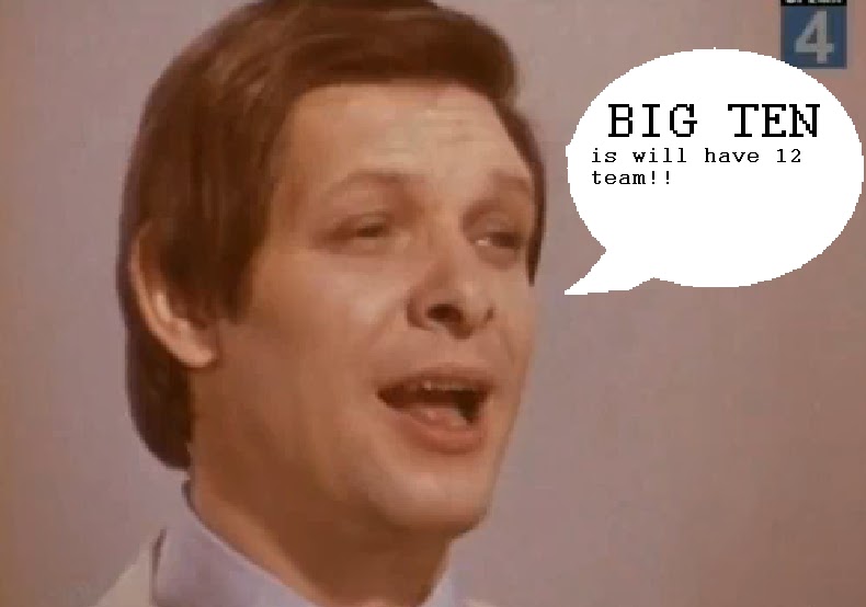
When Twitter blew up at noon I figured something inane involving Jim Delany had just happened—this is my default assumption whenever Twitter blows up and has always been right, even when Michael Jackson died—and good lord, inane doesn't even begin to cover it. You know this by now but to remind you that the people in charge of marketing the Big Ten are either very stupid or think you are very stupid, the Big Ten Divisions are called "Legends" and "Leaders."
So. A group of people responsible for turning the Big Ten Network into a spigot of filthy lucre so gushing it can afford to employ Chris Martin is also responsible for making the Big Ten the Successories Conference. They've created division names that signify nothing about the teams inside of them—the only way I can remember that Michigan is in the "Legends" division is that "Leaders" is part of the friggin' fight song and we're not in that division. Their inane names don't just start with the same letter, they start with the same two letters. They are unusable.
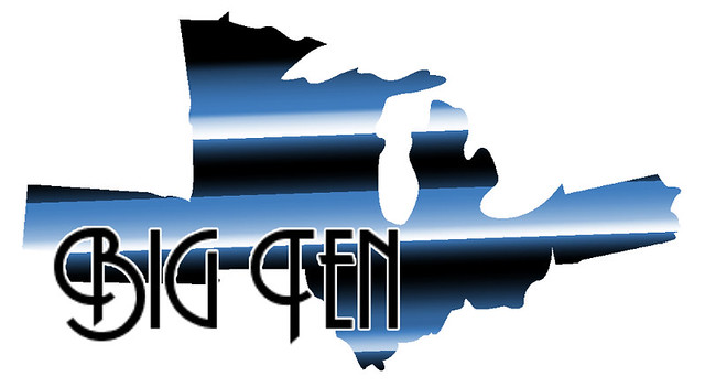
And they've done this with 15 minutes in photoshop:

Note the use of negative space. Also note how stupid it looks.
By comparison, the new Pac-10 logo would look badass on any soccer shirt in the world:

How can the same group of people responsible for creating the BTN be responsible for this? Obviously the visionary bits of the BTN arrangement come from Fox, with Delany and company the lucky nomads who parked their camels in the right bit of desert and now get to call themselves an emirate.
Policy
These division names do not exist. I'm not using them. Michigan is in the West. Ohio State is in the East. Wisconsin has to deal. It is immediately obvious which teams are in the West—the ones mostly in the west. Michigan can be Champions of the West, and no one has to think about how leadership is more about character than authority.
Can we make this a blogosphere-wide insurrection? Please? Everyone just use "East" and "West."
Remember when you'd go in your room and imagine that instead of a broken down tricycle you had a flying unicorn that could take you away from mommy and daddy's screaming? Yeah, this will be like that.
BONUS: someone on the twitters said "I'm pretty sure an ordinary @MGoBlog thread could have produced better logo options," which is true. So do it either in the comments or by email and I'll pull up the best five and we can vote on the Unofficial Big Ten Logo; I hope I can work out a deal with the winner so we can offer it to the conference for free, if only to shame them.
December 13th, 2010 at 2:49 PM ^
I wasn't against divisions from the beginning but the names are stupid....email the Big 10?
December 13th, 2010 at 4:20 PM ^
Interesting that their website has no comments section or "Contact Us" link. Maybe I missed it with that strange logo clouding my eyes.
December 13th, 2010 at 2:51 PM ^
Truly pitiful. The logo sucks, the names of the divisions suck.
<br>
<br>How bout the Yakety and Sax Divisions?
December 13th, 2010 at 2:54 PM ^
yes, i spent all of five minutes on this monstrosity...

December 13th, 2010 at 4:24 PM ^
I honestly like this better
December 13th, 2010 at 2:55 PM ^
I think the best logo would have been using the current Big Ten logo (with the 11 between the T) but instead of "11" make the roman numerals "II" between the T. Therefore, you have the big TEN included, plus the II for the 2 additional teams, in which you get 12.
December 13th, 2010 at 2:58 PM ^
there would be no math.
December 13th, 2010 at 2:55 PM ^
How could they possibly miss the opportunity for the Pryor-Sheridan QB of the Year trophy?
THIS WAS IT!!!1!!
December 13th, 2010 at 3:01 PM ^
Looks sloppy and lame.
December 13th, 2010 at 2:55 PM ^
...something with a more Soviet flare?


December 13th, 2010 at 3:22 PM ^
The second one is pretty damn good.


December 13th, 2010 at 5:00 PM ^
you totally pwned Pentagram with this. Nice work


December 13th, 2010 at 3:22 PM ^
But I think the other conference members might be jealous.


December 13th, 2010 at 6:42 PM ^
I like it.
December 13th, 2010 at 8:31 PM ^
If you add some dreadlocks to Wolverine.
December 13th, 2010 at 9:07 PM ^
A guy with hair like this-
Has never worn dreadlocks.
To make it up to you, I'd post Erin Andrews with dreads...but she has boobs.
http://2.bp.blogspot.com/_DNWziKTu2TU/TIgyx3ucavI/AAAAAAAABOQ/kGn-qH3db…
December 13th, 2010 at 2:59 PM ^
You all do realize that Delany is going to make all 12 teams paint that logo on their football field next season. Ohio State and Michigan had managed to hold fast against that tide, but you know it's coming.
December 13th, 2010 at 3:03 PM ^
This sucks
December 13th, 2010 at 5:22 PM ^
We have to paint that baby blue piece of crap on our field? Can we at least paint it in Michigan colors?
December 13th, 2010 at 3:03 PM ^
This announcement was thoroughly underwhelming. Maybe we're just punking Nebraska....please?
December 13th, 2010 at 3:05 PM ^
Logo sucks; CCHA logo is way better. Choosing colors that are NOT used by any of the schools is a must, so that doesn't leave much to choose from. However, they could have used two distinct colors and named each division after one of them. Not that this is the greatest idea, but off the top of my head they could have used teal and wheat, which can represent the water of the great lakes and midwestern agriculture. That's kind of what the PAC 10 did with the stylized wave/mountain motif...it speaks to the geographic region.
However, the award names are actually criminal. There are NO trophies named after the winningest and most innovative coach of all time, Yost. Championship trophy should be Yost-Stagg, as that was the big rivalry back at the beginning of the conference. Paterno's name should be nowhere...how many BIG 10 championships did he win compared to so many others? A travesty, I tell you.
December 13th, 2010 at 11:17 PM ^
teal and wheat, which can represent the water of the great lakes and midwestern agriculture.
So... sort of like Blue and Maize?
December 13th, 2010 at 3:05 PM ^
I don't really care about the logo (who buys conference-logo merchandise?), but "Leaders" and "Legends"? Ugh. Those names will be mocked forever, and rightly so. They won't last.
December 13th, 2010 at 3:12 PM ^
All will hopefuly be re done soon.
December 13th, 2010 at 4:09 PM ^
Don't get your hopes up.
December 13th, 2010 at 5:24 PM ^
I wouldn't rule it out. If the reception for them is terrible, why would they want to keep them?
December 13th, 2010 at 3:07 PM ^
Kind of a play off of the "black and blue" division title the region gets for the NFL. It's film noir styling - black and blue for the shades and blue lenses they use, and striped like the "through the blinds" lighting effects of the genre.
The Dakotas leave room for a championship logo or a year or whatever you want to add to the logo.
Click for larger size.
December 13th, 2010 at 3:10 PM ^
This is pretty awesome. Is it based on something?
December 13th, 2010 at 3:12 PM ^
A map?
December 13th, 2010 at 3:37 PM ^
It looks like something out of some movie or something
December 13th, 2010 at 3:54 PM ^
I figured. I just couldn't resist the opportunity. All in good fun. I hope you don't mind. :)
December 13th, 2010 at 4:34 PM ^
The remark was witty. And I posbanged it.
December 13th, 2010 at 3:15 PM ^
But it feels like we should be selling cars in the 50s with it....

December 13th, 2010 at 3:33 PM ^
Get Jean-Paul Belmondo to drive it and that's exactly the concept I was going for. Classic.
December 13th, 2010 at 7:44 PM ^
My computer doesn't show the image, just a blank square with one of those pesky red x's in a box in the top lefthand corner. When I click it, I get "URL not found."
EDIT: Whoever negged me must have fixed the problem. When I came back Misopogon's design was there in all its beauty. Excellent.

December 13th, 2010 at 4:47 PM ^
And you've got yourself a winner! Oh, and this is still better than the crap they came out with today.
December 13th, 2010 at 7:04 PM ^
The Big 10^12 is going to require a hell of a lot of new teams...
December 13th, 2010 at 3:10 PM ^
...that one of the most entertaining threads i have read on this great blog had to be about this horrific new logo and divisions setup (i always enjoy reading the blog, but this one is above and beyond in terms of entertainment value in the face of B1G FAIL). hilarious responses though, keep them coming, i have work to avoid and haven't laughed this much at a thread in ages!
December 13th, 2010 at 3:31 PM ^
You obviously missed the Mrs Kass thread from this past weekend. But you're right, the blog has been comedy gold recently!
December 13th, 2010 at 3:11 PM ^
My conspiracy theory side is now working at full speed. Considering that they added the "1", but not the "2", and given the odd shape of the "G", is it possible that they just punted on this logo based upon a (to them) foregone conclusion that we're going to 16 teams in the very near future? If so, that would make much more sense considering the use of the "1" without the "2" and the fact that the "G" isn't real far off from a "6".
December 13th, 2010 at 3:16 PM ^
I thought the same thing. "I see a 16 in there...."
Might be on to something.
December 13th, 2010 at 3:27 PM ^
I see a 16 too. A 16 that was OPOTY, but not 1st team anything... maybe because he was... THE CONFERENCE!>!>@#one!!
It makes sense now... whole thing was a tribute to denard.
December 13th, 2010 at 8:30 PM ^
You could be on to something. So now need a new thread on who the other 4 that they have already lined up are. Damn, I love conspiracy theories.
December 13th, 2010 at 3:13 PM ^
Said Big Ten commissioner Jim Delany, "We think the new logo is fun and has something for everyone."
http://www.nesn.com/2010/12/new-big-ten-logo-looks-like-it-took-25-seco… (with some comments from the "designers")
"something for everyone" is the death knell for any venture, as it results in "nothing for no one."
This mentality does help to explain why the division names sound like the group names used at camps I went to as a pre-teen.
Comments