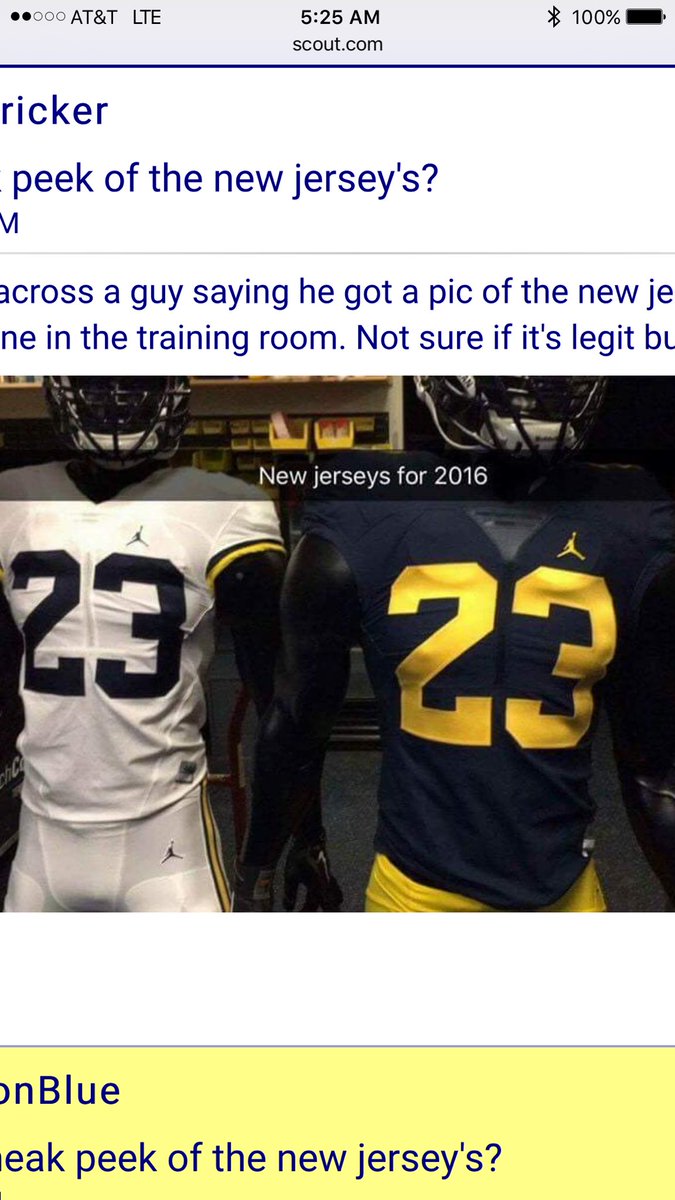
Jumpman Football uniforms (PHOTO)

I woke up to a nice surprise this morning. Someone tweeted this and it was brought to my attention.
ORIGINAL TWEET:
@mgoblog @michiganinsider @umichWD @SamWebb77 pic.twitter.com/NzWfGbhPVn
— Justin E Harkelroad (@jharkelroad1) July 29, 2016
The font we're using is NBA Bulls. The first change to the font in almost 50 years. The classic #2 worn by Woodson is gone.
Phil Knight is a graduate and booster for Oregon, what's your point? These aren't "NBA numbers". USC, FSU, and Texas A & M all have similar fonts when it comes to the #2 on their jersey. Lets not act like the new numbers font is completely different from anything else out there. Aside from the 3 teams I mentioned, I'm sure there are plenty of other teams who use a similar font. The Jumpman logo will take some getting used to seeing on a football jersey, but if Jeter and Neymar have no problem wearing them on their shoes, then I don't see how it is a big deal for Michigan to wear them on their jersey. Jordan brand is clearly branching out into the football world so I expect you will see a lot more Jumpman on football gear in the coming years.
i love how much hate people can have over something just because it is not what you would have done.
Michigan wore Adidas for eight seasons, and all changes and alternate jerseys were signed off on and/or encouraged by the athletic department. Look at Indiana basketball...you can say, "Uh, no."
what? They signed off on them, fine, but nearly every signle alternate uniform we had caused spontaneous eye bleeding and they turned maize into "hot yellow." I said above, the Jumpman symbol looks a little odd, but you guys really think these uniforms are awful(!), terrible(!), cannot stand them? I guess I don't know what you want/expected or how you can see these as that bad.
Somebody put up the Outback Bowl uniforms from the SC game if you want to be reminded about BAD.
upvoted the eye bleed above
Sent from MGoBlog HD for iPhone & iPad
doesn't check out
haha, true. Dave Brandon said clowniforms and piped in muzak were what the croots wanted too.
Just to name a few
We have an NBA font and basketball player on our football uniforms?
Wtf is an "NBA font?" The "2" looks a little different. It's still the same number. Settle down, everyone.
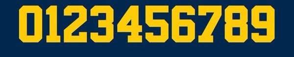
WD- Do that thing you do with the maize and blue fonts side-by-side. The Bulls font in maize on top with the current UM font in maize below.
New

Old

Looks like Nike owns the rights to the number zero. Take that, adidas.
the only difference is in the 2. Noithing to see here.. move along.
Not quite.
Note the chamfer on the 5, and the bulkier look of the new font.
Compare the 8s. Or the 3s. SuperstarM54 was sleeker.
The 5 is different as well.
I think the new "2" is better.
(Ducks flying pitchforks.)
the only real difference is the 2 and the A, the classic 2 is sweet but the new 2 isnt bad the serifs on the A i could take or leave.
There is also N serifs, as well.
Ah there is a little serif there good catch i dont mind the new serifs...still deciding on the 2
In my opinion, the 2 got a little worse, the A got a little better, nothing else changed all that much, and the end result is "Who gives a shit?"
Sent from MGoBlog HD for iPhone & iPad
You must not know too many graphic designers. You should hear our CFO talking to him about needing $20 for a font. It's hilarious.
I was wondering how they were going to deal with having two logos - the swoosh and jumpman. Interesting that Nike would let the swoosh go.
Sent from MGoBlog HD for iPhone & iPad
Until I see the reveal on August 2nd, I'm going to remain skeptical that these are the final jerseys. Could just be a close up pic of the jersey that was caught in the background over a month ago. Pic was taken then and reposted to create extra surprise next Tuesday.
Not saying these aren't going to be the real ones, I'm just not taking it as a given yet.
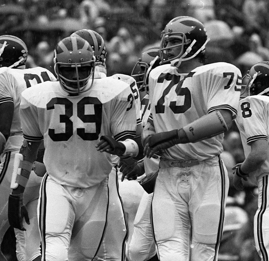
Everyone's upset about the numbers, and I'm over here asking WHY STILL WHITE PANTS?!?!
I like the white pants because I think they draw attention to our helmet, which is the best part of our road uniforms.
This ranks up there with my most ridiculous posts ever on MGoBlog.
I have to say that I don't think it would be entirely bad to have white, maize, and blue pants available for road games. I think the home uniforms should remain a constant, but I think varying the colors on the bottom for road games would be kind of cool (i.e. FSU in the 90s with gold, red, and white). I think our road uniforms have undergone enough tinkering that it would not be too much of a "break with tradition" to do that.
I've been saying this since back before we tried alternates at all.
I've never been fond of the idea that we'd go crazy with stripes and piping and bumblebee patterns, but I'm not opposed to simple alternates such as changing up the colors of our pants on the road.
I do think that we're way overdue on giving blue pants a shot, even if just once.
Blue pants for UTL II right? Anyway its happened. I think the blue pants looked great as an alternate uniform but I think it was hated by the majority of the fanbase because it was not traditional michigan.
was, but it was also the home uniform. I don't think the home uniform should ever be modified in any way. I am just calling for some variety on the road.
Yeah, that was all blues at home with weird stripes and stuff.
I'm talking about our standard road jersey, with blue pants instead of maize (or now white, apparently.) Everything we've tried, we've yet to do that. It seems so obvious.
The bright side is until (if?) we get them back, the team won't look ugly as sin. I never understood the obsession with stripes when Brandon was here.
Sent from MGoBlog HD for iPhone & iPad
not sure if abortion joke or typo (.gif)...
Agree. Want maize pants back. The rumor is Harbaugh likes an all white uni or something? Maybe he grew up watching those unis, but I don't think he ever wore them.
WD, can you confirm?
The white pants and the overall look for our road unis are from 1973. Michigan went back to maize pants in 1976. I believe Harbaugh was 10-13 years old when these were out so he probably associates it with his childhood.
cool, thanks. I wouldn't mind rotating road jerseys. Really want the maize pants back for at least one game per season. seems like a super easy alternate uni.
I agree. If we were to have alternate jerseys, the maize pants would an easy change and it would look so classy.
a black & white photo, I can tell it is the correct maize.

That's Racist.gif