Tournament Uniformz Unveiled

Because it's always the right idea to mess with a good thing, Michigan (among several other Adidas schools) unveiled special uniformz for the postseason. They're not terrible, though I'd prefer "MICHIGAN" across the chest; they're also completely unnecessary and way worse than, say, the throwbacks they wore against Penn State last year.
 Jargon-laced press release ahoy. (Emphasis is mine, because holy jargon.)
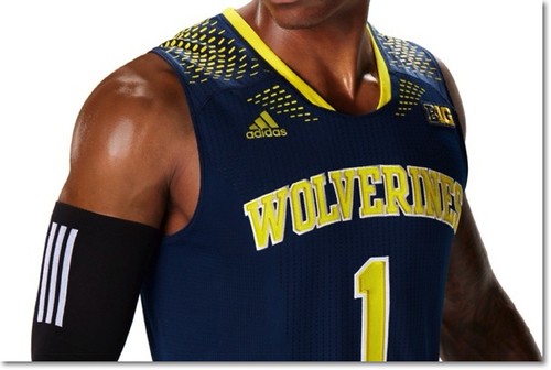
ANN ARBOR, Mich. -- The University of Michigan men's basketball team and adidas unveiled today (Thursday, March 6) the Made in March Uniform System for the 2014 basketball postseason. The collection was created to provide the Wolverines with adidas' most advanced uniform system and basketball apparel technology so they can take on the challenges and intense play of March.
To evoke team unity and spirit, Made in March uniforms feature the Wolverines team name across the chest, while the school's "Go Blue" rally cry is printed on the inside collar of each jersey.
Made in March uniforms feature a functional perforated print pattern along the leg of the stretch woven short to enhance breathability and ventilation, keeping players cool as the clock winds down. Adidas' quick-drying jersey technology found in current NBA uniforms along with ClimaCool zones on the chest, back and side move heat and moisture away from the body to keep the jersey light and dry as players sweat.
The Made in March Uniform System debuts on-court beginning with conference tournament play.
You can purchase these if you'd like; since I don't want to encourage this behavior, you'll have to find the link elsewhere.
The good news: at least we're not Baylor.
"Adidas' most advanced uniform system," or "Adidas' improved uniform system that won't tear in half when you as much as cross midcourt"?
It's not just a basketball shirt and shorts, it's an entire uniform system. So it has to be good, right?
Yeah, right.
They're going to rip just like everything else adidas makes.
I usually hate uniform changes.... But, man, I actually like these. They could have done a lot worse.
At least ours looks like the best of the bunch (click on the Baylor link).
We are the least runtiest of the runt litter. Whoo hoo!
I clicked on the Baylor link. My eyes will never forgive me.
now i'm sorry i bothered getting up this morning...
Uniform System = Marketing-speak for "A pile of dog shit from Adidas". Not that these are bad compared to what we usually get when they start making "special" stuff.
I'd love to be a fly on the wall in one of the Adidas "design" meetings. Either these people are dumb as bricks, 13-year-old kids, or high as kites...I'd love to be able to figure it out, once and for all.
I think they are dumb, high, 13 year old kids.
That's like your daughter not exactly marrying the man of her/your dreams. "Well, she could have done a lot worse." Like, at least he is not in prison.
l love how having the "Go Blue rally cry printed on the inside collar of each jersey" will evoke team unity and spirit. I hope they didn't include something similar for other teams, lest we lose the advantage that comes from wearing them.
When the 5 cent Adidas crap uniform rips in half, they want you to focus on the "Go Blue!" label instead of the garbage quality of the uniform.
One thing I've noticed living in Madison is that Wisconsin fans tend to say that they are going to the "Badger Game". As a life long Michigan fan I don't think I've ever heard someone say that they are going to the "Wolverines Game". It's Michigan damn it. This is homoginzation of tradition across schools for corporate (and AD) profit. I am a Michigan fan. I go to games in Michigan Stadium. There is now Wolverine mascot. Put Michigan on the god damn jerseys.
I don't really see a huge difference. Would you say you are going to the Detroit game or the Tigers game?
I also live in Wisconsin. People here to go Packer games and Brewer games. Not Green Bay and Milwaukee games. It's sports. Sports teams are often indentified by their mascots.
Never heard it, even once.
it's homogenization across continents and across sports. I can't find a picture that really captures how ugly these were, and for the 80% of you that don't like soccer this won't mean anything (suffice to say that they ordinarily wear red and this shade of neon is not a national color), but Spain came out in these for their friendly yesterday and my eyes said ohmygodbaylor that must be Adidas.
Many of the usual Adidas trademarks are here--two different shades of yellow-green, one more green and one more yellow. (No, three shades, because the socks didn't match either one.) Black shirts--remember Adidas outfitting schools in monochrome charcoal or black last year? (Unlike the NCAA, FIFA doesn't allow numbers the same color as the uniforms.) The only thing missing was the uniforms didn't tear every time somebody grabbed a fistful.
Which means they worked on me, I got the intended brand message, and that's very sad.

Maize Dawn: Wolverines!
Exact same thing that went through my mind.
If only those kids had ClimaCool.
These would be awesome if it said "Michigan," and weren't the same as every other Adidas school in the tourney.
On TV, you won't even be able to see that it actually says "Wolverines". It will just look like it says "BlahBlahBlah" in an arch.
These are fine, I guess, and aren't nearly as bad as our "hideaway numbers when exposed to sunlight" Outback Bowl jerseys. But "Wolverines" has too many letters for the amount of space with that font choice. Does adidas not care whether you can easily read what's on their jerseys?
Just look at Kansas or Louisville -- you know who that is.
That said, these are better than "Sic 'em Bears". Uggh.
"Wolverines" and "Louisville" is the exact same amount of letters. The font sizes are nearly identical as well.
Go look at that picture again. Lucky for us, the "Wolverines" and "Louisville" guys are the exact same distance/placement. You can read the "Louisville" one, but the "Wolverines" one looks decidedly more blurry. Why? The difference in font type.
Louisville's is more thick and "blocky" which makes their letters more distinct. Ours looks more like an italicized, curved version of something, which doesn't work as well when the letters are already on the small size.
Put Michigan on the front of the jersey. It's OUR state now!
It's not like they will be wearing the new unis in the NCAA tournament or anything.
Forget this stuff. It's time to bring back the so-called "Fab Five" unis with the big, bold, bad-ass block M on them. They were the best Michigan BB unis ever and they should be back on the court.
They are classic unis that belong to the University of Michigan and not just the Fab Five. They are just as iconic as the Football unis are. We are blessed to have the best looking unis in both Football and Basketball.

Think about it: If these were our unis the last five years, do you believe that all anyone would think about when they see them is the Fab Five? No, they'd think about Trey's glorious 3, Nik's rain of death, Zak's aneurysm, Jordan's charge pickup, and Mitch's linebacker screen.
Time to reclaim them.
This look should be what we have forever (including being made by Nike).
Thank god we didn't get the sleeves.
Amen, brother.
A) These are cool. They do not deviate much from our design and the shorts look better with the M at the bottom. (I do enjoy the tiny fading Ms as well on the regular jersey)
B) I like the idea of a tournament jersey in basketball. It is not like our current jersey is such a classic.
C) To the suggestion we wear a throwback jersey for the tournament - There is a reason it is a throwback. It looks old and 80's. I don't think it would be cool to all wear super baggy deep scoop cut beach looking tank tops for the tournament. A throwback game is great, but lets keep that to a game.
D) At least it does not have camo and is not a T Shirt.
Yes, because the current uniforms have proven to be entirely insufficient for the rigors of playing two games in three days.
Whatever. The rubes and suckers will eagerly shell out $90 for the top and $65 for the shorts and David Brandon will pour himself another snifter of brandy to celebrate another marketing coup. After all, it's for the kids.
So the way the dimples/patterns/spots on the shoulders work is by slowing the airflow over the players shoulders, creating a pressure gradient perpendicular to the flow direction created by GRIII jumping, which produces aerodynamic lift. This effect is exacerbated with higher velocities, hence why GRIII's jersey is being used as the example.
They tried this with Denard, but even his hair was unable to breakup the pressure gradient enough for him to maintain enough surface contact to get a good plant on cuts.
the dimples/patterns/spots on the shoulders work is to create a visual effect for the marketing team at Adidas to make up some scientific BS about.
The Baylor uniforms are intentionally terrible so as to pacify all of the other teams
Also, real hilarity with the "Made in March" thing, when in reality they're "Made in Bangladesh/China/anywhere poor 12 year olds are sewing basketball gear."
"SPARTANS" on their uniforms, which I can understand. But for me that is all the more reason why I prefer UM's unis to say "MICHIGAN"
I don't really have a problem with changing the bball uniforms. Football yes, but basketball doesn't really have an iconic look. Small changes to the basic concept like the perforated design don't really bother me and I actually like these. My only problem is with the yellow color. Bring back our colors!
Basketball doesn't have an "iconic look" because Nike/Adidas keep changing the uniforms every five minutes. That is, if you live by the premise that there isn't an "iconic look." Which there is.
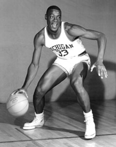


The white '89 unis looked pretty nice though.

These are horrendous. The best thing about them is the short shorts, because it means there's less of them to look at.
Comments