Rank the MBB's Jerseys Throughout the Years (With Pictures)
Michigan will be wearing "Throwback" uniforms when they play MSU in a few weeks which got me thinking about the past uniforms Michigan has worn. I have compiled a few options with pictures and would like for you guys to rank them from best to worst.
You can either rank them by era or be super specific and give your top 5 individual uniforms.
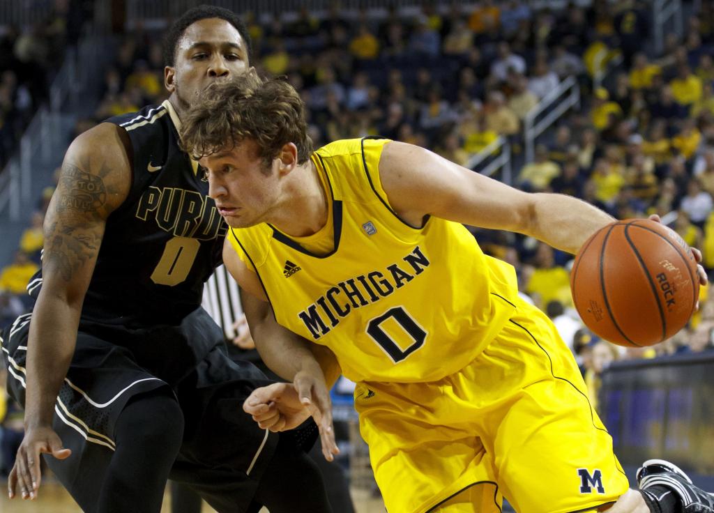
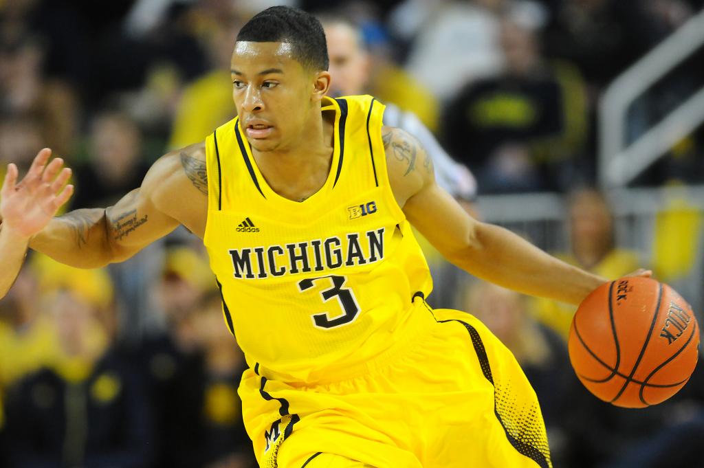
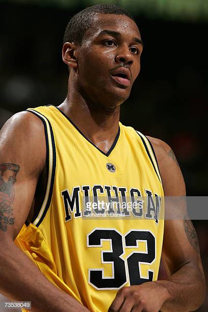
Current Jordan Brand White, Maize, and Blue: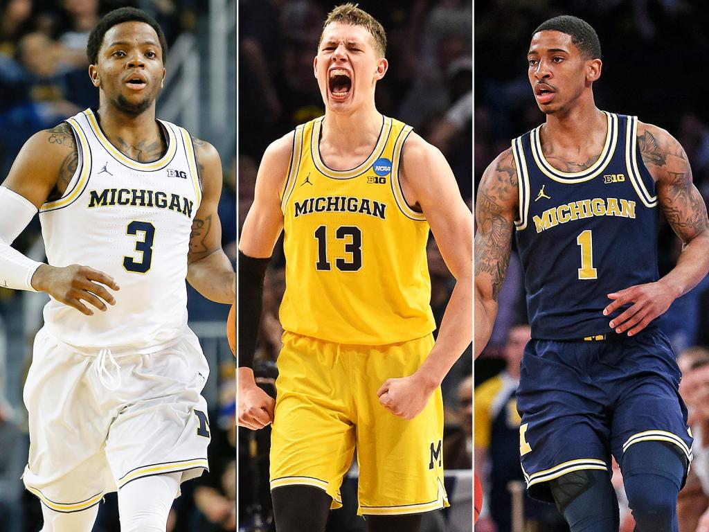
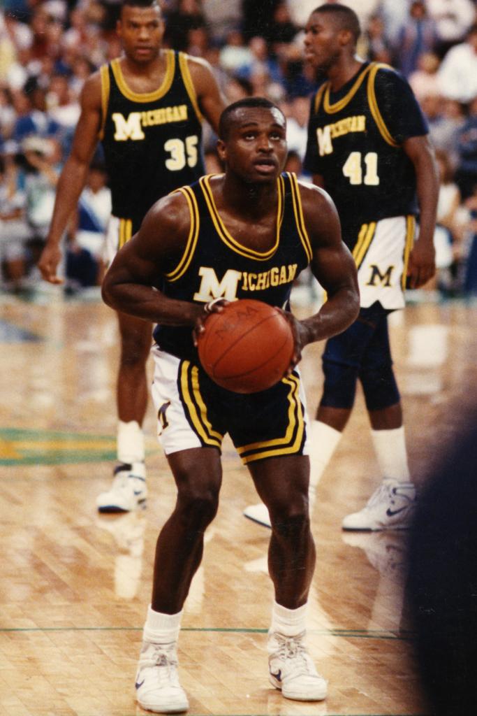
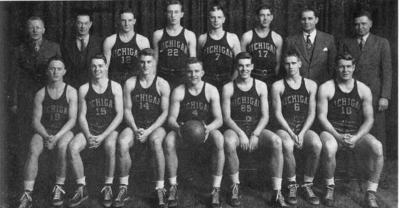
Mid/Late 80s
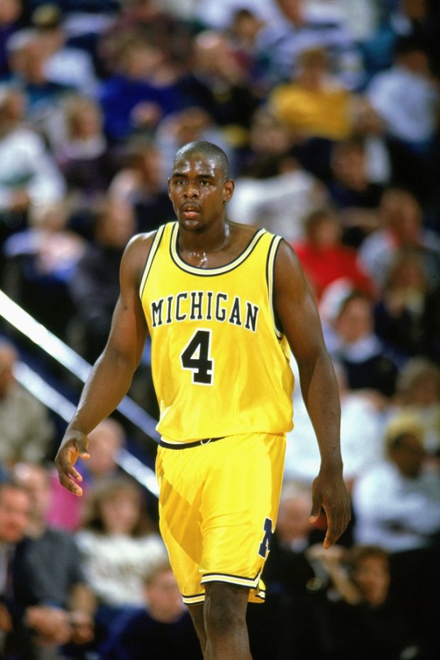
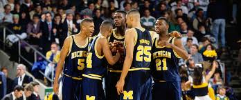
Fab Five Era
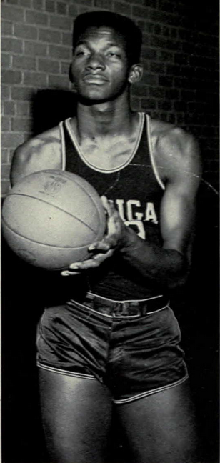
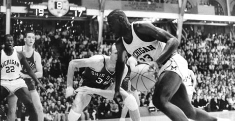
Late 90s/Early 2000's
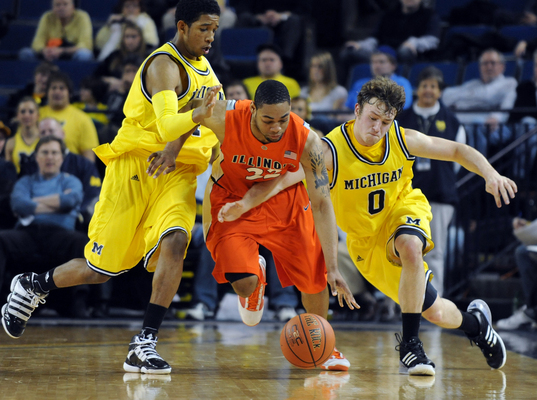
Addidas
February 6th, 2019 at 10:25 AM ^
Rank by Era: Top 5 Uniforms:
1.) Fab Five Uniforms 1.) Fab Five Maize
2.) Current 2.) Current Maize
3.) 80's 3.) Fab Five White
4.) Addidas 4.) Current White
5.) Later 90s/Early 2000s 5.) Current Blue
February 6th, 2019 at 11:26 AM ^
I agree with everything in your rankings but the 80's jerseys are the worst for me. The tops are fine but the shorts are absolutely horrendous especially when paired with the tops. As a whole it looks like Michigan didn't know what look it was trying to go for and because of that the uniform has no direction whatsoever.
If those tops were paired with a solid colored bottom then I'd rank them 3rd as well.
February 6th, 2019 at 12:11 PM ^
I agree about the 80s uniforms. Those are not good looking. They look cheap.
February 6th, 2019 at 3:12 PM ^
Its hard for me to "hate" the only jerseys we cut down the nets in. The Fab 5 jerseys created a seismic shift in basketball fashion that can still be felt today, so I agree, hard to not make them #1. At the same time, too much nostalgia wrapped up in the 80's gear to put them below the train wreck jerseys of the 90's/2000's.
February 6th, 2019 at 9:00 PM ^
The tops look sharp with my zubaz pants.
February 6th, 2019 at 10:25 AM ^
Fab 5 era, of course. Jordan's current lettering (our custom lettering or whatever it is) is too small and squished together. Also, your picture doesn't have it, but I hate the little circle M tag under the neck they started putting on the jerseys this season.
February 6th, 2019 at 10:32 AM ^
Yup, Nike's font does not look good arched across uniforms and apparel. The letters are too wide and short, which makes it look cramped and small. It's the only thing I don't like about Nike's work. Michigan's old wordmark was much better.
February 6th, 2019 at 10:54 AM ^
I hate the new font, it looks bad on tshirts and jerseys because it's so small.
February 6th, 2019 at 10:50 AM ^
I completely disagree with the lettering, but agree about the circle tag on the neck
February 6th, 2019 at 11:21 AM ^
Yeah, it feels like we're wearing 1950s throwbacks with that narrow lettering and small, highly-placed numbers.
February 6th, 2019 at 10:27 AM ^
Fab 5 jerseys with current Jordan shorts would be perfect. But I'm so content with the current jerseys I also don't care
February 6th, 2019 at 10:32 AM ^
isn't the current kit basically the same as the fabfive era kit?
February 6th, 2019 at 10:34 AM ^
It's definitely very similar and an obvious influence. But as someone else pointed out, the font is a little smaller and more squished together and there are some fine details that are different.
February 6th, 2019 at 10:35 AM ^
Not sure. Can somebody post pictures of our soccer uniform?
February 6th, 2019 at 10:38 AM ^
sorry. been watching too much soccer recently.
February 6th, 2019 at 12:20 PM ^
So much that you unconsciously type "kit" instead of "uniform?" OK, man.
February 6th, 2019 at 12:18 PM ^
OMG fuck this "kit" garbage.
February 6th, 2019 at 12:34 PM ^
OH THE HUMANITY
February 6th, 2019 at 10:33 AM ^
This also just makes me realize how bad our uniforms were for most of the 2000s
February 6th, 2019 at 10:36 AM ^
Those tire track across the package shorts were heinous.
February 6th, 2019 at 10:42 AM ^
anything adidas touched was doo doo.
February 6th, 2019 at 12:19 PM ^
The uniforms with the big (and misshapen) block M on them and those ridiculous side panels were the absolute worst. I'm a guy who loves side panels saying this--they were awful.
February 6th, 2019 at 10:35 AM ^
I’m doing a crossover, ‘89 jersey with the current shorts.
February 6th, 2019 at 3:19 PM ^
M.C. Burton would like to weigh in...
February 6th, 2019 at 10:35 AM ^
1) Fab 5. Simple, clean, classic, traditional. Fits the style and attitude of Michigan.
2) Current. Similar to the Fab 5'ers. Don't like the current Nike font compared to the taller letters of the 90s. And they've got that weird Jordan fit with the sports bra back, and they seem to be forcing the short shorts. The weird, shiny numbers on the blues. Style is right, but too many weird quirks.
3) 1989 team. Too busy. Too much happening. But a fun throwback that immediately sparks good memories.
4) Everything else. Stupid Adidas piping and tire treads and maize font on maize background and just bad ideas all around. Like the football uni, you have to be actively trying to screw up a Michigan uniform. Obviously, plenty have actively tried.
February 6th, 2019 at 10:52 AM ^
I don't think they're "forcing" the short-shorts. I think thats just how players have started wearing shorts nowadays. Also, the "sports bra" back is for performance reasons. Allows for less material around the joint and more unimpeded range of motion
February 6th, 2019 at 11:10 AM ^
Are you Phil Knight? Kidding, but never once in the history of basketball did a player complain that he had trouble shooting because of his bulky, restrictive, sleeveless tank top jersey.
February 6th, 2019 at 10:39 AM ^
You left off the best one IMO. Absolutely clean lines and perfectly done (and quite similar to the Fab 5 unis). The mid-60's Cazzie Russell era unis.

February 6th, 2019 at 10:44 AM ^
Those are fantastic. I like pretty much any of the white basketball uniforms Michigan has worn. I particularly like our current whites, but a lot of that also has to do with Poole's buzzer beater being in those uniforms
February 6th, 2019 at 12:12 PM ^
White with simple blue piping. Terrific. Proof that less can definitely be more.
The Blues didn't look too bad either.

February 6th, 2019 at 10:40 AM ^
Thread ain't really legit 'til WD weighs in, but yeah, I like the Fab Five maize. Current ones great too
February 6th, 2019 at 10:44 AM ^
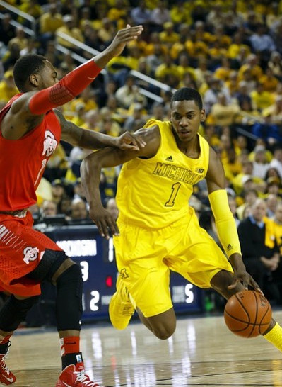
You left out a lot of the Adidas uniforms. When Zack Novak and co. first arrived, Adidas was basically using the Fab Five template, just with a brighter Maize. Then there was the thick collar era and the Trey Burke era with the fade on the shorts.
February 6th, 2019 at 10:46 AM ^
Yeah I left out of a lot of the Addidas ones for a few reasons. First, for the most part they were pretty bad. Outside of that first picture, Addidas added too much to the uniform. The piping and weird designs on the shorts ruined those for me.
February 6th, 2019 at 11:17 AM ^
Yeah I left out of a lot of the Addidas ones for a few reasons. First, for the most part they were pretty bad.
But isn't the point of this thread to ask us our opinion about them? If you want us to rank the uniforms over the past 30 years, it doesn't make sense to leave out a bunch of them.
February 6th, 2019 at 12:39 PM ^
OP starts a fun, cool thread and you're nitpicking and complaining. Classic Michigan fan.
February 6th, 2019 at 12:53 PM ^
It's a legitimate point. It really doesn't make sense to ask us to rank the jerseys of the past 30 years and then leave out a lot of them. Also, he chose probably the two most unpopular Adidas designs as the only representatives of that era.
February 6th, 2019 at 1:16 PM ^
And what contribution have you made to this thread, KBLOW? Your sole comment so far in the thread is an attack on other posters.
I like the idea of the thread but I'm disappointed that the OP seems to have written off the entire Adidas era (which was almost a decade).
February 6th, 2019 at 12:01 PM ^
The Burke/Stauskas era Adidas uniforms feature in some of the most iconic moments in the history of the program. They have some uneven elements, but winning makes uniforms grow on you and even without that I actually rather like them (I don't get a lot of accessories anymore, but I have all three colors of shorts from that era to wear around the house).
This is, frankly, a fatal mistake for the thread. Leaving out huge swaths of uniform history makes this kind of exercise impossible.
February 6th, 2019 at 11:09 PM ^
I own the Adidas shorts in maize. Block M's on the side but no piping anywhere. Beautiful gear. I can only use them for home workouts because they have no pockets.
February 6th, 2019 at 2:47 PM ^
Love the ones Trey is wearing.
February 6th, 2019 at 10:44 AM ^
WD - this isn't your thread?
February 6th, 2019 at 10:45 AM ^
Props for misspelling Adidas - hopefully on purpose.
Fab 5 - maize/blue/white. Current unis - same order. 1989. Burn the rest.
February 6th, 2019 at 10:46 AM ^
I llke the classic look
Or Cazzie era...
February 6th, 2019 at 10:47 AM ^
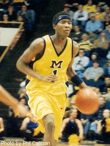
There's a pretty big gap in there between the POS ones we wore when Jamal Crawford was here to adidas. I think these ones were pretty good, better than what we have now. The ones we have now just look like Fab Five knockoffs.
February 6th, 2019 at 10:52 AM ^
Wasn't the one with just the "M" on the front (the Jamal Crawford image in the OP) just an alternate that was only used a couple times? I thought the main jersey that year had "Michigan" spelled out in full.
Whatever your other preferences, the Adidas "tire-tracks-across-the-shorts" look has to take last place by a mile.
[My cool story, Bro:] I was an undergrad during the Fab Five years. I don't think State Street Sports even exists anymore, but back then I believe it had some affiliation with the M-Den and the Athletic Department. When Webber declared for the draft, they had two or three authentic Webber jerseys that they claimed were directly from the Athletic Department. They even had the Webber name sewn on on the back. Selling a jersey with the name on the back was a no-no under the NCAA rules, but apparently this was cleared because they were intended for game use and only resold when they turned out to be extras (or at least that was the story). This was before the Ed Martin stench, so I snapped one up. It's been in my closet for 25+ years and only worn a couple times. I'm 6'0" and it is huge on a normal sized person.
February 6th, 2019 at 10:57 AM ^
The M uniforms were the primary uniforms. UNC had a similar template, maybe a couple other schools, too.
The MDen story is 100% plausible, I remember stuff like that happening in the 90s.
February 6th, 2019 at 11:14 AM ^
Yeah, all three - Maize, Blue, White - had that same block M on the chest.
February 6th, 2019 at 11:42 AM ^
And then in Amaker's first year we just took the M off and wore the same template with MICHIGAN instead.
February 6th, 2019 at 11:41 AM ^
Once the guy turns pro, I don't think it matters if his name is on the jersey, since he's not a member of the team anymore.
February 6th, 2019 at 10:52 AM ^
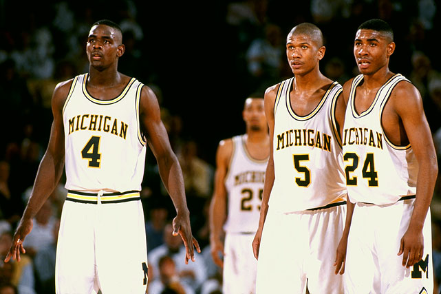
Tractor Traylor era Michigan uniforms were pretty sharp and were a little different from the Fab 5 era:
