Rank the MBB's Jerseys Throughout the Years (With Pictures)
Michigan will be wearing "Throwback" uniforms when they play MSU in a few weeks which got me thinking about the past uniforms Michigan has worn. I have compiled a few options with pictures and would like for you guys to rank them from best to worst.
You can either rank them by era or be super specific and give your top 5 individual uniforms.
Current Jordan Brand White, Maize, and Blue: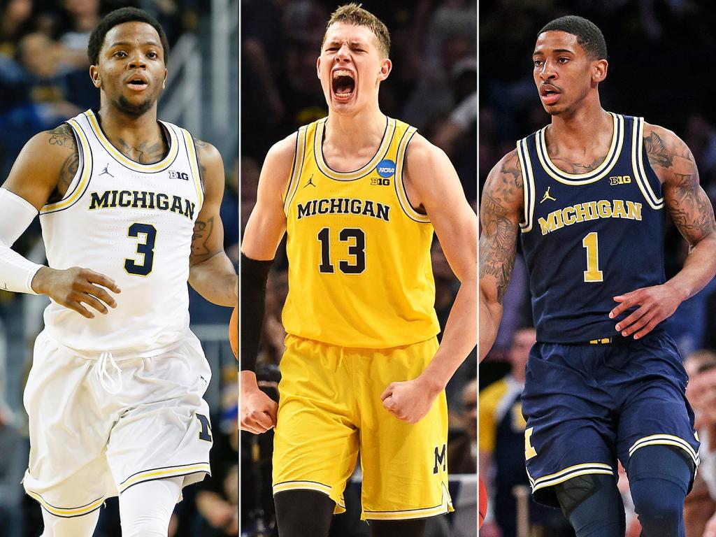
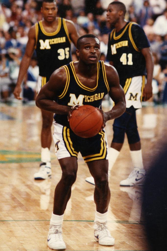
Mid/Late 80s
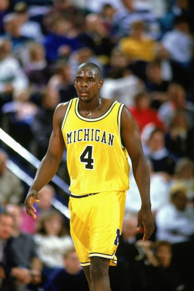
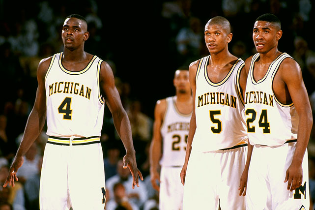
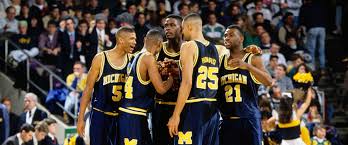
Fab Five Era
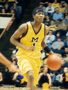
Late 90s/Early 2000's
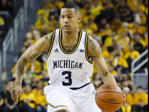
Addidas
February 6th, 2019 at 11:08 AM ^
Wow, Tractor must've been on a diet that day!
February 6th, 2019 at 11:43 AM ^
Ugh, the tractor photo file was broken...
February 6th, 2019 at 11:38 AM ^
That design would be OK except that the MICHIGAN is too low on those uniforms, like it was an error in stitching.
February 6th, 2019 at 12:12 PM ^
lol, what i love about this uni and imo the fab five maize jerseys is they have this satin-shiny look that looks dope on the camera. this year's blue seems to have the same effect with the lettering
February 6th, 2019 at 10:55 AM ^
I know this is unpopular, but I loved the late 90s-early 2000s M jerseys. The shorts, too.
I pretty much love all this stuff except for the Adidas era.
I like the current shorts, but the jersey fonts always look slightly off to me.
February 6th, 2019 at 7:10 PM ^
Jersey font and number on the blue uni’s look cheap and bubbly on TV.
why put pockets in shorts - dumb.
February 6th, 2019 at 11:00 AM ^
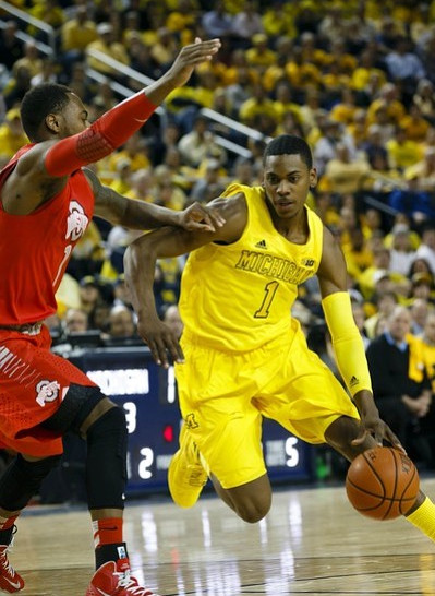
Adidas is everyone’s favorite whipping boy on the board, but outside of the “tire track” uniform, I thought their uniforms were pretty good—certainly better than the late ‘80s era uniforms, or the Jamal Crawford/Lavell Blanchard ‘M’ v-necks, the latter being absolutely atrocious. I particularly enjoyed adidas’ Stauskas/Hardaway era Maize on Maize uniforms.
February 6th, 2019 at 11:19 AM ^
tire tracks and the fact that they ripped like crazy.
February 6th, 2019 at 11:29 AM ^
I just saw your comment. Didn't they have a problem getting replacements too?
February 6th, 2019 at 12:03 PM ^
Yes, they did. That’s why they wore the blue uniforms so little in 2012-13. After that Minnesota game where several ripped, they only wore blue a couple more times and the ones who had their uniforms ripped had to wear the 2011-12 style.
February 6th, 2019 at 12:25 PM ^
I think they basically went away from those blue unis (which I love) entirely, right? They used throwbacks/alternates, wore a lot of maize, and used a one-off postseason uni in the BTT I think.
I'm getting old, it's hard to remember, but at some point the road uniforms hit the shelf for the rest of the year, before one would have thought. I think that's the year that Adidas had those weird water-pattern postseason shorts that Louisville used and Michigan would have skipped except they needed to wear blue for a game.
February 6th, 2019 at 3:20 PM ^
Yes the only time they wore blue was in the BTT and they wore the camo styled shorts with the 2011-12 uniform. They opted not to wear the short sleeve jerseys because well, they sucked
February 6th, 2019 at 1:38 PM ^
I think the fabric problem was only during one season (2012-13), but it was bad. I remember Trey wearing #12 in the second half of one game.
February 6th, 2019 at 11:25 AM ^
Didn't they have a tendency to rip and tear? Was that adidas?
February 6th, 2019 at 11:36 AM ^
It was. I think one game in the midst of the Adidas stretch something like 2 or 3 jerseys ripped in the same game (random Minnesota game?).
February 6th, 2019 at 11:06 AM ^
The Tarpley/Grant/Rice unis were the best, although the Fab 5 threads are a close second.
All the others are meh at best.
February 6th, 2019 at 11:10 AM ^
The Tarpley/Rice uniforms are only good for nostalgic reasons. Don’t get me wrong, I love them for that very reason, but the design itself is horrible.
February 6th, 2019 at 11:53 AM ^
I would have to disagree. They're remembered because we won a national championship in them. If we hadn't they would be looked on as bad, because they are.
February 6th, 2019 at 11:10 AM ^
Fab 5 era.
February 6th, 2019 at 11:11 AM ^
1. Fab Five
2. Current
3. Traylor, Taylor, Bullock
February 6th, 2019 at 11:11 AM ^
Rumeal, Rice, Loy look the greatest.
That's a winning championship shot.
February 6th, 2019 at 11:12 AM ^
That's not a fair representation of the Adidas era. We only wore the "bleed-out" uniforms (all maize) for a few games in 2013 and the tire-tread ones in one season. They had some other uniforms that were solid.
February 6th, 2019 at 2:43 PM ^
Adidas uniforms always seemed to have some goofy element just to let you know this is a super awesome Adidas uniform, and that irritated me. Like the shorts here with this smeared blue look. The weird no-rhyme-or-reason zig zag stripe down the side. It was always something just for the sake of being different. Michigan uniforms are best when they're kept simple and clean. Adidas would never allow that.

February 6th, 2019 at 3:23 PM ^
Yeah, I didn't love those shorts, but thought the jersey was solid. Incidentally, you can't tell from the photo, but the "smear" actually is made up of little block M's.
February 6th, 2019 at 11:13 AM ^
I'd say the Fab 5 jerseys modestly outrank the current ones, which significantly outrank those from the 80s ... and everything else is unrankable garbage.
February 6th, 2019 at 11:16 AM ^
If I were uniform god, I would have UM's standard uniforms be as follows...
Maize = Fab Five
Blue = '89
White = Cazzie era
February 6th, 2019 at 11:18 AM ^
Adidas....the absolute worst
February 6th, 2019 at 11:24 AM ^
I wish I could unsee those adidas tiger shorts or strike them from memory. Tie Fab 5 and current.
February 6th, 2019 at 12:22 PM ^
I am fairly sure those terrible shorts were just a giant middle finger from Adidas because at that time, they knew Michigan was going back to Nike.
February 6th, 2019 at 2:49 PM ^
Yeah, it was nothing against Michigan. If you can handle it, check out some pictures of the 2013 national championship game. Louisville was also an Adidas school. They were wearing those animal print/zubaz style shorts and sleeved jerseys.
Adidas was on crack and lots of schools paid the price. Remember these shits? With one horizontal leg stripe for some reason?

February 6th, 2019 at 11:29 AM ^
Fab Five era by far.
My favorite football unis come from that era also. Wasn't crazy about the road uniform numbering in the mid-late 90s.
February 6th, 2019 at 11:35 AM ^
what about early 80s and 70s and 60s
February 6th, 2019 at 11:40 AM ^
We wore the retro 1968 jerseys vs Penn State in 2013
https://umhoops.com/2013/02/06/michigan-to-wear-1968-throwback-uniforms-for-crisler-rededication/
February 6th, 2019 at 11:59 AM ^
I didn't realize Michigan's colors used to be black and white
February 6th, 2019 at 11:41 AM ^
Tire track jerseys have to be the worst god I’m glad those are gone
February 6th, 2019 at 11:42 AM ^
Fab 5 is the best forever and ever.
Just make that our permanent uniform and never change it. Like with home football unis, you don't mess with perfection.
February 6th, 2019 at 11:42 AM ^
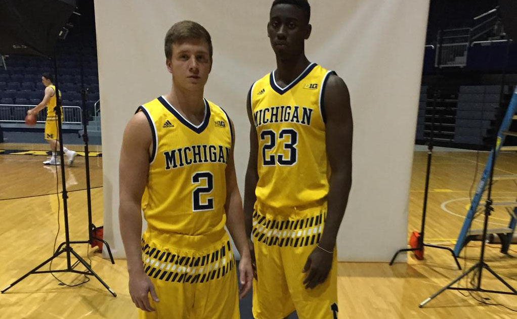
Those are not the current jerseys. Those were from last year. This year they added an ugly M in a circle under the neckline. Last year was a lot better, that little M ruined the clean look.

February 6th, 2019 at 11:45 AM ^
I hate how basketball (and football) uniforms are so cluttered with junk on the shoulders nowadays. I miss when it was just the school name.
February 6th, 2019 at 11:57 AM ^
Those fab 5 maize are my all time favorite
February 6th, 2019 at 11:58 AM ^
Current era are the cleanest, IMO. The Fab Five uniforms have the best lettering, but the belt is super weird looking to me. However, the maize belt on the blue uniforms looks fine, so those are probably the best in my book.
The 80s jerseys are hilarious, but I like that style. The Addidas jerseys are an abomination. The 2000s era jersey looks more like warm up gear. But even for warm up gear it is bad.
February 6th, 2019 at 12:02 PM ^
Take the white trim out of the road uniforms:

No white piping in the home football uniforms, which is what makes them great. The colors are maize and blue; not maize, white, and blue.
EDIT:
Home white throwbacks looked awesome on one Mr. Burke:
February 6th, 2019 at 12:09 PM ^
The lettering on the current style is quite bad. Way too small and cramped together. Also, the “shininess” of the lettering and numbers on the blue uniforms looks bad as well.
Adidas did some bad stuff with our uniforms but, they did a lot that looked quite good. Minus the tire tracks the 2015-16 Blue uniforms looked great. The more traditional maize on the blue in larger lettering looked sharp.
I know Nike branded the “victors” font, but it really leaves a lot to be desired; especially compared to the Fab 5 style. Also the little M under the neckline they added this year is pointless and just adds to the cluttered look.
February 6th, 2019 at 12:15 PM ^
White:
1. 1980s Grant/Rice/Robinson
They look weird by today's standards, but there was a lot of color on the white uniforms and I loved the side panel as a kid. Michigan's colors are maize and blue, and this did the best job of showing that. It wouldn't look as good today, but I wish Michigan would go to a modern side-panel look.
2. 2013 Burke/Stauskas
The Burke/Stauskas era. They're not the best, but I like the thick blue piping and the use of maize. Mainly ranked here because white is too plain of a color for Michigan basketball.
3. 1993 Fab Five
Again, white is a boring color for Michigan basketball uniforms. This, at least, features a block M on the shorts that is large. (Note: If I were alive and had a good feel for what the Cazzie-era uniforms looked like in person, they'd probably get this--I loved the Cazzie throwbacks against PSU and would favor that as a permanent home uniform, but I'm not ranking one-offs).
Maize:
1. 1993 Fab Five
The original. Dazzle fabric, baggy pants, iconic.
2. 2013 Burke/Stauskas
I'd change the shoulders, but I love the striping through most of the uniform. This uni gets serious bonus points because Trey Burke wore it when he put Kansas to the sword.
3. This item left open in case the new fauxbacks are really cool
4. 2014 (I think) tournament uniforms.
Nice, understated pip pattern. I thought it was a good look that wasn't quite as good as the base set.
Blue:
1. 2013 Burke/Stauskas
The blue, the healthy helpings of maize, the cut of the shorts, the swagger of Stauskas hitting threes at Wisconsin and Illinois and MSU
2. 1993 Fab Five
It's hard to go wrong with blue uniforms and maize trim. As with white, this uniform wins in part by the size of the M on the shorts.
3. Early Beilein
I thought early Adidas blue uniforms really got the look right, despite using small Ms.
4. Current
Becoming iconic with some great Michigan moments in a basically well-dressed uniform.
Note: Despite my affection for the 80s uniforms, I'm not a huge fan of all the white on the blue version. Not a favorite as a standalone.
Bonus:
The practice uniforms we wore in DC after the plane crash. Not a great look on its own, but perfect for the moment. Perhaps it's the way the light shone on them when reflected off of Maverick Morgan's bitter tears.
February 6th, 2019 at 12:30 PM ^

Maize 2014 tournament uniforms. Since I'd forgotten about these and had to look it up.
February 6th, 2019 at 1:01 PM ^
Seeing "WOLVERINES" just looks odd - we're so used to reading MICHIGAN on the front.
Otherwise it's a pretty sharp design IMO.
February 6th, 2019 at 12:39 PM ^
I really hope the fauxbacks have the panel on the side of the shorts, but since they are maize and not white or blue, I'm not sure what color you would put in the panel. Probably won't have it.
February 6th, 2019 at 12:16 PM ^
The 80s jersey is cool, but adding the white to the shorts make the shorts look stupid. The railroad tracks shorts are the worst. Fuck you, Adidas. The all-maize is also bad. Fab 5 era is dope. I also really like the Jordan brand.
February 6th, 2019 at 12:41 PM ^
Those railroad shorts were only worn in the post season. But yeah, they were awful.
February 6th, 2019 at 1:03 PM ^
Pretty sure we wore those shorts the entire season.