Acceptable and Unacceptable Block M's

Per Kyle Meinke, the Athletic Department has sent out a flier detailing which Block M's are and aren't right. A lot of people here knew about the Split M, but here's the official guide.
Not every block M was created equal. What is and isn't approved, per the U twitter.com/kmeinke/status…
— Kyle Meinke (@kmeinke) February 28, 2013
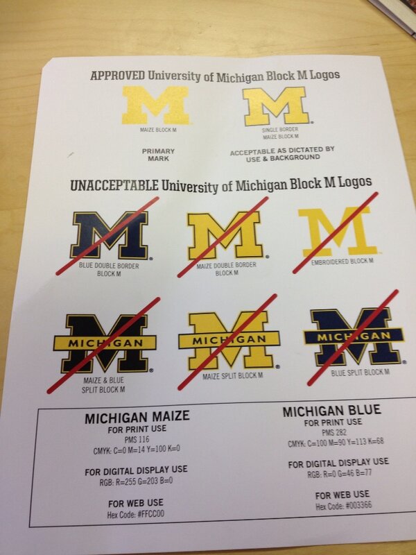
What's funny is that Yost and Crisler have "incorrect" Block M's


February 28th, 2013 at 6:28 PM ^
February 28th, 2013 at 6:29 PM ^
Weird that a plain blue block M isn't one of the approved logos...
February 28th, 2013 at 7:53 PM ^
I think it's the blue M with its yellow outlined in blue that's illegal, not the blue with straight yellow outlining (like in Yost & Crisler).
They probably don't want people using this M too much, that's why it isn't specified as good or bad.
My two cents.
that's a good point, the one that is listed as unacceptable is specifically labelled as double bordered.
Now I have to redesign my tile floor. I like the blue M with the maize trim. However, I cannot install something "unapproved".
February 28th, 2013 at 9:12 PM ^
February 28th, 2013 at 9:20 PM ^
The guy that took over selling pizzas is a lot better than Dave Brandon.
February 28th, 2013 at 11:02 PM ^
simply cannot be accepted any longer.
February 28th, 2013 at 11:22 PM ^
Dont you get tired of ragging on DB? The guy does more for UM athletics than any of us knows. Its getting old buddy.
February 28th, 2013 at 11:25 PM ^
Nice burn, brosky.
February 28th, 2013 at 6:29 PM ^
This is a good decision. Inconsistent branding is a no-no. Need a clear-cut single logo.
It actually annoys me now when I see Split Ms on new things produced.
February 28th, 2013 at 6:32 PM ^
As pointed out above, there was not a distinction one way or another on a blue Block-M with a plain maize border, but a blue Block-M with a maize-[and then blue] (or double) border is unacceptable. I think if you have a white or maize backround, it only makes sense to use a blue block M (how poorly maize shows up on white or on top of other maize has been covered ad nauseum here)
February 28th, 2013 at 6:33 PM ^
February 28th, 2013 at 6:41 PM ^
Sorry, but your avatar is just unacceptable.
February 28th, 2013 at 8:18 PM ^
i dont think it was ever acceptable
February 28th, 2013 at 7:14 PM ^
Harbuagh's wearing it, so if it was lost, it's been found.
February 28th, 2013 at 6:35 PM ^
weekly about the Split M. Obviously they dont read nor care about what is approved.
February 28th, 2013 at 6:39 PM ^
WAT? Blue Block M being unacceptable is UNACCEPTABLE! /rabblerabblerabble
February 28th, 2013 at 6:42 PM ^
Aren't they kind of opening themselves up to having a bunch of bootleg merchandise out there with the "unacceptable" logos? It seems to me that a decent lawyer could argue they are abandoning a copyright here.
February 28th, 2013 at 7:01 PM ^
They can still own the copyright to the image without using it or allowing anyone to use it?
February 28th, 2013 at 7:04 PM ^
would argue that they were abandoning a trademark. :)
February 28th, 2013 at 6:43 PM ^
I know that I am in the minority here but I actually like the spilt M. It is currently my computers background.
February 28th, 2013 at 6:47 PM ^

February 28th, 2013 at 7:19 PM ^
My apologies, Wolverine Devotee. I meant to moderate your comment/picture as funny and somehow I clicked on trolling. My bad.
February 28th, 2013 at 7:46 PM ^
Well played Wolverine Devotee.
February 28th, 2013 at 7:59 PM ^
DB's block M is unacceptable.
February 28th, 2013 at 11:17 PM ^
the split M with the word michigan doing the splitting is a lot more obvious for people out of the region that see lots of other Ms and U of M (missou, minnesota)
looks good, as well.
Good point. I live in the NJ suburbs of Philly and there is a town with a yellow "M" as their logo (Moorestown). I once thought there was an unusual collection of U-M alumni/fans there until this was explained to me.
next to you two. And whoever pos banged you.
My last 3 cars have all displayed it. With luck, I will find another for my next car. I am not a fan of the yellow M, much prefer the blue. Interesting that we are deluged with offbeat uniforms, but they want to police how the "M" looks.
February 28th, 2013 at 6:59 PM ^
I'm with ya. I'm sure we're nto as a minority as we think. It's a classy look, regardless if one likes the plain Block M better.
February 28th, 2013 at 7:36 PM ^
February 28th, 2013 at 8:23 PM ^
I can't stand the split block M. Michigan is the block M and the block M is Michigan. Writing 'Michigan' across the block M cheapens its effect because we shouldn't have to identify ourselves by name. Everyone, including the illiterate, should know who we are just from seeing that block M.
February 28th, 2013 at 9:52 PM ^
Frankly, I think the split M epitomizes 1970s/80s awful. The block M is classic, old school and iconic.
And everyone knows it is Michigan.
February 28th, 2013 at 6:45 PM ^
February 28th, 2013 at 6:51 PM ^
It would be nice if they properly figured this out so we can avoid highlighter yellow jerseys.
February 28th, 2013 at 6:53 PM ^
DB gets it
/s ???
February 28th, 2013 at 6:56 PM ^
My front license plate:

February 28th, 2013 at 7:33 PM ^
Have to hand it to Sparty, he got you pretty good. Awful devious of him using the unacceptable "Split M" like that.

February 28th, 2013 at 11:20 PM ^
good M but blue is not good
It's not a good picture. The blue is 100% correct, but that picture kinda sucks.
I was going to add that disclaimer to the original comment, guess I should have. The maize in the pic isn't very accurate either, and the whole thing has a slight metallic background. It's actually pretty nice in real life. Got it at M-Den some years ago.
February 28th, 2013 at 6:58 PM ^
The primary UM logo has no blue on it?
February 28th, 2013 at 7:02 PM ^
February 28th, 2013 at 7:03 PM ^
to putting athetics administrators in charge of large athletic departments.