Acceptable and Unacceptable Block M's

Per Kyle Meinke, the Athletic Department has sent out a flier detailing which Block M's are and aren't right. A lot of people here knew about the Split M, but here's the official guide.
Not every block M was created equal. What is and isn't approved, per the U twitter.com/kmeinke/status…
— Kyle Meinke (@kmeinke) February 28, 2013
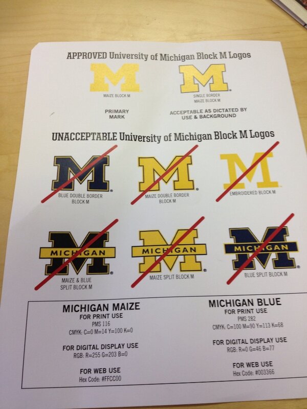
What's funny is that Yost and Crisler have "incorrect" Block M's


February 28th, 2013 at 7:03 PM ^
at least brian can finally get his colors right, ffs
February 28th, 2013 at 7:04 PM ^
February 28th, 2013 at 7:06 PM ^

February 28th, 2013 at 7:23 PM ^
and from the 2012 Sugar Bowl:
This has got to just be an oversight.
February 28th, 2013 at 7:33 PM ^
I would certainly argue that both uses of that block M, and their context, are completely unacceptable.
February 28th, 2013 at 8:03 PM ^
In the broader sense, yes. I am a fan of the blue block M (without a maize border), though.
This jersey (not including the helmet) is by far my favorite M away jersey of my lifetime (1990-present). It needs to be the every day away uniform. Simple, clean, and beautiful.
[edit:] Sugar Bowl
February 28th, 2013 at 7:09 PM ^
February 28th, 2013 at 7:21 PM ^
This is sweet. Where can I get it?
February 28th, 2013 at 7:38 PM ^
You can order one with four proofs-of-purchase for Wonka Bars.
February 28th, 2013 at 9:04 PM ^
Wal-Mart.
~Herm
zubazzzz
February 28th, 2013 at 7:22 PM ^
"Unacceptable"....?

Dave Brandon apparently asks us to prefer this:

And I think that's nuts. This is branding run amok.
February 28th, 2013 at 7:36 PM ^
February 28th, 2013 at 7:59 PM ^
Obviously, you don't know what the Minnesota M looks like.
February 28th, 2013 at 8:23 PM ^
that first M is a classic
February 28th, 2013 at 10:51 PM ^


February 28th, 2013 at 7:43 PM ^
It's the only style Michigan hat I've ever had (4 and counting). I hope I never have to buy another design. If they want to get rid of the split M (or any of the others) thats fine, but to say that this specific logo is no longer acceptable is incomprehensible to be.
The hat on my avatar was purchased 11 years ago. I have been reluctant to buy a new one because the new ones have the larger New Era logo on the side, and even that is too much to me. It's a personal choice, and if people like the fatter M, then thats wonderful, but I want to wear a plain "Bo" style hat until I die, thank you very much
February 28th, 2013 at 9:58 PM ^
Looks like I should buy 3-4 so I have a lifetime supply.
Hey, I forgot one. Surprised that you boys let me get away without posting one more. Just goes to show you that the classic M hat isn't merely some dusty relic. It's still here, today. Looking better than ever:
I just purchased one from the M Den just minutes ago. For the life of me, I just don't understand why that one, of all logos is "unacceptable". God, I hate that word.
I just purchased one from the M Den just minutes ago. For the life of me, I just don't understand why that one, of all logos is "unacceptable". God, I hate that word.
Yikes! Please be gentle.
February 28th, 2013 at 9:36 PM ^
February 28th, 2013 at 7:22 PM ^
I do like the Approved M the most, but I really dont see whats wrong with the split M. The split M is probably the most common one out there, correct or not.
February 28th, 2013 at 7:24 PM ^
Aw crap! I just realized this is one of my favorite t-shirts (besides the worst state ever)

February 28th, 2013 at 7:31 PM ^
You know it's official when the logo kingdom, Chris Creamer's Sports Logos has updated it as the official one.
I still love this one-

February 28th, 2013 at 10:59 PM ^
I've got that on my 1984 painters hat and it's still one of my favorites.

February 28th, 2013 at 7:35 PM ^

Got that?
February 28th, 2013 at 7:39 PM ^

February 28th, 2013 at 7:43 PM ^
February 28th, 2013 at 7:49 PM ^
Here is some adivce: Insulting posters like that won't win you over any friends around here, and you will experience the city La Paz in Bolivia very soon if you keep making posts like that.
I'm not a mod or anything, but I tend think they'd tend to agree with me on that.
And I've been to Bolivia a couple of times. You wouldn't last. Luckily I became an Archduke of my village.
February 28th, 2013 at 9:21 PM ^
Let me put the counter argument in terms you can understand: Go fuck yourself.


February 28th, 2013 at 7:48 PM ^
and the one above, you're taking this too seriously. Brandon doesn't make every choice (this seems more on the side of something he'd want input in, though), but he's the head of the department and has taken on a visible role as its leader.
How often do you hear the same about Facebook and Zuckerberg or 1860's public policy and Lincoln? Even MSC and Michigan; although she has a huge beauracracy to answer to and use, her name is used in place of saying, "the Regents, President's office, 23 Vice Presidents and a marketing department are working on..." Using an executive to put a face on something or to scapegoat is a pretty common practice, and I don't think it means people believe DB wrote this memo.
You have to excuse Section 1. He just has an obsession with all things Dave Brandon and the Detroit Free Press.
February 28th, 2013 at 7:44 PM ^
I must have seen that thing a thousand times but never looked closely at it until now. What is that on his forehead, a Dutch oven? I don't get it. I like it, but I don't get it.
February 28th, 2013 at 8:02 PM ^
A dutch oven with chili for gameday. Or a dutch oven with flatulence to release on an unsuspecting Brutus.
Back in the 1940's wearing sailor caps on their little furry heads was apparently popular among wolverines.
February 28th, 2013 at 7:46 PM ^