OT: Purdue's new Nike unis (new threads do not = good threads)

August 5th, 2011 at 12:41 PM ^
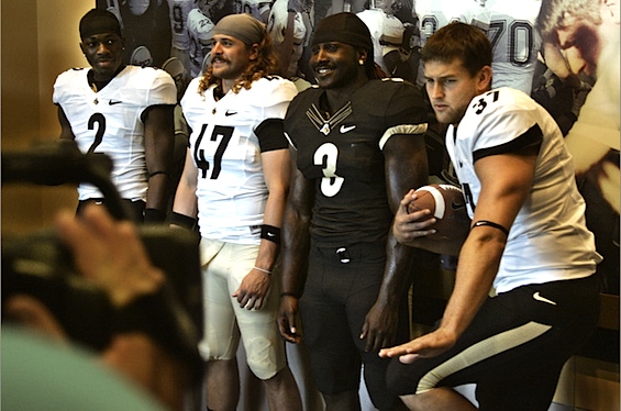
I didn't realize Purdue is at the point where their kicker is doing the Heisman pose....
August 5th, 2011 at 12:43 PM ^
Did you ask Danny Hope? According to him, their kicker is Tom Brady, Barry Sanders, & Jerry Rice bottled up into a foot, the last I heard
August 5th, 2011 at 12:46 PM ^
Is Danny Hope related to Fred Jackson?
August 5th, 2011 at 12:56 PM ^
But, due to Hope's lack of personality, he's been taking notes from every bit he can get his hands on from Fred.
August 5th, 2011 at 12:46 PM ^
And I approved this message.
...two elbows in your left arm, you can do whatever the hell you want. Seriously, is that photoshop gone bad or just an extraordinarily weird camera angle?
......you mean his triceps?
August 5th, 2011 at 12:41 PM ^
I don't hate them, I like them more thant he ones they previously had. They aren't attempted to be overly flashy and I like simplicity.
I actually like them, except for that white jersey with the stripes in the collar. I like the understated approach to jerseys.
I would have liked to see a tan alternative "away jersey", but just white and blakk is OK too.
August 5th, 2011 at 12:43 PM ^
Is that a pirate?
I bet Hope is fitting him with a hook to use against us.
Siller is clearly thinking "when the hell did we get a pirate?"

"BUT I DON'T WANNA BE A PIRATE!"
My thoughts exactly.
That is Chris Carlino, and he's from my hometown. Friends with his familiy and I remember him running around as a little kid. He's a great kid and a great representative for purdue. And on that note, I will make fun of him for looking like a weird Boiler Pete pirate the next time I see him.
August 5th, 2011 at 12:47 PM ^
I realize it's MGoBlog standard operating procedure to hate All Things New, but I actually really, really like the home gear. A little bit more vegas gold would make them really sweet in my opinion.
August 5th, 2011 at 12:56 PM ^
I agree....looks good to me.
I didn't know Vegas gold was actually the name of a color. It seems like the Pitt Panthers have Vegas gold as their colors as well.
Amen, good sir... I like them a lot.
August 5th, 2011 at 12:48 PM ^
Their old ones weren't too bad, but those just look bad. I'm especially not liking those numbers.
August 5th, 2011 at 12:54 PM ^
Hey... people scoffed at the idea of a primarily defensive player winning the Heisman. It's just a matter of time before a kicker shocks the world.
I want to see Danny Hope return his own kick in a game.
August 5th, 2011 at 12:55 PM ^
Not a fan. I like simplicity, but the number font makes them look like Steeler practice jerseys.
August 5th, 2011 at 12:55 PM ^
OMG Siller's expression is priceless. It reminded me of when somebody in a family photo decides they're going to do something "memorable" and emarrasses the hell out of everybody else.

quite disturbing.
August 5th, 2011 at 12:56 PM ^
Purdue was so excited about their new jerseys that everyone on the depth chart at a skill position blew out both ACLs.
ROFLMAO
August 5th, 2011 at 12:56 PM ^
To be fair, I hated the previous ones.
August 5th, 2011 at 12:59 PM ^
was specifically chosen because it represents the DIN typeface, the standard for engineering, technology and traffic (3 PU specialties)
http://www.jconline.com/article/20110805/SPORTS020101/108050334/Purdue-…
Was I the only one that thought the parenthetical in the thread name was an a propos comment on the thread itself?
No. My first thought was, "wow this must be really bad, the OP is calling out the content of his own thread".
I agree it's not a great thread, and I am embarrassed that I missed the other meaning of thread. Still, I think the kicker's pose and Siller's expression are funny.
They look good to me.
"Boring" is better than "totally fucking stupid." Glad they didn't go that route. Only problem I have is that the gold is so light it looks almost white and the all-black is ugly - but then, all-black has always been really ugly.
Danny Hope approves that kids mustache!
Has a pretty epic pornstache
Ahoy matey!
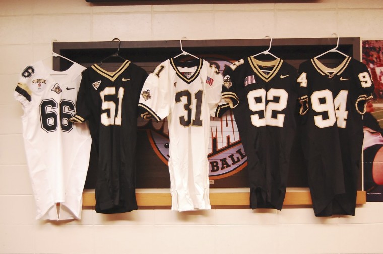
Look how classy Purdue set this up -- plastic hangers. Awesome.
They look fine to me. At least they didn't take the route Ohio and Michigan State did.
Don't forget Michigan's throwback unis for this years ND game.
I like them.
Here's what they did: black jersey, white numbers. White jersey, black numbers. Let's toss a tiny logo at the neck line and then copy the Steelers numbers. DONE!
like Mack from Super Troopers. Who wants to go to Mexico?!
Those uniforms are nice and uncluttered for the most part. I don't like the collar stripes on the black jersey.
They're not bad... but I like traditional uni numbers a lot more
Is the guy next to Siller the same guy that is in Rescue Dawn's avatar?
I hate when teams change jerseys for no apparent reason.
What is an apparent reason to change your jersey?