
I think raisin cookies are of the Devil
Oatmeal raisin cookies are the best!
Also, from my iPad I see a new background - the football stadium in light grey, New ‘Create Content’ link in the upper right. Nice refresh!
Oatmeal raison cookies are tasty if you know that's what it is. Biting into what you think is a chocolate chip cookie, only to discover it is actually oatmeal raison is one life's greatest disappointments.
Two days ago I bit into a peanut butter and chocolate chip cookie thinking it was a big soft regular chocolate chip cookie. It looked identical. And while I don't mind a peanut butter cookie, they definitely have a "grittier" mouth texture. It was an unpleasant surprise and I want a chocolate chip cookie now.
Ditto for Raisinets. Chocolate and raisins together are no good, no good.
Ah jeez, I used to think highly of you. But negative comments about Raisinets? Nope, no more.
Chocolate is a food of the gods. Grapes are the essence of fine wines. How could that combination not be perfect? ;-)
/s
Chocolate goes with peanuts, pretzels, bananas, popcorn, vanilla, strawberry, raspberry, ice cream, pound cake, oranges, chocolate, marshmallows, graham crackers, coconut, almonds, hazelnuts, caramel, coffee, and cheesecake. No raisins.
you forgot chili peppers, martinis, waffles, donuts (basically any fried dough), whole milk, pistachios … but never raisins
And chocolate is great all by itself! Especially dark chocolate 🍫
The darker the better. I am waiting for them to invent black chocolate. 200% Cacao.
Somehow, despite two lists, you both failed to mention peanut butter - the most perfect partner to chocolate.
The chocolate martini is an abomination and should only be served in Bolivia!
Seriously. Just be honest with yourself and order the 10 layer chocolate cake.
Raisinets are delicious. Chocolate covered dried cherries are super duper delicious!
No way..Raisinets are tasty. Plus they give the added benefit of if you place them just right you can smile at your friends and look toothelsss.
You could’ve stopped at raisin. Devil fruit. At best it’s an unwelcome chewy sweetness in otherwise delicious items and at worst it’s mistaken for a chocolate chip. Just completely unredeemable
I had no idea raisins were so divisive.
Obviously, you’ve never done MBSR.
I love raisins - on their own. They do not belong in cookies or - especially - sweet rolls. Oatmeal raisin cookies need to be changed into oatmeal butterscotch cookies. You guys (and gals) can thank me later...
Or in bagels.
The only thing raisins belong in is potato salad.

Looks great.
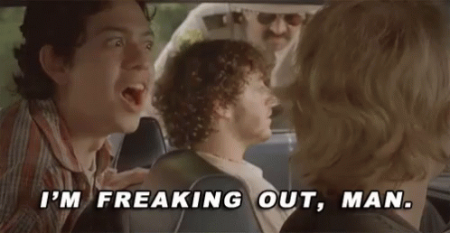
But you can't just pop these things on us without warning. I thought someone slipped me some LSD or something.
The first thing I noticed was the giant wastebasket behind the content.
(...here comes the horseshoe/toilet seat gifs...)
That's the wastebasket that OSU was crumpled up and tossed away in...
Yep...it appears to happen about once a decade.
Since you brought it Up Chuck
You would.
...and you said upchuck.
EDIT: and it's too bad that Michigan fan puts their toilet seat on backwards.

Sometimes you gotta get off your feet once in a while. Take the load off. Sit down & relax.
Is that so unreasonable?
Will the site make me look less fat? Or should I just cut out the beers and brats?
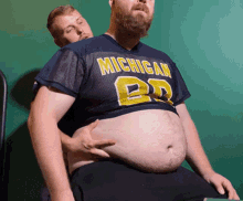
I fear one day I will look like this if I keep drinking lots of beer. I remember some fat dude on the Ghoul television show doing the same thing on Saturday nights in the mid 70s.
Wow. That adipose tissue is going to be reverberating through my consciousness the day long. I owe you one.
All you have to do is send him a brainworm like "Edelweiss" or 867-5309 and let the song reverberate through his noggin all the livelong day.
Damn you. How do I get 867-5309 out of my head now? What's the cure?
Uptown Funk:
This hit
That ice cold
Michelle Pfeiffer
That white gold
This one for them hood girls
Them good girls
Straight masterpieces
Stylin', wiling
Livin' it up in the city
Got Chucks on with Saint Laurent
Gotta kiss myself I'm so pretty ...
(all the way down to)
If we show up, we gon' show out
Smoother than a fresh jar of Skippy!
I like it. The "lonely" sitting at the top right corner is interesting. I don't think it was there before.
It's been there since the Schlissel revelations
that makes me feel much better i thought it was a brian cry for help
Ah. Subtle!
It used to be on the lower left under the banner along with other similar phrases in the past. Personally preferred it there as a bit more of a subtle easter egg, but I'm sure it is related to other overall design elements & it'll hopefully remain fun in the new spot.
Is the banner blurry to anyone else or is it just me?
can you send a screenshot?
I does seem like there is a dark spot on the left side that goes from the left edge over to the football over the US map. And a smudge above the ruins on the lower right side, right above "Never Eat Boogers" that obscures "You are over the legal limit for what ifs" and some of the quotes above it that make them tough to read.
Those are part of the design. The "dark spot" is Harbaugh's shadow.
you're a maniac to take such detailed interest and action on these things. thank you.
i will put in my plug for an additional quote in the banner. comes from today's 'there are' post. if you hit the article about the featured player there is a comment about him from a newspaper writer describing our former running back's bruising running style. it is (IMHO) a classic:
'he's a smacker from smackersville'
mgo-t-shirt idea, picture of haskins crushing someone or leaping a fool. just an idea.
I don't understand the shadow. If I hadn't read your explanation, I never would have seen it - and still I have to think about it really hard to see it. Not sure it's working as well as you might have hoped...
Scrolling through the website on my computer this morning and the site looks terrific! The background is subtle and the grey is easy on the eyes.
it does look....fuzzy or out of focus. Not sure if that was a design effort or not but it's less crisp than the previous version from what i can recall. perhaps its just that it's smaller and so the text looks more chalky/less readable?
I like the harbaugh shadow - would be better if we could see his hat or something that hints at who it is.
Overall like the redesign, Seth. Thanks as always for the work you all to do to keep this place humming.
This is my personal opinion on the website:
I personally prefer the headers under the MGOBLOG logo, catches the eye easier.
I would like a way to know who commented on my comments, and a quick way to go view it. Similar to reddit--it's very easy to find comments and scroll through threads. This website feels a little outdated in that sense. I think even more people would become active on the site, as their experience of interacting with others would be easier