
https://www.mgoblog.com/users/badandboujee/activity
Your activity page should tell you if there are any new comments in threads you're active in, and clicking the (X new) should take you to either the most recent new reply to you or the most recent new reply if there isn't one.
The message board is Reddit's main feature. For us it's really a side feature.
Yes, I have a comment.
In everyone's post, there is one space between their name and (new) in red.
But in your posts, there look to be 3-4 spaces in between. Why is this? Do the moms automatically get more spaces? Are they somehow more worthy of spaces than the rest of us? In an egalitarian society, aren't we all deserving of more spaces? What kind of one-percenter bullshit is this? In other words:
Space, bitches, space!
I'm surprised you consider the message board to be a side feature. The interaction on the message board and comments on main site/diary posts seem like the lifeblood of the mgoblog community, for better or worse sometimes. I've long found it odd that you haven't incorporated a third-party comment management tool or increased the functionality of your homegrown setup. Getting an email notification when a thread you've contributed to would increase engagement on the site, IMO.
I think, therefore I am?
seems like this might be us, following the redesign around, uncertain of what it all means...

I'm dying to know if the sheep ever catch the dog. I hope not. Run fella, run!
worst.
sheep dog.
ever.
we have/had need to herd our sheep from time to time and without the slightest bit of training our bird dog (yellow lab) was a natural at it. incredibly helpful when you need to round up a flock and head them back to the barn. legions better than the pooch depicted in the gif.
Herding cattle is certainly a piece of cake-relative to sheep.
i would agree that sheep tend to be the absolute definition of skittish, prone to run away, freeze, bleat at things they've seen 1,000 times, and are far more likely to do those things than any other livestock. that said, when cattle get it in their heads that they either do or don't want to go somewhere, 'persuading' them is way, way more difficult. and the physical damage a cow/steer/bull can do dwarfs what a sheep/ewe/ram can do, so there is that, too.
I think it looks great but I think the banner needs to be expanded across the top of the site, not just above the text.
I'm talking about the big chalkboard image at the top of the site, if that wasn't clear. I'm not sure if "banner" is the right word for it.
I 2nd this, I really love the big house in the background though
Can I edit my OPs???
Looks great, just one request, can we bring this guy back as part of the banner???

/jk
/jk, or not - this comment deserves a neg! Don't even joke about this clown coming back, worst idea the blog ever had...
"Worst idea", you've not been here long enough.
Fair point...
Worse idea was getting rid of sexy bits. Nothing like opening this blog at working and seeing bouncing big boobs, and then trying to close your browser very fast.
Nice! Much appreciate the "active threads" link.
I thought I was tripping balls for a second there.
This background is the view the guy with the parachute had the moment he realized he would be lucky to land at Briarwood in this wind, forget the stadium.
In all seriousness though, I do like it. Well done.
I never noticed before, but the banner only exists on the PC. It does not Illini the iPhone.
seth, I love ya. The yellow and blue camo looks weird in my opinion. Unless you have QR codes embedded or are sending subliminal messages or massages
question: how do you 'un-troll cave' someone?
i accidentally did that to a user and have no idea how to undo the voodoo that you do.
thanks.
Not sure how to do it with Windows etc., but in a Mac:
- Click on the MgoBlog Enhancer icon on the top right of the chrome window
- Then click on "Options" This will bring up a new window with the app options.
- At the bottom, there is a box showing you the people you have put in the "Troll Cave"
- Click on the user you want to remove, then click the blue "Remove Selected from Cave"
- Click save.
Hope this works.
thanks blue. what is the 'enhancer' icon, what does it look like?
https://mgoblog.com/mgoboard/meta-mgoblog-enhancer-extension-update-troll-cave
Here is a link with a link!
It is a blue square with diagonal maize stripes. It should be next to other add-ons like adblock if you have that installed.
i didn't pay for the 'enhanced user' subscription.... so i'm just a guest user, don't get all those paid memeber frills.....
Generally love the updates! Think the new visuals and background are quite cool, and while it took me a second to figure out the headers, locking them to the top as you scroll down makes a ton of sense and people will get used to the new location. That said, I could live without the blurry yellow line. I think it looks sharper with just a clean line between the blue and then the grey background.
For me, on desktop, loading incredibly slowly (even after multiple visits, closing browser, and returning to the site), with base content loading first followed by the yellow blur thing popping up, then the different ad spaces, causing overall experience to be very jumpy. Hopefully mostly due to updates being in progress somehow?
One thing I was really hoping was fixed was that clicking on a message board topic near the top wouldn't inevitably result on an accidental click of an ad that happened to pop up and expand down just as I selected a post to click. I know that the message board is a complement to actual blog content, but this has become a real problem for quite a while now, especially since then I'm coded into the internet forever has having been interested in whatever random ad, which then makes my broader online experience worse in the long run. If this isn't solved, it may cause me to visit exclusively from a browser with an ad block and then just make up with beveled guilt from time to time, though I would really hate for it to come to that.
So yeah, love the updates in general, same general challenges as have existed for a while with some things (especially ads) loading on delay. I wouldn't even care about the ads if they just loaded with the rest of content / didn't cause the site content to jump around!
Yeah, addressing that was part of the design fix. What needed to happen was to shrink the banner so that everything was the same width-wise, allowing us to lock the position of things on the site so that different sized ads won't push things around. When a 300x250 ad loads in place of a 300x900 ad, it should still have 300x900 spacing.
I am certainly on board with these improvements. It's also good to see that Brian has a main page post!
One improvement that I would die for is regaining the ability to distinguish between old and new comments when I revisit a thread multiple times. The old site design prior to the HUEL update had a "NEW" indicator in Red color so if you visit a thread again it is much easier to find the new comments. I assume this isn't easy to do, or it would have been done. I know I can't be the only one who misses this feature.
We do have that. It says "NEW" in red. Are you not seeing it?

the red 'new' designation only works on some browsers.
Does not work in chrome.
I love the new background! But, as others have said, the banner is a little small and gets lost in all the surrounding gibberish. Widen it out to the width of the screen, like it used to be (and then get off my lawn!).
As for further improvements, if you're taking suggestions:
- Unlock the right side menus (BG, Diaries and Board links) so they stay on screen as you slide down the page reading comments. Having to scroll all they back up is a pain
- Add page number links to the top of the page - it sucks having to scroll down to the bottom just to jump to the next (or last) page when looking for specific comments/replies
- Bring back the ability to see upvotes and downvotes, rather than just a running total of pluses minus minus'
- Bring back the ability to see who is voting how (I know clicking your username for the activity menu is supposed to show how people are voting, but I've never figured it out)
Thanks for the changes and the work in maintaining something you guys aren't really fond of!
I wonder how much of their traffic is based on mobile browsing vs desktop browsing. Because if it's mostly mobile, I can understand not really caring about the desktop looks/functionality.
On desktop, there's just so much empty space when you scroll through a thread -

But on mobile, everything looks great -

Although honestly, the last few times HUEL/Seth/Brian did site redesign and tweaks, tons of functionality things got broken, so maybe we should just be happy the website is still working? ¯\_(ツ)_/¯
Can’t collapse threads on iPad anymore.
Could you put the staff in a 2 column in the footer? Or create a staff page rather than listing out everyone creating a footer that's an entire screen and link to it.
Hail to the Victors 2021 is a 404 under the mgostore dropdown.
I'm also seeing some weird comments missing backgrounds. On this page for me the top few don't have a background. https://mgoblog.com/mgoboard/what-happened-dylan-mccaffrey-rhetorical-e…
Looks like if a comment is replying to someone from the page before, it doesn't have a background.
I don't see the little ^ next to the posts anymore that allowed you to collapse comments and any child responses. Was this ability axed? I quite enjoyed that feature, especially when a digression would take on a life of its own and clog up a thread with a bunch of responses to the initial comment.
EDIT: An astute poster noticed that the collapse carrot is still there, but is transparent unless you highlight the area. Link to the discovery from the bug report thread here.

Also, after you submit a comment on desktop, the sidebar still sometimes becomes unlocked and ends up at the bottom of the page.

I also agree with the person above who said that the banner looks blurry. The various text used to much clearer and easier to read.
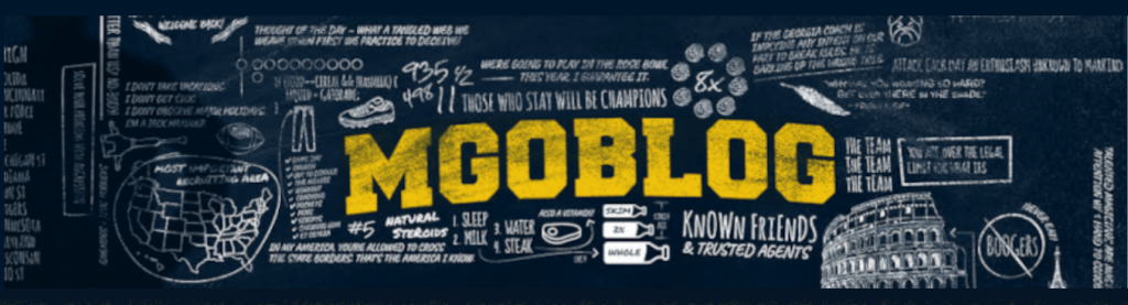
Edit: It actually looks clearer in this post since the site shrunk down the photo a little to fit within the comment box. If you right-click and select "Open image in new tab" you'll get the full size, original screengrab that better illustrates the blurriness.
Ahhhh, my eyes! As a dark reader extension user I cannot get behind white backgrounds that bypass it.....
Edit: Solution I don't like but it does work. Block the background image from loading...
Like the "Your Active Threads" link, but is it possible to get notified if someone responds to you without refreshing and going to look at your comment?
This is a little nitpicky, but anyway to remove the "reply" button in the reply window? I have accidentally hit this more than I would like to admit and it causes you to have to restart your comment.
Hey Seth,
Twitter embeds seem like they may have a problem. I simply clicked on my username to go to my user profile, then I got these errors on the top of my page.
It may be the oembed tag, that's what I use for Twitter embeds.
Screencap for helping purposes.

I got this, too. This morning I posted an embedded clip in a post using the Insert Media Embed button and it showed up nicely. I came back this afternoon to the thread where I'd posted it (the art fair thread) and got a similar message that the content from the link could not be retrieved.
I found a gif of the clip I wanted to post, so I was able to upload it using the File Manager, but it does look like the media embed button (or <oembed></oembed> tags) isn't working.
Testing...
Okay, Seth, seems we can no longer embed tweets
Not a fan of the new design format.
Comment threads that continue from one page to another page lose their white background and blend in site background. Could be difficult to read for someone who's visually impaired

I think it actually looks kind of crummy. I don't like the break between the banner and the main background; I don't really like seeing the stadium background (too noisy visually). Overall, I think a step down. Honestly, simpler is better.
</sorry>