Illinois' New Helmets: Ehhh.
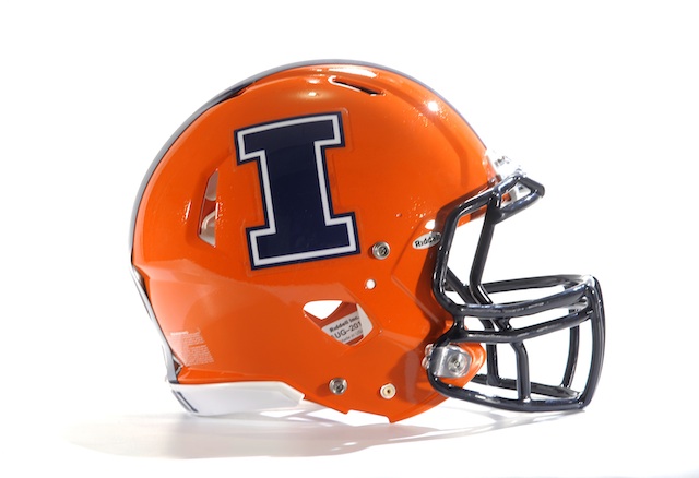
Reports that Illinois has new headgear -- bright orange, a blue stripe, and a big block blue I. their secondary helmets will be matte blue:
http://www.thechampaignroom.com/2013/7/16/4529244/illinois-football-new-helmets
This is disappointing. The bold orange is nice and all. But a few months ago, there was talk of a new helmet with a basic blue background, but orange and white, zig-zag feathers coming off the front -- a Native American headress -- that was 100% cool. Perhaps too in-your-face Native American, for the NCAA. I had higher hopes here.
Well... we'll always have Maryland (starting in 2014).
(Although I am on record as saying, Rutger's battle chrome helmet is waaaaay cool - easily second best in the conference now. Or will be, in 2014.)
Cue the 'my opinions of uniforms are more valid than your opinions' comments.
David, you ignorant slut. My opinions regarding uniforms are more valid than yours. Primarily because I'm old and hate everything.
Also, a question. Will Illinois be giving out sunglasses before games? Because I couldn't look at those for 60 minutes and not suffer sight loss and migraines. Maybe they should just stick the players' heads in gigantic flaming oranges.

You are too cool for everthing. Just tell us your opinion so we know what is right and be done with it.
(whoosh)
It isn't about my opinion. Or the opinion of anyone else.
Because they are opinions.
It isn't about undisputed facts or the laws of physics. It's a message board.
So edgy, man. So brave.
So much vitriol for you post, david from wyoming. Not me, mind you, others.
Definitely should have gone with that one that looked like a head dress! With the feathers on the crown of the helmet. Those would've really popped on tv. Or a blown up Redskins-style face that takes up the entire side of the helmet. I like the zig-zag look, haven't seen it before.
yeah who really cares, illinois will remain miserable regardless of their slight cosmetic change
The feather headdress helmet was a concept by some guy, never a real thing. http://www.illinoisloyalty.com/Forums/showpost.php?p=701154&postcount=1…
Edit: or maybe you meant the other one. Either way, just concepts. http://www.thechampaignroom.com/2013/2/23/4019504/illinois-helmet-mocku…
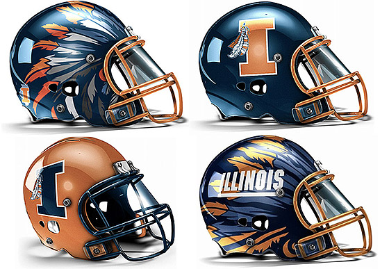

Not gonna lie, the top left headdress looks pretty bitchin'.
Yes! It looks really sweet. Kind of like Wings, but with feathers.
I agree, Chuck Norris.
The only question is, "Does Chuck Norris agree with you?"
That truly is the ONLY question.
Life = Chuck Norris.
Is that good or bad?
Yeah. I like the one on the bottom too. Now let's dance on these old peoples' lawns.
The one on the bottom would be the coolest helmet in all of football. But it's not PC so that kills it.
Too bad. Maybe they could claim that it represents some kind ot Parisian Can Can costume. You know, in honor of Champagne.
Looks like the chubby love child of Syracuse and IU.
Reminds me more of Florida
It's because they're pinin' for the Zooker
Are you mocking me just because my father is a giant orange? These days, lots of different family arrangements exist, and that's okay. We're a family too, even if I'm not allowed to hug my father very hard, and he has a huge fear of juicers.
It still makes me laugh out loud.
Did you HALOL?
(and you just made me miss MBB a bit more, my friend!)
With a move like that, he should be a professional soccer player.
They should have gone with the state's two letter acronym; "IL". Then, when things go south, in the mid-to-late season, they can add another "L" and be "ILL".
They're better than the old helmets.
I like the new helments, but it would have been better if they'd just replaced the i at the end "Illini" with an apostrophe.
I think it's an improvement. The I is a little thick, and I think it would look better without the white border, but it's a solid change.
Not bad. Better than the old ones, I'd say. I like the single "I".
the release of the new helmets, Illinois fans began their countdown to basketball season.
Do hate them. But then again, I couldn't care less.
stumbled across this article: here from the Alton, Illinois Telegraph published last Thursday.
Uniforms in the Big 10, overall, are pretty blah. Nothing exciting about any of them, save for the always-stunning classic look of Michigan’s maize and blue with those iconic helmets. The rest of the league, though, is average at best. So for the Illini to finish dead-last in the poll says a lot.
I usually don't like the new helmets... (I'm looking at you Indiana), but these are ok.
to give it a try---between the slaughterhouses and the farms in outstate Illinois, the state has more than its share of piggies.
Well at least they can go 1-11 in STYLE!
UTEP-y