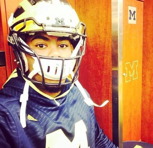
Block M added to front bumper of Winged Helmets

I saw this a few weeks ago at Schembechler. It was a display for the history of the helmets at Michigan.
For the current one, I thought it was interesting seeing what looked like a small Blue foam(?) M stuck to the front bumper on the helmet in the case that talked about the current design.

I thought it was just something for display. Well, it looks like that's a real thing now based off of a photo Canteen tweeted.

Interesting. I don't really know what to think of it.
The front bumper looked like this since 9/25/1985

August 3rd, 2014 at 10:08 PM ^
M of McDonalds and collect more revenue. Brandon'd!
Seriously, the helmet is better without the new M, but it's very low on my list of caring about things.
August 4th, 2014 at 12:16 PM ^
Look... me and the McDonald's people got this little misunderstanding. See, they're McDonald's... We're Michigan. They got the Golden Arches, ours is the Maize M. They got the Big Mac, we got the Big House.
August 3rd, 2014 at 10:12 PM ^
August 3rd, 2014 at 10:44 PM ^
August 3rd, 2014 at 11:23 PM ^
^that
August 3rd, 2014 at 11:34 PM ^
^the other
August 3rd, 2014 at 10:11 PM ^
I don't like it. Michigan has perhaps the most recognizable helmet in college football. Anybody who knows or cares anything about the game immediately knows those winged helmets represent Michigan. It's not at all needed and clutters up the look.
August 3rd, 2014 at 10:17 PM ^
More cluttered than the previous version, which had "Michigan" there rather than the block M?

August 3rd, 2014 at 10:20 PM ^
August 3rd, 2014 at 10:34 PM ^
How many people even knew "Michigan" was there? I didn't. (But then I'm not a uniform freak.)
Any overreaction in this thread probably stems partly from the title ("Block M" added to front of winged helmets"), when it should have been: "Block M replaces 'Michigan' on front of winged helmets."
They should put "Helmet" on the front of the helmet.
August 4th, 2014 at 10:34 AM ^
How about if they put "FRONT" on the helmet bumper? That way nobody puts on their helmet backwards. (Under advisement - whether to put it in mirror-image, so it reads correctly to the player when in front of the mirror.)
I'm all about functionality.

August 3rd, 2014 at 11:55 PM ^
We have gorgeous helmets
August 3rd, 2014 at 10:18 PM ^
August 3rd, 2014 at 10:31 PM ^
over the years. Without DB to blame for it, no one noticed.
August 3rd, 2014 at 10:43 PM ^
and don't care cause I gave you + 1
August 3rd, 2014 at 10:13 PM ^
Is that white piece a new safety/technology feature or was that always there? Could explain it if not.
August 4th, 2014 at 12:20 AM ^
The decal/sticker is just used to cover the brand name of the helmet so it's consistent across the entire team. It's used by a lot of teams as well, but no new safety or technological feature.
August 3rd, 2014 at 10:15 PM ^
It's sort of distracting. Not a dealbreaker for me though
August 3rd, 2014 at 10:22 PM ^
Yeah, not a dealbreaker for me either. If Hoke throws a scholly offer my way you can all buckle right the hell up.
Now you're just piling on...and I like it.
Now you're just piling on...and I like it.
August 3rd, 2014 at 10:16 PM ^
August 3rd, 2014 at 10:16 PM ^
It takes a minute because the block "M" is so prominent, but I think it actually looks better than the smaller "Michigan" that was on the front beore.
August 3rd, 2014 at 10:16 PM ^
August 3rd, 2014 at 10:18 PM ^
August 3rd, 2014 at 10:19 PM ^
Fire Brandon?
August 3rd, 2014 at 10:21 PM ^
August 3rd, 2014 at 10:22 PM ^
August 3rd, 2014 at 10:22 PM ^
August 3rd, 2014 at 10:43 PM ^
Do you have f.lux? If so, try disabling it. It looked clear to me until I did, but now it's clearly white in both pics.
August 3rd, 2014 at 10:23 PM ^
I like it... Heck, if anything, it's only helping to promote the universality of the block M, which I know the athletic department is trying to do. And for all of you Ann Arbor naysayers who don't know what I'm talking about: I live in Tennessee and whenever I wear a Michigan shirt with a block M on it, I am inevitably asked, "what's the M on your shirt stand for?" It gets rather annoying.
August 3rd, 2014 at 10:27 PM ^
August 3rd, 2014 at 10:52 PM ^
August 3rd, 2014 at 10:25 PM ^
August 3rd, 2014 at 10:33 PM ^
August 4th, 2014 at 12:03 PM ^
Says the person with the unauthorized split M in your avatar. For shame!
I enjoy seeing "Michigan" spelled out and think it fits a bit better on the helmet (maybe?). Ultimately, though, this is very low to nonexistent on the scale of things to get excited over.
August 3rd, 2014 at 10:25 PM ^
Saw it on Twitter and immediately thought "I wonder if Wolverine Devotee posted this on MGoBlog yet."
Keep being awesome, dude.
August 3rd, 2014 at 10:26 PM ^
August 3rd, 2014 at 10:27 PM ^
August 3rd, 2014 at 10:27 PM ^
August 3rd, 2014 at 10:28 PM ^
That it has said "Michigan" there for at least 30 years? All they are doing is replacing that with "M."