The Recruiting Maps

Now that we’ve officially entered the dead period after Spring Ball and before Fall Camp, its time to start digging into some of the details. As always if you have something you want me to look into hit me up in the comments or on twitter.
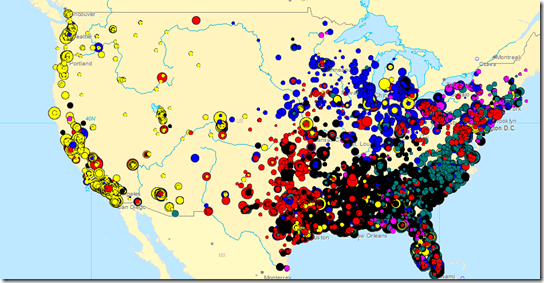
Using some new software and my recruiting database, I wanted to see what the recruiting scene from the last 12 classes (2002-2013) look like on a map. Each BCS conference signee is shown with a dot and scaled to represent the consensus rating of that recruit. The larger the dot, the more highly regarded the recruit was. Metro areas have tons of recruits piled on top of each and are difficult to distinguish, but I think there are plenty of interesting things to pull from the overall picture.
The National Overview

B1G=Blue, SEC=Black, B12=Red, P12=Yellow, ACC=Teal, former Big East=Pink
Unsurprisingly the recruits center largely around the geographies of the schools they are attending. Florida is a jumbled mess across all of the conferences but there are very clear boundaries by conference. It is also amazing that other than Phoenix, Salt Lake City, Denver and west Texas there are essentially no FBS football recruits between the Pacific coast and I-35. It will be interesting to see what happens with this as geographical boundaries continue to overlap with the ongoing conference expansion.
B1G and SEC Country

The B1G Footprint
Although the Big Ten footprint has largely stayed at home to play, there are regions that have had some pull from outside conferences. Iowa is naturally split and the Big 12 has pulled a few other players from Illinois, Ohio and Pennsylvania. The Pac-10/12 has scored a couple of big Midwest recruits themselves and Eastern Ohio/Western Pennsylvania is a natural ground for competition between the Big 10, Pitt and West Virginia.

Even excluding Florida, the SEC looks to have held their territory about as well as the Big Ten has. The most striking thing to me, is how much coverage the SEC has across its geographic footprint. In the Big 10 there are areas of high population/recruit density with a fair amount of space between them. In the Southeast there are black dots everywhere. It appears as if every county is generating major college football recruits, not just the major metro areas.
[After the jump, a cartographer's dream]
B1G By School

Looking just at the Big Ten teams in the Big Ten footprint, Michigan is probably the team with the widest range. The combination of program prestige and a quality but insufficient home state talent base is likely the source of Michigan's wider footprint. The Buckeyes can generate enough talent in state that the need to extend the boundary is less. Penn State has natural tie-ins east and most of the other teams in the conference haven’t had.
B1G Recruiting the State of Michigan

Michigan has pulled most of the major circles from outside of the Detroit metro while Michigan State has signed most of the second level rated players. The random black circles in the middle of the state represent Doug Van Dyke and Garret Bushong signing with Purdue in 2003.
Michigan success across the rest of the state is easy to see visually but Detroit is tough to distinguish as most of the circles are piled on top of each other. To clarify what Detroit looks like I put together this chart of the top 100 Michigan recruits since 2002. Going left to right by consensus rating, it looks at how many recruits where signed by Michigan, Michigan State, other Big Ten schools and then all other schools.

Within Detroit, Michigan has really pursued the top 33 recruits, or about the top 3 in a given year. For reference, the 33rd ranked Detroit recruit since 2002 is 2013 Michigan signee Khalid Hill. Michigan State has also pursued a similar group. Of those 33, Michigan signed 15 players, Michigan State signed 9 and other schools have also signed 9. LSU, USC, Oregon, West Virginia and Notre Dame have all signed top level Detroit talent from outside the Big Ten while Iowa (2), Ohio State and Illinois have all done the same from within the conference.
B1G Recruiting the State of Ohio

Lots of big gray circles on this one. Tressel was quite successful in locking down the top talent in Ohio. During his tenure, he signed 33 of the top 50 players from Ohio and Michigan signed 5. Like Detroit, the local concentration is difficult to show the nuance of what is happening, so here is a statewide look at the top 500 recruits from Ohio.

Based on the flattening at the, Michigan and Ohio were probably only looking at the top 250 or so recruits, about 20 per year. Of that group, Ohio grabbed about 50% (and a higher rate of the truly elite). Michigan managed about 15% with the rest scattered around a host of schools. Notre Dame (15) and Michigan State (12) where the only other schools with more than 6 signees from the Ohio top 250 from 2002-2013.
But what happens when you look at just Hoke’s full seasons.

The 2012 and 2013 classes shifted things dramatically. Michigan and Ohio were nearly toe to toe through the top 50 and Ohio’s share overall went down considerably. From all indications, the 2014 will look more like the long term trend than the last two. Michael Ferns might be Michigan’s only elite Ohio signee.
As a final look, here is Michigan’s national map. Highly concentrated in Michigan with a strong presence throughout the major Big Ten hot spots and various key other pockets throughout the country.

-----------------------------
*Maps generated by software from Ann Arbor based Llamasoft
April 17th, 2013 at 12:15 PM ^
...and appreciated it very much. Nice work.
April 17th, 2013 at 12:18 PM ^
April 17th, 2013 at 12:20 PM ^
Ewww. Dalmatian lover's wet dream--would rather not consider.
April 17th, 2013 at 12:20 PM ^
Shows how much I follow recruiting and how interesting I find maps, because I can name a ton of recruits just based on the circle color and location. White circle up north? Anthony Zettel. Huge yellow circle in Muskegon? Rojo
April 17th, 2013 at 12:28 PM ^
Don't forget Jake Fisher as the yellow dot in Traverse City.
April 17th, 2013 at 12:22 PM ^
April 17th, 2013 at 12:27 PM ^
April 17th, 2013 at 12:29 PM ^
April 17th, 2013 at 12:52 PM ^
(Ronald Johnson) Top 10 WR out of Muskegon HS in '07. I think he was expected to come to Michigan for a long time but picked USC instead
http://rivals.yahoo.com/footballrecruiting/football/recruiting/player-Ronald-Johnson-38028
April 17th, 2013 at 12:24 PM ^
Does no one get Stauskases for football or are Canadians (and Mexicans?) just excluded from the database?
April 17th, 2013 at 12:24 PM ^
it's not very exciting, but I'm curious about the concept of "outkicking the coverage." Specifically, do longer punts give more variance and more chance of a long return? Is there an optimal length of punt to maximize distance and minimize return?
It seems to me that kicking, say, 35 yards and forcing a fair catch is a safer play than punting 50+ and having a potential return for TD. But I'd be curious if the data shows that longer punts are more likely to give up a longer return.
I second this
April 17th, 2013 at 12:25 PM ^
Fascinating stuff! But why aren't there any dots in the U.P.? /s
The first dot that really stood out to me was ROJO, but who is the big Toledo area recruit that went to the PAC 12?
April 17th, 2013 at 12:51 PM ^
Wisconsin's Jacob Pedersen is the cream of the U.P. crop over the past (insert large number) years and more than makes up for the lack of dots in the U.P. Maybe Dean Altobelli, Spartan safety in the 80's, is the last significant B1G contributor from above the bridge?
/Yooper
would take us to Barry Pierson, whose two long punt returns were instrumental against Ohio in the 1969 24-12 righting of the universe. Of course Barry was from St. Ignace, a town which to us true Yoopers has always rather been an honorary member of the Yooper club. . . .
April 17th, 2013 at 10:56 PM ^
Tight end Fred Davis from Toledo won the Mackey Award at USC and is now in the NFL with Washington.
April 17th, 2013 at 12:25 PM ^
It is also amazing that other than Phoenix, Salt Lake City, Denver and west Texas there are essentially no FBS football recruits between the Pacific coast and I-35.
This basically maps onto population, doesn't it? If you compare your map of FBS recruits to population, as indicated by light production at night, you get a pretty decent fit:

Boise State begs to differ. They certainly found some gems in the middle of no where.
A quick search on Rivals' database yields the following states of origin for Boise State commits. Almost half of them are from California. More than half are from California + Texas. Only 15% are from Idaho.

Close, except as the OP mentioned, there are a ton of bubbles all over the SEC area, even outside metro areas, while talent in other areas of the country is mostly all coming from the urban areas. So is the SEC advantage the fact that randome schools in the middle of nowhere are able to produce football talent vs. other regions?
This, according to the US census, is the population density of the US by county:

You can see that those Southern counties are pretty dense, even though they may not have major metro areas. The population density drops off pretty quickly west of I-35, and what's more, you tend to have very low rural population densities until you get to the West Coast.
I suspect that the SEC's advantage is that football is far and away the most popular sport, so most of their athletes are playing football as opposed to other sports.
April 17th, 2013 at 12:33 PM ^
Have you considered using Google Chart Tools to display your graphs? It's HTML5 / javascript so users don't need any plugins, and it allows some degree of interactivity that I think could be really cool for your posts. Also free, obviously.
https://google-developers.appspot.com/chart/interactive/docs/index
It would just be a nice touch, your posts and insights are already great.
D3 is another option http://d3js.org/
http://mbostock.github.io/d3/talk/20111116/airports.html
It would not take a lot of time to create an interactive version of these maps using d3.
April 17th, 2013 at 12:52 PM ^
is pretty stoked. Great job as always Mathlete.
April 17th, 2013 at 12:55 PM ^
Who is the red dot from upper Montana/North Dakota?
from Malta, Montana. 2002 3-star kicker that went to Oklahoma.
Thanks, Mathlete.
Another fine job from you.
Looking at just the B1G by school map, is it just me, or does it seem like Wisconsin's geographic reach is mighty impressive?
I know ND is a true national recruiter in the non-MSU sense. I would be interested to see where they bunch up though... I expect they would have some areas in California, and a few other states where they get more talent.
Looking at the various maps it does seem (not a big surprise) that "most" decisions have a big geographic component to them. With that being said - then that is probably the biggest driver of conference success - especially if that conference is heavilly populated. Add to that an overall issue of having success recruiting at cold-weather schools which is a pretty big deal. A young stud from Louisianna is probably not going to seriously enjoy our winters if he feels has equal choices (I know that young Mr Dilieo has however... thank you).
As for the more consistent density of athletes in SEC land which was mentioned. Demographically - you have more African American youth (majority of D1 players) living in rural areas in the south than you comparatively have here in the north where these athletes more often than not live in larger urban areas.
I guess - all this tells me we can still compete but MN is screwed...
Mathlete, are you using Tableau, or something else? Cool stuff!
Be curious if you do a time-lapse viz that looks at only the 4* and above recruits and shows where they came from by year -- is 2002 far enough back to show the migration of where the top recruits hail from?
I'm a dork, could look at maps and the graphs and the patterns for hours.
April 17th, 2013 at 10:07 PM ^
Fixed your map to adjust for MSU recruiting

Comments