Welcome To The Successories Conference


aaargh unnecessary comma
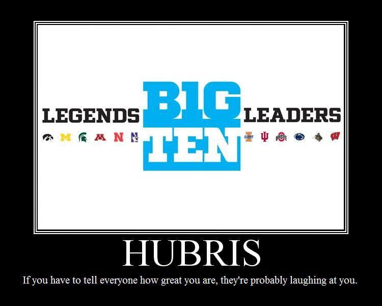
When Twitter blew up at noon I figured something inane involving Jim Delany had just happened—this is my default assumption whenever Twitter blows up and has always been right, even when Michael Jackson died—and good lord, inane doesn't even begin to cover it. You know this by now but to remind you that the people in charge of marketing the Big Ten are either very stupid or think you are very stupid, the Big Ten Divisions are called "Legends" and "Leaders."
So. A group of people responsible for turning the Big Ten Network into a spigot of filthy lucre so gushing it can afford to employ Chris Martin is also responsible for making the Big Ten the Successories Conference. They've created division names that signify nothing about the teams inside of them—the only way I can remember that Michigan is in the "Legends" division is that "Leaders" is part of the friggin' fight song and we're not in that division. Their inane names don't just start with the same letter, they start with the same two letters. They are unusable.
And they've done this with 15 minutes in photoshop:

Note the use of negative space. Also note how stupid it looks.
By comparison, the new Pac-10 logo would look badass on any soccer shirt in the world:

How can the same group of people responsible for creating the BTN be responsible for this? Obviously the visionary bits of the BTN arrangement come from Fox, with Delany and company the lucky nomads who parked their camels in the right bit of desert and now get to call themselves an emirate.
Policy
These division names do not exist. I'm not using them. Michigan is in the West. Ohio State is in the East. Wisconsin has to deal. It is immediately obvious which teams are in the West—the ones mostly in the west. Michigan can be Champions of the West, and no one has to think about how leadership is more about character than authority.
Can we make this a blogosphere-wide insurrection? Please? Everyone just use "East" and "West."
Remember when you'd go in your room and imagine that instead of a broken down tricycle you had a flying unicorn that could take you away from mommy and daddy's screaming? Yeah, this will be like that.
BONUS: someone on the twitters said "I'm pretty sure an ordinary @MGoBlog thread could have produced better logo options," which is true. So do it either in the comments or by email and I'll pull up the best five and we can vote on the Unofficial Big Ten Logo; I hope I can work out a deal with the winner so we can offer it to the conference for free, if only to shame them.
December 13th, 2010 at 8:58 PM ^
The Big 10's new bland plain logo reinforces the plodding Big 10 image. Then the wussy cyan comes along and makes it even worse. Combining these two is a disaster.
Boring Logo + Wussy Color =! Exciting Logo.
I think your logo is much better. It has some potential. But please, no Carolina Blue, er, cyan.
December 13th, 2010 at 5:32 PM ^

Has this already been submitted? Nothing groundbreaking but is it really so bad? I'd pick this over the new one. Or is there a rule against a conference having the same logo as it's network? (I even added another star!)

Okay, more of a concept piece... Get it? The 10 is big! Inspired by an earlier post.
I actually might try to come up with a real design just for fun. But by the time I finish it there will probably be 14 or 16 teams in the conference (I'm slow and have creativity ADD).
December 13th, 2010 at 5:45 PM ^
That's not bad. I wonder why they wouldn't want a logo similar to the BTN's. If it's allowed, they should go for it.
December 13th, 2010 at 10:15 PM ^
It's a hell of a lot better than that thing that some Photoshop newbie came up with.
It's so bad that I'm wondering if they have another in mind and they're just trying to boost support for the second one by having it replace this dud.
December 14th, 2010 at 4:50 PM ^
I like it.
December 13th, 2010 at 5:33 PM ^
wtf? i'm still in shock. I can't believe these morons struck gold with the btn.
December 13th, 2010 at 5:48 PM ^
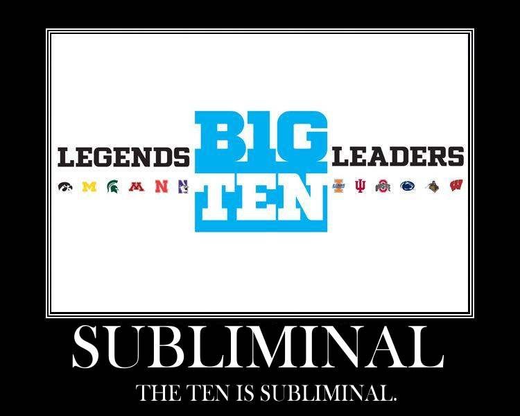
In efforts to pay homage to the original ten teams, Pentagram decides to hide a subliminal ten in the text of the new Big Ten logo. Which now has twelve teams. But is still called the Big Ten. In homage to the original ten teams.
My problem is this:
Why, goddammit? Hiding a subliminal number in a logo whose name perceptibly displays the same number is REDUNDANT. KILL ME.
December 13th, 2010 at 5:59 PM ^
Even dumber is how they failed so badly and everybody is looking around for a two because the G != 0
December 13th, 2010 at 8:16 PM ^
shouldn't the subliminal part be a "12" ?
December 14th, 2010 at 6:32 PM ^
Nice Work!
Your color and font seem so much more FOOTBALL than the actual logo. The best logos everything is relevant. Font, color, graphics.
I don't care if this is off topic. I think Blue in a Red State is onto something and wouldn't it be cool if MgoBlog came up with the new logo. I like the use of positive and negative space with the NBA logo. The Big 10 could do something similar with a football. Do we even need to use #12 or #10?


December 13th, 2010 at 6:02 PM ^
I am having difficulty not laughing at this and thereby disturbing everyone else in the Grad. The first time was watching the cartoonish intro video where "Legends" talked about "Leadership" (Get it, guys, it's the division names?)
December 13th, 2010 at 6:05 PM ^
He could run the Detroit Lions.
December 13th, 2010 at 7:17 PM ^
When the Big Ten announced the addition of Nebraska, I gave that move two thumbs up.
Everything since then has been bad news and just seems to be getting worse. This makes me sad.
December 13th, 2010 at 7:20 PM ^
Here's my 2 cents worth for the logo + a product idea for the commish!
![]()
December 13th, 2010 at 8:23 PM ^
What a bunch of fucking ass clowns. This is what we get from the people running our conference. The lack of original thinking and creativity is frightening.

December 14th, 2010 at 12:55 AM ^
Alas, the same can't be said for the logo design specialist.
December 13th, 2010 at 8:47 PM ^
It's not like Wisconsin is out on the Pacific coast.
Even if we expand to 14 or 16 teams, there will be enough critical mass to have a clearly identifiable East Diviison and a clearly identifiable West Division, even if a few teams seem somewhat out of place.
It works well enough for the NFL, MLB, and so on.
December 13th, 2010 at 10:53 PM ^
That is excellent!
December 13th, 2010 at 9:17 PM ^
I think they should go with "Legends" and "Legendary".
Good God, I hope this is another one of those Big 10 test marketing exercises where Delaney and friends throw something out there willy-nilly to gauge our reaction.
Yeah, that must be it. There can be no other explaination. Next week they'll produce the real logo and division names and let us know they were just jerking our chains, ala the moving Michigan-Ohio State game.
December 13th, 2010 at 9:37 PM ^
For division names, how about "Big" and "Ten"?
December 13th, 2010 at 9:53 PM ^

BIG TEN (12)
December 13th, 2010 at 9:48 PM ^
Go Blue!
December 13th, 2010 at 10:03 PM ^
All along I've wanted them to be named the Bo & Woody divisions.
So I hereby suggest that we fans start calling them the Bo & Woody divisions. It's not like anyone's going to prefer L & L.
December 13th, 2010 at 10:37 PM ^
Am I the only one who is pleased w/ Legends & Leaders?
yes.
December 13th, 2010 at 10:02 PM ^
but clearly neither are most of the commenters submitting logos. My thoughts? If you are a Michigan fan I am surprised that you don't like the logo. We have the block M and the logo is essentially made of block letters. It's very collegial, simple and clean. I'm not touting it as the best thing ever, but clearly not something worth being upset about or dissing. I personally dont love the new Pac 10 logo, so the Big 10's retro logo is classic and will come to be loved IMO. Maybe the color coulda been a darker blue, but why split hairs really. #goblue
The Rake
December 13th, 2010 at 10:21 PM ^
How about "M1chigan" on our hockey sweaters.
December 13th, 2010 at 10:39 PM ^
December 13th, 2010 at 10:58 PM ^
D-Brandon must have been shown this crap on November 15th and it blew his mind so badly he needs until January to figure out who is gonna be the football coach...
Check out the full list of awards:
http://collegefootballtalk.nbcsports.com/2010/12/13/big-ten-reveals-div…
December 13th, 2010 at 11:25 PM ^
Paterno's longevity and record is amazing, but most of his success happened before Penn State entered the Big 10. He has only won 3 big ten championships and 2 of them were shared. The historical indenity of the Big 10 has nothing to do with Penn State or Paterno. It makes no sense at all!
Stagg is a legend, but he only won 7 big ten championships for a school that left the Big 10 in 1946. Yost won 10 during the same era! His name belongs on there before Stagg!
I understand that the coach of the year trophy is called the "Shembechler-Hayes" trophy, but that should be the name of the championship trophy! They made the Big 10 special in the modern era, not Stagg or Paterno. Bo and Woody combined for 26 Big 10 Championships (13 each). All they did was win Big 10 championships, shouldn't that be reflected on the Big 10 championship trophy or whould that make too much sense for Jimbo?

December 14th, 2010 at 3:10 PM ^
And you know she's the one - look at the color of her crayons.
December 14th, 2010 at 12:39 AM ^
Check out my craptacular suggestion. And yes, I know Chicago is in the research consortium but who cares.
December 14th, 2010 at 12:51 AM ^
now people will resort to calling the divisions the Michigan division and the Ohio St division
(or Wolverine / Buckeye).
Immediately clear which group your talking about.
December 14th, 2010 at 1:18 AM ^
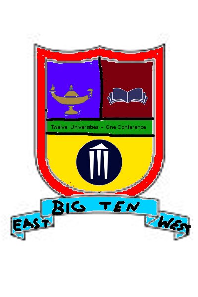
Idea I've been trying (unsuccessfully) to sketch out: I like the idea of a shield logo - it's associated with sports, and while the Pac 12 already did it, we have a traditional rivalry with them, so it works. I'd say a play off of the Interstate shield (see e.g. here ) which plays off of the region's large size and automotive heritage. BIG TEN would be written across the top (reddish) field in some sort of classy yet modern sans serif font. The lower field (blue) would contain some combination of 12 stars, a wave motif (for the lakes), a grain/corn motif (for the plains), and/or a gear motif (for industry). Probably not all that, it would be too busy, but I like those symbols. Stylize the whole thing by darkening/"modernizing" the colors and throwing some nice relief and gradients, a la the Pac 10 logo, and I think you'd have something nice. If someone with some talent sees any promise there, feel free to sketch it up - you'll probably do better than I can.
December 14th, 2010 at 12:55 PM ^
The Big Ten conference has been around since 1896 -- 114 years -- and yet the vast majority of the names on the player trophies are for players since 1960. Grange, Graham, Nagurski, Ameche, and Eddleman -- 5 players out of 28. That is absolutely ridiculous, and does utter violence to the Big Ten's history.
I almost want to call for Delany's resignation over this -- how do you ignore the vast majority of the Big Ten's heritage like that? Unbelievable.
December 14th, 2010 at 2:42 PM ^
One major part of the logo design was its use in new media, which is why the PAC-10 badge idea works so well, and why they stacked it. I think any new logo should have this quality of being able to fit in a square for avatars, favicons, etc., but that doesn't mean that anything in that shape works. I like the idea of using the BTN logo but possibly stacking the BIG/TEN like the new logo, and completely doing away with the awful font color of the new logo.
December 14th, 2010 at 3:08 PM ^
I'm surprised that no one else has noticed that the color of the new B10 logo is the same as the "reply" button here.
December 14th, 2010 at 4:47 PM ^
I actually thought it was pretty cool how they worked the 11 into the old logo. But this new logo sucks. Leaders & Legends? Are you kidding me? For a second I thought it was a spoof.
December 14th, 2010 at 7:17 PM ^
But here's my contributions anyway. Surprised no one came up with them:


December 14th, 2010 at 8:21 PM ^
It turns out that color is really, really hard here. Without using some sort of a light blue, you almost certainly stumble onto somebody's school colors. I just said nuts to it and went with something close to ours. In a final version, the buildings in the background could easily be changed to each be the primary color of a school. I was trying to capture the dual nature of the Big Ten with big cities and big agriculture.
![]()
Thoughts?
December 14th, 2010 at 10:20 PM ^

Comments? Suggestions?
Note 12 stars, one for each school
December 14th, 2010 at 11:46 PM ^
I wouldn't put the football in there (versions of it that could be used for different sports could each have their own sport represented there, but the main conference logo shouldn't single out any particular sport).
Otherwise, I like.
December 15th, 2010 at 3:06 PM ^
Yes, I realized my mistake afterwards. I like your suggestion though for changing it up for different sports. Here's another shot at it, I'm not sure I like it as much, but sans football:


Comments