OT: Dallas Stars new logo/uniformz

Uh.....why did they need to change their look again?
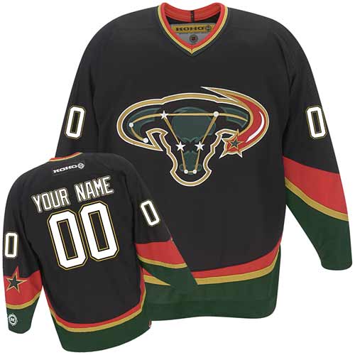
The Minnesota North Dallas Stars had a great logo. They look like North Dakota now.
![]()
Article-
http://news.sportslogos.net/2013/06/04/dallas-stars-unveil-new-logo-uniforms/
Thank you for reminding me that I don't spend nearly enough time on The Onion.


God bless the NHL and the Original Six. You could make a list of the 10 or 20 best uniforms in sports, and all Original Six NHL franchises would be on it.
Agree 100%, although I've always thought the Rangers unis were the least interesting.
I dunno, the overall simplicity, the originality of the diagonal lettering, and the beautifully balanced color scheme make this a really awesome jersey.


Prediction: this lasts maybe 4-5 years and then they go back to their old look.
You mean this one?

That one was classic. But I just meant this one:

 >
> >
> >
>
The final image leading into your signature has (what I suspect are) unintended consequences.
Yep, the original was the best. Even the name was better: North Stars. Too bad the franchise had to relocate.
Dallas should change their name to the Pelicans so that Minnesota can be the North Stars again.
They're only the Ducks now as Disney owned the rights to the "Mighty Ducks" and the duck goalie mask logo IIRC. But they don't own the franchise anymore so we most likely won't see those
Or was it the new ownership group making a change on their own? Seems like a ton of "free" advertising for Disney in exchange for letting them keep the old name and logo. Speaking of Disney, Dallas should just stick with this:
"I heard you were a farmer."
After further research, you are correct. I had thought Disney took their logo and name with them when they left.
season tix holder and went to their first game....against the wings.
quick story: they were using special pucks for the game and the extras used for warm-ups are kept in the penalty box. buddy of mine from canada works the box and at the end of the game probert is in the box with somebody else for fighting (what else). proby and the other wing take a liking to the pucks and want to keep some, problem is they don't have any way to get them over to the wings bench. my friend, not remembering the infamous limo incident with proby where he was busted at the Det/Wind border with an ounce of blow in his pants says to proby, "Put them in your pants". There is dead silence as proby is looking at lloyd, about to kill him, but then realizes that lloyd didn't have a clue about the trouser coke. proby and the other wing laughed so hard they nearly missed getting out of the box when their time was up.
New colors as well?
BTW, the Canes are introducing new jerseys as well.
Appears to be NJ for the road and DET at home.
Disappointing they are removing the hurricane flags from the sweater as that was the part I liked the best.
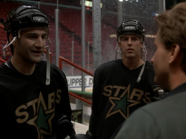
Not much different from the old North Stars jersey, except, well, the obvious.

You mean the yellow parts?
Those new jerseys SUCK! I'm glad I bought my son an all black Stars jersey.
the Canes became the Coyotes:

I don't get why the logo is so damn high, looks ridiculous.
Those could be Ohio's jerseys if you put a block O on them.
They remind me of the Cedar Rapids Roughriders.
They are slowly migrating toward become the Dallas Cowboys of hockey, by moving to the silver. Soon the green will become blue, they'll get rid of the D and just have the star, and then they'll just change their name to Cowboys in the hope of getting more of a fan base. Lord knows it can't hurt especially with the CLYTT network's infatuation with the Cowboys.
The CLYTT network is what I call ESPN, which should rename itself accordingly since 75% of all coverage orbits around these four entities:
COWBOYS
LAKERS
YANKEES
TEBOW
TIGER
However, you do need one more 'L' for LeBron
I like cli, oops different kind...
... the site for repressed fashionistas.
I love CLYTT
EDIT: JK I only like the Cowboys.
I wish i had more hands so I could give those jerseys four thumbs down!!!
It looks like something DC Comics would have come up with in the 70's for a superhero, some minor character named "Dyna-Star" or some such thing. It's got that "I bet the kids really thought that looked cool 30 years ago" vibe going on.
Look like a generic logo for a create-a-team in a video game
Pick a letter, pick a shape, DONE!
YES! That is excatly what it looks like. I was trying to put my finger on what exactly it reminded me of, thank you.

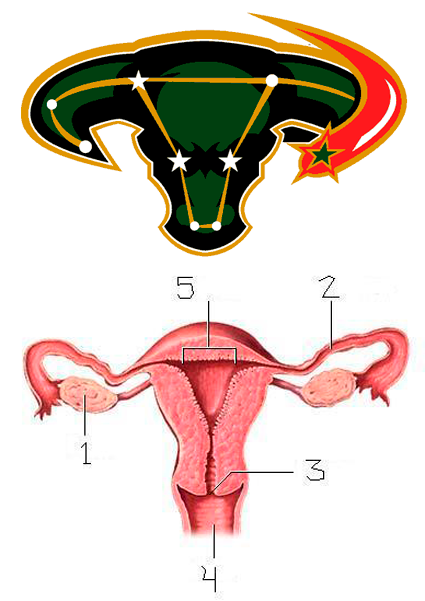
Edit: On second glance, they look almost exactly like North Dakota's jerseys. Right down to the green shoulders and the green and black stripes at the waist
Double Edit: Just realized the OP pointed that out. Oops
The jerseys themselves are actually quite an improvement in my opinion, but that logo is a trainwreck.