UniWatch reports Change in Road Jerseys
http://espn.go.com/espn/page2/story/_/id/6937142/uni-watch-ponders-nike-future-nfl-jersey-design
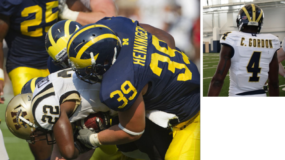
Michigan has added a block "M" above the player names, and has also scrapped the extraneous piping on the road jersey (although the Wolverines don't play on the road until Oct. 8 -- their sixth game! -- so it'll be a while before you see the new road design).
Saw the Block M on the back of the home jerseys last week, and from this photo:
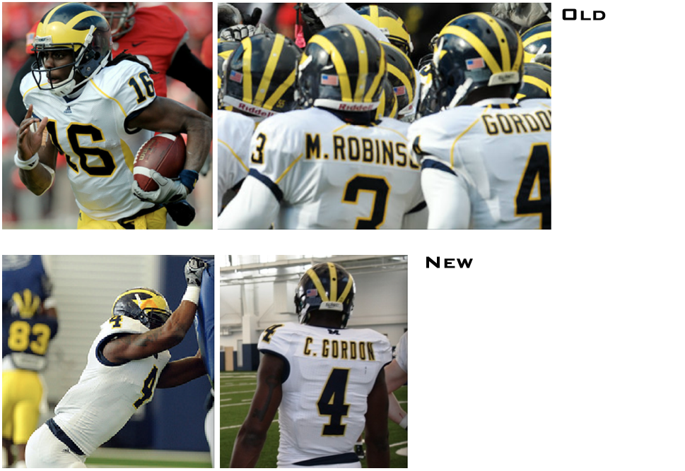
It appears the yellow piping is gone. Yes that's in practice, and yes Cam is wearing White Pants that are NOT supposed to make it to game day, but his jersey is fancier than some of the other practice jerseys we saw. It has his name, and yellow outlining around the name and numbers, as well as a matching Block M above his name.
I don't mind the changes. Never loved the yellow piping, but didn't hate it either. Your thoughts?
September 7th, 2011 at 11:50 AM ^
I'm not a football jersey expert, but those look like game jerseys being tried out in practice. They look heavier than a practice jersey and the quality of the numbers/name are both high for a practice uniform.
Also, I really like them.
September 7th, 2011 at 11:50 AM ^
More simple = more better
September 7th, 2011 at 12:27 PM ^
The grammar Nazi in me just shot himself after reading that
September 7th, 2011 at 12:53 PM ^
September 7th, 2011 at 1:55 PM ^
It was supposed to be ="More Weller".
September 7th, 2011 at 1:40 PM ^
Sometimes, bad grammar is used on purpose.
September 7th, 2011 at 11:51 AM ^
If what Cam is wearing are the new road jersey they look real slick, I like them a lot.
September 7th, 2011 at 12:43 PM ^
I actually didnt mind the maize piping either but the new ones look good! I like the simple white and the block M on the back looks cool. Some didnt like it on last weeks jerseys but I did.
September 7th, 2011 at 12:52 PM ^
The piping looked like West Virginia... Hasta la later
September 7th, 2011 at 11:53 AM ^
I was really hoping they were going to use those jerseys this year. I like them a lot better compared to last year's.
September 7th, 2011 at 11:55 AM ^
Good. I attribute our 4-10 road record the past 3 years to the stripes.
September 7th, 2011 at 12:08 PM ^
We had yellow piping with Nike too at least as far back as 2006...
September 7th, 2011 at 12:21 PM ^
Since when do we wear yellow?
September 7th, 2011 at 1:45 PM ^
The Alma Mater is called "The Yellow and Blue," so I think it's acceptable to use Maize and Yellow interchangeably.
September 7th, 2011 at 5:21 PM ^
.....will solve this once and for all. We should send them a jersey and wait for the results, but then we may need to turn the Alma Mater into "The 13-0746 TCX and 072 PC"
September 7th, 2011 at 12:29 PM ^
2006:

if you squint real hard, you may see that tiny shred of yellow wrapping around henne's back.
2008:

September 7th, 2011 at 1:59 PM ^
since it was less piping, but not zero piping, and we lost fewer road games with less piping, he may be on to something. We'll see, but if we wear these jersey's with no piping and win vs NW in our first road game, then we will be undeafeted on the road without the piping, thus giving us a perfect correlation of amount of piping vs losses on the road.
And here I thought it had something to do with Gerg.
September 7th, 2011 at 11:54 AM ^
They are an improvement. I like larger numbers, like back in the early 90's and before. Something more bold, as long as they don't blow up to tOSU size (numbers on steroids).
September 7th, 2011 at 11:55 AM ^
I don't like the Block "M" above the names. I love the Block "M" itself but not there over the names. It looks out of place. If its necessary, it might look better on the front over the number instead.
September 7th, 2011 at 11:59 AM ^
I agree. Right on top of the Adidas logo would be good.
September 7th, 2011 at 3:10 PM ^
Ah, but maybe that emphasizes team over the individual.
September 7th, 2011 at 11:57 AM ^
Definitely liked the new home jerseys on Saturday -- looked much MUCH cleaner than last year's home jerseys which looked beat up and ragged. I like the tight fit and also the block M above the number. I think they looked sharp.
As for road jerseys, I noticed the M Den also failed to put a picture of the old away jerseys in their fall magazine so that was an obvious hint that something was going to change.
September 7th, 2011 at 12:03 PM ^
Indeed I love the whole less is more thing. They look great.
September 7th, 2011 at 12:04 PM ^
if this is true..... I'm very happy! I've thought that the yellow piping was bad for a long time.
If the jersey that Cam is wearing is a game jersey, I'm very pleased!
September 7th, 2011 at 12:04 PM ^
September 7th, 2011 at 12:05 PM ^
wasn't a fan of the piping so i love the cleaner, simpler look. one nitpick, i feel like the numbers on the front of the jersey look a little small, definitely shrunk from the previous jersey. but overall two thumbs up.
September 7th, 2011 at 12:13 PM ^
If true, this is a move in the right direction of Michigan football "fashionry".
Yes, I made that word up.
Strategery.
September 7th, 2011 at 12:16 PM ^
I like the simplicity, but I kind of wish they would go back to the Schembechler-era sleeve stripes. That was a strong "classic" look.
September 7th, 2011 at 1:28 PM ^
but.... these newfangled tight whatchamacalits don't have sleeves.
One cool thing I've seen is to put "sleeve stripes" on a compression shirt under the jersey, like this:
Here the jersey numbers are on the undershirt

That might work for us to bring back the stripes
September 7th, 2011 at 10:10 PM ^
Put a Block M on the undershirt. Sweet.
September 7th, 2011 at 12:18 PM ^
Yeah I agree. The more simple the design the better. All White looks good.
September 7th, 2011 at 12:22 PM ^
September 7th, 2011 at 1:02 PM ^
September 7th, 2011 at 12:24 PM ^
"Yellow"? It's Maize!
September 7th, 2011 at 12:55 PM ^
Nike has a trademark on Maize.
September 7th, 2011 at 1:01 PM ^
It's been yellow for a while..
September 7th, 2011 at 12:27 PM ^
Didn't mind the piping...But do like the all white better. Just looks clean and classy. Gotta say I like the all white with the pants too. Always likes how Texas looked and The U busting out the white on white on white look!
September 7th, 2011 at 12:31 PM ^
Farther down that article points out that OSU added an "All In" helmet decal.
http://photo.the-ozone.net/photos/2011_2012/Football/11-09-03-FB-1919-D…
September 7th, 2011 at 3:14 PM ^
All in for Michigan?
<br>
<br>(for the record, i hated that slogan)
September 7th, 2011 at 12:37 PM ^
Love these jerseys. The block M isn't my favorite, but all in all I think they're a great step up. I never knew what sense it made that the old road jerseys were so different from the home editions. If I had my choice, they'd just be like photo negatives of each other; just the colors inverted. This is getting a little closer.
Edit: to clarify, the block M IS my favorite, just not its placement here.
September 7th, 2011 at 12:37 PM ^
getting rid of the piping is great. I hated the piping with the heat of a thousand suns (well, maybe not that much). Only lesser teams need to draw attention to themselves with such ornamentation.
September 7th, 2011 at 12:43 PM ^
I LOVE that they got rid of the piping and it's now a cleaner look. When I first saw the early practice video's I was hoping those were the away jersey's.
September 7th, 2011 at 12:49 PM ^
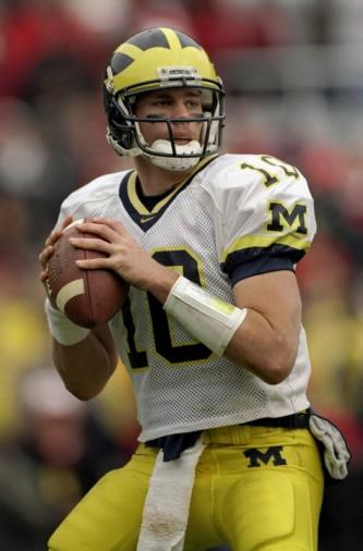
Absolutely can't stand the piping. I will be very happy if it is truly gone. I always thought the away jerseys were perfect the way they were. The white with maize and blue trim always looked classy.
September 7th, 2011 at 12:48 PM ^
If what Cam Gordon is wearing in practice our new road jerseys, I think they look pretty darn good. Michigan has always had a great home jersey and always seemed to change their road jersey. I wonder why?
September 7th, 2011 at 12:49 PM ^
I think we should go the new Maryland '11 route. Maybe add the winged helmet look to the shoulders, create a cute and cuddly wolverine to add to the hemet, or add life like wolverine fur to the entire uniform/helmet complete with tails and claws.......
September 7th, 2011 at 7:03 PM ^
I'm just picturing the gloves now. Brown and shiny (to replicate ???) with silver on the fingernails representing Wolverine claws. The sick part? A picture of our new sideline mascot so that when players score they can hold their hands up in an "O" or "U" design and show off our totally sweet new mascot.
I'M SO PSYCHED FOR SATURDAY BRAH'S. RAWK!!!!!!!!111!!!!!
September 7th, 2011 at 12:51 PM ^
then I give it a double thumbs up! I like the look with maize outline and the block M above the name. I notcied them on Saturday and liked it then as well.
I saw one person wearing the "throwback" or historical jersey for the night game on Saturday and I still can't get excited about it. I know the game jerseys will be a little better, but still. The cardinal rule is don't mess with the home unis!
September 7th, 2011 at 12:57 PM ^
If we're going to have a block M on the jersey, it needs to go ON THE FRONT.
September 7th, 2011 at 2:10 PM ^
Man-Barbie Outfits Minimally Altered!
You guys are ridiculous.
Edit: This is not flamebait. It's trolling.* Get it right, Barbie lovers.
*On uniform-related threads only, and only because somebody's gotta do it.
September 7th, 2011 at 1:10 PM ^