New/alternate logo?

So, as I was ordering/checking out the new student shirt, I was thinking about the new kind of direction that Rich Rod seems to be taking the program, with his new offense and "All In For Michigan" slogan/mentality, and I got to thinking, maybe it would be cool to see a new Wolverine logo to be used for things like the student shirt or whatever. I was thinking something like a badass looking Wolverine flashing his claws and looking all deadly and whatnot. I know there was an old Wolverine in a sailor cap logo back in the day, and I was thinking that it might be good to have something else new age to complement the block M. Any thoughts?
Edit: I'm deleting the non-serious patch idea.
"Possibly even something to be used as an additional patch on the Maize jersey for our night game in the near future."
I was about to respond until I saw this.
Ok, obviously the patch on the Maize jersey was sarcasm.
What the hell would be the point? Dude, let's have maize jerseys with BLACK HELMETS for MAXIMUM BADASSITUDE.
While we're at it, we can add wolverine claws on the shoulders of the maize jerseys as well!
The point was just to have something a little new/exciting that DIDN'T involve making a maize rage jersey or having a night game. It's also something that's sort of been done before, so there's a precedent, it's not "ruining" any long-standing Michigan tradition. It would also be cooler than the "Michigan Is Football" slogan that adidas seems to be pushing on the new shirts (not even sure what the hell that means).
Would be a great alternate logo
Seriously!
I see M hats on occasion with a wolverine claw ripping out of them, and I hate them. Michigan is "M". That is all.
It's also a violation of Michigan's logo usage policy. link here, http://www.logos.umich.edu/
I cannot find the specific page today, but U-M usage policy clearly states that you cannot put anything over the block M or alter it in any way.
It's why I have to change the logo at the bottom of http://www.umich.edu/~billiard/
How official and for how long has it been that way? I have a pennant bought in the 80's, officially licensed, with a Wolverine head over the M and "Wolverines" written across it.
It's pretty official. They make both student organizations and departments within the University (Health System, School of Public Policy, etc) abide by the policy, stating that the Block M is their "most valuable financial asset."
I think it's pretty recent, however. Their usage policy also mentions that the split M (Block M with Michigan across the middle) should not be used.
The split M shouldn't be used? Whoa, that's a change.
My jaw dropped when I read it - I was rather stunned to see it.
They do say to use it "in settings where we need to graphically distinguish ourselves from another university that uses some form of an "M" as their logo"
source: http://www.logos.umich.edu/faq.html#overblock
I am in full support of Maize Rage jerseys so long as we have black helmets with a bad ass Wolverine with claws and shit instead of those winged helmets while playing a night game and blasting Metallica over the PA while have uber CGI graphics on the video screen every ten seconds!
Why does anything need to change? Can someone please explain to me why people persist on asking questions about night games, maize jerseys, pumped in music, circles of terror, alternate logos, warm up videos, mascots etc.? The only thing I want to see changed is the number in the wins column. Maybe I'm a crotchety stubborn old guy at the age of 21 who wants every game at noon so I can get up at 7 am on gameday, tailgate for four hours, and be in my seats 20 minutes early for the game so I can see the band and the team take the field to pump myself up to yell for the next four hours. But I am too old I guess to understand the new ways and what I perceive as the best experience in college football is outdated and needs to be updated with a bunch of random shit that doesn't have anything to do with Michigan Football.
This times a million. Especially the first two sentences and the last.
I have never understood why, when presented with a college football game and all the pageantry and atmosphere that goes with it, people would think "this is great but what this really needs is an alternate logo." Or different colored jerseys or whatever. Anyone who can't get themselves excited over this shit without a bunch of crazy new stuff probably doesn't have the attention span to stay excited for very long and is gonna want to change things up again real soon. Whatever the state of Michigan football, it's not such that the only thing it's missing is an alternate logo to make it perfect.
He isn't suggesting a change people! He's just suggesting that we use the logo with the wolverine going across it as an alternate. Don't flame him when you are the ones not comprehending what he's saying.
I fully comprehend that he wants an alternate logo. I do not like the idea. We all know very much that you endorse these types of ideas. I am not flaming him, I am merely putting down the idea as I don't want to end up with Michigan supporting any idea of that nature. You have suggested many of these types of ideas and in my opinion each one is worse than the next. However I found an alternate logo for you anyways. I hope you enjoy it. It will go good on alternate jerseys to wear while doing the circle of terror.
http://www.leaguelineup.com/njwolverines/images/wolverines-logo-cropped…
I liked that winged helmet design profile that nike had on some merchandise a while back. I'm not saying that has to be an official alternate but i'd like to see that make a reappearance on some shirts.
I came in here to say this. Although it definitely shouldn't be on any uniform, it's slick enough to be on the front of a slew of shirts without being overtly cheesy.
Just stop it. Please. Just stop it. The M is classic - don't mess with a classic.
I'm not saying mess with the M. There are old logos, like the block M with the wolverine climbing on it, that they have on old school franchise hats. I guess this whole thing started mainly because I thought the '09 student shirt would look better with a different logo than just placing the helmet on the front.
Is that you wanted to remove the helmet and put "a badass looking Wolverine flashing his claws and looking all deadly and whatnot" instead? That would go brilliant with the pledge on the back and the All in for Michigan slogan. The shirt would then have no relevance whatsoever and everything on it would be forgotten in a year. The 09 shirt is the worst student shirt yet. I wish they would go back to something like 05, the front read "Michigan Wolverines 2005 Football Season."
Well, I also think the pledge is retarded, so yeah I would like to see a Wolverine or something better on the front or back. The shirt is only supposed to last/be remembered for a year anyway, so making it interesting wouldn't be a crime, especially since it's designed to be worn by young college students who might appreciate something flashier.
To accompany the "All In For Michigan" slogan, put a wolverine on the front who's snarling but wearing a knit sweater with a block M on the front and rolling his sleeves up to fight or something like that. You can blend tradition with something cool looking.
fists clenched, ready to fight... how about we build a big-ass statue of a wolverine on his hind legs, arms outstretched, looking skyward and call him TW Touchdown Wolverine....
Is what they tried to do this year and you agree that it didn't work whatsoever. A lot of "young college students" don't like things to be flashy. Simple slogans such as it's great to be a Michigan Wolverine and The Team The Team The Team were interesting enough and provided a solid change from year to year. Like I said before though, 21 and just graduated must have put me out of the loop on the badass factor of flashy shirts and awesome pledges.
No one here wants to destroy tradition. We just want to update things. We're updating the stadium and the offense the football team runs, why not a few other things?
Block M with vicious looking wolverine climing across it with those slogans all around it? Why the hell not?
Did I say somewhere that you are trying to destroy tradition? I know that you aren't trying to destroy tradition, you just want a bunch of stupid, gawdy, unnecessary, and unrelated shit to occur so everyone, in your mind, will scream louder. Your posts are so damn predictable I don't even need to read them. Also, I know the word we is over used excessively and I have probably used it when I didn't need to before, but who is the we you are referring to? Who wants to update things beyond the stadium and the offense? Ferocious wolverines with big muscles and snarling teeth have nothing to do with Michigan and shouldn't be used anywhere. You didn't respond to my suggestion for a logo for you though, I thought it would have fit perfectly for you.
I never said anything about ferocious wolverines with big muscles and snarling teeth buddy. You're putting words in my mouth. I like the logo with a wolverine climbing on it. that is all.
also I would like our fan base to yell a little more and show more support this year. is that such a crime? you need to chill out...
Please answer my questions from the previous post instead of trying to say now I am the one putting words in your mouth. I am happy you want people to yell, I just don't like your ideas at all. I am very chill.
Only supposed to last for a year. So basically, you do admit to having the attention span of a goldfish. I want something new this year. Then I want something new next year. I need something new all the time to keep my attention. That's what this tells me. So when we add an alternate logo, how long before you get tired of it and want a new one to "update the look" again?
you sir, are boring.
 I get what he's saying and i kinda like this logo. They used to use this as an alternate but idk why they stopped. I like the one better where its going across the M. and i swear the bulldog was in there cuz i found it on some website where they had a vote on what mascot was best. lol maybe we should play georgia.
Did it occur to you that maybe they stopped because an alternate logo was totally unnecessary?
Well, the one below already exists and isn't that bad. It's just that, IDK, it's unnecessary to create one, but if one exists already, have at selling merchandise with it. Just don't put it on the uniforms.
 only one i could find with the wolverine going across it. its on a chrismas ornament.
Shit you not I actually have a hat with that logo on it.
Proof: 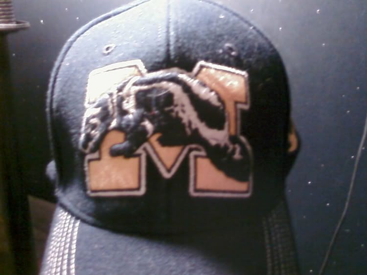
I thought the ornament was a flask.
http://www.itsalreadysigned4u.com/shop/media/images/product_detail/mw48…
Would love to actually post the picture, but I have absolutely no idea how ... anyway, still wish this alternate was used today!
hmmmm....looks more like a bear to me.
I'd wear that on a hat.
I have a t-shirt with that old-school logo on it. It's pretty cool. I wouldn't mind seeing it get used a bit more than it currently is. The Block M and the split M (with "MICHIGAN" running across it) must remain in the forefront, though.
deleted
If there is a cool new logo that doesn't crap all over tradition then fine. I liked the Nike helmet logo. It was simple and everyone knew what it was when you saw it. The old logo's are cool and nostalgic but that's what makes them great is that you don't see them all the time.
can you post a link with a picture of that logo?
But it is the helmet stripes horizontal across the shirt.
http://3.bp.blogspot.com/_2g_sq65J9fw/RsR-GWQjEwI/AAAAAAAABWE/jPk-uZLEY…
this makes me feel very similar to how i felt when the cheerleaders tried to change the 3rd down stop temptation chop (which btw makes no damn sense at all) to "the claw," which did nothing to make me feel like i was praising our defense, and a lot to make me feel like i was in a derek zoolander photoshoot.
LAME-O.
The "Temptation" chop was supposed to be done with a fist (to symbolize putting the hammer down to the opponent) but the students wrongly interpreted it as an FSU-style chop.
hmm. my circle always rationalized it as a change of possession referee signal.
regardless, "the claw" is inexcusable. it makes me think of liar liar. "ooo, you're afraid of the claw! the claw's gonna get you!" we are not inspiring fear here..
Our uniform is awesome because it looks the same as it did 40 years ago.