If Coach Hoke wants to unite the fanbase and bring back Michigan Football, I have a simple yet obvious suggestion for Step 1

January 13th, 2011 at 1:13 AM ^
and I believe he's adressed this... he doesn't break contracts, we're stuck with our shitty deal with adidas until it runs out
January 13th, 2011 at 1:14 AM ^
I think OP is just talking about changing the design, not breaking the contract with adidas. I did think it was pretty funny that all of the players apparently started chanting Nike tho.
January 13th, 2011 at 1:17 AM ^
Haha, that is awesome. Where did you hear about the players chanting nike?
January 13th, 2011 at 1:18 AM ^
right after brandon announced his decision to the team
January 13th, 2011 at 1:17 AM ^
I can live with it, those practice unis are an embarassment though. The one thing I can say for Adidas, I love the font on the shirts though:

January 13th, 2011 at 1:33 AM ^
Block M Michigan gets collegiate font, not neo-digital font. I've always hated that font as soon as Adidas took over.
We have never had a font like that. There is no way you can support this coach and the classic history of Michigan football and like that font!
January 13th, 2011 at 1:36 AM ^
I had no idea that that was a determining factor in ones fanhood... I also like calibri, what does that mean?
January 13th, 2011 at 1:48 AM ^
It's a question of branding. Your brand is "Block M", "history", "most wins", "powerhouse", "smashmouth" football.
No way you represent yourself with neo-digital font. You're not Oregon (as much as you wish you were in that championship). You ARE college football!
January 13th, 2011 at 1:55 AM ^
It's just another damn font, I'm wearing a Michigan Shirt right now with the normal collegeate font and guess what logo is above the word "Michigan", that's right it's adidas. I'm no less a fan of Brady Hoke or of Michigan and it's history and tradition than anyone else because I happen to think that the font used in the shirt above looks sweet.
January 13th, 2011 at 2:03 AM ^
That's what you don't understand.
Your font represents your brand as an institution. Adidas was the first to ever market Michigan football with a font like that. They weren't representing the Michigan brand, they were representing the generic font Adidas wanted every team to use so it would be easier for their sweatshop workers to produce high volumes.
The control of brand should always fall to the institution, not to the marketer who is making money off that brand.
January 13th, 2011 at 2:38 AM ^
as the university is viewed, it looks cool, but other than that it does nothing, same can be said of the traditional collegeate font.
What is far more important and says more about the University, and it's "brand" is what the font spells out, what the words say. Getting up in arms over a font is a waste of energy. As long as what is being said of written or whatever portrays the University in a positive fasion who cares what font is used as long as it's legible.
I still don't see how I'm any less enthusiastic about Michigan or it's history because I like the look of a font, and if it's not a question of liking a font, why did you question my allegence because I like that font?
There is no way you can support this coach and the classic history of Michigan football and like that font!
January 13th, 2011 at 7:02 AM ^
You think Nike never used anything but good ol' Block M? I got about 3 sweatshirts from the 90's rocking FUTURA BOLD that might tell you otherwise...
January 13th, 2011 at 7:44 AM ^
I have Nike apparel that has the same bold lettering.
Now, please change your signature (concerning Harbaugh) please.
January 13th, 2011 at 2:46 PM ^
done.
January 13th, 2011 at 6:48 AM ^
It reminds me of the font used to spell out "Michigan Stadium" on the old press box.
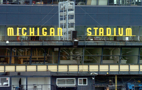
January 13th, 2011 at 7:33 AM ^
Wow, what a rickety mess the old press box was...never really paid much attention to it, but in light of the new Michigan Stadium boxes, it's almost embarrassing to have put that structure out there as the face of the stadium...it looks like it's being held together with spit and bailing wire.
January 13th, 2011 at 9:01 AM ^
That structure supported Brandstatter. I just can't believe it.
January 13th, 2011 at 1:16 AM ^
January 13th, 2011 at 5:27 AM ^
You are correct. Actually, we have two dedicated, onsite account reps with Adidas. And it was expressly written into the contract that we would have input into the designs, something we did not actually have with Nike previously.
Here's an article from the Daily that talks a bit about the contract.
There are a couple others out there as well.
January 13th, 2011 at 10:58 AM ^
Maybe DB should have clarified, "I don't break contracts - unless they are with the Head football coach and all of his staff."
January 13th, 2011 at 1:13 AM ^
I think those horns are a small price to pay for having the largest apparel contract in college sports.
January 13th, 2011 at 7:59 AM ^
Not to mention that any time a school uses Nike stuff, they invariably just give money to the Oregon football program. Phil Knight funnels a shit ton of money there, and is probably the reason they now have kick-ass facilities and are now a national power.
January 13th, 2011 at 1:16 AM ^
Screw horns, I want to see them actually attempt to nail down what maize actually looks like.
January 13th, 2011 at 1:28 AM ^
No small feat. Many people at maize outs are still wearing blue. They're way off!
/s
January 13th, 2011 at 1:31 AM ^
According to this, "maize" was copyrighted by Nike, so we're stuck with the Adidas knock off "sun." Assuming that's true, Nike is the devil and someone in the athletic department (or legal department) dropped the ball, massively.
January 13th, 2011 at 1:53 AM ^
Well, yeah, but that doesn't mean it needs to be highlighter-yellow, though. They erred on the wrong side of the yellow spectrum, IMO.
And if you look at what maize has historically been, it's been almost everything BUT this neon yellow deal. Some of the 70's shades (pants not necessarily matching helmets) were darn near orange.
January 13th, 2011 at 2:43 AM ^
Yes, but the 70s shades were pre-Nike. I personally think the mid-90s/early-2000s Nike apparel looked the best of any in the years immediately preceding or following it. The official Nike colorway we used is known as "Varsity Maize / Midnight Navy." The Maize was indeed unique to Michigan--actually created for Michigan when the Fab Five first donned their Nike unis--whereas other 'yellows' exist for specific entities: Iowa has "Goldenrod" and the LA Lakers have "Del Sol." For people who give Nike shit for 'keeping' the Maize colorway from us, consider that they were the ones who developed the shade that many of us prefer aesthetically. I'm all for capitalism and having the top apparel contract in the nation, but there's just something about the pervasiveness of branding that renders my eye more pleased when I look at photos/footage from 5 years ago. I hate that I'm about to quote Jim Rome, but he's fond of saying, "Look good, feel good. Feel good, play good [sic]." There's something to that IMO, and I think it's very real for 18-year-old kids who want the brand of choice (Oregon, anyone?). Steve Breaston talks about this all the time and says he likely wouldn't have been as attracted to Michigan if it was an Adidas school during his recruitment. Also, as a fan I'd much prefer wearing a Nike Michigan jersey to an adidas Michigan jersey--I have a "Woodson" and a "McGuffie," and the look of the former is much more striking.
January 13th, 2011 at 2:57 AM ^
The Fab Five NEVER wore Nike unis. Michigan was not a Nike school until 1994, so the only ones of the five that could have worn Nike would have been Ray Jackson and Jimmy King, though I think their senior year was the last pre-Nike year.
The iconic maize Fab Five unis from 1991-93 were made by Russell.
January 13th, 2011 at 4:17 AM ^
Good call. Didn't they wear the Huaraches though?
January 13th, 2011 at 9:10 AM ^
You're correct! They wore Nike Air Hurraches, and black Nike socks!.
January 13th, 2011 at 5:28 AM ^
Weren't the shorts DeLong?
January 13th, 2011 at 10:48 AM ^
One of the styles you could buy in the store were made by DeLong, but I'm almost 100% certain the game uniforms were made by Russell.
January 13th, 2011 at 1:44 AM ^
what "horns" are you talking or trying to point about?..lol
i cant find them anywhere!! haha
January 13th, 2011 at 1:55 AM ^
See those little Adidas logos on Roy Roundtree's helmet right above the facemask? Those are the horns.
January 13th, 2011 at 1:59 AM ^
You mean the tabs that every single helmet visor has, that invariably have a Nike/Oakley/UA/adidas logo on them? If I'm not mistaken, those tabs are how they actually stay on the helmet. And not every player wears one anyway.
January 13th, 2011 at 2:06 AM ^
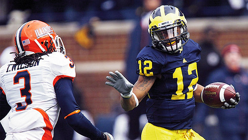
Is the OP referring to something on the actual jersey itself? I'm just confused because horns are traditionally found on the head of animals, Viking helmets, etc. Is it referring to the yellow stripe or the blue wedge-shapes that go up some of the uniforms on the side?
January 13th, 2011 at 2:28 AM ^
that crap on the sides of the jersey, the thick yellow parts that look like you wiped mustard on your jersey

January 13th, 2011 at 9:37 AM ^
See those little Adidas logos on Roy Roundtree's helmet right above the facemask? Those are the horns.
Like hell they are. I'm talking about the wrap-around stripe on the waist that looks like bull horns, plus the diagonal piping on the shoulders.
January 13th, 2011 at 1:22 AM ^
I don't know. On one hand, Adidas has shitty stuff for consumers to buy. On the other hand, do you really want to be a part the uniform revolution that Nike subjects its teams too? You think they wouldn't insist that we do that ourselves? Fuck that.
January 13th, 2011 at 1:24 AM ^
they have to want the Nike pro combat unis... seriously, who's the retard in tsio's AD that keeps approving those eyesores?
January 13th, 2011 at 1:30 AM ^
TSiO's normal unis are pretty shitty, so it isn't such a big deal to change things up.
January 13th, 2011 at 1:31 AM ^
Filthy lucre, TRSaunders...filthy lucre. What's the best way to get your fan-base who each own 3+ pieces of tsio gear to buy more stuff? Why, introduce new Retro Uni's, of course!
Just follow the money and it all becomes clear.
January 13th, 2011 at 1:37 AM ^
The same one that said TP and company sold their trophies, rings, pants and jerseys to help their families.
January 13th, 2011 at 2:58 AM ^
I do not trust in my AD to make the correct decision regarding this issue.

January 13th, 2011 at 9:59 AM ^
I think that was just in anticipation of a hat trick.
January 13th, 2011 at 1:47 AM ^
at least they made the school in ohio look like raaaatards this past year..
January 13th, 2011 at 7:47 AM ^
This Fall I got compliments all the time when I wore my "Sun" Impossible is Nothing t-shirt on Saturdays. I'm a big fan of my Sun and Blue track suit too. The variety of what's available could be better, but I don't get the Adidias hate.
January 13th, 2011 at 1:23 AM ^
Pro Tec Combat, here we come. Hoo-boy.
If the players want it, I'm All In for it too. And I'll probably think it looks awesome because I'll be inebriated at the time.
Edit: This comment also works as a response to TTUWolverine's comment.