Some dude redesigns the helmet

EDIT: Twitter acts like this is real, but it seems like some guy just designed an updated look for our helmet. Ondre Pipkins tweeted this earlier and I posted it as "new helmet." It's not. Title changed to avoid pissing people off.
Regardless, I like it.
Source, with other cool things: http://www.thezuba.com/michigan-wolverines-pro-combat-helmets/

January 22nd, 2012 at 4:54 PM ^
No chance they're at all real seeing as they're Nike helmets and we've got what, 6 years left with Adidas?
January 22nd, 2012 at 4:56 PM ^
How do you know these are Nike helmets?
January 22nd, 2012 at 5:00 PM ^
Doesn't
January 22nd, 2012 at 5:18 PM ^
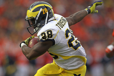
It's their Pro Combat helmet. Pretty much no mistaking the facemask and all the indents.
Edit: I stand corrected. After a little research it looks like it's just the Riddell model that Nike always models its Pro Combats with. Delonte Hollowell wears this model.
January 22nd, 2012 at 5:21 PM ^
The uniforms are Nike, but the Helmets are Riddell.
January 22nd, 2012 at 6:21 PM ^
Fitz wears one too. From what I've heard they are supposed to be one of the safest helmets out there.
January 22nd, 2012 at 9:14 PM ^
I wore a Revo Speed in high school. Safe and comfy...
January 22nd, 2012 at 11:54 PM ^
They aren't Nike helmets, Nike doesn't make helmets. Those are Ridell helmets. I don't think college teams have deals with helmet companies. I think this is the same type of helmet that Roundtree wore all year.
January 22nd, 2012 at 4:54 PM ^
No sort if "real" but the first one looks good
January 22nd, 2012 at 4:54 PM ^
I like it.
January 23rd, 2012 at 12:48 AM ^
I don't mind these too much because it's just changing the texture / finish. The all blue/black is bad. If it must happen, I hope it's something along these lines, ONCE A YEAR AND NO MORE.
My biggest complaint about the Pro Combat craze has been, what happens when we look back at pictures of the big games of this decade 20 years from now and cant tell who's playing who?
January 22nd, 2012 at 4:56 PM ^
I saw his tweet and was like Nooooo!!!! But I read up on it a little bit and it is just a rendering of what our procombat helmet would look like through the eyes of the creator. He also did an all blue version which I didn't care for much, but it is kinda cool
January 22nd, 2012 at 5:28 PM ^
Maybe we could put each player's astrological sign on the side? Or, their Twitter id. Or, a picture of some tasty Arby's curly fires, which could significantly boost in-stadium sales. Here I'll show you; I'll go ahead right now and boost some curly-fry sales:

Or how about this; we take the basic winged design, and we transform it into two shades of titanium/platinum, one in a kind of matte finish and one in a kind of mirror finish. It might look something like so:

Just trying to offer some helpful suggestions. You're welcome.
January 22nd, 2012 at 5:01 PM ^
the lil M on the side
January 22nd, 2012 at 5:01 PM ^
Its not real at all, please change the thread title. Some designer just came up with it on his own.
January 22nd, 2012 at 5:04 PM ^
Kerpew.
January 22nd, 2012 at 5:02 PM ^
Hideous.
January 22nd, 2012 at 6:13 PM ^
The Michigan helmet is hideous?
He didn't do anything except put a Bo Block M under the ear.
January 22nd, 2012 at 7:22 PM ^
Yeah, no kidding.
The helmet looks awesome and I wish they would get them.
January 22nd, 2012 at 8:01 PM ^
The wings are lower and wider plus I don't like the futuristic styles of the revolution helmet.
January 23rd, 2012 at 7:01 AM ^
...also a darker blue "shadow" accenting the maize wing.
A little more "3D." I like the look.
January 22nd, 2012 at 6:21 PM ^
These are from thezuba.com. There's a new design for Wisconsin and for State that actually look kinda cool
January 22nd, 2012 at 5:09 PM ^
The M on the side is sweet. It's like the M on Bo hats
January 22nd, 2012 at 5:11 PM ^
Smooth as frick.
January 22nd, 2012 at 5:28 PM ^
These helmets are tight! I'd love if we did it. The tradition argument has gotten old. Real old. I'd love if we switched to these
January 22nd, 2012 at 5:11 PM ^
UM's uniforms are the best in college football just the way they are. This may be the wave of the future, but I'm not a fan.
January 22nd, 2012 at 5:12 PM ^
January 22nd, 2012 at 5:12 PM ^
Looks cool and modern but it will never happen, traditional is better.
OT: I came up with a new design for a football helmet and Im thinking of patenting it. This design would reduce concussions significantly. Im just not sure what the next step is in getting it off the ground....
January 22nd, 2012 at 6:17 PM ^
When I was a kid...we're talking maybe 40 years ago...somebody announced they'd come up with a helmet design that would significantly reduce head and spine injuries.
He couldn't get it off the ground, supposedly because coaches hated it when they didn't hear that satisfying CRACK on a helmet-to-helmet hit.
Maybe times have changed.
January 22nd, 2012 at 5:14 PM ^
I like our helmets just the way they are.
<br>
<br>These are really beautiful, don't get ms wrong, but our helmets are the best in cfb - let leave them alone.
January 22nd, 2012 at 7:45 PM ^
Which ones? The ones without numbers, the ones with numbers, or the ones with numbers and the grey facemask? We've got a couple now.
January 22nd, 2012 at 5:16 PM ^
January 22nd, 2012 at 5:22 PM ^
Not the revolution helmet!
January 22nd, 2012 at 5:42 PM ^
I have to admit, I'm almost ALWAYS on the side of tradition. I just feel that we have the most classic uni's in the game. Having said that, and I kind of hate that I feel this way, but I love that design! Love the "M"!
January 22nd, 2012 at 5:45 PM ^
I like the way he went after the design. He basically says touching the wings would be stupid and we have the best helmet out there. But using things like classic Bo M and maize from before it went neon, I can appreciate the work.
January 22nd, 2012 at 5:59 PM ^
January 22nd, 2012 at 6:01 PM ^
I'm kind of a fan of the helmets. I don't know why most Michigan fans are ultra conservatives when it comes to jersey alterations but you guys have to think of the players and recruits. I know this is just some guy messing around with photoshop, regardless... These are 17/18 year olds playing the game, they want something fresh and new... This isn't 1970 guys, let's have some fun and keep the tradition of Michigan football on the field regardless of what they're wearing.
January 22nd, 2012 at 6:20 PM ^
What they're wearing is a fundamental, defining part of that tradition. You see a winged helmet, even on a high school field, the first thing you think is Michigan. To paraphrase Fritz Crisler, "tradition isn't something you can buy at the corner store."
This "Some dude" is making spec designs as a fun-time amateur-hour art project. Methinks it's all a bunch of wasted time.
January 22nd, 2012 at 6:25 PM ^
That's why you need adults running things. Kids make dumb decisions every day because they think they're being fresh and new.
January 22nd, 2012 at 6:39 PM ^
And yet, this year, when we had adults running things, it translated into three different helmets, six jerseys, and three sets of pants.
Let the gimmicky schools like Boise and Oregon, whose traditions are largely promotional campaigns by the art department at Nike, be gimmicky. Let Michigan be Michigan.
January 22nd, 2012 at 6:49 PM ^
I remember that time your old people generation ran the world for a few decades and left my generation several trillion dollars in debt to China. Thanks, you stupid incompetant asshat.
See? I can stereotype, too.
January 22nd, 2012 at 6:15 PM ^
The OP should add this link to thier post. Shows other helmet ideas and explains the ideas behind them.
http://www.thezuba.com/michigan-wolverines-pro-combat-helmets/
January 22nd, 2012 at 6:28 PM ^
Cool site and I didn't realize some of the other designs and detail until after reading this.
January 22nd, 2012 at 6:50 PM ^
Credit'd.
January 22nd, 2012 at 6:25 PM ^
Nice work indeed.
January 22nd, 2012 at 6:30 PM ^
Maybe I'm incredibly stupid, but what is the difference between this and the current helmets, other than the small block M?
January 22nd, 2012 at 6:37 PM ^
Gives the detail and insight along with a photo of another M helmet
January 22nd, 2012 at 6:56 PM ^
I'm usually always digging what Pipkins is saying, but today he said we should have maize jerseys! HELL NO!
January 22nd, 2012 at 7:12 PM ^
I love our helmets the way they are but that does look bad ass I won't lie and the small block M by the ear cover is not that bad. I actually (as shocking a this is to say) think they're sharp!
January 22nd, 2012 at 8:04 PM ^
Badass.... That is all