Alternate jersey mock-up

Someone on twitter shared this me. I made a small adjustment to our 1997 Road jerseys by placing the jumpman on them.
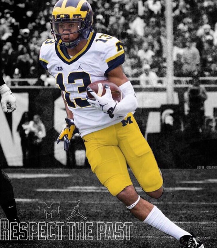
Here is a mock up of that jersey idea everyone liked but on a 2016 photo.
That just looks right.
I love our all-white road uniforms, but that NEEDS to come back at some point.
August 9th, 2017 at 12:07 PM ^
Unless the difference is drastic, I can't tell what is modern and what is throwback anymore. I can just judge each uniform on its individual merits. And this looks bad. From the chest up, this is waaaaay too busy for a Michigan uniform. Especially the shoulders and sleeves. Just awful.
August 9th, 2017 at 12:29 PM ^
August 9th, 2017 at 12:36 PM ^
I wish the Big Ten logo could be removed. It's a dumb rule that they need to be there (at least I assume it's a rule). If I'm removing the logo, I'd put the Jumpman in the middle of the collar.
August 9th, 2017 at 12:42 PM ^
August 9th, 2017 at 12:49 PM ^
'97 swoosh > '17 JM
As soon as every Tom, Dick, and Herbie Husker has a jumpman logo, we can go back to the classic swoosh.
Not a fan of the yellow trim in the collar. Just go with the blue trim there. I also prefer a cleaner loo so I'd lose the blue Block M's on the shoulder. The shoulder trim you have however, is fresh and outstanding.
Very nice. Was never a huge fan of the Block M's on the sleeves, but nitpicking and such.
I wouldn't mind if we alternated between this and the all white uniforms for road games.
Gold? Gold?!?! REALLY?!
Sheesh.
I had a number 10 jersey in this style when Brady was the QB. I loved it and thought the look was clean, simple, and classy. While I realize I might catch some heat for this, the Block M on the sleeve was nice because otherwise it can be seen by the casual observer as just a white jersey with some maize and blue accents. The M distinguished the jersey as Michigan's jersey and not some other team or local high school. I liked the M on the Adidas home jersey that was between the neck and name as well. Totally subjective opinion, but my two cents.

August 10th, 2017 at 4:27 AM ^
LOVE IT
Bring them back for PSU like you suggested...that's about it.
August 9th, 2017 at 10:07 PM ^
Take the numbers off the shoulders and its perfect.
August 10th, 2017 at 1:48 AM ^
We finally got the away jersey right after all these years - it's clean! No maize piping on seams, or maize outlining of numbers/letters. No more collar trim! Just because you can add all those "touches" doesn't mean you should.
So why go back to that too-busy look? That color on the sleave is fine, but the collar trim for example, is just noise that draws the eye away from the best helmet in football. Why do that?
Swap in the maize pants - leave the current jersey alone!
August 10th, 2017 at 3:00 AM ^