Acceptable and Unacceptable Block M's

Per Kyle Meinke, the Athletic Department has sent out a flier detailing which Block M's are and aren't right. A lot of people here knew about the Split M, but here's the official guide.
Not every block M was created equal. What is and isn't approved, per the U twitter.com/kmeinke/status…
— Kyle Meinke (@kmeinke) February 28, 2013
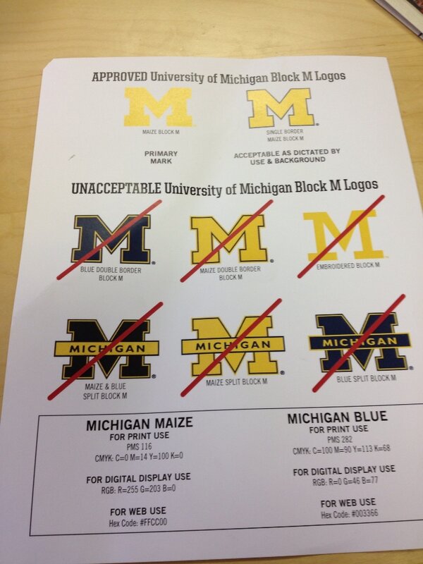
What's funny is that Yost and Crisler have "incorrect" Block M's


February 28th, 2013 at 7:42 PM ^
umm... it's "fergodsakes."
February 28th, 2013 at 7:48 PM ^
I like the embroidered block M, very Bo. I'm surprised they don't have a plain blue block 'M'. Shocking that Crisler and Yost have the "unacceptable" M.
I was never really a fan of the split M, it just looks a bit tacky to me, reminds me of Notre Dame for some reason and I hate that. The plain block M is very crisp, simple, and says everything it needs to say. You don't need to see "MICHIGAN" splattered across the 'M', everyone should know what the block M means.
February 28th, 2013 at 7:50 PM ^
So what you are saying is, the Split M is kind of like having your avatar being a photo of a kid with an angry expression wearing a Michigan shirt while giving the finger, and the words "F__K Ohio" at the top and bottom?
February 28th, 2013 at 8:03 PM ^
February 28th, 2013 at 8:06 PM ^
Obviously, this was not thought out carefully. Even if you put aside what's at Yost or Crisler or on the various away jerseys, only a fool would overlook the fact that the student shirts (and many other popular clothing items) have been maize for almost the entirety of their existence (about 10 years). A maize M is going to look fantastic on a maize shirt. Well done, Dave Brandon.
February 28th, 2013 at 8:33 PM ^
February 28th, 2013 at 8:49 PM ^
February 28th, 2013 at 9:14 PM ^
Man, I liked the split M a ton... if I return my old merchandise can I get an upgrade to the new M?
February 28th, 2013 at 9:34 PM ^
February 28th, 2013 at 9:36 PM ^
February 28th, 2013 at 10:00 PM ^
February 28th, 2013 at 10:12 PM ^
on some of the video monitor animations. Maybe we should get stupid shit like this worked out internally before we release instructions to the media.
February 28th, 2013 at 10:04 PM ^
Damn. I love me some split M. I don't understand why we have to revert to the simplest M we have...looks boring. I also have no problem with the thin Bo M...I like the kind of throwback-y look. The split blue M with maize letter box is the best, though.
February 28th, 2013 at 11:36 PM ^
wore the Bo 'M' cap at his announcement conference.
Unacceptable Class?
The following site shows all the official logos sanctioned by the U of M and are available for download:
https://www.logos.umich.edu/toolkit/downloads.html
Isn't it unbelievable that there is an office that makes rules like this and people who get paid to implement these rules? Go figure out how to lower tuition instead of worrying about the fucking M. If you approve products with the correct M's and put the correct M's in places where they belong, then the rules wouldn't even be needed - but they can't even follow their own rule in Crisler and Yost!
March 27th, 2014 at 11:57 PM ^
A Big Plus One to you.
I hate this branding BS.
I also think it's silly to just throw all these other M's (and logos/'mascots')to the wayside. As seen by so many posts above, they carry a lot of history and tradition with them. Would be really cool to see that M with the wolverine on the court at Crisler.
wtf? A lot of famous, coveted people/players/coaches here that have apparently been disgracing the university. This list can go screw itself, imo. Most of those are FINE.
Maize
Neon Yellow
So based off thier own paper work when do they plan on using the correct color for the M?
This has been university wide policy for several years now, an the AD is either just bringing things in line or felt the need to reiterate.
I'm surprised we aren't arguing about Official Maize - they give print colors right there in the bottom left!
Wait, you mean this memo is not an all-out assault by Dave Brandon on Michigan tradition in the pursuit of the almighty dollar and we've been blowing this way out of proportion?
Color me shocked.
Those regulations have been in place for a long time; the website (http://logos.umich.edu) has been around for a while also. I think they are just reminding everyone that they exist. What surprised me the first time I looked through the site was that different "units" of the university have different "official" shades of maize and blue. What?
Yeah, the "official" colors of the university are much lighter than we think they are. More of a baby blue and faded yellow. Those have been around for about 100 years. The dark navy and deep maize colors that we are used to are from the athletic department.
There was a really interesting article on this wayyy back in '96:
Very good read. So according to that the official University colors are here:

The official athletic colors are here:

So that pretty much settles that. I must say if everything was made in the official athletic colors, they would be very good looking. I think those two colors go extremely well together. It's too bad you hardly ever find them just like this.


do I have to stop wearing my skinny M Bo hat?
So this is verboten?
I have a feeling that the band is not going to change.