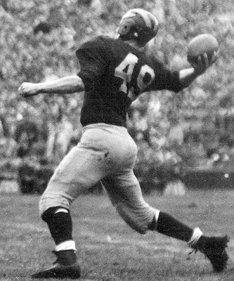
Some more info on Michigan's new font
An eagle-eyed user on Twitter pointed this out to me this morning.
On the Michigan Athletics twitter page, they have been releasing a graphic every day counting down to the Nike launch.
In those graphics, they have been using the font we have seen on the new gear that's been released. Have a look-


I gathered together the new jersey number font and put it together.
Not only has the #2 changed drastically, but the #4 has severely changed along with the #5 that has been slightly altered.


Old

Sent from MGoBlog HD for iPhone & iPad
Sent from MGoBlog HD for iPhone & iPad
Although it impinges on fewer historical figures, I find the new four more objectionable even than the new two.
the letters are fine, but the numbers just plain SUCK.
The 4 is especially bad when it's the first digit.
The both look horrible, but #34 looks ways better than #45.
Sent from MGoBlog HD for iPhone & iPad
Bob Chappuis disagrees.

Sent from MGoBlog HD for iPhone & iPad
Well, the bumblebees really weren't historical. Those uniforms were never worn by anyone--they were fantasy designs.
This is a number font. It has precedent. Aside from the sleeve sizes and the addition of brand logos and names on the back, it's the exact same jersey Michigan has worn at home for, what, 90+ years?
Looks like "If it ain't broke, break it!" didn't entire follow Brandon out the door. Too bad. Maybe they'll change it back next year.
The 4 is awful, and the five looks like it encountered a food allergy.
they had to put it somewhere.
Woodstock from The Peanuts.
Sent from MGoBlog HD for iPhone & iPad
Interesting that they even needed to specify, but NCAA Football rule 1-4-4-c-3: "The jersey must have clearly visible, permanent Arabic numerals measuring at least 8 and 10 inches in height front and back, respectively..."
Too bad, because I would much rather see an "IV" over that awful "4" any day. Seriously, that's hideous.
Then how in the hell did those highlighter yellow numbers on white jerseys against SC get past the censors? Those were the total opposite of clearly visible.
You monster!
My vote is for sign language
They had to change the font because what else could they change? I'll reserve total judgment until I see these on players, but I hate to see the change. I've been a fan since the early 70s and every uniform change since 97 has been for the worse. Last year was the best since 96, if not 75. It looks like the numbers may be a bit smaller too, which I really hate. Maybe it won't be so bad…
I noticed that USC's number 2 looks exactly the same as our new number 2.
So wait...it's NOT the Chicago Bulls anymore?!
I've been hearing about the Chicago Bulls font for 2 fucking months WD, what's going on maaan? You can't do this to me in the 11th hour!
Oh, and that #4 is fucking terrible.
are all fucking terrible.
No and I'm actually glad it's not. Although the #4 looks dumb now.
The #1, #6, #7 and #9 stay the exact same, though.
and then Braylon set them straight about how the 1 should look.
Sent from MGoBlog HD for iPhone & iPad
But credit where it's due to Nike for discovering zero.
All is fine and dandy until you start dividing by it.
A: Rutgers is winning.
Sent from MGoBlog HD for iPhone & iPad
Need to attend Camp Sanderson
I think everything will look great as soon as we see the uniforms in action. No worries.
Sent from MGoBlog HD for iPhone & iPad
Sent from MGoBlog HD for iPhone & iPad
