Reason for the change to '4': Willis Ward, Gerald Ford, and Diversity
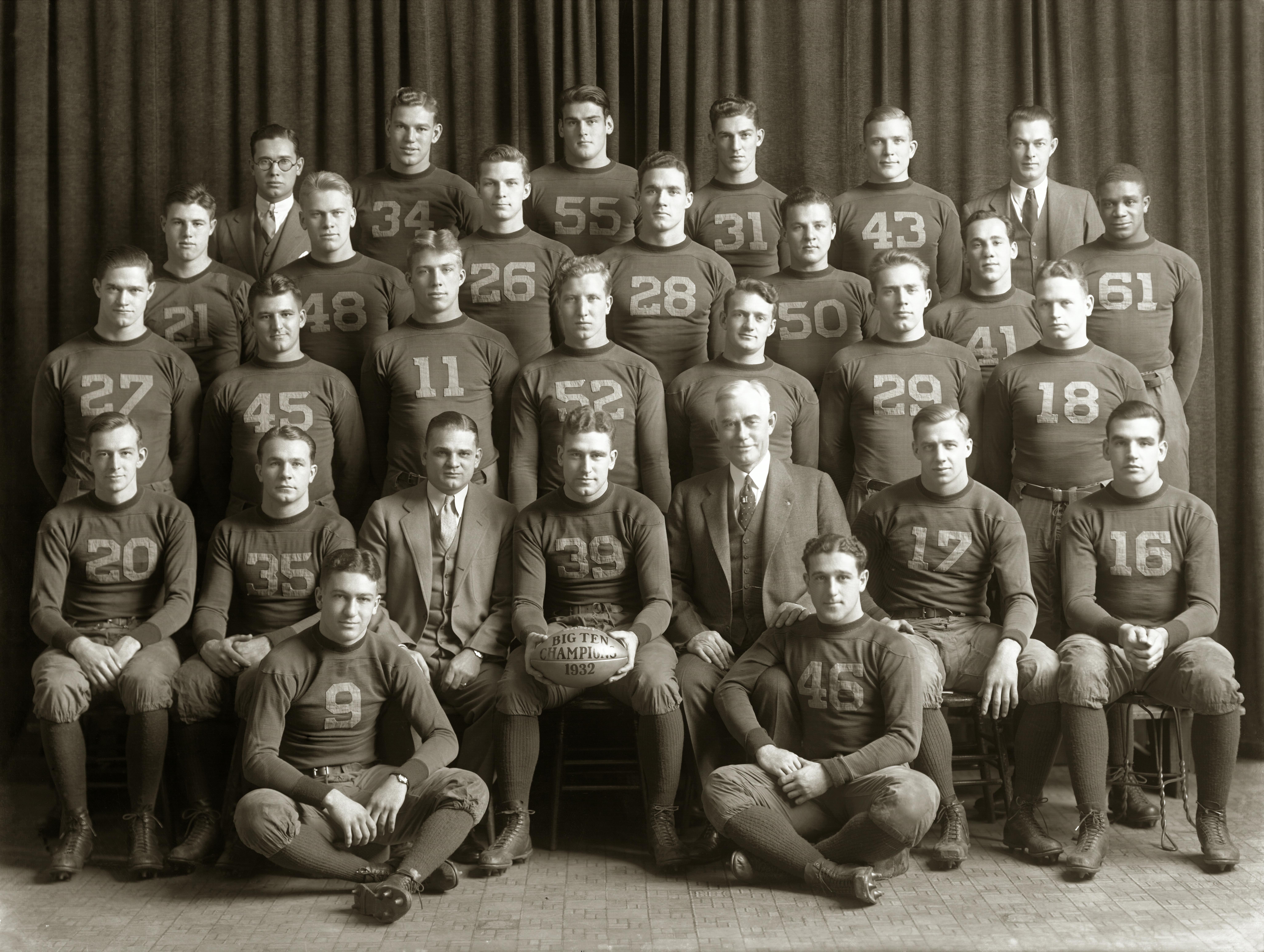
Angelique has an article up at the Detroit News explaining the change to the number 4 with the new Nike uniforms. It apparently was something spearheaded by Jim Hackett, looking back to a team photo with Willis Ward and Gerald Ford next to each other. This was the 4 used on Ford's uniform in the picture. Hackett apparently pushed for the 4, as a way to remind people about Willis Ward and diversity. Great article, and much better reasoning than Michael Jordan and the Bulls.
You don't like black people or presidents? Which is it?
How the number looks
Thanks for posting as Autocracy Now did have it linked in his post in the other thread but people may have missed it.
Sent from MGoBlog HD for iPhone & iPad
I'll voted him down for you. Anybody else?
Sent from MGoBlog HD for iPhone & iPad
August 2nd, 2016 at 11:46 PM ^
Or else I'll call them names.
Sent from MGoBlog HD for iPhone & iPad
I appreciate everything he did for Michigan, however Michigan has had several legendary AD's who don't have statues and did it for longer than Hackett.
Whatever. Nike says it is good, so it is the best thing EVER. OMG!!!!!!!!!!
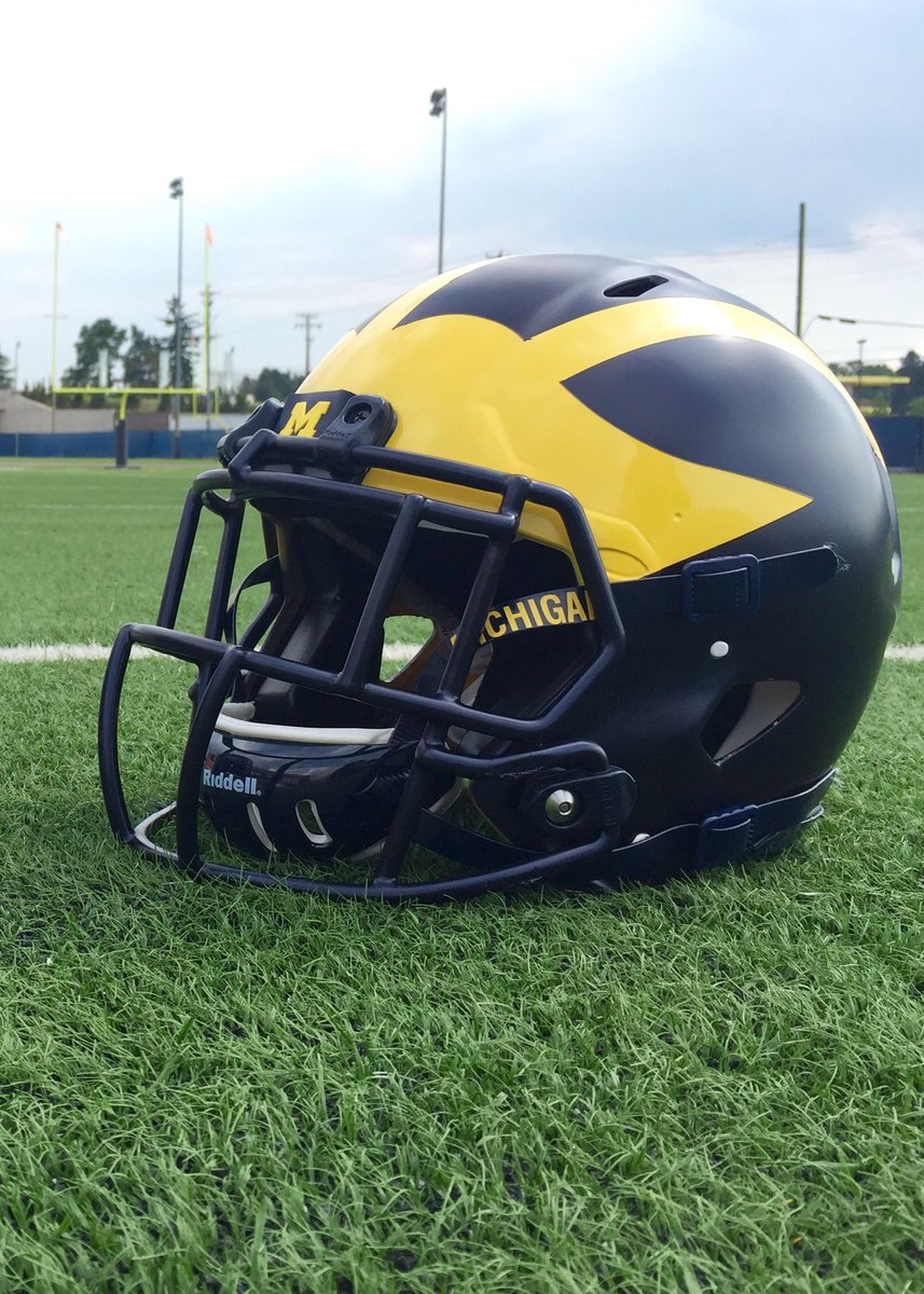
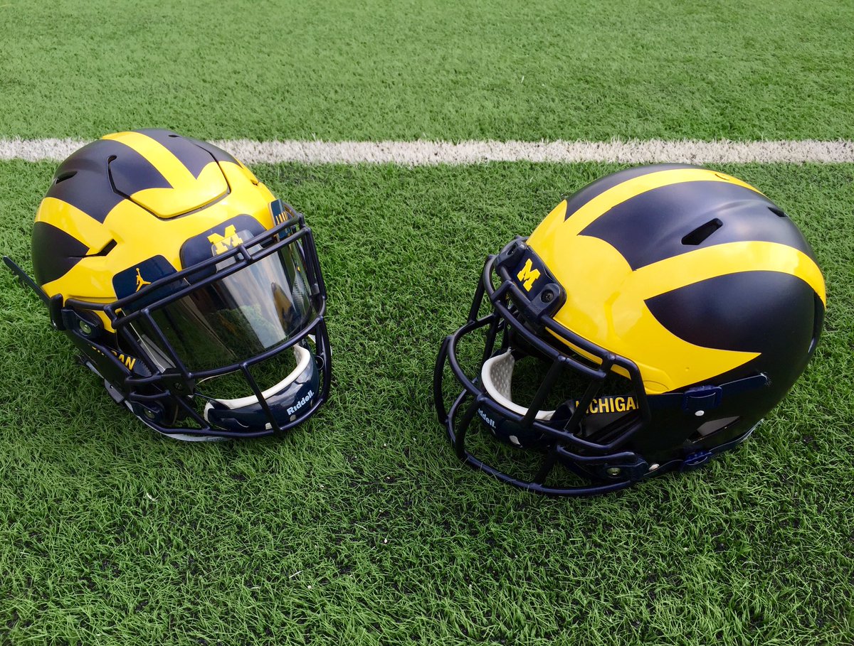
OT, but just wondering. Is the facemask black or blue on the new helmets, can't really tell. I sure do hope it is black. Love the new uniforms regardless!

Sent from MGoBlog HD for iPhone & iPad
Sent from MGoBlog HD for iPhone & iPad
That's definitely blue, but more to the point regarding the helmets, I kind of like the matte look for the blue actually. As much as we have one of the most classic looks in college football, one that doesn't always lend itself to change or need change for that matter, I think this is a cool tweak to that look.
“Rashan Gary’s mom came to me and asked me about diversity at Michigan, and I told her about ‘Black and Blue,’ the movie about Willis Ward,” Hackett said. “She had some really good questions about Michigan going backward in its enrollment. “I want somebody to say, ‘Do you know why the 4 is the way it is?’ The idea is to keep a sticky thing in there. It’s Michigan.”
Well done, Mr. Hackett!
Sent from MGoBlog HD for iPhone & iPad
Sent from MGoBlog HD for iPhone & iPad

Not sure if that's why.
Sent from MGoBlog HD for iPhone & iPad
Sent from MGoBlog HD for iPhone & iPad
This.
Love the #4, but it looks out of place without at least changing the #1 to match it. The #1 should look like the left side of a Block M.
Now, if 6 turned up to be 9,I don't mind, I don't mind. If all the hippies cut off their hair,I don't care, I don't care. Dig? 'Cos I got my own world to live through and I ain't gonna copy you.
Not sure I totally believe this explanation. To say that they chose the number of the guy who stood next to the guy who wasn't allowed to play seems like a marketing ploy.
It also doesn't explain why the #2 is different. If we were really all about the #4 as some historical number that helped defeat racism, then it would be the lone exception.
More than likely Nike told us what the font was going to look like and Hackett filled in the blanks as he saw fit.
The two is the Bulls Michael Jordan two (as in 23). Simple as that. And I doubt they would just come up with that 4 on their own.
The guy who stood next to the guy? The President of the United States? Who threatened to quit the team over it?
I respectfully think you are being a little too cynical here.
Willis Ward wore 61.
Love this...clearly a Harbaugh detail. One of the thousands of little fingerprints he is putting on this football program that make it his baby. He will never ever let anyone have it as long as he can stand on two feet.
Can't get too excited about them. But I respect the right for strong feelings in either direction. Always impressed with the (supported) diversity of opinion of the MGoPeeps on virtually all subjects. I almost feel guilty not having a strong opinion either way. :-(
Sent from MGoBlog HD for iPhone & iPad
Professor Needs a Raise, Tyran Steward, who now works in the football program, wrote his master's thesis on Willis Ward and is featured prominently in the excellent documentary "Black and Blue." Hackett's quote confirms to me that we can credit Willis Ward as much as Jim Harbaugh in landing Rashan.
I love that Rashan's mom asked the questions that she did, too. That's a first-class parent right there.
David Brandon was the one who was dead-set against honoring Willis Ward in the stadium on Willis Ward Day in 2012. It took an online petition and a full-court press by MVictors before he finally relented at the last minute.
I don't disbelieve you at all - at this point you could tell me that Dave Brandon was the head of ISIS and I'd say 'yup, that makes sense - but where did you hear that?
That's utterly beyond the pale even by Dave Branding's lofty standards of tone-deaf douchebaggery.
The whole Willis Ward thing was covered in "Endzone," too. Brandon also tried to get the filmmakers to pay $180,000 for photos that were available for free at the Bentley.
August 2nd, 2016 at 11:46 PM ^
...and it appears Dave Brandon downvoted both of us
August 3rd, 2016 at 12:24 AM ^
...he'll take back the downvotes.
I personally don't care either way (on the font change with the 4 or the 2). I don't get too exercised about the uniforms. But the way Angelique's article read, I suspect that this is true. Not like Hackett to tell a half truth. And regardless, I love the story of Willis Ward and how Gerald Ford and UofM students responded to the racism so many years ago.
Oh, and I'm excited this year about the prospect of beating MSU and OSU. Michigan could wear the ugliest uniforms known to mankind: if they beat those two teams, I wouldn't care.
By the way, on the off chance I'm not the only person here who likes reading these things:
Below are the marketing blurbs for Nike's rebrand.
As a one-time mediocre architecture student I can kinda appreciate the mindbending that went into explaining the design process and trying to wring form and font from school landmarks/ They did similar ones for U-Washington and Oregon State explaining the design process, albeit with a ton of corporate buzzwording, because Nike. There are several other blurbs for other Nike schools - here's the best place I could find to aggregate them:
http://news.nike.com/college-football-uniforms
For Washington, they used elements like the iconic profile of Husky Stadium into the uni trim and put a gold cap on the upper left corner of the numbers to represent Washington being in the Pacific Northwest.
For Oregon State: I got a kick out of this word salad: A metallic bronze secondary color has been introduced, representing strength and integrity and draws inspiration from the well-used machinery utilized in the timber industry. The addition of bronze brings depth to the existing Oregon State color palette; it will be reserved for limited use only.
Anyways, for Michigan:
Here's the main page: http://www.gobluehailmichigan.com/ There really isn't a whole lot of novel concepts compared to other schools because we're Michigan and we like Michigan things, but they have to justify the design with lots of buzzwords anyways.
Regarding the somewhat controversial font:
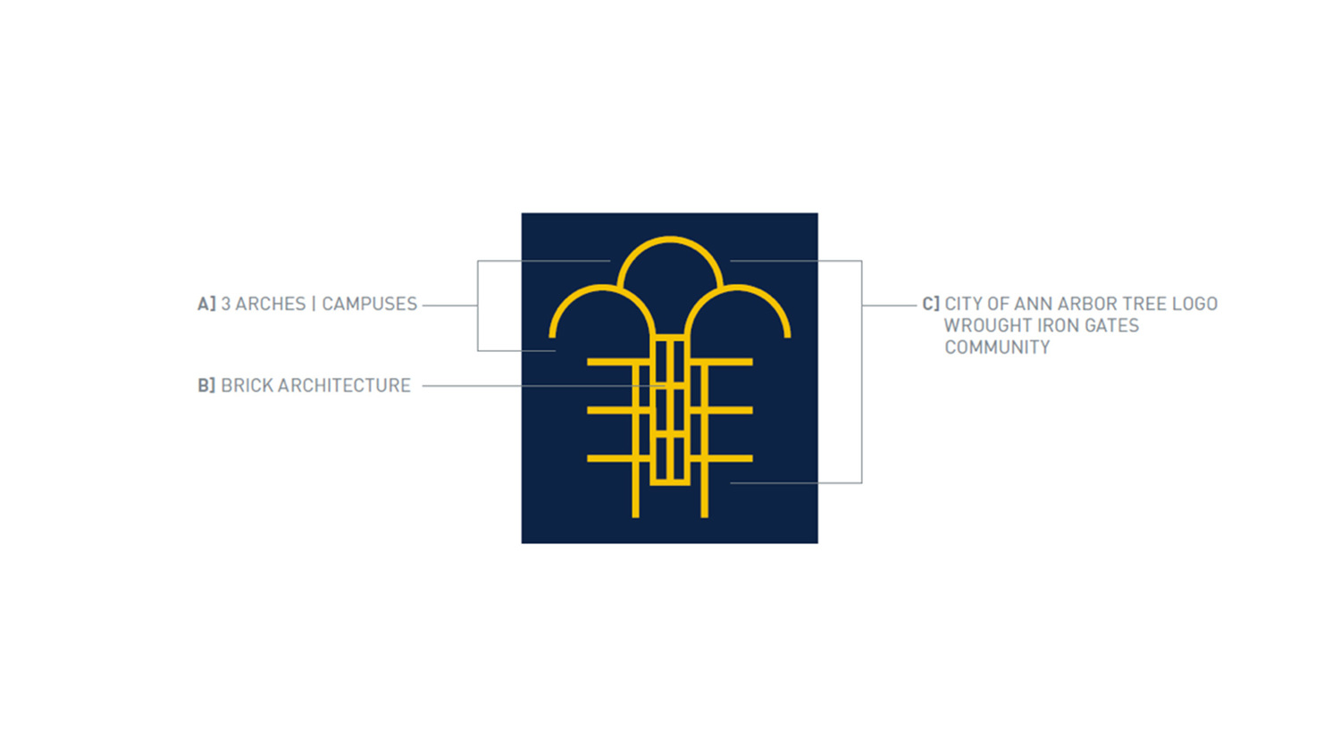
Anyone familiar with the University of Michigan Athletics campus knows the architectural mainstay is brick and wrought iron. Those elements surrounded first Regents Field, Ferry Field and now Michigan Stadium. They welcome us inside Yost Ice Arena and the University’s Intramural Sports Building, dating to the 1920s. Even in the 21st Century, the Ross Academic Center, Schembechler Hall and the South Competition and Performance complex that is under construction at this moment, showcase brick and wrought iron to provide that same classic, familiar presence.
Like fired brick, one of the longest lasting and strongest building materials, Michigan Athletics has a long-standing history of strength and endurance. The Valiant font we introduce with our partnership with NIKE utilizes a combination of Stretcher [horizontal bricks] and Soldier [vertical bricks] Course. These vertical and horizontal directional elements used in masonry are reflected in our custom block serif typeface.
The custom letterforms have been designed with unique characteristics that are carried throughout. The strong block serifs reflect the tradition of Michigan Athletics while maintaining a clean, classic and timeless look.
Regarding the custom pattern:

Nike apparel and uniforms are fine.
But this phoney made up custom pattern and pablum to justify the new font is preposterous.
These things only work when they emerge organically over time, as opposed to a bunch of baloney invented in an office park cubicle farm at Nike world HQ.
Synthetic.tradition is an oxymoron.
As someone with a degree in a design field who has many artist friends, I am very sympathetic to the outwardly arcane-sounding explanations designers give when describing their work because as an artist the process is every bit as important as the product.
Still, yeah, I can't disagree with you at all here. Michigan's iconic uniform is the winged helmet, blue jersey with maize block numbers and maize pants. That's it, full stop. There's only so much room for reinvention here and woe befall any hotshot iconoclast who dares provoke Ann Arbor Torch and Pitchfork.
August 2nd, 2016 at 10:18 PM ^
Sent from MGoBlog HD for iPhone & iPad

