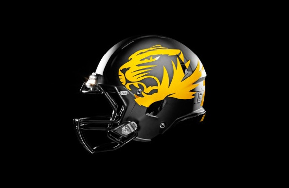
OT: Missouri Football abandon's the block "M". Replaced with Tiger Logo.

Missouri's earlier announced new college football team uniforms and new sports brand identity for other sports.
For football, they've decided to abandon the block "M" designation and embrace the tiger logo. Kind of like the new black helmet with large gold tiger design. Also the all black home uniforms with gold numerals look pretty damn cool.
Check out the changes here: http://www.mutigers.com/sports/m-footbl/spec-rel/041412aaa.html
Oh no!!!! Now Jerel Worthy's tattoo is gonna look real awkward
It's ok, now he hates the Marshall Thundering Herd.

Nah. It looks more like Marshall.
You would think that for all the theatrical hullabaloo there they would have chosen a better receptacle for the helmet reveal than a beat up cardboard box. Oh well.
it was their most modestly priced receptacle.
"Look, just because we're bereaved doesn't make us saps!"
and to conclude the scene....
"Is there a Ralph's around here?"
good... one thing Mizzou people always complain about on their blogs is running into Michigan fans and one side assuming the other is one of their own. It was a problem for them as a brand
Though really they should rename themselves after their most famous alum... the Mizzou Fighting Jon Hamms
I went to Mizzou. My freshman year there, I wore a Mizzou hat pretty much all the time. It was a gold hat with a black block-M on the front. I would wear this hat, on campus at the University of Missouri, and other Mizzou students would stop and ask me if I was from Michigan. Which then neccesitated a long answer about how I was, but the hat they were pointing to was in fact a Mizzou hat.
This happened all the time. It happened at Mizzou football games. I really liked the hat too, but I just had to get rid of it.
You should have just swtiched to a Michigan hat and then you could have simply answered "yes".
If Mizzou students couldn't identify a black and gold hat with a block M on it as Mizzou gear, then it really was time for a change
Some shades of blue and black are very similar, especially depending on the lighting. And it's even worse when it's just a yellow M.
is from Missouri, but he went to the University of Texas. He told me so on Conan.
He's in one of the commercials. Various famous Mizzou alum take turns saying "M-I-Z" and "Z-O-U" back and forth. Jon Hamm goes last, and in the most dramatic voice he can muster says "Z-O-U... Forever." It's terrible. It's probably on the internet somewhere if you want to look it up. I'd recommend it.
Mizzou also lays claim to Sheryl Crow and Brad Pitt (though he never graduated).
Hamm went to Texas and iirc transferred to Mizzou after one of his parents came down with cancer. He graduated from Mizzou.
Not like they were that memorable before.
I'm glad that we stick with the iconic winged helmet and don't do all of this Oregon/ Maryland/MSU helmet switches. It cheapens your brand and makes you look like a minor league baseball team that has no identity.
April 26th, 2012 at 10:13 PM ^
Sucks to be Oregon right now. The array of heinous mix and match unis was their thing. Now everyone is doing it. It dilutes their gawdawful tackiness.
How can they be Nike's crash test dummy when everybody's doing it?
It looks like the figure on my sex panther cologne bottle.
60% of the time, winning every time would be a nice improvement historically for the Mizzou football team.
The helmet probably smells like "desire".
"let's start with the women's soccer team!" *fireworks* *smoke* *"y'allreadyforthis?* three girls come out to mild polite applause.
also this, regarding the custom typeface: "These unique characteristics of the typeface are infused with speed and the serifs are sleek and powerful drawing inspiration from the ear of the tiger."
THE EAR OF THE TIGER!
They obviously had it all wrong.
Next someone will be telling me it's all about the nose of the tiger....
It looks good up close, but on TV it's just gonna be a mass of yellow shit.
April 26th, 2012 at 10:17 PM ^
TING!!! Once again, the classic superiority of the winged helmet reigns supreme.
Until Dave BRANDon changes it for some quick cash.
That helmet is sweet.
Kind of like a rainbow colored tie is pretty to look at, but once put to real use looks atrocious.
There's no bengal tigers in Missouri.
/s
April 27th, 2012 at 10:36 AM ^
I thought that was Wisconsin?
that looks so much better than a knockout ugly M they had
It's our M.
A refined color palette allows for instant team identification and heightens emotional ties to the Mizzou name. The official colors for Mizzou are black and gold, in keeping with the colors of the Bengal Tiger. Gold, Black, Anthracite and White are used for the foundation of the Mizzou Athletics color palette.
There's so much bullsh*t there that I don't know where to start. I will say that Bengal tigers are not gold, black, anthracite, and white. I've been to the Cincinnati Zoo a few too many times for you to pull that one on me, thank you very much.
I don't hate the way that looks, but I don't like it either. TBH all-black rarely looks good. All-any one color rarely looks good, actually. When the Saints do it, for example, they look like gymnasts wearing Spandex.
There is no way they can combat the similarities to Michigan, they lose every time. Don't fight the battle, find something and make it yours. Anthracite?
...I like the change. This isn't to say that we should change our uniforms significantly, but Missouri doesn't have the history or the immediate brand recognition with their old block M that Michigan does. I think the decal looks kinda cool. My only concern is I wonder how they'll look once they get a bit banged up. Offensive line players' helmets might end up looking like they have tigers wearing "Corky" helmets or headgear braces.
Looks good, actually.
They should have done this a long time ago
There is only one M and that's
MICHIGAN!!!
I really like those...
It's annoying seeing block M's on hats and apparel and thinking Michgan only to see its Mizzou- glad their football switch may make that less common!
Brandon is pushing the block M as depicted on the new scoreboards to make the mark as strong as possible.
I did a quick and dirty trademark search for the block "M" - anyone wanting to see the Patent and Trademark Office registration, I THINK this is it:
http://tess2.uspto.gov/bin/gate.exe?f=doc&state=4004:m88jdo.9.109
the worst thing that has happened to sports is the legitimizing of sports marketing as a career.
The drawing of alternate jerseys and such should go back to the people to whom it belongs: fourth graders who are bored in class.
April 26th, 2012 at 10:21 PM ^
That's not who's doing it now?
Have you not seen Maryland's unis?
the Michigan Athletic Director that hired Bo, was one of the great pioneers of sports marketing. Sports marketing has helped pay for the scholarships of thousands of student-athletes. You surely can think of something worse that has happened in sports in your lifetime than the legitimizing of sports marketing as a career.
It's OUR block M. Figure something else out like Minnesota's goofy /\/\.
Rable/Get Off My Lawn!
get his tat touched up?